 Charles Bochet
9c4b0f526c
Charles Bochet
9c4b0f526c
## Summary

Cleans up the chip component hierarchy in `twenty-ui`:

- **Fix twenty-ui Storybook** — The `wyw-in-js` Vite plugin crashed on
`/@react-refresh` virtual module. Fixed by setting `enforce: 'pre'` so
it runs before the React refresh plugin injects virtual imports.
- **Rename `AvatarChip` → `AvatarOrIcon`** — The old name was
misleading. This component is not a chip — it's a polymorphic renderer
that displays either an `Avatar` (image/initials) or an `Icon` (plain or
with colored background). It's typically slotted into `Chip`/`LinkChip`
as `leftComponent`.
- **Move `rightComponentDivider` to `Chip`/`LinkChip`** — The vertical
separator between chip content and a right action (e.g. a close button)
is a chip layout concern, not an avatar concern. Added
`rightComponentDivider` boolean prop to `Chip` and `LinkChip`.
- **Remove `MultipleAvatarChip`** — Zero consumers in the codebase. The
command menu implements its own overlapping avatar layout.
- **Migrate raw icon usages** — `CalendarEventDetails` and `FileIcon`
(small size) now use `AvatarOrIcon` for consistent Chip icon rendering.
- **Enhance stories** — Full `CatalogDecorator` coverage for `Chip` and
`LinkChip` showing all variants, sizes, accents, and states.

## Component hierarchy

```
AvatarOrIcon (twenty-ui)
  ├── No Icon → renders Avatar (image or initials)
  ├── Icon + background → renders icon in colored square
  └── Icon only → renders plain icon
  Used as leftComponent/rightComponent in Chip or standalone

Chip (twenty-ui)
  ├── leftComponent (typically AvatarOrIcon)
  ├── label (with overflow tooltip)
  ├── rightComponentDivider (optional vertical separator)
  └── rightComponent (e.g. close icon via AvatarOrIcon)

LinkChip (twenty-ui)
  └── Wraps Chip inside a react-router <Link>

RecordChip (twenty-front)
  └── Composes Chip/LinkChip + AvatarOrIcon with record data
```

## `Chip` API additions

| Prop | Type | Description |
|------|------|-------------|
| `rightComponentDivider` | `boolean` | Renders a vertical separator
before `rightComponent` |

## Stories

<img width="1032" height="576" alt="image"
src="https://github.com/user-attachments/assets/fe7c7666-9b16-4545-b87e-1b53e22d462d"
/>

The #1 Open-Source CRM
🌐 Website · 📚 Documentation ·  Roadmap ·
  Discord ·
  Figma
Figma
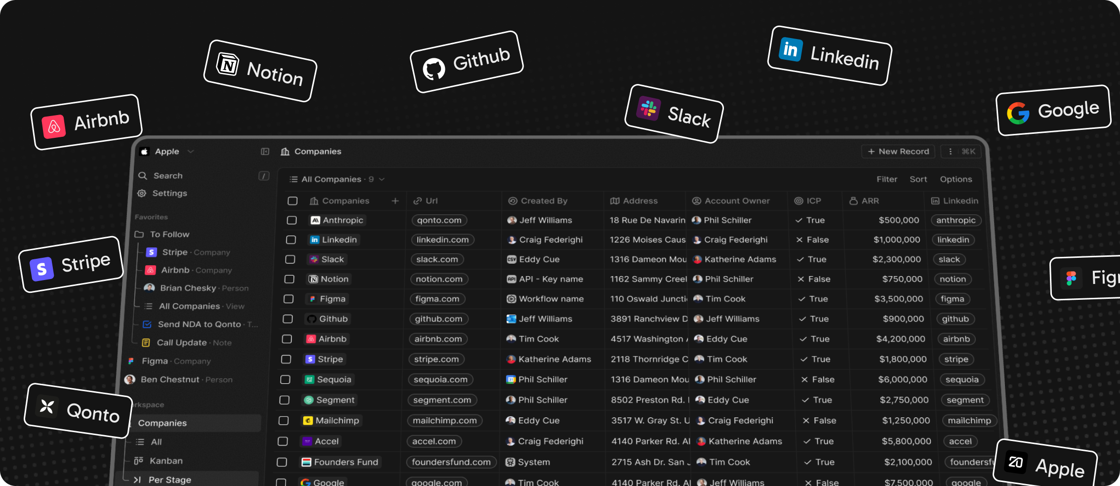
Installation
See: 🚀 Self-hosting 🖥️ Local Setup
Why Twenty
We built Twenty for three reasons:
CRMs are too expensive, and users are trapped. Companies use locked-in customer data to hike prices. It shouldn't be that way.
A fresh start is required to build a better experience. We can learn from past mistakes and craft a cohesive experience inspired by new UX patterns from tools like Notion, Airtable or Linear.
We believe in Open-source and community. Hundreds of developers are already building Twenty together. Once we have plugin capabilities, a whole ecosystem will grow around it.
What You Can Do With Twenty
Please feel free to flag any specific needs you have by creating an issue.
Below are a few features we have implemented to date:
- Personalize layouts with filters, sort, group by, kanban and table views
- Customize your objects and fields
- Create and manage permissions with custom roles
- Automate workflow with triggers and actions
- Emails, calendar events, files, and more
Personalize layouts with filters, sort, group by, kanban and table views

Customize your objects and fields

Create and manage permissions with custom roles

Automate workflow with triggers and actions

Emails, calendar events, files, and more

Stack
- TypeScript
- Nx
- NestJS, with BullMQ, PostgreSQL, Redis
- React, with Jotai, Emotion and Lingui
Thanks


Thanks to these amazing services that we use and recommend for UI testing (Chromatic), code review (Greptile), catching bugs (Sentry) and translating (Crowdin).
Join the Community
- Star the repo
- Subscribe to releases (watch -> custom -> releases)
- Follow us on Twitter or LinkedIn
- Join our Discord
- Improve translations on Crowdin
- Contributions are, of course, most welcome!