 Félix Malfait
2d9582117b
Félix Malfait
2d9582117b
Previewing the highlighted record while searching. The preview is a card anchored to the highlighted result, and its fields come from the object's **index view** (the base list view), so what you see while searching matches the list you came from. ## Screenshots > Note: these were taken before the latest design pass (smaller header, field cap). The layout is otherwise unchanged. Highlighted result, showing the index view's columns: 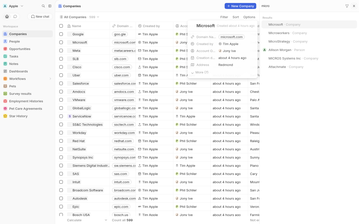 Overflow and hidden columns sit behind the `More (N)` expander: 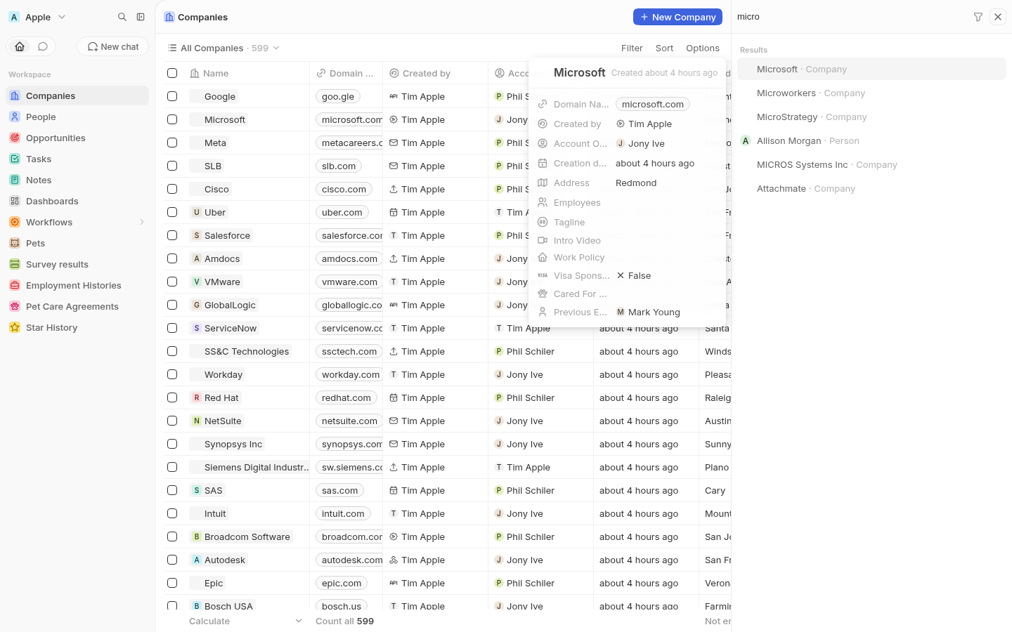 Arrowing to a Person re-anchors the card and renders that object's own index view fields: 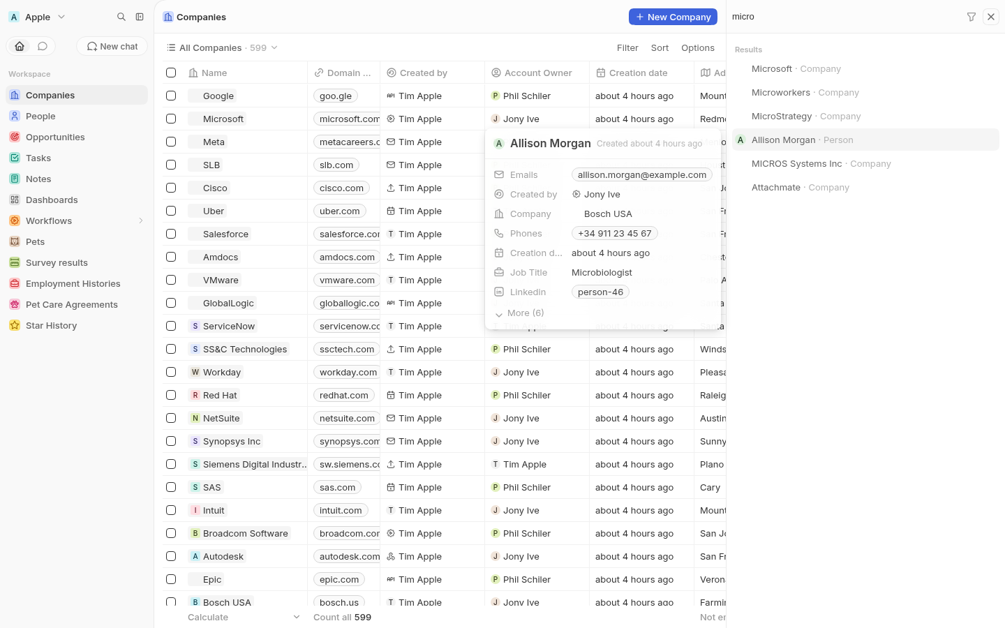 ## Changes - `SidePanelSearchRecordPreviewCard.tsx` — the card: the shared `SidePanelPageInfoLayout` header (avatar + name + created-at), then read-only `FieldDisplay` rows, then the `More (N)` expander. - `useSidePanelSearchRecordPreviewFields.ts` — resolves the object's index view through `useViewOrDefaultView` and splits its `viewFields` into visible and hidden, sorted by position, dropping the label identifier since the card already shows the record name. - `useSidePanelSearchRecordPreviewItem.ts` — resolves the highlighted item from the selectable list, following the selection immediately. - `useSidePanelSearchRecordPreviewRecord.ts` — hydrates the record into the record store so field displays can read their values. The fetch is debounced 200ms so holding an arrow key doesn't fire a `findOne` per row crossed, and it reports whether the record is hydrated yet. - `SidePanelSearchRecordsPage.tsx` — anchors the card with `AppTooltip` (`place="left-start"`, controlled `isOpen`, `clickable` so the expander is reachable) against a per-result anchor id. ## How many fields show Collapsed, the card shows at most seven of the index view's visible columns. Everything past that, plus the columns hidden in that view, sits behind `More (N)`. So the expander appears whenever there are more fields than fit, not only when the view happens to have hidden columns. ## Keeping the card stable while it loads The first cut jumped: measuring it over time gave `288px → unmounted for ~200ms → 232px`. Two separate causes, both fixed. It was **unmounting between records** because the previewed item was debounced and briefly resolved to `null`. The selection is now followed immediately and the *fetch* is what's debounced instead, so the card is reused across records rather than remounted. Its **size was derived from the data**, so every value that arrived nudged the layout. The header, rows (24px) and width are fixed, with skeleton placeholders for values until the record is hydrated. The field list comes from view metadata, which is available synchronously, so the card is its final size on first paint. Measured after that change: a constant `360x328` across 13 consecutive records spanning Person and Workspace Member, and no unmount. The skeleton and loaded states are the same height, so values just fade in. The card still disappears briefly on a brand-new search. That tracks the results list turning over — the anchor row it attaches to is genuinely removed from the DOM — so following the list is the correct behaviour there rather than holding a stale card against a deleted anchor. ## Notes The preview is read-only (`FieldDisplay`, not `RecordInlineCell`) — a floating preview isn't the right place to start an inline edit, and it keeps the card out of the field hover/edit portal machinery. The `More` button is wrapped in a container that prevents the default mousedown focus shift. Without it, clicking the expander moved focus out of the search input and arrow keys started driving the record table behind the panel instead of the results list. The section heading still reads `Results`; the design says `Records`. Left as-is since it is out of scope here. ## Testing - `nx typecheck twenty-front` passes. - `oxlint --type-aware` and `oxfmt` clean on the changed files. - Verified manually against a seeded dev workspace: anchoring and re-anchoring on arrow navigation, Company vs Person rendering their own index view fields, the `More` expander, arrow keys still driving the results list after clicking it, and the card holding a constant size through load.

The #1 Open-Source CRM
 Website ·
  Documentation ·
  Roadmap ·
  Discord ·
  Figma
Figma

Why Twenty
Twenty gives technical teams the building blocks for a custom CRM that meets complex business needs and quickly adapts as the business evolves. Twenty is the CRM you build, ship, and version like the rest of your stack.
 Learn more about why we built Twenty
Installation
Cloud

The fastest way to get started. Sign up at twenty.com and spin up a workspace in under a minute, with no infrastructure to manage and always up to date.
Build an app

Scaffold a new app with the Twenty CLI:
npx create-twenty-app my-app
Define objects, fields, and views as code:
import { defineObject, FieldType } from 'twenty-sdk/define';

export default defineObject({
  nameSingular: 'deal',
  namePlural: 'deals',
  labelSingular: 'Deal',
  labelPlural: 'Deals',
  fields: [
    { name: 'name', label: 'Name', type: FieldType.TEXT },
    { name: 'amount', label: 'Amount', type: FieldType.CURRENCY },
    { name: 'closeDate', label: 'Close Date', type: FieldType.DATE_TIME },
  ],
});
Then ship it to your workspace:
npx twenty app:publish --private
See the app development guide for objects, views, agents, and logic functions.
 Self-hosting

Run Twenty on your own infrastructure with Docker Compose, or contribute locally via the local setup guide.
Everything you need
Twenty gives you the building blocks of a modern CRM (objects, views, workflows, and agents) and lets you extend them as code. Here's a tour of what's in the box.
Want to go deeper? Read the  User Guide for product walkthroughs, or the Documentation for developer reference.

|

|

|

|

|

|
 Learn more about version control in doc


Stack
 TypeScript
 Nx
Nx NestJS, with BullMQ,
  PostgreSQL,
  Redis
Redis React, with Jotai, Linaria and Lingui
Thanks


Thanks to these amazing services that we use and recommend for code review (Greptile), catching bugs (Sentry) and translating (Crowdin).
Join the Community
Star the repo · Discord ·  Feature requests · Releases ·
  X ·
X ·  LinkedIn ·
  Crowdin ·
  Contribute