472c7c1edc7dca4bfe50174dc3400f1d0c8afe4e
6510 Commits
| Author | SHA1 | Message | Date | |
|---|---|---|---|---|
 eeshsaxena eeshsaxena
|
472c7c1edc |
fix(workspace): open edit panel for PAGE_LAYOUT sidebar items (#23293)
Fixes #22649. Custom page-layout links in the sidebar (like "Star History") couldn't be removed. Clicking them in edit mode did nothing. **Root cause** `handleNavigationMenuItemClick` in `WorkspaceSection.tsx` switches on `item.type`. `FOLDER` and `LINK` have explicit cases that call `openNavigationMenuItemInSidePanel`. `PAGE_LAYOUT` fell through to `default`, which calls `openViewOrRecordEditPanelAndNavigate`. That function only opens the side panel when `objectMetadataItem` is defined - PAGE_LAYOUT items don't have one - so the panel never opened. **Fix** Add a `PAGE_LAYOUT` case that calls `openNavigationMenuItemInSidePanel` directly, using the item's own label and icon. Same pattern as `LINK`. **How to test** 1. Create a custom page link in the sidebar (Settings > Workspace > Add menu item > Page layout). 2. Click the wrench icon to enter edit mode. 3. Click the custom page item - the edit side panel should now open. 4. Verify you can remove it from the sidebar. <!-- This is an auto-generated description by cubic. --> <a href="https://cubic.dev/pr/twentyhq/twenty/pull/23293?utm_source=github" target="_blank" rel="noopener noreferrer" data-no-image-dialog="true"><picture><source media="(prefers-color-scheme: dark)" srcset="https://www.cubic.dev/buttons/review-in-cubic-dark.svg"><source media="(prefers-color-scheme: light)" srcset="https://www.cubic.dev/buttons/review-in-cubic-light.svg"><img alt="Review in cubic" src="https://www.cubic.dev/buttons/review-in-cubic-dark.svg"></picture></a> <!-- End of auto-generated description by cubic. --> --------- Co-authored-by: prastoin <paul@twenty.com> |
||
|
github-actions[bot]
|
4eb5ad9e32 |
i18n - translations (#23313)
Created by Github action <!-- This is an auto-generated description by cubic. --> <a href="https://cubic.dev/pr/twentyhq/twenty/pull/23313?utm_source=github" target="_blank" rel="noopener noreferrer" data-no-image-dialog="true"><picture><source media="(prefers-color-scheme: dark)" srcset="https://www.cubic.dev/buttons/review-in-cubic-dark.svg"><source media="(prefers-color-scheme: light)" srcset="https://www.cubic.dev/buttons/review-in-cubic-light.svg"><img alt="Review in cubic" src="https://www.cubic.dev/buttons/review-in-cubic-dark.svg"></picture></a> <!-- End of auto-generated description by cubic. --> --------- Co-authored-by: github-actions <github-actions@twenty.com> |
||
|
Gueye Papa Djadji
|
93066ae800 |
fix(a11y): add aria-label to navigation drawer collapse button (WCAG … (#23287)
…4.1.2) Fixes #23131 Added `aria-label` to the navigation drawer collapse/expand button (LightIconButton with IconLayoutSidebarLeftCollapse/RightCollapse), which previously had no accessible name for screen readers. Verified with axe DevTools scan on localhost — the button-name violation for this element no longer appears. <!-- This is an auto-generated description by cubic. --> <a href="https://cubic.dev/pr/twentyhq/twenty/pull/23287?utm_source=github" target="_blank" rel="noopener noreferrer" data-no-image-dialog="true"><picture><source media="(prefers-color-scheme: dark)" srcset="https://www.cubic.dev/buttons/review-in-cubic-dark.svg"><source media="(prefers-color-scheme: light)" srcset="https://www.cubic.dev/buttons/review-in-cubic-light.svg"><img alt="Review in cubic" src="https://www.cubic.dev/buttons/review-in-cubic-dark.svg"></picture></a> <!-- End of auto-generated description by cubic. --> --------- Co-authored-by: Thomas Trompette <thomas.trompette@sfr.fr> |
||
|
github-actions[bot]
|
70e1e94e55 |
i18n - translations (#23288)
Created by Github action <!-- This is an auto-generated description by cubic. --> <a href="https://cubic.dev/pr/twentyhq/twenty/pull/23288?utm_source=github" target="_blank" rel="noopener noreferrer" data-no-image-dialog="true"><picture><source media="(prefers-color-scheme: dark)" srcset="https://www.cubic.dev/buttons/review-in-cubic-dark.svg"><source media="(prefers-color-scheme: light)" srcset="https://www.cubic.dev/buttons/review-in-cubic-light.svg"><img alt="Review in cubic" src="https://www.cubic.dev/buttons/review-in-cubic-dark.svg"></picture></a> <!-- End of auto-generated description by cubic. --> --------- Co-authored-by: github-actions <github-actions@twenty.com> |
||
|
Félix Malfait
|
6cc7ed7570 |
Make solo tabs first-class: derived presentation, native editing, unified widget header (#23109)
## Why

Full-page record tabs (Timeline, Tasks, Notes, Files, Emails, Calendar,
Flow) were encoded by storing a `CANVAS` layout mode. That made them a
separate species: editing one didn't feel native (no drag handles, no
way to add a second widget, the tab couldn't adapt), and the widget
pipeline was full of `layoutMode === CANVAS` branches.

This PR replaces the stored mode with two derived rules and one unified
header grammar:

> **Presentation is derived from content, never stored.**
> A list tab with exactly **one widget** renders it **solo**
(full-bleed, it owns the tab). Anything else is a **stack** of boxed
cards. **Edit mode always shows the stack structure.**

No widget taxonomy, no per-type branches: any lone widget owns its tab.

## What

**Presentation model**
- `getTabPresentation({ widgets, layoutMode, isInEditMode })`: solo iff
a list tab has exactly one widget in view mode; grid tabs (dashboards)
and edit mode are always stacks. The pinned left panel is always a
column (a surface rule, not a widget rule).
- Solo view rendering is identical to the old CANVAS rendering
(container height, internal scroll).
- Stacked widgets in the main tab area get one bounded slot rule
(`max-height` + own scroll) so no widget swallows the tab;
pinned/side-column stacks keep their flowing behavior. This only binds
on user-composed mixed tabs, which could not exist before.

**Native editing (the point of the PR)**
- Every record-page tab is edited through the same vertical-list editor:
drag handle, reorder, remove, add widget. Add a second widget to a
Timeline tab and it becomes a stack; remove back down to one and it's
solo again. Nothing is stored, nothing to migrate.
- Fixes the stuck-drag bug found while testing the preview: widgets
publishing header info republished a fresh object on every render
(activity cards build their action from non-memoized hook returns), and
since the widget chrome reads that state above the widget content, any
tab with an activity card sat in an infinite render loop. The loop
starved React's transition lane, which dnd-kit's drop teardown waits on,
so the drag clone and drop outlines froze on screen after a drop. The
header hook now republishes only on real value changes and routes
onClick through a stable wrapper, so callers need no memoization. The
page-layout drag provider also disables the Feedback drop animation so
clone cleanup is synchronous at drop time.

**Unified widget header API**
- A widget's content can publish header info to its chrome via
`usePublishWidgetHeaderInfo({ count, primaryAction })`: a count rendered
in grey next to the title, and a primary action (icon button with
accessible name) on the right in view mode. Instance-scoped state keyed
by widget id, so third-party widgets (front components) can use the same
seam later; the hook no-ops outside a page layout (stories, previews)
and is safe to call with inline, non-memoized values.
- A solo widget's header only appears when the widget published
something: the tab label already names it, so a bare title row adds
nothing. Timeline/Flow tabs stay exactly as today.
- Emails, Tasks, Notes, Files, Calendar publish their count (query
totals, not loaded-page lengths) and action (Compose, New task, New
note, Add file) and stop rendering internal title rows ("Inbox 12", "All
5"): exactly one header per widget everywhere, same grammar.
`ComposeEmailButton`, `AddTaskButton` and the title/button plumbing in
`NoteList`/`AttachmentList`/`TaskList` are deleted.

**Object-aware tabs**
- The hardcoded `SYSTEM_OBJECT_TABS` title allowlist is gone. A tab
renders based on whether the target object supports its widgets: widgets
that read through a relation (Tasks, Notes, Files, Timeline) require the
relation field to exist and be active, while Emails and Calendar
aggregate through the messaging timeline, so a missing participants
relation is fine (Company) and a deactivated one is an explicit opt-out.
System objects on the shared default layout keep exactly Home +
Timeline, now by derivation instead of hardcoded titles.

**Data cleanup**
- Seeds (frontend defaults, server standard template, `twenty app`
scaffolder, docs) write `VERTICAL_LIST`;
`PageLayoutTabLayoutMode.CANVAS` is `@deprecated`, kept read-only for
layouts persisted before this change (they render correctly through the
derivation; no data migration, by design: an in-place flip can't pass
the widget-position/tab-layoutMode validator atomically, and it isn't
needed).
- Locale catalogs are intentionally untouched: the i18n pipeline
extracts and translates the new header labels on main; they fall back to
their English source until then.

## Deliberate view-mode changes (approved)

- A lone widget of any type now owns its tab full-bleed: lone Fields tab
(mobile/side panel), lone rich-text Note tab, lone chart, and the
message-thread page lose their card box.
- Activity tabs show the unified header (title, grey count, + action)
instead of their internal "Inbox 12"-style rows.

Everything else is pixel-parity, including solo scroll behavior and
dashboards.

## Test plan
- `nx typecheck twenty-front` / `twenty-server`: clean; oxlint/oxfmt on
the changeset: clean
- 239 suites / 1474 tests across page-layout, activities, side-panel
pass, including new tests for `getTabPresentation` (count-based,
edit-mode override) and `usePublishWidgetHeaderInfo` (publish, cleanup
on unmount, no-op outside a widget, referential stability across
re-renders with inline actions, latest-onClick wrapper)
- `getTabsRenderableForTargetObject` tests covering missing vs
deactivated relations, Emails/Calendar without a participants relation,
and non-relation widgets
- Stuck-drag repro verified fixed end to end against a local stack with
an instrumented dnd-kit: before the fix the affected tab committed ~65
renders/second at idle and drops never tore down; after it, idle commits
are flat and every drop cleans up
|
||
|
github-actions[bot]
|
482b88bcda |
i18n - translations (#23283)
Created by Github action --------- Co-authored-by: github-actions <github-actions@twenty.com> |
||
|
Thomas Trompette
|
cbcfba0de2 |
feat(workflow): dedicated updateWorkflowVersionTrigger mutation + close version CRUD holes (#23207)
Prerequisite for the workflow-core soft-ref migration: every
`workflowVersion` content write must go through a dedicated,
draft-guarded server mutation so it can later be wrapped in a
transactional core mirror. This closes the generic-CRUD holes that let
writes bypass that path.

## Part A - dedicated `updateWorkflowVersionTrigger` mutation
The builder saved a version's trigger through generic
`updateOneWorkflowVersion` - the only content write not going through a
dedicated mutation. Added:
- Server: `updateWorkflowVersionTrigger(input: { workflowVersionId,
trigger })` resolver +
`WorkflowVersionStepWorkspaceService.updateWorkflowVersionTrigger`,
draft-guarded via `getValidatedDraftWorkflowVersion` then
`updateWorkflowVersionStepsAndTrigger` (reuses existing write logic).
- Front: `useUpdateWorkflowVersionTrigger` now calls the dedicated
mutation instead of `useUpdateOneRecord`.

## Part B - restrict generic `updateOneWorkflowVersion`
`validateWorkflowVersionForUpdateOne` previously allowed writing
`trigger`, `position`, `workflowId` (re-parenting),
`coreWorkflowVersionId`, and let `steps: null` slip through on a draft.
It now rejects any update that sets `steps`, `trigger`, `status`,
`workflowId`, or `coreWorkflowVersionId`, or that clears the `name`,
while still allowing a plain rename. (A name-only allowlist was tried
first but blocked legitimate renames - at the pre-hook the generic
update payload is not single-key - so it was replaced by this denylist,
verified live.)

## Part C - close the destroy/restore hole
`workflowVersion` had no `destroyOne/destroyMany/restoreOne/restoreMany`
query hooks, so a caller with object permission could hard-destroy any
version (including active) or resurrect one with no validation. Added
pre-hooks that forbid all four via the API ("Method not allowed"),
matching the existing forbidden generic mutations (`createOne`,
`deleteMany`, ...). Rationale: there is no legitimate API use for
standalone version destroy/restore - retention purging happens through
the trash-cleanup cron (internal, not hook-gated) and restore happens
through the workflow-restore cascade or create-draft-from-version.

## Tests
Integration specs that set a trigger through the generic mutation were
migrated to the new `updateWorkflowVersionTrigger` mutation (new
`update-workflow-version-trigger.util.ts`). Unit test for the front hook
updated.

## Verification
- `twenty-server` + `twenty-front` typecheck: clean.
- oxlint + oxfmt on all changed files: clean.
- `graphql.ts` regenerated for the new mutation; its types match the
server DTOs exactly. Local `graphql:generate` introspects a running
server, so it only succeeds against a server built from this branch - CI
regenerates against the PR server and verifies.


<!-- This is an auto-generated description by cubic. -->
<a
href="https://cubic.dev/pr/twentyhq/twenty/pull/23207?utm_source=github"
target="_blank" rel="noopener noreferrer"
data-no-image-dialog="true"><picture><source
media="(prefers-color-scheme: dark)"
srcset="https://www.cubic.dev/buttons/review-in-cubic-dark.svg"><source
media="(prefers-color-scheme: light)"
srcset="https://www.cubic.dev/buttons/review-in-cubic-light.svg"><img
alt="Review in cubic"
src="https://www.cubic.dev/buttons/review-in-cubic-dark.svg"></picture></a>
<!-- End of auto-generated description by cubic. -->

---------

Co-authored-by: prastoin <paul@twenty.com>
|
||
|
martmull
|
25b0b2601f |
Replace admin app rollout buttons with upgrade-application CLI command (#23212)
## What Removes the two rollout buttons from the admin application detail page and replaces the upgrade flow with a CLI command that can be run directly from a server or worker pod. Also restructures application stop into its own module with a kill switch CLI command, and surfaces stopped apps in workspace settings. ### Removed - "Install on all workspaces" button (General tab, `SettingsAdminApplicationRegistrationGeneralToggles`), its confirmation modal and tooltip - "Upgrade existing installations" button (`SettingsApplicationRegistrationGeneralStats`), its confirmation modal and batch size input - `backfillApplicationInstallation` and `upgradeRegistrationApplications` admin GraphQL mutations and their frontend documents / generated types - `BackfillApplicationInstallationJob` (its only trigger was the removed mutation); `UpgradeApplicationsJob` is kept since the auto-upgrade flow still enqueues it Per review, the "install on all workspaces" flow is dropped without a CLI replacement for now; a dedicated command will be added when needed. ### application:upgrade command Located in `application-upgrade/commands`, registered in `ApplicationUpgradeModule`: ``` yarn command:prod application:upgrade \ --application-registration-universal-identifier <universalIdentifier> \ [--batch-size 5] \ [--workspace-id <id> --workspace-id <id2>] \ [--workspace-count-limit 10] \ [--dry-run] [--yes] ``` - `--workspace-id` (repeatable) restricts the upgrade to specific workspaces; `--workspace-count-limit` caps how many installations are upgraded (max 50, for canary rollouts) - `--batch-size` and `--workspace-count-limit` are validated as positive integers, max 50 - `--dry-run` reports how many (and which) workspaces would be upgraded, without upgrading - Without `--dry-run`, a confirmation prompt shows the app, target version and impacted workspaces; the run then executes exactly the confirmed set; `--yes` skips the prompt for non-interactive usage The upgrade plan is computed by a new `ApplicationUpgradeService.findApplicationsToUpgrade`, and batches run through a new `upgradeApplications` method — both reused by `upgradeAllApplications`, so the auto-upgrade job path is unchanged. ### Application kill switch (per review) Global mechanism only — a per-workspace stop had no demonstrated operational need and added a Redis key format, execution branching, CLI options and tests; an isolated workspace issue can be handled directly in the DB or Redis with the same effort. - `ApplicationStopService` moved to a dedicated `application-stop/` folder with its own `ApplicationStopModule` (imported and re-exported by `ApplicationModule`) - `stop` / `remove` methods that enable or clear the Redis-backed global kill switch; the logic function executor checks it before executing - `application:kill-switch` command with a positional action, confirmation prompt (shows the installation count) and `--yes` bypass: ``` # Enable the kill switch (stop is the default action) yarn command:prod application:kill-switch stop -u <universalIdentifier> [-y] yarn command:prod application:kill-switch -u <universalIdentifier> # Remove the kill switch yarn command:prod application:kill-switch remove -u <universalIdentifier> [-y] ``` ### Stopped apps surfaced in workspace settings (per review) - Dedicated `isApplicationStopped(applicationUniversalIdentifier)` query backed by the kill switch, fetched with `network-only` policy solely by the application detail page — listing applications triggers no extra Redis reads - Application detail page shows a danger banner when the app is stopped: "We are currently encountering issues with this app, its behavior may be degraded while we work on a fix." ## Test - `npx nx typecheck twenty-server` / `npx nx typecheck twenty-front` pass - `npx nx lint:diff-with-main` passes for both packages - `application-stop.service.spec.ts` covers stop, remove, caching and fail-open behavior - Verified end to end locally: ran the kill switch command on a seeded workspace and confirmed the banner renders on the app detail page (screenshot shared separately) |
||
|
github-actions[bot]
|
86d0e15a6a |
i18n - translations (#23281)
Created by Github action --------- Co-authored-by: github-actions <github-actions@twenty.com> |
||
|
Raphaël Bosi
|
d1c6b8ee72 |
Show relation record labels instead of UUIDs in dashboard charts (#23163)
https://github.com/user-attachments/assets/d012a013-2c90-49a1-a27e-b8e4b684a84f Charts grouped by a relation without a sub-field rendered raw FK UUIDs on axis ticks, legends and tooltips. The server now batch-resolves the grouped record ids to their label identifier through a permission-scoped query and formats every bucket with the record's display name. Unresolvable records (deleted or not readable) render as Unknown and their ids are stripped from the response payload. Same-named records get an ordinal suffix so their buckets don't merge. Covers bar, line and pie, plain and morph relations. ```mermaid flowchart TD A["Dashboard widget load"] --> B["Chart data service<br/>(bar / line / pie)"] B --> C["executeGroupByQuery:<br/>group by relation FK id,<br/>ORDER BY target label identifier,<br/>scoped to source object permissions"] C --> D["filterOutEmptyChartBuckets"] D --> E{"Bare relation axis?<br/>(no sub-field)"} subgraph RL["ChartRelationLabelService.resolveRelationLabels"] direction TB G1["Collect distinct record ids<br/>per target object"] --> G2["Batch SELECT label identifier columns,<br/>scoped to TARGET object permissions"] G2 --> G3["buildRawLabelByRecordId:<br/>display name per record"] G3 --> G4["buildUniqueRelationLabels:<br/>suffix duplicates, Unknown for unresolved"] end E -- No --> H["formatDimensionValue per bucket"] E -- Yes --> G1 G4 --> H H --> I["Strip unresolved ids from<br/>formattedToRawLookup"] I --> J["Chart DTO to frontend"] ``` The chart settings sub-field dropdown gains a Record option to group by the related record itself, and now only offers sub-fields the backend accepts (system fields like a workspace member's updatedBy were selectable but rejected at query time). Chart-data errors are now logged server-side. Also fixes two latent bugs on this path: sorting a bare-relation chart by field threw `Cannot orderBy unknown field: agentId`, and the pie chart truncated slices before sorting. The AI dashboard tool guidance and the seeded dashboards no longer force the sub-field workaround. The group-by query orders buckets by the related record's label identifier at the database level (the engine now accepts ordering by a target field when grouping by its id), so with more than 100 distinct related records the surviving buckets match the label order. |
||
|
github-actions[bot]
|
b61134ea5b |
i18n - translations (#23268)
Created by Github action Co-authored-by: github-actions <github-actions@twenty.com> |
||
|
Raphaël Bosi
|
3ee8fc0973 |
Add front component skeleton loader (#23261)
Front components (dashboard widget, side panel, settings preview) showed blank space during their entire load. They now show a shimmering full-area skeleton continuously, from the lazy chunk load through metadata fetch, token/SDK wait, and worker boot, until the real UI mounts. The skeleton is threaded down as an optional `loadingFallback` prop so the shared `twenty-front-component-renderer` package stays dependency-free (react-loading-skeleton stays in twenty-front). The command-menu headless component opts out by not passing a fallback, so it stays blank as before. <!-- This is an auto-generated description by cubic. --> <a href="https://cubic.dev/pr/twentyhq/twenty/pull/23261?utm_source=github" target="_blank" rel="noopener noreferrer" data-no-image-dialog="true"><picture><source media="(prefers-color-scheme: dark)" srcset="https://www.cubic.dev/buttons/review-in-cubic-dark.svg"><source media="(prefers-color-scheme: light)" srcset="https://www.cubic.dev/buttons/review-in-cubic-light.svg"><img alt="Review in cubic" src="https://www.cubic.dev/buttons/review-in-cubic-dark.svg"></picture></a> <!-- End of auto-generated description by cubic. --> |
||
|
Félix Malfait
|
3a8f086d15 |
Converge drag and drop on shared dnd-kit primitives, remove @hello-pangea/dnd (#23211)
Follow-ups recorded in #23023, done in one pass. ## Shared primitives - Folded `PageLayoutWidgetSortableItem` and `PageLayoutWidgetDropLine` into the shared `DragDropItemSortableCell` / new `DragDropItemDropLine` (new `data`, `dropLine`, `highlightWhileDragging`, `hasTransition` props). - Added generic `DragDropProviderDragStartEvent` (and DragMove/DragOver/DragEnd/DropTarget) helpers and deleted the 7 copied `Parameters<...>` extractions across the dnd hooks. - Replaced the `useMovePageLayoutWidgetUp/Down` implementations (~140 lines) with `moveWidgetWithinTabInDraft`. - Migrated the remaining page-layout test suites onto `pageLayoutDraftFixtures`. ## Tab reordering off Pangea - Tabs are sortable cells on the same provider as widget drags, segregated by dnd type, so widget drops on tab buttons keep working while tabs reorder. - Reordering is ID based (`reorderTabInDraft`: insert before the hovered tab), which keeps the pinned first tab in place without index arithmetic. - Preserved overflow behaviors: the dropdown stays open while a tab drag is in flight, dropping a tab on the "+N More" button appends it and opens the dropdown, and both the visible strip and the overflow list have end drop zones. ## Fields configuration editors off Pangea - Group reorder, field reorder and cross-group field moves now run on the shared cells (same drop line and end-zone patterns). ## DraggableList off Pangea - `DraggableList` / `DraggableItem` keep their consumer-facing API — the ~9 consumers now type their handlers with a local `DraggableListDropResult` instead of pangea's `DropResult` — but run on the shared sortable cells; each list's uuid group doubles as its dnd type so nested lists stay isolated from page-level providers. - Items register their index in a list-scoped registry so the end drop zone can resolve the append index at drop time (with insert-before semantics an item could otherwise never reach the last position). - Deleted three dead files that only existed for pangea plumbing (the side panel navigation placeholder, `getCssCompatibleDraggableProps`, the orphaned `recordGroupPendingDragEndReorderState`). ## Record table row drag off Pangea - Rows register through `useSortable` directly on the row element — no wrapper div, so row CSS, sticky cells and virtualization stay untouched — with the grip cell wired as the drag handle via the shared sortable handle ref context. - Both table modes (virtualized flat list and record groups) share a `DragOverlay` clone that replaces pangea's virtual-mode `renderClone`, and end drop zones per record group (and after the virtualized list) allow dropping after the last row or into an empty group. - The drop handlers keep their pangea-shaped result object, retyped as a local `RecordDragDropResult`, so the position computation logic is untouched. ## Pangea removed `@hello-pangea/dnd` is gone from `package.json` and the lockfile, along with its orphaned transitive entries (`css-box-model`, `raf-schd`, `react-redux`, `redux`). Nothing in the repo imports it anymore. ## Dashboards: cross-tab widget drag for grids react-grid-layout drags never enter dnd-kit, so the bridge hit-tests the pointer against the tab buttons' `data-page-layout-tab-drop-target-id` rects during grid drags, highlights the hovered tab through state, and on drop moves the widget to the destination grid below its existing content (`moveWidgetToGridTabInDraft`, `buildTabWidgetLayouts`). The grid's own post-drag layout commit is suppressed once so it does not overwrite the cross-tab move. ## Fixes found while testing - With `feedback: 'clone'`, the drag source is its own initial drop target and its placeholder is a DOM clone taken at drag start, so the drop line rendered into the source got baked into the placeholder and stuck there for the whole drag. The line is now hidden on the source cell, leaving a single indicator at the actual target. - Reorderable tabs collapsed to text height and sat top-aligned next to "+ New Tab" because the sortable cell wrapper defaults to `display: block; height: auto`, breaking the tab height chain — the tab list now uses the cell's `fill` mode so tabs stretch to the strip height again. ## Testing Playwright against the dev app: - Record page: widget reorder up and down in the pinned column (single blue drop line at the target), drag to another tab via its tab button (highlight + move), drag back into content at a specific position, chained cross-tab moves, tab reorder with vertical drop line, new tab creation. - Overflow (narrow viewport): drop a tab on "+N More" (appends last, dropdown opens), reorder inside the dropdown (stays open), drag a tab from the dropdown back to the visible strip. - Dashboard: grid drag within a tab, cross-tab drag onto a tab button (hover highlight, widget lands below destination content, remaining widgets keep their positions), save and reload persistence in both directions. - Fields editor: field reorder, group reorder, field move across groups, plus the Move Up / Move Down widget actions. Since the pangea-removal commits: - Typecheck, oxlint and oxfmt green over the full front source; unit suites green including the migrated `useStartRecordDrag` test (jest needed a scoped transform exemption for `@preact/signals-core` once dnd-kit reached the side-panel suites). - Storybook visual regression unchanged across ~700 stories — expected, since the migrated surfaces render identical DOM at rest (drop lines and drag overlays only exist mid-drag). - The tab strip fix reverses the exact regression mechanism: the sortable cell wrapper defaulted to `display: block; height: auto`, collapsing the tab height chain next to the full-height "+ New Tab" button; `fill` restores the stretch. --- _Generated by [Claude Code](https://claude.ai/code/session_01XKRCzzu8oGyocXZtFp7VEG)_ <a href="https://cubic.dev/pr/twentyhq/twenty/pull/23211?utm_source=github" rel="nofollow noreferrer noopener" target="_blank">``<img alt="Review in cubic" src="https://www.cubic.dev/buttons/review-in-cubic-dark.svg">``</a> |
||
|
github-actions[bot]
|
d0863dd1f7 |
i18n - translations (#23253)
Created by Github action --------- Co-authored-by: github-actions <github-actions@twenty.com> |
||
|
Félix Malfait
|
1fdb5605f1 |
feat: kanban, calendar and grouped-table layouts for relation field widgets (#23112)
## Context A relation field widget on a record page can already embed a record-scoped view rendered as a **table** (`FieldDisplayMode.TABLE`) — e.g. a Company's Opportunities. This brings **kanban, calendar and grouped-table** to that same embedded view, so the board/calendar stays scoped to *this* record's related records (not a standalone all-records widget — that was the earlier #23003 approach, closed). Builds directly on the merged dashboard widget layouts (#22963), reusing its renderer, draft/save pipeline, and settings dropdowns. ## Approach — extend the existing "Table" display mode The relation field widget already stores a `viewId` and renders it through the layout-agnostic `RecordTableWidgetRendererContent` (which branches on the embedded view's `type`), scoped to the current record via `RecordFilterValueDependenciesContext`. So rendering + persistence already work for any widget view type — only the authoring UI and one server gate were missing. **No new `FieldDisplayMode`, no data migration.** ## Server - `view-widget-upsert.service.ts`: a field widget in table display mode (`isFieldTableWidget`) could already persist viewFields/filters/sorts through this path, but was **blocked from updating view settings** (`type` / group-by / calendar), pinning its embedded view to a table. The widget-type guard earlier in the method already rejects every widget kind other than record-table and field-table, so the now-redundant record-table-only guard on the view-settings branch is dropped. The allowed-widget-view-types check and the downstream group-by / calendar-field validations still apply equally. ## Frontend - **One merged Layout picker.** The field widget's Layout dropdown lists **Field / Card / Table / Kanban / Calendar** in a single flat list — you pick Kanban directly, instead of "Display as: Table" first and a separate embedded-view layout second. Picking a view layout selects the `TABLE` display mode under the hood, seeds the record-scoped embedded view on first use (with a default group-by / date field), and applies the layout in the same click. Kanban/Calendar are disabled with a hint ("Needs a Select field" / "Needs a Date field") when the relation target can't support them — same gating as the dashboard picker. The row's icon and description reflect the effective selection (e.g. Kanban), and the dropdown mounts the draft-init effect so switching straight from Field/Card to Kanban works before the table renderer has ever mounted. - **Contextual rows** (Group by / Date field / Calendar view / Hide empty groups) extracted from the dashboard panel into a reusable `WidgetViewLayoutSettingsRows` (source object passed in — fixed to the relation target; no Source / Limit rows) and surfaced under the picker while a view layout is active. Its standalone layout row is hidden here (`isLayoutRowHidden`) since layout lives in the merged picker. - Reuses the dashboard draft snapshot + `upsertViewWidget` save pipeline and the group-by/calendar dropdown components unchanged. ## Scope - **One-to-many relations only** (matches the existing `getFieldWidgetAvailableDisplayModes` gate; junction / many-to-many stay table-only — a pre-existing inconsistency left untouched here). - Field-widget **calendars inherit the dashboard's behavior** (month read-only by default; day/week + drag-to-reschedule only behind `IS_CALENDAR_WEEK_VIEW_ENABLED`), since it's literally the same renderer. ## Tests - Server integration (`upsert-view-widget-view-settings.integration-spec.ts`): a FIELD + TABLE widget can switch its embedded view to `KANBAN_WIDGET` (with group-by) and `CALENDAR_WIDGET` (with date field), and the kanban group-by validation still applies through the newly-opened path. - Front unit: `getWidgetViewLayoutSettingsItemIds` (keyboard-nav row ids per layout/flag/group state). ## Follow-ups (intentionally not in this PR) - Migrate the dashboard settings panel onto the shared `WidgetViewLayoutSettingsRows` (kept out to avoid churning the just-merged #22963 file; behavior-preserving refactor). https://claude.ai/code/session_01E5N87kwwZWhDtEQaP72cMf |
||
|
github-actions[bot]
|
09e20eee5f |
i18n - translations (#23246)
Created by Github action <!-- This is an auto-generated description by cubic. --> <a href="https://cubic.dev/pr/twentyhq/twenty/pull/23246?utm_source=github" target="_blank" rel="noopener noreferrer" data-no-image-dialog="true"><picture><source media="(prefers-color-scheme: dark)" srcset="https://www.cubic.dev/buttons/review-in-cubic-dark.svg"><source media="(prefers-color-scheme: light)" srcset="https://www.cubic.dev/buttons/review-in-cubic-light.svg"><img alt="Review in cubic" src="https://www.cubic.dev/buttons/review-in-cubic-dark.svg"></picture></a> <!-- End of auto-generated description by cubic. --> Co-authored-by: github-actions <github-actions@twenty.com> |
||
|
martmull
|
91f0b77fdb |
Only suggest vetted apps in onboarding install step (#23222)
The onboarding "Install your first apps" step now only suggests marketplace apps where `isVetted` is true. |
||
|
martmull
|
fb52635d2a | Add defineUninstallLogicFunction hook for applications (#23227) | ||
|
Rehuz
|
7f1e3d3541 |
fix(admin): prevent fallback to 'latest' string when dockerhub tags c… (#22885)
Fixes #22849 ### What changed? When the `AdminPanelVersionService` hits a DockerHub API error (or filters out all valid tags), it was previously hardcoded to return `'latest'`. This caused the frontend to display `Latest version: latest`. I updated the GraphQL DTO to make `latestVersion` nullable, and modified the service fallback and unit tests to return and expect `null` instead. The frontend (`SettingsAdminVersionDisplay`) already has logic to handle a falsy version and gracefully display `No latest version found`, so this backend fix entirely resolves the UX issue without touching the frontend. <!-- This is an auto-generated description by cubic. --> <a href="https://cubic.dev/pr/twentyhq/twenty/pull/22885?utm_source=github" target="_blank" rel="noopener noreferrer" data-no-image-dialog="true"><picture><source media="(prefers-color-scheme: dark)" srcset="https://www.cubic.dev/buttons/review-in-cubic-dark.svg"><source media="(prefers-color-scheme: light)" srcset="https://www.cubic.dev/buttons/review-in-cubic-light.svg"><img alt="Review in cubic" src="https://www.cubic.dev/buttons/review-in-cubic-dark.svg"></picture></a> <!-- End of auto-generated description by cubic. --> |
||
|
github-actions[bot]
|
8b7ac02464 |
i18n - translations (#23226)
Created by Github action Co-authored-by: github-actions <github-actions@twenty.com> |
||
|
neo773
|
59eead238d |
message list member backfill (#23176)
<!-- This is an auto-generated description by cubic. --> <a href="https://cubic.dev/pr/twentyhq/twenty/pull/23176?utm_source=github" target="_blank" rel="noopener noreferrer" data-no-image-dialog="true"><picture><source media="(prefers-color-scheme: dark)" srcset="https://www.cubic.dev/buttons/review-in-cubic-dark.svg"><source media="(prefers-color-scheme: light)" srcset="https://www.cubic.dev/buttons/review-in-cubic-light.svg"><img alt="Review in cubic" src="https://www.cubic.dev/buttons/review-in-cubic-dark.svg"></picture></a> <!-- End of auto-generated description by cubic. --> |
||
|
neo773
|
97d2b52a71 |
fix(front): duplicate junction chip after Add New in relation picker (#23185)
Clicking Add New in a junction relation picker rendered the newly created target twice until a page reload. The handler appended the created junction to the source record's store field after awaiting the mutation, but useCreateOneRecord's post-optimistic effect had already attached it, so the same junction id ended up in the field array twice (single row in DB). Removes the redundant manual append in both to-many picker flows. <!-- This is an auto-generated description by cubic. --> <a href="https://cubic.dev/pr/twentyhq/twenty/pull/23185?utm_source=github" target="_blank" rel="noopener noreferrer" data-no-image-dialog="true"><picture><source media="(prefers-color-scheme: dark)" srcset="https://www.cubic.dev/buttons/review-in-cubic-dark.svg"><source media="(prefers-color-scheme: light)" srcset="https://www.cubic.dev/buttons/review-in-cubic-light.svg"><img alt="Review in cubic" src="https://www.cubic.dev/buttons/review-in-cubic-dark.svg"></picture></a> <!-- End of auto-generated description by cubic. --> |
||
|
Raphaël Bosi
|
5c7915ba56 |
Skip install apps onboarding step for invitees (#23214)
Users joining an existing workspace via an invitation link were shown the install apps onboarding step after skipping the email-connect step, even though the backend never assigns them that step (and apps they selected were silently not installed). The frontend optimistic transition unconditionally mapped SYNC_EMAIL to APPS_INSTALLATION. It now checks workspaceMembersCount === 1, like the existing PROFILE_CREATION to INVITE_TEAM transition, so invitees go straight to profile creation. <!-- This is an auto-generated description by cubic. --> <a href="https://cubic.dev/pr/twentyhq/twenty/pull/23214?utm_source=github" target="_blank" rel="noopener noreferrer" data-no-image-dialog="true"><picture><source media="(prefers-color-scheme: dark)" srcset="https://www.cubic.dev/buttons/review-in-cubic-dark.svg"><source media="(prefers-color-scheme: light)" srcset="https://www.cubic.dev/buttons/review-in-cubic-light.svg"><img alt="Review in cubic" src="https://www.cubic.dev/buttons/review-in-cubic-dark.svg"></picture></a> <!-- End of auto-generated description by cubic. --> |
||
|
Félix Malfait
|
65d399c70d |
feat(page-layout): drag widgets across tabs on record pages (#23023)
## What When editing a record page layout, you can now drag a widget out of one tab and into another. The most common case works: drag from the left column (the pinned first tab, in full mode) into the tab you're currently viewing. Ways to move a widget across tabs: - **Into the visible tab's content** — drop it into another vertical-list tab's list to place it at a precise index. A blue line shows exactly where it will land. - **Onto a tab button** — drop a widget onto another tab's button to move it to that tab; the button highlights while hovered. - **Into an empty tab / the end of a tab** — an end-of-list drop zone (wrapping the add-widget area) accepts the widget, so an empty tab is a valid drop target and widgets can be appended to the end of a populated one. Within-tab reordering keeps working as before, now with the same blue drop-line indicator. ## How The record-page widget list is migrated from `@hello-pangea/dnd` to `@dnd-kit/react` (already used elsewhere in the app, e.g. navigation-menu-item and record-board). A single `DragDropProvider` spans the left column, the tab bar, and the active tab content, which is what makes cross-list drag possible — Pangea scopes each list to its own context, so cross-tab drag wasn't expressible there. - Widgets are dnd-kit sortables grouped by `tabId`; dropping into a different group is a cross-tab move. - The drop line uses `useSortable().isDropTarget` on the targeted widget, plus an end-of-list droppable for append/empty-tab. - Each record-page tab button is a `useDroppable` target for widgets, opt-in per vertical-list tab so canvas/grid tabs keep their native placement. - The drag lifecycle lives in one router hook (`usePageLayoutWidgetDragAndDrop`) that routes to two pure, unit-tested draft utils (`moveWidgetWithinTabInDraft`, `moveWidgetToTabInDraft`). The side-panel "Move to tab" action shares the same `moveWidgetToTabInDraft` util, so drag and menu paths converge on one mutation. - Drop resolution reuses the shared module #23071 landed: `getDestinationIndex` compensates same-tab downward moves for the source-removal shift so the drop line and the landing slot agree, and the shared `preventNativeDragStart` guard stops links/images inside widget content from starting a native URL drag. ## Scope Deliberately staged to the record-page widget list. Not included (follow-ups): - Tab reordering and the field-config editors still use `@hello-pangea/dnd`; finishing the full page-layout removal of Pangea is separate. - Grid/dashboard cross-tab drag (the source there is `react-grid-layout`, which needs a cross-system bridge). - #23071 has merged and this branch sits on it; the remaining convergence is a follow-up: fold `PageLayoutWidgetSortableItem`/`PageLayoutWidgetDropLine` into the shared `DragDropItem*` cells, export a generic drag-event-type helper to delete the 7 copied `Parameters<...>` extractions, replace `useMovePageLayoutWidgetUp/Down` with `moveWidgetWithinTabInDraft`, and migrate the remaining page-layout test suites onto `pageLayoutDraftFixtures`. ## Testing - Unit tests for `moveWidgetToTabInDraft` and `moveWidgetWithinTabInDraft` (incl. the non-vertical destination guard); the three suites now share one fixture module (`page-layout/testing/pageLayoutDraftFixtures`). - The downward off-by-one is covered by the shared `getDestinationIndex` unit tests from #23071. - Full `page-layout` suite green (161 files / 1055 tests), plus typecheck, lint, and format. - The drag interaction itself (drop precision incl. downward same-tab drops, line/highlight, clone feedback) still needs a manual pass in the running app. |
||
|
github-actions[bot]
|
d20e5378fd |
i18n - translations (#23200)
Created by Github action --------- Co-authored-by: github-actions <github-actions@twenty.com> |
||
|
Raphaël Bosi
|
f5a9adcb76 |
Add post-onboarding AI chat setup behind a feature flag (#23120)
https://github.com/user-attachments/assets/fec7076f-4e46-4c39-84d7-68e4340244ac After finishing onboarding, users now land in a full-screen AI chat that helps them set up their workspace, instead of going straight to their default view. The welcome overlay's title flies into the chat's first message so the handoff reads as one continuous motion: the slide plays alone, the title swaps in place pixel-exactly (a regular-weight clone of the target line is crossfaded in mid-flight to morph the font weight), then the rest of the text fades in. All of it sits behind `IS_ONBOARDING_AI_CHAT_ENABLED` (default off, not registered as a public flag). With the flag off, onboarding behaves exactly as it does today — the welcome overlay still plays and the user lands on their home view. Layout follows the Figma: the nav drawer stays visible and the chat renders in a panel-styled container with an "Onboarding" header, matching the expanded side panel. Also fixes two pre-existing bugs the feature surfaced: - On billing instances the completion redirect raced the lazy `PaymentSuccess` page, which silently skipped the welcome animation on the no-card trial path. The redirect now defers while a checkout is pending, and `PaymentSuccess` always confirms through `useLoadCurrentUser` so freshly served feature flags are respected. - `useDefaultHomePagePath` could conclude its `/settings/profile` empty-workspace fallback from a transiently empty metadata store and strand the user there; it now waits for both object metadata and navigation menu items before deciding. Reviewer notes: - `AgentChatRuntimeEffects` no longer keys off side-panel state, so `modules/ai` stops importing `modules/side-panel`. The two visibility-scoped effects moved into `AiChatTab`. - `/workspace-setup` is deliberately URL-addressable rather than onboarding-only: the collapse control in the header is a general expand/collapse toggle (paired with a new expand button in the side panel top bar), and gating the route would break refresh and browser-back. It is still authenticated-only. - The design's second, LLM-authored paragraph is not implemented — starting an assistant turn with no user message needs server-side work. <!-- This is an auto-generated description by cubic. --> <a href="https://cubic.dev/pr/twentyhq/twenty/pull/23120?utm_source=github" target="_blank" rel="noopener noreferrer" data-no-image-dialog="true"><picture><source media="(prefers-color-scheme: dark)" srcset="https://www.cubic.dev/buttons/review-in-cubic-dark.svg"><source media="(prefers-color-scheme: light)" srcset="https://www.cubic.dev/buttons/review-in-cubic-light.svg"><img alt="Review in cubic" src="https://www.cubic.dev/buttons/review-in-cubic-dark.svg"></picture></a> <!-- End of auto-generated description by cubic. --> |
||
|
Weiko
|
e15b9efc2d |
Deprecate workspace metadataVersion and stop consuming it in the frontend (#23189)
## Context Follow-up to #23164. Now that the metadata GraphQL response cache and the workspace SDL cache are keyed on flat-map hashes, `workspace.metadataVersion` no longer drives any cache invalidation. This PR is the next stage of retiring it: the frontend stops consuming the field entirely, and the public GraphQL field is marked deprecated so external API consumers get a migration signal. ## What changed **Frontend stops consuming `metadataVersion`:** - `userQueryFragment.ts` no longer selects the field. - `currentWorkspaceState.ts` drops it from the workspace `Pick`. - `apollo.factory.ts` no longer attaches the `X-Schema-Version` request header. Dropping the header retires the "your workspace has been updated, please refresh the page" error rewrite on the server (it only fired when the header was present, and only on requests that had already failed validation). Metadata staleness detection is unaffected: the frontend has been running on collection hashes plus SSE since the minimal-metadata work, so that path stays intact. Stale clients now surface a raw validation error instead of the friendly message, which we consider an acceptable trade for deleting the mechanism. **Server marks the field deprecated:** - `workspace.entity.ts`: `@Field({ deprecationReason: 'No longer used for metadata cache invalidation, will be removed' })`. **Regenerated (CI-enforced surfaces):** `twenty-front/src/generated-metadata`, and `twenty-client-sdk`'s generated schema, which now carries `@deprecated(reason: ...)`. The `admin` codegen config produced no changes. `packages/twenty-sdk/generated` is intentionally untouched: no in-repo command produces it, CI does not drift-check it, and its committed snapshot lags the live schema, so regenerating it here would pull unrelated schema drift into this PR; it will pick up the directive on its next routine refresh. ## Deployment notes - No ordering constraint with #23164: removing a field selection and a request header is backward compatible against any server, and old frontend bundles keep working during the rollout because the field still exists and the server-side header check is still in place. Same release is fine. - The follow-up server cleanup (removing the `X-Schema-Version` check in `use-graphql-error-handler.hook.ts`, the per-request `metadataVersion` reads and seed in `middleware.service.ts`/`jwt-auth.guard.ts`, and the REST heal block) must wait until the release containing this PR has shipped, since a deployed frontend still selecting the field would break `GetCurrentUser` if the field were removed first. After that cleanup, the only remaining `metadataVersion` consumers are the five pinned upgrade commands (2.8 through 2.20), which hold the column and `WorkspaceMetadataVersionService` until that upgrade window closes; the physical column drop then follows the two-phase pattern used for `gridPosition`. ## Validation - Server and frontend typecheck, lint, and format pass; the apollo factory test suite passes unchanged (it fixtures the field but never asserted the header). - Live introspection against a server running this branch returns `isDeprecated: true` with the reason on `Workspace.metadataVersion`. - CI's pending-codegen check covers the regenerated surfaces (`data`/`metadata`/`admin` configs and `twenty-client-sdk:generate-metadata-client`). <!-- This is an auto-generated description by cubic. --> <a href="https://cubic.dev/pr/twentyhq/twenty/pull/23189?utm_source=github" target="_blank" rel="noopener noreferrer" data-no-image-dialog="true"><picture><source media="(prefers-color-scheme: dark)" srcset="https://www.cubic.dev/buttons/review-in-cubic-dark.svg"><source media="(prefers-color-scheme: light)" srcset="https://www.cubic.dev/buttons/review-in-cubic-light.svg"><img alt="Review in cubic" src="https://www.cubic.dev/buttons/review-in-cubic-dark.svg"></picture></a> <!-- End of auto-generated description by cubic. --> |
||
|
Scarab Systems
|
d1c70ab0bf |
Fix dashboard record table widget aggregate persistence (#23008)
## Summary - Update dashboard record-table widget aggregate changes to write into the widget draft while page layout edit mode is active. - Include `aggregateOperation` when saving record-table widget view fields through `upsertViewWidget`. - Persist aggregate operations server-side for widget view-field create, update, and clear flows. - Add frontend utility tests and backend integration coverage for widget aggregate create/update/clear behavior. Fixes #22934. ## Why Dashboard record-table widgets use their own draft view state while a page layout is being edited. The aggregate footer path was resolving fields through the normal current-view flow and then trying to persist immediately, which can miss widget draft fields and fail before the save flow runs. This change keeps aggregate edits in the widget draft during page layout editing, then saves the aggregate operation with the rest of the widget view configuration. ## Validation - `npx nx lint twenty-front` - `npx nx typecheck twenty-front` - `npx nx test twenty-front --configuration=ci` - `npx nx build twenty-front` - `npx nx build twenty-server` - `npx nx lint twenty-server --configuration=ci` - `npx nx typecheck twenty-server` - `npx nx test twenty-server --configuration=ci` - `npx nx jest --config ./jest-integration.config.ts --logHeapUsage --runTestsByPath test/integration/metadata/suites/view/upsert-view-widget.integration-spec.ts` - `git diff --check` Disclosure: I used AI-assisted coding tools while preparing this PR. I reviewed the changes myself, tested them, and take responsibility for the implementation and any follow-up revisions needed. <!-- This is an auto-generated description by cubic. --> <a href="https://cubic.dev/pr/twentyhq/twenty/pull/23008?utm_source=github" target="_blank" rel="noopener noreferrer" data-no-image-dialog="true"><picture><source media="(prefers-color-scheme: dark)" srcset="https://www.cubic.dev/buttons/review-in-cubic-dark.svg"><source media="(prefers-color-scheme: light)" srcset="https://www.cubic.dev/buttons/review-in-cubic-light.svg"><img alt="Review in cubic" src="https://www.cubic.dev/buttons/review-in-cubic-dark.svg"></picture></a> <!-- End of auto-generated description by cubic. --> |
||
|
github-actions[bot]
|
3ae09cd581 |
i18n - translations (#23187)
Created by Github action Co-authored-by: github-actions <github-actions@twenty.com> |
||
|
Paul Rastoin
|
987995636f |
Sync metadata store after view child entity mutations server response (#23150)
## Summary - View persist hooks (`usePerformView(Sort|Field|Filter|Group|FieldGroup|FilterGroup|)APIPersist`) now write successful mutation results back to the metadata store (`addToDraft` / `updateInDraft` / `removeFromDraft` + `applyChanges`), following the existing pattern from `usePerformViewAPIUpdate`. - Previously the store only updated via SSE, so until that landed, save flows diffed against stale view data and re-sent creates with the same id — failing server-side with a duplicate key error. Fixes TWENTY-SERVER-HQM |
||
|
Raphaël Bosi
|
eddb56d26e |
Fix uneven padding in the onboarding trust badge (#23174)
The "+10k" trust badge on the onboarding import contacts step had 2px left padding vs 10px right, so the PwC logo hugged the left edge. The badge now has equal padding on both sides so its content is centered. <img width="347" height="168" alt="image" src="https://github.com/user-attachments/assets/05e18541-827e-4ace-99ce-7e8c4201cd1b" /> |
||
|
Thomas Trompette
|
de3889e04a |
fix: use aria-current instead of aria-selected on navigation drawer items (#23160)
## Fixes Closes #23129 ## Problem Navigation drawer items render an `<a>` (or React Router `Link`) with `aria-selected="true"`. `aria-selected` is only valid on roles such as `option`, `tab`, `row`, or `gridcell`, not on links, so axe flags WCAG 4.1.2 (aria-allowed-attr): "ARIA attribute is not allowed: aria-selected=true". ## Fix Use `aria-current="page"` instead. It is the WAI-ARIA recommended way to mark the current item in a navigation, it is a global attribute valid on any role (link, button, or div), and it correctly communicates the active page to screen readers. `packages/twenty-front/src/modules/ui/navigation/navigation-drawer/components/NavigationDrawerItem.tsx`: - aria-selected={active} + aria-current={active ? 'page' : undefined} <!-- This is an auto-generated description by cubic. --> <a href="https://cubic.dev/pr/twentyhq/twenty/pull/23160?utm_source=github" target="_blank" rel="noopener noreferrer" data-no-image-dialog="true"><picture><source media="(prefers-color-scheme: dark)" srcset="https://www.cubic.dev/buttons/review-in-cubic-dark.svg"><source media="(prefers-color-scheme: light)" srcset="https://www.cubic.dev/buttons/review-in-cubic-light.svg"><img alt="Review in cubic" src="https://www.cubic.dev/buttons/review-in-cubic-dark.svg"></picture></a> <!-- End of auto-generated description by cubic. --> |
||
|
github-actions[bot]
|
271f9f833b |
i18n - translations (#23171)
Created by Github action <!-- This is an auto-generated description by cubic. --> <a href="https://cubic.dev/pr/twentyhq/twenty/pull/23171?utm_source=github" target="_blank" rel="noopener noreferrer" data-no-image-dialog="true"><picture><source media="(prefers-color-scheme: dark)" srcset="https://www.cubic.dev/buttons/review-in-cubic-dark.svg"><source media="(prefers-color-scheme: light)" srcset="https://www.cubic.dev/buttons/review-in-cubic-light.svg"><img alt="Review in cubic" src="https://www.cubic.dev/buttons/review-in-cubic-dark.svg"></picture></a> <!-- End of auto-generated description by cubic. --> --------- Co-authored-by: github-actions <github-actions@twenty.com> |
||
|
Raphaël Bosi
|
0c964aee10 |
Fix blank pages and add error recovery in onboarding (#23069)
Onboarding showed a blank page in two places: before the plan/payment step, and briefly after the welcome animation. `ChooseYourPlan` returned `null` while its `ListPlans` query loaded, leaving the step empty during the crossfade. It now renders the step loader, and the plans query is warmed from an earlier onboarding step so the content is usually already there. The post-completion redirect lands transiently on `/`, whose route element was `<></>`, so the welcome animation could reveal an empty page. It now renders a skeleton, and the `null` Suspense fallbacks on payment-success and book-call are replaced too. A failed `ListPlans` query was worse than a blank frame: `PLAN_REQUIRED` redirects every route back to itself, so the user was locked out of the product with no way to retry. That step and the billing settings page now show a retryable error state. One related fix found on the way: `BlankLayout` had no error boundary, so a render-time throw anywhere in sign-in or onboarding took down the whole app. `DefaultLayout` already had one. <!-- This is an auto-generated description by cubic. --> <a href="https://cubic.dev/pr/twentyhq/twenty/pull/23069?utm_source=github" target="_blank" rel="noopener noreferrer" data-no-image-dialog="true"><picture><source media="(prefers-color-scheme: dark)" srcset="https://www.cubic.dev/buttons/review-in-cubic-dark.svg"><source media="(prefers-color-scheme: light)" srcset="https://www.cubic.dev/buttons/review-in-cubic-light.svg"><img alt="Review in cubic" src="https://www.cubic.dev/buttons/review-in-cubic-dark.svg"></picture></a> <!-- End of auto-generated description by cubic. --> |
||
|
github-actions[bot]
|
ec859faa6a |
i18n - translations (#23170)
Created by Github action <!-- This is an auto-generated description by cubic. --> <a href="https://cubic.dev/pr/twentyhq/twenty/pull/23170?utm_source=github" target="_blank" rel="noopener noreferrer" data-no-image-dialog="true"><picture><source media="(prefers-color-scheme: dark)" srcset="https://www.cubic.dev/buttons/review-in-cubic-dark.svg"><source media="(prefers-color-scheme: light)" srcset="https://www.cubic.dev/buttons/review-in-cubic-light.svg"><img alt="Review in cubic" src="https://www.cubic.dev/buttons/review-in-cubic-dark.svg"></picture></a> <!-- End of auto-generated description by cubic. --> --------- Co-authored-by: github-actions <github-actions@twenty.com> |
||
|
Thomas Trompette
|
f5ab8a236c |
fix: add aria-label to record table selection checkboxes (#23147)
## Fixes Closes #23130 ## Problem On record tables, the select-all header checkbox and each row's selection checkbox render as `role="checkbox"` with no accessible name, failing WCAG 4.1.2 (aria-toggle-field-name). Screen-reader users cannot tell what the checkbox selects. ## Fix The shared `Checkbox` component already accepts and forwards `aria-label`, but the record-table callers weren't passing one. Added translated labels: - Row checkbox: `aria-label={t\`Select row\`}` in `RecordTableCellCheckbox.tsx` - Header checkbox: `aria-label={t\`Select all rows\`}` in `RecordTableHeaderCheckboxColumn.tsx` Both use `const { t } = useLingui()` from `@lingui/react/macro`, following the existing i18n convention in this module. <!-- This is an auto-generated description by cubic. --> <a href="https://cubic.dev/pr/twentyhq/twenty/pull/23147?utm_source=github" target="_blank" rel="noopener noreferrer" data-no-image-dialog="true"><picture><source media="(prefers-color-scheme: dark)" srcset="https://www.cubic.dev/buttons/review-in-cubic-dark.svg"><source media="(prefers-color-scheme: light)" srcset="https://www.cubic.dev/buttons/review-in-cubic-light.svg"><img alt="Review in cubic" src="https://www.cubic.dev/buttons/review-in-cubic-dark.svg"></picture></a> <!-- End of auto-generated description by cubic. --> |
||
|
Priyanshu Bartwal
|
b4aa323889 |
Record Board & Record Calendar Drag Drop dnd-kit rewrite. (#23071)
Closes: #23070 Record Board: https://github.com/user-attachments/assets/26df63e2-fbbd-4339-88b3-eed73af283b4 Record Calendar: https://github.com/user-attachments/assets/cb209545-695e-44a1-8dfb-a92b3c8650a6 ### Technical Inputs - Each column is a `Droppable`. This differs from other implementations (Record table header and Record board header), where only the gap between headers is `Droppable`. - Individual cards are `Sortable`. - Uses `DragOverlay` to display a cloned version of the dragged card along with a `+N` chip when dragging multiple cards. - Updated `DragDropColumnDropTarget` to handle `vertical` and `horizontal` orientation of drop target. - File name changes: - `DragDropColumnDropTarget` → `DragDropItemDropTarget` - `DragDropColumnDroppableSlot` → `DragDropItemDroppableSlot` - `DragDropColumnSortableCell` → `DragDropItemSortableCell` - `DragDropColumnSortableHandle` → `DragDropItemSortableHandle` - `DragDropColumnDndContext` → `DragDropItemDndContext` - `DragDropColumnData` → `DragDropItemData` <!-- This is an auto-generated description by cubic. --> <a href="https://cubic.dev/pr/twentyhq/twenty/pull/23071?utm_source=github" target="_blank" rel="noopener noreferrer" data-no-image-dialog="true"><picture><source media="(prefers-color-scheme: dark)" srcset="https://www.cubic.dev/buttons/review-in-cubic-dark.svg"><source media="(prefers-color-scheme: light)" srcset="https://www.cubic.dev/buttons/review-in-cubic-light.svg"><img alt="Review in cubic" src="https://www.cubic.dev/buttons/review-in-cubic-dark.svg"></picture></a> <!-- End of auto-generated description by cubic. --> --------- Co-authored-by: Félix Malfait <felix.malfait@gmail.com> |
||
|
Etienne
|
3223e3c58f |
fix - fix light overscroll flash in dark mode (#23153)
Before https://github.com/user-attachments/assets/7dc35369-0c1e-4ca8-9d30-12738c7e7d5b After https://github.com/user-attachments/assets/b8dd49c2-9ad3-49d0-a107-6ddfdf1ba531 <!-- This is an auto-generated description by cubic. --> <a href="https://cubic.dev/pr/twentyhq/twenty/pull/23153?utm_source=github" target="_blank" rel="noopener noreferrer" data-no-image-dialog="true"><picture><source media="(prefers-color-scheme: dark)" srcset="https://www.cubic.dev/buttons/review-in-cubic-dark.svg"><source media="(prefers-color-scheme: light)" srcset="https://www.cubic.dev/buttons/review-in-cubic-light.svg"><img alt="Review in cubic" src="https://www.cubic.dev/buttons/review-in-cubic-dark.svg"></picture></a> <!-- End of auto-generated description by cubic. --> |
||
|
Abdul Rahman
|
4c4a154d31 |
key-value storage for applications (#23089)
## What

Key-value storage for applications, as proposed in
twentyhq/core-team-issues#2391 — built on the existing `keyValuePair`
entity:

- Nullable `applicationId` relation on `keyValuePair` + a new
`APPLICATION_VARIABLE` type (fast instance command included)
- GraphQL CRUD on the metadata schema (`appKeyValue`, `setAppKeyValue`,
`deleteAppKeyValue`), requiring an `APPLICATION_ACCESS` token —
`applicationId` always comes from the token, never from arguments, so
apps can't touch each other's entries
- `kv.get` / `kv.set` / `kv.delete` helpers in
`twenty-sdk/logic-function`

## Scopes

- **`INSTALL`** (default): entries are private to one workspace install;
arbitrary JSON values
- **`GLOBAL`**: entries are shared across every install of the app, with
claim semantics — the value is always the claiming `workspaceId` and
only that workspace can overwrite or delete the key (guarded writes,
race-safe via insert-if-absent)

Since `applicationId` identifies an install (one row per workspace),
GLOBAL entries are stored under the registration owner workspace's
install so all installs of the same app share one namespace.

The GLOBAL scope is what enables cross-workspace webhook routing: e.g.
the Slack app's `serverRoute` resolver (running in the owner workspace)
can resolve `kv.get('slack:team:' + team_id, { scope: 'GLOBAL' })` to
find the workspace that connected that Slack team — without a workspace
being able to hijack another's mapping.

## Follow-ups

- Wire the Slack assistant PR (#22984) to write the claim at connect
time and read it in the events resolver
- `kv.*` access from front components

<!-- This is an auto-generated description by cubic. -->
<a
href="https://cubic.dev/pr/twentyhq/twenty/pull/23089?utm_source=github"
target="_blank" rel="noopener noreferrer"
data-no-image-dialog="true"><picture><source
media="(prefers-color-scheme: dark)"
srcset="https://www.cubic.dev/buttons/review-in-cubic-dark.svg"><source
media="(prefers-color-scheme: light)"
srcset="https://www.cubic.dev/buttons/review-in-cubic-light.svg"><img
alt="Review in cubic"
src="https://www.cubic.dev/buttons/review-in-cubic-dark.svg"></picture></a>
<!-- End of auto-generated description by cubic. -->
|
||
|
github-actions[bot]
|
0ce90d5c82 |
i18n - translations (#23116)
Created by Github action <!-- This is an auto-generated description by cubic. --> <a href="https://cubic.dev/pr/twentyhq/twenty/pull/23116?utm_source=github" target="_blank" rel="noopener noreferrer" data-no-image-dialog="true"><picture><source media="(prefers-color-scheme: dark)" srcset="https://www.cubic.dev/buttons/review-in-cubic-dark.svg"><source media="(prefers-color-scheme: light)" srcset="https://www.cubic.dev/buttons/review-in-cubic-light.svg"><img alt="Review in cubic" src="https://www.cubic.dev/buttons/review-in-cubic-dark.svg"></picture></a> <!-- End of auto-generated description by cubic. --> --------- Co-authored-by: github-actions <github-actions@twenty.com> |
||
|
Paul Rastoin
|
71a1ff7ac8 |
Cache twenty-client-sdk modules host-side via content-addressed URLs (#22981)
## Context Front component sources are fetched host-side and integrity-verified by the SHA-256 checksum embedded in their URL, cached in Cache Storage — a layer that exists specifically because their download URLs are presigned and rotate. The `twenty-client-sdk` modules (`core` and `metadata`) were re-fetched on every render and could not be cached safely: their URLs carried no checksum and the server exposed no freshness signal. This PR makes the SDK module URLs **content-addressed** and relies on the **browser HTTP cache** for immutability, and it keys the checksums on their real owners: the **application** for `core`, the **instance** for `metadata`. The checksum does double duty: cache invalidation (regeneration changes the checksum → the URL changes → guaranteed cache miss) and a server-side cacheability guard (the server only grants `immutable` when the checksum in the URL matches the authoritative checksum it knows for that module — persisted at generation time for `core`, hashed once at bootstrap for `metadata` — so no per-request hashing of the served bytes). Note this is **not** an end-to-end integrity guarantee: there is no client-side hash verification, and on a fingerprint mismatch the server still serves the current bytes with `no-store` (self-healing for stale URLs) rather than failing. <img width="2412" height="926" alt="image" src="https://github.com/user-attachments/assets/d97935d2-0fdb-4c44-89ac-596b7ca8ca64" /> Closes twentyhq/core-team-issues#2688. ## Routes | Module | URL | Scope | | --- | --- | --- | | `core` | `/rest/sdk-client/{applicationId}/core[/{checksum}]` | Per application (generated bundle) | | `metadata` | `/rest/sdk-client/metadata[/{checksum}]` | **Instance-wide**: no application segment, so every application converges on one URL and the browser downloads the module once per release instead of once per application | The previous application-scoped metadata path (`/rest/sdk-client/{applicationId}/metadata[/{checksum}]`) is **kept for backward compatibility**, new clients just stop generating those URLs. The instance-wide route is declared before the parameterized route so `metadata/{checksum}` is not swallowed as `:applicationId/:moduleName`. ## Caching model | Request | `Cache-Control` | Effect | | --- | --- | --- | | Fingerprinted URL, checksum matches the known module checksum | `immutable` | Cached indefinitely by the browser HTTP cache; a new checksum is a new URL | | Fingerprinted URL, checksum does not match | `no-store` | Current bytes served uncached (self-healing for stale URLs) | | Bare URL (pre-generation fallback, `core` only in practice) | `no-store` | Never cached | - Both responses also set `X-Content-Type-Options: nosniff` and `Content-Type: application/javascript`. - SDK modules are intentionally **not** placed in Cache Storage. That layer stays reserved for the presigned/rotating component-source URLs; SDK modules are served directly and authenticated, so the browser HTTP cache (keyed by the content-addressed URL) is their single cache layer. ## Checksum provenance - **core** — per **application**, persisted on `application.sdkClientCoreChecksum` at generation time and read back from `flatApplicationMaps` (never re-hashed per request). - **metadata** — **instance-wide**, hashed once from the installed `twenty-client-sdk/dist/metadata.mjs` package (warmed at bootstrap, memoized per process) and served straight from that package, so it is fresh from the first request after a release with no archive dependency. ## Server (twenty-server) - Hash `dist/core.mjs` at SDK generation and persist `sdkClientCoreChecksum` via `applicationRepository.update`. Adds the nullable text column to `application.entity.ts` (mirroring `packageJsonChecksum`) plus a fast instance command with up/down; `FlatApplication` picks it up automatically. - New **application-scoped** query `applicationSdkClientChecksums(applicationId: UUID!): SdkClientChecksums` on `ApplicationResolver` (metadata schema, `WorkspaceAuthGuard` + `NoPermissionGuard`). `SdkClientChecksums.core` is **nullable** and stays `null` until the SDK has been generated at least once; `metadata` is **always present** (bootstrap-warmed), so the metadata module is cacheable from the very first render of any app. The query itself returns `null` only for unknown applications. - `SdkClientChecksumsDTO` now lives in the shared `core-modules/sdk-client/dtos/`. `FrontComponentDTO` and the `frontComponent` resolver no longer carry checksums (decoupled from the front-component row). - `sdk-client` controller: instance-wide `metadata[/:checksum]` route (no workspace-cache or application lookup, serves the memoized installed module) + application-scoped `:applicationId/:moduleName[/:checksum]` route (serves `core` from the per-application archive, `metadata` kept for back-compat). Cacheability compares the URL checksum against the **known** checksum — persisted `sdkClientCoreChecksum` for `core`, memoized package hash for `metadata` — instead of hashing the served bytes on every request: `immutable` on match, `no-store` otherwise (bare URL or stale fingerprint), plus `nosniff`. A persisted checksum out of sync with the archive only downgrades to `no-store` until the next regeneration. ## Front (twenty-front) - New metadata query `GetApplicationSdkClientChecksums`, keyed by `applicationId`; removed the `sdkClientChecksums` selection from `FindOneFrontComponent`. - `getSdkClientUrls` builds the two module URLs independently: `/sdk-client/{applicationId}/core/{checksum}` and the **instance-wide** `/sdk-client/metadata/{checksum}` (no application segment → one shared browser cache entry per release across all applications). Each falls back to its bare URL when its checksum is absent — since `core` is nullable, a never-generated app still gets a content-addressed metadata URL and only `core` falls back. The checksum type is sourced from the codegen `SdkClientChecksums` type rather than a hand-maintained duplicate. - `FrontComponentRenderer` is split into a gating outer component (runs `FindOneFrontComponent`, renders nothing while loading) and a content component that receives a guaranteed-non-null `frontComponent`. Following project conventions, the side effects live in dedicated effect components: `FrontComponentLoadErrorSnackBarEffect` (query error → snackbar) and `FrontComponentApplicationTokenPairEffect` (mirrors the query-derived token pair into component state unconditionally, `null` included, so revoked credentials can never be retained or refreshed). The content component fetches checksums via the application-keyed query and **gates the mount of SDK-using components on that query**, so the very first module fetch is always the content-addressed (`immutable`) URL instead of the bare `no-store` one. Non-SDK components skip the query and are never blocked. - **Live invalidation without reload:** SDK regeneration updates the application row, and the server broadcasts an `application` metadata event carrying the new core checksum. `useOnApplicationSdkClientChecksumsUpdated` / `useUpdateSdkClientChecksumsApolloCache` patch the application-keyed checksum query cache (core only; the instance-wide metadata is preserved), so every mounted component of that application picks up the new URL at once. This replaces the previous frontComponent-derived field and closes the earlier "known gap" (a mounted component staying on a session-old checksum until a full reload). The cache-patching callback is memoized (`useCallback`) so the window listener is registered once per application, and the listener is **skipped entirely** for non-SDK components (`useListenToMetadataOperationBrowserEvent` gained a `skip` option) — they register no listener and never refetch a query they don't consume. ## Renderer (twenty-front-component-renderer) - SDK sources are fetched through a dedicated plain authenticated fetch, `fetchJavaScriptModuleSourceText` (Bearer header, `credentials: 'omit'`), instead of the Cache Storage `fetchComponentSource` path; `fetchSdkClientSources` uses it. Execution stays exclusively in the opaque-origin worker via blob URLs; the host only fetches and forwards source strings (no hashing host-side). Staleness self-resolves through the checksum: new checksum → new URL → cache miss. <!-- This is an auto-generated description by cubic. --> <a href="https://cubic.dev/pr/twentyhq/twenty/pull/22981?utm_source=github" target="_blank" rel="noopener noreferrer" data-no-image-dialog="true"><picture><source media="(prefers-color-scheme: dark)" srcset="https://www.cubic.dev/buttons/review-in-cubic-dark.svg"><source media="(prefers-color-scheme: light)" srcset="https://www.cubic.dev/buttons/review-in-cubic-light.svg"><img alt="Review in cubic" src="https://www.cubic.dev/buttons/review-in-cubic-dark.svg"></picture></a> <!-- End of auto-generated description by cubic. --> |
||
|
Etienne
|
8f704e87e3 |
fix(ai-chat) - fix AI record references when display names contain markdown characters (#23113)
<img width="516" height="86" alt="Screenshot 2026-07-21 at 16 41 16" src="https://github.com/user-attachments/assets/6e14b933-b48e-49ab-856b-400efdeba53a" /> ## Summary - Switch record references from `[[record:object:id:label]]` to `[[record:object:id:label[[/record]]` so labels can include `]`, backticks, brackets, and other markdown-significant characters - Parse references with an explicit close tag (still accepting legacy `]]`), escape labels before markdown lexing, and serialize mentions through a shared formatter - Update the AI chat system prompt so the model emits the new format ## Test plan - [ ] Ask AI about a record whose name contains `` ` ``, `[`, `]`, or `]]` and confirm it renders as a chip, not broken markdown - [ ] Confirm legacy `[[record:...]]` references still chip correctly - [ ] Mention a record in the chat editor and verify serialized text uses `[[/record]]` - [ ] Run: - `npx jest src/modules/ai/utils/__tests__/findRecordReferences.test.ts src/modules/ai/utils/__tests__/formatRecordReference.test.ts src/modules/ai/utils/__tests__/protectRecordReferencesForMarkdown.test.ts src/modules/ai/components/__tests__/TextWithRecordLinks.test.tsx --config=packages/twenty-front/jest.config.mjs` - mention extension tests for `MentionTag` / `MentionSuggestion` <!-- This is an auto-generated description by cubic. --> <a href="https://cubic.dev/pr/twentyhq/twenty/pull/23113?utm_source=github" target="_blank" rel="noopener noreferrer" data-no-image-dialog="true"><picture><source media="(prefers-color-scheme: dark)" srcset="https://www.cubic.dev/buttons/review-in-cubic-dark.svg"><source media="(prefers-color-scheme: light)" srcset="https://www.cubic.dev/buttons/review-in-cubic-light.svg"><img alt="Review in cubic" src="https://www.cubic.dev/buttons/review-in-cubic-dark.svg"></picture></a> <!-- End of auto-generated description by cubic. --> |
||
|
github-actions[bot]
|
d1087d5fc7 |
i18n - translations (#23114)
Created by Github action <!-- This is an auto-generated description by cubic. --> <a href="https://cubic.dev/pr/twentyhq/twenty/pull/23114?utm_source=github" target="_blank" rel="noopener noreferrer" data-no-image-dialog="true"><picture><source media="(prefers-color-scheme: dark)" srcset="https://www.cubic.dev/buttons/review-in-cubic-dark.svg"><source media="(prefers-color-scheme: light)" srcset="https://www.cubic.dev/buttons/review-in-cubic-light.svg"><img alt="Review in cubic" src="https://www.cubic.dev/buttons/review-in-cubic-dark.svg"></picture></a> <!-- End of auto-generated description by cubic. --> --------- Co-authored-by: github-actions <github-actions@twenty.com> |
||
|
martmull
|
e14c32015f |
Make upgrade applications batch size a job parameter defaulting to 5 (#23101)
Makes the batch size used when upgrading applications a parameter instead of a hardcoded constant, defaulting to 5, and lets admins set it from the upgrade confirmation modal. Backend: - `UpgradeApplicationsJobData` gains an optional `batchSize` field, passed through by `UpgradeApplicationsJob` to the service. - `ApplicationUpgradeService.upgradeAllApplications` accepts an optional `batchSize` parameter, defaulting to `UPGRADE_APPLICATIONS_DEFAULT_BATCH_SIZE = 5` (previously a fixed batch size of 20). The value is sanitized to a positive integer to avoid an infinite batching loop. - The `upgradeRegistrationApplications` admin mutation accepts an optional `batchSize: Int` argument and forwards it to the job. Frontend (admin panel): - The "Upgrade existing installations" confirmation modal now includes a "Batch size" number input, defaulting to 5, sent with the mutation. - Updated the admin GraphQL document and generated types. ## Screenshots Upgrade section on the admin app registration page: 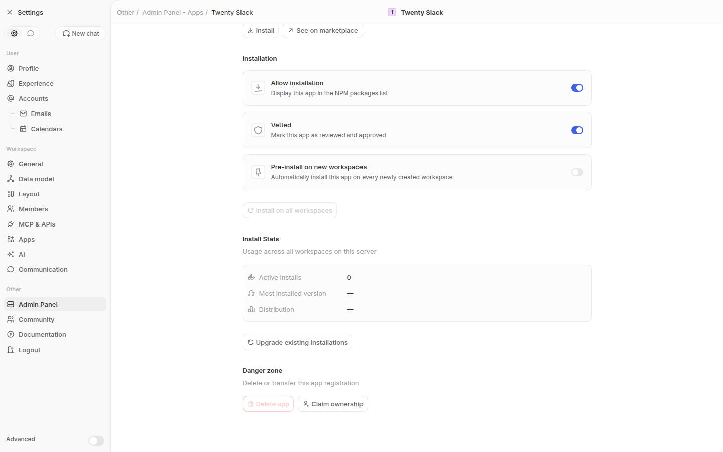 Confirmation modal with the new batch size input (defaults to 5): 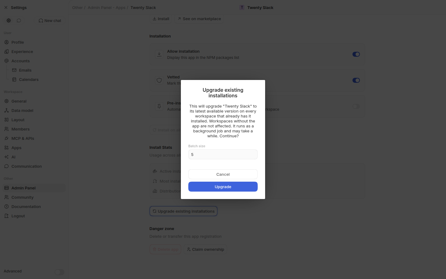 --------- Co-authored-by: Martin <martin@twenty.com> |
||
|
github-actions[bot]
|
64891c561d |
i18n - translations (#23108)
Created by Github action <!-- This is an auto-generated description by cubic. --> <a href="https://cubic.dev/pr/twentyhq/twenty/pull/23108?utm_source=github" target="_blank" rel="noopener noreferrer" data-no-image-dialog="true"><picture><source media="(prefers-color-scheme: dark)" srcset="https://www.cubic.dev/buttons/review-in-cubic-dark.svg"><source media="(prefers-color-scheme: light)" srcset="https://www.cubic.dev/buttons/review-in-cubic-light.svg"><img alt="Review in cubic" src="https://www.cubic.dev/buttons/review-in-cubic-dark.svg"></picture></a> <!-- End of auto-generated description by cubic. --> --------- Co-authored-by: github-actions <github-actions@twenty.com> |
||
|
Félix Malfait
|
3ad3e8bd1a |
feat: kanban, calendar and group-by table layouts for dashboard view widgets (#22963)
## Context Dashboard view widgets previously only rendered flat tables. This PR ships the full feature: **Table with group-by**, **Kanban**, and **Calendar** layouts for dashboard view widgets — server API + frontend, end-to-end. (Originally staged as a 4-PR stack — #22966, #22967, #22968 — consolidated here per review.) ## Server / API - **View typing.** Adds `KANBAN_WIDGET` and `CALENDAR_WIDGET` to `ViewType` (following the `TABLE_WIDGET` precedent) so widget-backing views keep their layout in `view.type` while staying excluded from record-index pickers. Shared `getViewLayoutFromViewType()` maps widget types to their base layout; `isWidgetViewType()` centralizes the exclusions that were previously hardcoded per-site. - **Migrations.** Two fast instance commands (**2.23**): `ALTER TYPE core.view_type_enum ADD VALUE` for both values, and a widened `CHK_VIEW_CALENDAR_INTEGRITY` constraint covering `CALENDAR_WIDGET` (entity `@Check` updated for fresh installs). - **Validation.** `FlatViewValidatorService` keys kanban/calendar validation on the mapped layout, so widget views get the same invariants as index views (kanban needs a groupable group-by field; calendar needs a date field + layout). Calendar widget views default to month; a non-month (DAY/WEEK) layout is rejected at the API level **unless** the `IS_CALENDAR_WEEK_VIEW_ENABLED` feature flag is enabled for the workspace — the same flag that gates day/week on index calendars. - **API.** `upsertViewWidget` (LAYOUTS permission) accepts a nested `view` settings input (`type`, `mainGroupByFieldMetadataId`, `shouldHideEmptyGroups`, kanban aggregate/column-width, calendar layout/fields). Routes through the standard update path, so `viewGroups` auto-generate from SELECT options exactly like index views. Only widget view types accepted; only `RECORD_TABLE` widgets can change view settings. - **AI tools.** `create-complete-dashboard` + `create_view` now use/allow the `*_WIDGET` types (previously they created plain `TABLE` views that leak into index pickers). ## Frontend **Settings panel.** The **Source** (object) row comes first, since which layouts are available depends on it. The **Layout** row below is a working dropdown (Table / Kanban / Calendar); layouts the source object can't support are **disabled with a hint** ("Needs a Select field" / "Needs a Date field") rather than hidden. Group-by row (select fields; searchable) with a **Hide empty groups** toggle while grouped; **Date field** row replaces Group by while Calendar is active, and — when the `IS_CALENDAR_WEEK_VIEW_ENABLED` flag is on — a **Calendar view** row (Day / Week / Month) appears beside it; **Limit** row hidden while grouped (only the flat virtualized loader enforces it). Kanban keeps its group-by locked (no `None` option). **Instant edit-mode preview.** Draft snapshots carry `viewGroups`; picking a group-by synthesizes them client-side (`buildDraftViewGroupsForFieldMetadataItem`, mirroring the server's generation), so grouped tables/boards preview immediately before dashboard save. On save, `upsertViewWidget` responses hand back the server-generated groups, which replace the client-generated ones in the persisted snapshot. **Renderers.** `RecordTableWidgetRendererContent` branches on the backing view's layout: `RecordBoardWidget` (wraps the standard `RecordBoardContainer`) and `RecordCalendarWidget` (mounts the existing `RecordCalendar`, which renders month / day / week) inside the same per-widget provider sandbox the table uses. **Read-only semantics.** Two flags with distinct scopes, each documented on its state: - `isRecordBoardViewSettingsReadOnlyComponentState` — locks the board chrome that edits view settings (add group, column reorder/resize/menu, aggregates); **card drag still updates records** under object permissions. - `isRecordCalendarReadOnlyComponentState` — widget calendars are read-only by default (no drag, no add-new, no in-calendar layout switch); cards open the side panel. The one exception, behind `IS_CALENDAR_WEEK_VIEW_ENABLED`: a **live (non edit-mode) day/week** widget calendar allows drag-to-reschedule and record creation under object permissions. Month calendars and edit-mode previews stay read-only. **Calendar state componentization.** The calendar module's three settings move from global atoms to component states keyed on `RecordCalendarComponentInstanceContext` (same pattern as record-board), so several calendar widgets and an index-page calendar can coexist without leaking state. All readers resolve the ambient instance; calendar unit tests updated. **Multi-instance fixes that also fix index pages:** record drag states were written against a different instance than every reader resolves (now use the ambient instance); the board sticky-header DOM id is namespaced per board; dragged board cards portal to `document.body` while dragging so react-grid-layout's transforms can't offset the clone from the pointer. ## Scope (v1) - Widget calendars are month-only and read-only by default. With `IS_CALENDAR_WEEK_VIEW_ENABLED` enabled, day/week layouts become selectable (UI + API) and live day/week widget calendars support drag-to-reschedule and record creation under object permissions. - Widget group-by offers SELECT fields only (server auto-generates groups from options; widgets have no per-record add-group flow). ## Tests - Integration: `upsert-view-widget-view-settings.integration-spec.ts` (9 tests — group auto-creation, invalid type/field rejections, non-month calendar widget rejected while the week/day flag is off and accepted once it's enabled, combined settings+fields call); pre-existing `upsert-view-widget` suite (20) green. - Front: new suites for draft view-group generation and snapshot clone/build utils; calendar suites componentized; full `twenty-front` jest, typecheck, oxlint green; `twenty-server` typecheck + lint green. - Browser-verified end-to-end (real dev server + seeded workspace): configure → live edit-mode preview → save → reload for all three layouts; measured drag with pointer inside the card; index-page calendar re-verified (with the week/day flag enabled). https://claude.ai/code/session_01E5N87kwwZWhDtEQaP72cMf |
||
|
Marie
|
bc3112a999 |
Fix: allow API key creation without Roles permission (#23102)
## Problem A user with the **API keys & webhooks** permission but **without** the **Roles** setting permission cannot create an API key through the UI. The role selector relies on the `getRoles` query, which is guarded by the `ROLES` permission, so the roles list comes back empty, `SettingsDevelopersRoleSelector` early-returns, and no role can be selected — leaving the form unsavable. <img width="1058" height="408" alt="Screenshot 2026-07-21 at 13 38 34" src="https://github.com/user-attachments/assets/fe97ba78-e116-458d-af10-11c5969c4636" /> ## Fix Expose the assignable roles through the API-key permission scope so users can **pick** a role to assign to an API key without being able to **edit** roles. - **Backend**: add `getApiKeyRoles` query on `ApiKeyResolver` (already guarded by `API_KEYS_AND_WEBHOOKS`), backed by `ApiKeyRoleService.getApiKeyAssignableRoles` which returns roles where `canBeAssignedToApiKeys = true`. - **Frontend**: add a `GetApiKeyRoles` query and use it in the API key create and detail pages instead of `getRoles`. The role selector prop type is narrowed to the fields it actually uses. <img width="1025" height="455" alt="Screenshot 2026-07-21 at 13 45 01" src="https://github.com/user-attachments/assets/f1be8f97-5a30-4afc-9eee-c928f4607471" /> |
||
|
Etienne
|
6d38b14520 |
fix(ai-chat) - fix record chips in AI ask-questions card (#23106)
## Summary - Ask-questions cards rendered question text and option labels as plain strings, so `[[record:...]]` showed up raw instead of as chips - Extracted `TextWithRecordLinks` from `LazyMarkdownRenderer` and reuse it in `AiChatQuestionCard` for question text and option labels - Added unit coverage for plain text, single, and multiple record references <img width="532" height="242" alt="Screenshot 2026-07-21 at 14 37 43" src="https://github.com/user-attachments/assets/a4bbd386-7757-4f09-a74d-c7eb3d0f74b9" /> ## Test plan - [ ] Open an AI chat ask-questions card whose question/options include `[[record:...]]` mentions - [ ] Confirm mentions render as record chips (not raw markup) - [ ] Confirm normal assistant text replies still chip mentions as before - [ ] Run `npx jest packages/twenty-front/src/modules/ai/components/__tests__/TextWithRecordLinks.test.tsx --config=packages/twenty-front/jest.config.mjs` fixes: https://discord.com/channels/1130383047699738754/1526887613867360347 <!-- This is an auto-generated description by cubic. --> <a href="https://cubic.dev/pr/twentyhq/twenty/pull/23106?utm_source=github" target="_blank" rel="noopener noreferrer" data-no-image-dialog="true"><picture><source media="(prefers-color-scheme: dark)" srcset="https://www.cubic.dev/buttons/review-in-cubic-dark.svg"><source media="(prefers-color-scheme: light)" srcset="https://www.cubic.dev/buttons/review-in-cubic-light.svg"><img alt="Review in cubic" src="https://www.cubic.dev/buttons/review-in-cubic-dark.svg"></picture></a> <!-- End of auto-generated description by cubic. --> |
||
|
github-actions[bot]
|
ea5f908cb2 |
i18n - translations (#23085)
Created by Github action <!-- This is an auto-generated description by cubic. --> <a href="https://cubic.dev/pr/twentyhq/twenty/pull/23085?utm_source=github" target="_blank" rel="noopener noreferrer" data-no-image-dialog="true"><picture><source media="(prefers-color-scheme: dark)" srcset="https://www.cubic.dev/buttons/review-in-cubic-dark.svg"><source media="(prefers-color-scheme: light)" srcset="https://www.cubic.dev/buttons/review-in-cubic-light.svg"><img alt="Review in cubic" src="https://www.cubic.dev/buttons/review-in-cubic-dark.svg"></picture></a> <!-- End of auto-generated description by cubic. --> --------- Co-authored-by: github-actions <github-actions@twenty.com> |
||
|
Etienne
|
9abf76f5f2 |
fix(ai): show answered ask_questions as a card in chat history (#23075)
## Context Feedback on the `ask_questions` (Ask AI) tool: - When answering a select prompt with a free-form message, the answer wasn't surfaced as expected in the conversation history. - The selected value also looked dropped once picked. Root cause: answered `ask_questions` parts were caught by the thinking-steps grouping and rendered as a generic collapsible "Ran ask_questions" tool step (JSON output), so the dedicated renderer was never reached. ## Changes - **Render answered questions as a card** (`AiChatQuestionStatusRenderer`): an "Answers" card that shows each full question with the chosen option label(s) or the free-text answer beneath it, instead of the faint inline `header: value` line. - **Free-text keyboard navigation** (`AiChatQuestionCard`): pressing Enter in the free-text area now advances to the next question, or submits when on the last question (mirroring the option-select flow). Shift+Enter still inserts a newline. ## Notes - No schema/GraphQL changes; display + interaction only. - Existing `thinkingStepsDisplayState` grouping test is unaffected (only `web_search`/`create_task`/`code_interpreter` are used there). <img width="421" height="301" alt="Screenshot 2026-07-20 at 17 48 04" src="https://github.com/user-attachments/assets/3845055d-7061-40c0-b263-aa1c670329cd" /> <!-- This is an auto-generated description by cubic. --> <a href="https://cubic.dev/pr/twentyhq/twenty/pull/23075?utm_source=github" target="_blank" rel="noopener noreferrer" data-no-image-dialog="true"><picture><source media="(prefers-color-scheme: dark)" srcset="https://www.cubic.dev/buttons/review-in-cubic-dark.svg"><source media="(prefers-color-scheme: light)" srcset="https://www.cubic.dev/buttons/review-in-cubic-light.svg"><img alt="Review in cubic" src="https://www.cubic.dev/buttons/review-in-cubic-dark.svg"></picture></a> <!-- End of auto-generated description by cubic. --> fixes https://discord.com/channels/1130383047699738754/1526871110300209282 |



