## Summary

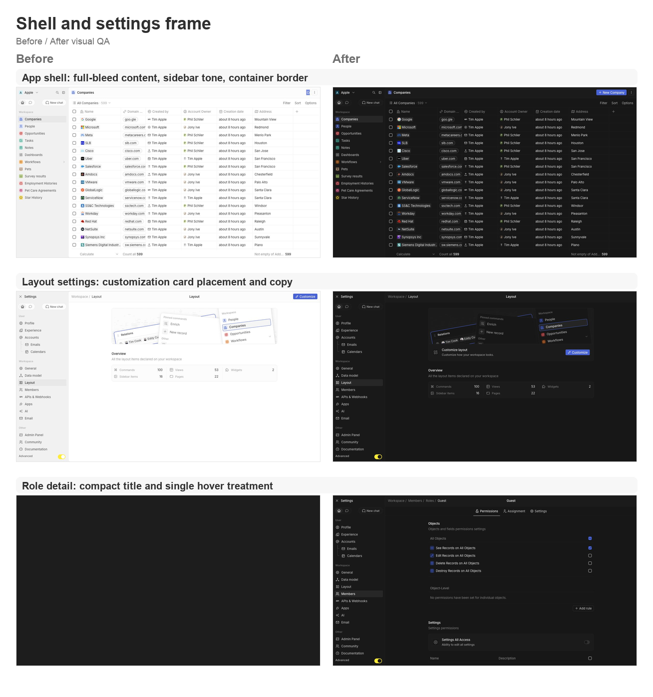
This PR groups the requested second UI polish pass across the app shell,
settings pages, data model, community, AI tools, and developer setup
surfaces.

### Shell and navigation polish
- Lets the app content card fill the available viewport and removes the
bottom-left radius on the main container.
- Uses an outside-looking container border treatment so the rounded
top-left edge matches the Figma frame without a double border.
- Restores the separator between the AI chat side panel and the record
container.
- Updates navigation drawer background/skeleton tones to use gray/3
consistently.
- Simplifies the full-screen backend error fallback so the white screen
fills the viewport.

### Settings page polish
- Moves the layout customization action from the settings navbar into a
settings card under the hero.
- Tightens layout page copy now that the customization surfaces are not
directly manageable yet.
- Aligns role detail title sizing and hover treatment with other
settings headers.
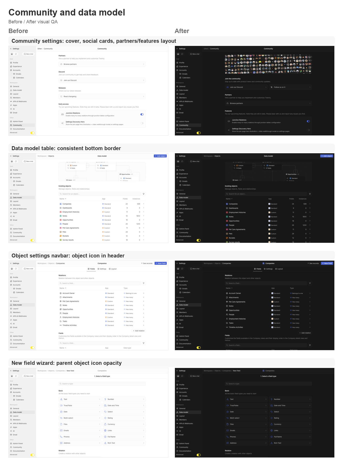
- Supports settings card brand icon colors, then restores Discord and X
brand logos on the Community page.
- Adds the Community discovery cover, moves community/social content to
the top, and reorganizes Partners and Features.
- Keeps setting card subtitle and separator behavior available for the
updated settings cards.

### Data model and object settings polish
- Adds a shared data-model table body wrapper so object, field, and
relation tables all keep the expected bottom border.
- Displays the object icon in the object settings navbar.
- Shares the new-field wizard parent object icon wrapper and keeps the
object icon at 64% opacity in wizard headers.
- Updates the new-field type selector icon treatment to match the wizard
header opacity behavior.

### Integrations, tools, and API polish
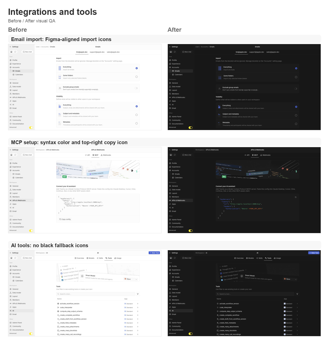
- Reworks the MCP setup config card with light syntax coloring and a
top-right copy icon button instead of the bottom copy section.
- Fixes email import icons to match the Figma asset shape.
- Ensures AI tool table icons and chevrons never fall back to black.

## Validation

- `npx nx lint:diff-with-main twenty-front`
- `npx tsc -p packages/twenty-front/tsconfig.json --noEmit`
- `git diff --check`
- Manual local visual pass on `apple.localhost:3001` for companies,
settings/community, data model, object settings, new-field wizard,
layout settings, account import, MCP setup, AI tools, and role detail
pages.

## Visual QA

### Shell and settings frame

<img width="1308" height="1397" alt="Shell and settings frame
before/after board"
src="https://raw.githubusercontent.com/twentyhq/twenty/pr-assets/ui-fixes-2/visual-qa/ui-fixes-2/shell-settings-frame.png"
/>

### Community and data model

<img width="1308" height="1806" alt="Community and data model
before/after board"
src="https://raw.githubusercontent.com/twentyhq/twenty/pr-assets/ui-fixes-2/visual-qa/ui-fixes-2/community-data-model.png"
/>

### Integrations and tools

<img width="1308" height="1397" alt="Integrations and tools before/after
board"
src="https://raw.githubusercontent.com/twentyhq/twenty/pr-assets/ui-fixes-2/visual-qa/ui-fixes-2/integrations-tools.png"
/>


<!-- This is an auto-generated description by cubic. -->
<a
href="https://cubic.dev/pr/twentyhq/twenty/pull/21540?utm_source=github"
target="_blank" rel="noopener noreferrer"
data-no-image-dialog="true"><picture><source
media="(prefers-color-scheme: dark)"
srcset="https://www.cubic.dev/buttons/review-in-cubic-dark.svg"><source
media="(prefers-color-scheme: light)"
srcset="https://www.cubic.dev/buttons/review-in-cubic-light.svg"><img
alt="Review in cubic"
src="https://www.cubic.dev/buttons/review-in-cubic-dark.svg"></picture></a>
<!-- End of auto-generated description by cubic. -->
 Thomas des Francs
d06e687b77
Thomas des Francs
d06e687b77