ea7863dc4e20c91ae69bb3eca3ce67a17e0220ea
6555 Commits
| Author | SHA1 | Message | Date | |
|---|---|---|---|---|
 Félix Malfait Félix Malfait
|
b602294f1d |
Hide the command menu button while the mobile side panel is open (#23471)
On mobile the side panel covers the page, but the page header stays mounted underneath. Its command menu button (`⌘K`, the `⋮` icon) sits at the same coordinates as the panel's own close button, so the two icons render on top of each other. Measured on a 390x844 viewport with the AI chat open: - `Command Menu` button at `x=346, y=8, 32x32` - `Close side panel` button at `x=358, y=14, 24x24` `SidePanelToggleButton` already hid itself for the command menu and search pages, but the AI chat pages (`AskAI`, `ViewPreviousAiChats`) are not in `COMMAND_MENU_SIDE_PANEL_PAGES`, so the button stayed and overlapped. ## Change Hide the button on mobile whenever the side panel is open, rather than enumerating pages — the header is not reachable behind a full-screen panel either way. Layout customization mode is the exception and keeps it: `alignWithSidePanelTopBar` deliberately repositions the button into the side panel top bar there, so that path is preserved. Desktop is unaffected. ## Testing Three cases added to `SidePanelToggleButton.test.tsx` (hidden on mobile with the panel open, kept on mobile in layout customization mode, kept on desktop with the AI chat open); the `useIsMobile` mock is now switchable per test. All 10 tests pass. Verified in the browser at 390x844: with the AI chat open only `Close side panel` remains in the top bar, and the button reappears once the panel is closed. --- _Generated by [Claude Code](https://claude.ai/code/session_018gcsCQbuTMsyFWv874p25Q)_ <!-- This is an auto-generated description by cubic. --> <a href="https://cubic.dev/pr/twentyhq/twenty/pull/23471?utm_source=github" target="_blank" rel="noopener noreferrer" data-no-image-dialog="true"><picture><source media="(prefers-color-scheme: dark)" srcset="https://www.cubic.dev/buttons/review-in-cubic-dark.svg"><source media="(prefers-color-scheme: light)" srcset="https://www.cubic.dev/buttons/review-in-cubic-light.svg"><img alt="Review in cubic" src="https://www.cubic.dev/buttons/review-in-cubic-dark.svg"></picture></a> <!-- End of auto-generated description by cubic. --> |
||
|
Félix Malfait
|
0859133774 |
Disable double-tap zoom while keeping pinch zoom (#23476)
Adds `touch-action: manipulation` on `body`. Context: #8477 disabled auto-zoom on iOS only, via `maximum-scale=1` behind a UA check. That leaves double-tap-to-zoom active everywhere, which is what makes taps feel laggy on mobile (the browser waits ~300ms to see if a second tap is coming) and what causes accidental zooms when tapping small targets twice in a row. `touch-action: manipulation` removes double-tap-to-zoom and the associated tap delay, and leaves pinch-to-zoom fully intact. So the page still zooms the way a website should, it just stops zooming when you didn't ask it to. This is deliberately not a revert of #8477 and not an extension of `maximum-scale` to Android: blocking pinch zoom fails WCAG 1.4.4, and being able to zoom is part of what makes this feel like a website rather than a native app. --- _Generated by [Claude Code](https://claude.ai/code/session_018gcsCQbuTMsyFWv874p25Q)_ <!-- This is an auto-generated description by cubic. --> <a href="https://cubic.dev/pr/twentyhq/twenty/pull/23476?utm_source=github" target="_blank" rel="noopener noreferrer" data-no-image-dialog="true"><picture><source media="(prefers-color-scheme: dark)" srcset="https://www.cubic.dev/buttons/review-in-cubic-dark.svg"><source media="(prefers-color-scheme: light)" srcset="https://www.cubic.dev/buttons/review-in-cubic-light.svg"><img alt="Review in cubic" src="https://www.cubic.dev/buttons/review-in-cubic-dark.svg"></picture></a> <!-- End of auto-generated description by cubic. --> |
||
|
Thomas Trompette
|
933ae9c20b |
fix(page-layout): render standalone rich text widget on record pages (#23435)
Fixes #21093 ## Problem A `STANDALONE_RICH_TEXT` widget can be created on a record page layout through the metadata API, and `getPageLayoutWidgets` returns it, but the record page renders nothing for it. `StandaloneRichTextWidget` only resolved a target id when `layoutType === PageLayoutType.DASHBOARD`, then bailed out with `return null` whenever that id was undefined. On a record page it never rendered. ## Why the guard was there It was correct when it was written. In #16437 the widget used the full `BLOCK_SCHEMA` and uploaded files: ```ts return await uploadAttachmentFile(file, { id: dashboardId, targetObjectNameSingular: CoreObjectNameSingular.Dashboard, }); ``` Without a dashboard id there was nowhere to attach an upload, and dashboards were the only layout type in play, so refusing to render was a coherent stance. #17934 then disabled file upload because the urls were not signed. It swapped in `DASHBOARD_BLOCK_SCHEMA`, dropped `useUploadAttachmentFile` and `prepareBodyWithSignedUrls`, and added `filterSupportedBlocks` to strip file blocks out of previously saved bodies. It left behind the attachments query, the `attachments` prop and the `useAttachmentSync` call. After that, `dashboardId` had one consumer left: a filter that could no longer match anything. The `return null` underneath it was guarding nothing. Record page layouts then made the widget reachable outside dashboards, and the stale guard blanked it. ## Fix The body lives on the widget configuration, not on the target record, so the widget needs no record id to display. The leftover attachment fetch has nothing to act on: - `DASHBOARD_BLOCK_SCHEMA` declares only paragraph, heading, lists, checklist, codeBlock, table and quote. No image, file, video or audio block. - The three sync utils all key off `ATTACHMENT_BLOCK_TYPES = ['image', 'file', 'video', 'audio']`, so they return empty for any body this editor can produce. - No `uploadFile` option, no `onPaste` handler, and `filterSupportedBlocks` strips unsupported blocks on load, so such a block cannot get in. So rather than generalise the attachment filter to every object type, this removes it: the `useFindManyRecords` call, the `attachments` prop, and the `useAttachmentSync` call in `StandaloneRichTextEditorContent`. It finishes the cleanup #17934 started. `useAttachmentSync` is untouched and still used by `RichTextFieldEditor`, which does support file blocks. Net result is a pure deletion, and the widget renders on every layout type. If image blocks are ever added back to `DASHBOARD_BLOCK_SCHEMA`, attachment sync will need to come back with them. ## Testing Local instance, widget created through `createPageLayoutWidget` on the default Company record page layout. - On the unpatched component the widget is absent from the page. - With the fix it renders read-only in the record page column. - Also verified with the payload shape from the issue (`markdown` set, `blocknote: null`); the server converts it to blocknote on write, so it renders too. - Verified on `calendarEvent`, an object with no `attachments` relation. Renders clean, no console or GraphQL errors. Generalising the old filter instead would have sent `targetCalendarEventId` and hit `Object attachment doesn't have any "targetCalendarEventId" field.` - Dashboard rendering unchanged, and editing still round-trips: typed into the widget in dashboard edit mode, hit Save, confirmed the new body in `core.pageLayoutWidget`. |
||
|
Félix Malfait
|
5d90fb33c0 |
Open records on a full page instead of a side panel on mobile (#23474)
On mobile the side panel covers the whole screen, so a record opened in
it arrives cramped behind an "Open" button offering the full page it
should have gone to in the first place.

`useResolveOpenRecordIn` already forces `RECORD_PAGE` on mobile via
`canDisplaySidePanel: !isMobile`, but it is a resolver callers have to
opt into, and only five do. Thirteen other call sites reach
`useOpenRecordInSidePanel` directly and get a panel on every device,
including:

- `TaskRow` and `NoteTile`, the activity lists inside a record's tabs
- `EventRowActivity`, `EventCardMessage`, `EventRowGenericLinked` on the
timeline
- `SidePanelSearchRecordsPage`, `EmailThreadPreview`,
`useOpenCreateActivityDrawer`, `useAddNewRecordAndOpenSidePanel`

## Change

Decide it inside `useOpenRecordInSidePanel` rather than at each call
site, so no caller can wedge a record into a panel by forgetting to ask.
On mobile it closes the panel and navigates to `AppPath.RecordShowPage`,
then returns before any of the side-panel setup runs.

Two details carried over so the redirect is not lossy:

- `setRecordPageActiveTabId` still runs first, so a caller passing `tab`
lands on the right tab.
- `isNewRecord` forwards `{ isNewRecord, objectRecordId,
labelIdentifierFieldName }` as navigation state, mirroring what
`useCreateNewIndexRecord` already does on its `RECORD_PAGE` branch, so a
freshly created record still opens its title for naming instead of
arriving untitled.

Side-panel-only effects are skipped rather than lost.
`runWorkflowRunOpeningInSidePanelEffects` ends in
`openWorkflowRunViewStepInSidePanel`, which auto-opens a step *in the
panel*; with no panel there is nothing for it to do, and the workflow
run's record page renders its own diagram.

The two hooks that already branch on `useResolveOpenRecordIn`
(`useOpenRecordFromIndexView`, `useCreateNewIndexRecord`) never call
into this path on mobile, so this is a no-op for them rather than a
double navigation.

Uses `useIsMobile` rather than `useIsTouchDevice`, matching
`useResolveOpenRecordIn`: this is a question of whether there is room
for a panel, not of how the user points.

## Testing

At 390x844, opening the search side panel and tapping a result now
navigates to `/object/person/<id>` with the panel closed, where it
previously stayed in the panel. Typecheck and lint clean.


---
_Generated by [Claude
Code](https://claude.ai/code/session_018gcsCQbuTMsyFWv874p25Q)_

<!-- This is an auto-generated description by cubic. -->
<a
href="https://cubic.dev/pr/twentyhq/twenty/pull/23474?utm_source=github"
target="_blank" rel="noopener noreferrer"
data-no-image-dialog="true"><picture><source
media="(prefers-color-scheme: dark)"
srcset="https://www.cubic.dev/buttons/review-in-cubic-dark.svg"><source
media="(prefers-color-scheme: light)"
srcset="https://www.cubic.dev/buttons/review-in-cubic-light.svg"><img
alt="Review in cubic"
src="https://www.cubic.dev/buttons/review-in-cubic-dark.svg"></picture></a>
<!-- End of auto-generated description by cubic. -->
|
||
|
github-actions[bot]
|
75047f3237 |
i18n - translations (#23463)
Created by Github action --------- Co-authored-by: github-actions <github-actions@twenty.com> |
||
|
martmull
|
00e418a039 |
Show call recorders as calendar event participants (#23380)
Closes twentyhq/core-team-issues#2729 Call recordings attached to a calendar event are now displayed next to the human participants, in the timeline event card (`EventCardCalendarEvent`). They are rendered as the source app's `AppChip`, rounded so it sits in the participant avatar group, with the recording status in tooltip https://github.com/user-attachments/assets/e0c393c8-fd65-4468-8c4f-503dd22c13d5 ## Before No call recorder chip displayed TODO: add this in the calendar views (`CalendarEventRow`) |
||
|
Félix Malfait
|
840c6d0129 |
Take openRecordIn from the view in scope instead of a global atom (#23422)
Stacked on #23424 (mobile chip navigation). Review that one first; the diff shown here is only the delta. ## Problem `recordIndexOpenRecordInState` was a global atom mirroring `view.openRecordIn`. It was written whenever any index view loaded and never reset, so a record chip behaved according to whichever view had been browsed last: - Companies view set to "record page". Open a Company, tap a related Opportunity chip. The Opportunities view says "side panel", but the chip reads the leftover Companies setting and opens a full page. - Visit the Opportunities index first, then the same Company page, and that same chip now opens a side panel. The setting is per view in the database, but the frontend kept it in one slot as though it were a user preference. ## Approach The value already lives on the view, so the mirror is deleted rather than scoped: - `useResolveOpenRecordIn` reads the current view of the surrounding context store. On a record index that is the view being displayed. On a record show page `MainContextStoreProvider` resolves a view for the object in the URL — the last visited view for that object, falling back to its index view — so chips there follow a view belonging to the object they sit on, rather than whatever was loaded last. - Where no context store is mounted at all (a mention inside a note, for instance) there is no view to take a setting from, so the hook falls back to `DEFAULT_VIEW_OPEN_RECORD_IN`. The instance lookup is non-throwing on purpose: `RecordChip` renders in a lot of places, and an existing test caught this crashing when the read was strict. - The options dropdown now reads and writes `currentView.openRecordIn` directly, the same way `isCompact` beside it already works, so `setAndPersistOpenRecordIn` only has to persist. - `useGetOpenRecordIn` is gone; every call site had the object name available at render, so the reactive hook covers all of them. ## Behaviour change A chip whose behaviour previously came from an unrelated view now follows the view in scope. That is the point of the change, but it does mean some chips will open somewhere different from before, always in the direction of "what this list is configured to do" rather than "what the last list was configured to do". ## Testing - New `useResolveOpenRecordIn` tests: falls back to the default with no context store, follows the context store's view when there is one. - Full frontend suite: 951 suites, 5598 tests passing. Typecheck and lint clean. - Not exercised in a running app: no database in this environment. The dropdown's optimistic behaviour in particular relies on the same view store refresh that `isCompact` already depends on, so it is worth a click-through before merge. |
||
|
github-actions[bot]
|
057468343f |
i18n - translations (#23459)
Created by Github action Co-authored-by: github-actions <github-actions@twenty.com> |
||
|
Félix Malfait
|
8990334cad |
Make record chips open records natively on touch devices (#23424)
Two mobile problems in the record table: tapping a chip in the first column takes two taps, and chips in every other column open a side panel where a full page is wanted. #23422 is stacked on this branch. ## Two taps to open a record The table's interactive layer lives in a hover portal mounted from `onMouseMove` on the table wrapper. Touch has no hover, so the browser fakes one, and the synthesised `mousemove` arrives *before* the `mousedown`. React commits the portal in the microtask between them, so the whole tap is hit-tested against a subtree that did not exist when the user aimed. Confirmed in Chromium with real touch input (`page.tap`, Pixel 5 emulation), mounting an overlay from the mousemove handler: ``` mousemove target=chip >>> overlay mounted <- the hover portal mousedown target=portalChip <- a node that did not exist when the finger went down mouseup target=portalChip click target=portalChip ``` The same test also ruled out `preventDefault` on the compat `mousedown` as a cause, and showed a `setTimeout`-deferred mount does *not* retarget — it is specifically React's sync flush timing that does. So hover state is now only tracked on hover-capable pointers. `useMoveHoverToCurrentCell` becomes the single writer and absorbs the deduplication `RecordTableContent` was duplicating inline. The interaction/layout split matters here: `useIsMobile` is a 768px width query, which answers "how much room is there to lay out", not "how does this person point". The new `useIsTouchDevice` uses `(hover: none) and (pointer: coarse)`. Layout keeps using width; interaction uses capability. ## Side panel on mobile "Where does a record open" was computed independently in six places and only `useOpenRecordFromIndexView` knew about mobile. `RecordChip` — every chip outside the first column, plus board cards and relation fields — had its own copy without that check. On mobile the side panel animates to `fullScreen`, so it is a full-page view with no URL and no back button. That decision now lives in one `resolveOpenRecordIn`: the view setting is an intent, and the side panel is only a real destination when there is room for it and the object supports it. Also here: `MOUSE_DOWN` navigation downgrades to `CLICK` on touch. It only buys a frame on a real pointer, since a tap synthesises its mouse events after the finger is already gone. ## Hover styling Separate layer, same root cause. A tap leaves CSS `:hover` applied until the next tap lands elsewhere, so a row you came back from keeps reading as selected. Nine `:hover` blocks across the record table, `Chip` and `Avatar` are now fenced behind `(hover: hover)` — the same media feature `useIsTouchDevice` branches on, via a new `hover-capable` SCSS mixin on the twenty-ui side and inline media queries in the Linaria components. Desktop rendering is unchanged, since Chrome matches `hover: hover`. Verified the built CSS emits the wrapper correctly, and checked the nested form through stylis directly for the Linaria side. ## Testing - New unit tests for `resolveOpenRecordIn` and for hover not being tracked on touch devices. - Full frontend suite: 951 suites, 5598 tests passing. Typecheck and lint clean. - Not observed end to end in a running app: no database in this environment, and the `RecordIndexPage` story renders an empty table under its msw mocks. The browser-level mechanism is verified and the fix removes the mid-gesture DOM change, but it is worth one pass on a real device before merge. ## Follow-ups not in this PR - The whole first cell navigates but only the chip-sized part of it gives tap feedback, and `isRecordTableRowActive` is only set on the side panel path — setting it on the navigate path too would keep the row lit while the page loads. - Rows are 32px against a 44px minimum touch target. - Giving the side panel a URL would make "panel vs page" a rendering decision on the same location, rather than something each call site has to branch on. --- _Generated by [Claude Code](https://claude.ai/code/session_019cDWPgWESbdRUhGxGb66j8)_ <!-- This is an auto-generated description by cubic. --> <a href="https://cubic.dev/pr/twentyhq/twenty/pull/23424?utm_source=github" target="_blank" rel="noopener noreferrer" data-no-image-dialog="true"><picture><source media="(prefers-color-scheme: dark)" srcset="https://www.cubic.dev/buttons/review-in-cubic-dark.svg"><source media="(prefers-color-scheme: light)" srcset="https://www.cubic.dev/buttons/review-in-cubic-light.svg"><img alt="Review in cubic" src="https://www.cubic.dev/buttons/review-in-cubic-dark.svg"></picture></a> <!-- End of auto-generated description by cubic. --> |
||
|
Félix Malfait
|
2d9582117b |
feat(front): preview highlighted record in the search command bar (#23413)
Previewing the highlighted record while searching. The preview is a card anchored to the highlighted result, and its fields come from the object's **index view** (the base list view), so what you see while searching matches the list you came from. ## Screenshots > Note: these were taken before the latest design pass (smaller header, field cap). The layout is otherwise unchanged. Highlighted result, showing the index view's columns: 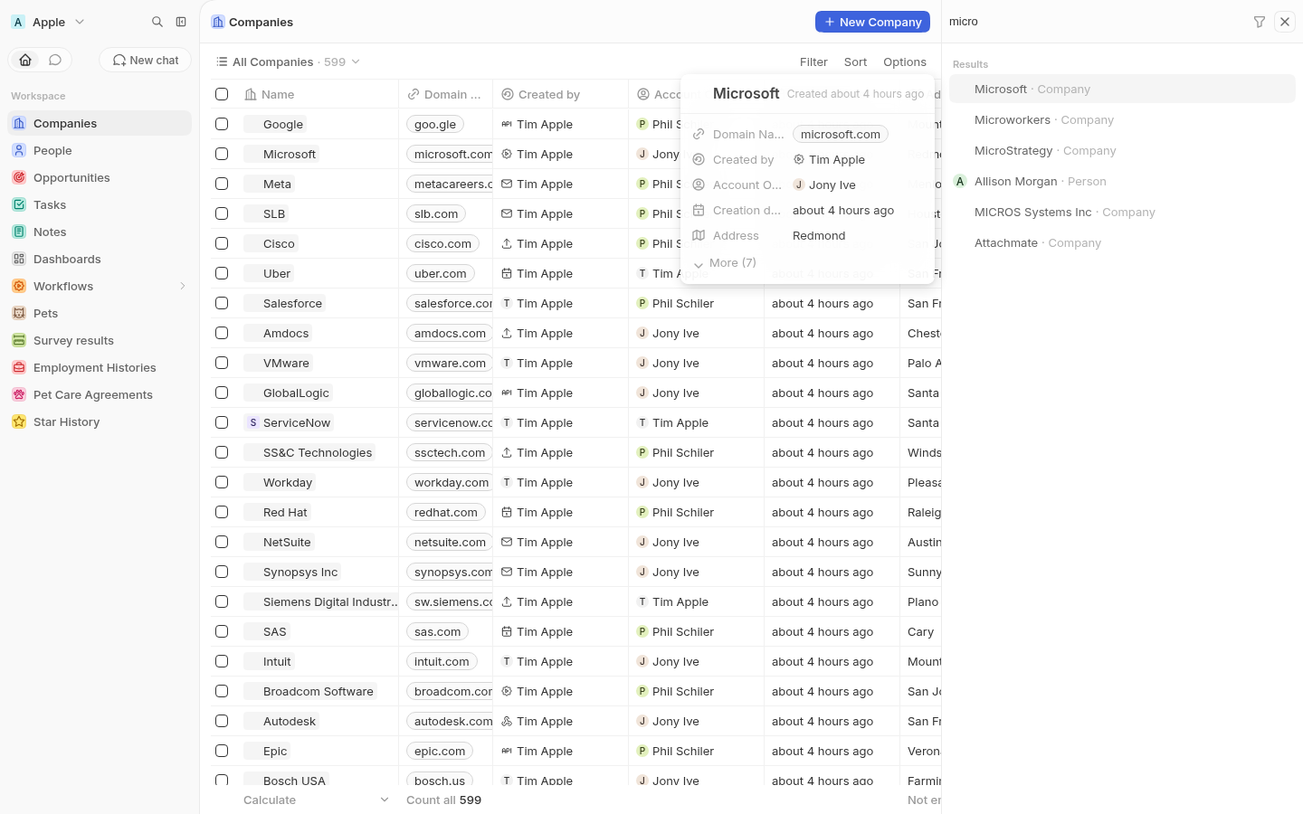 Overflow and hidden columns sit behind the `More (N)` expander: 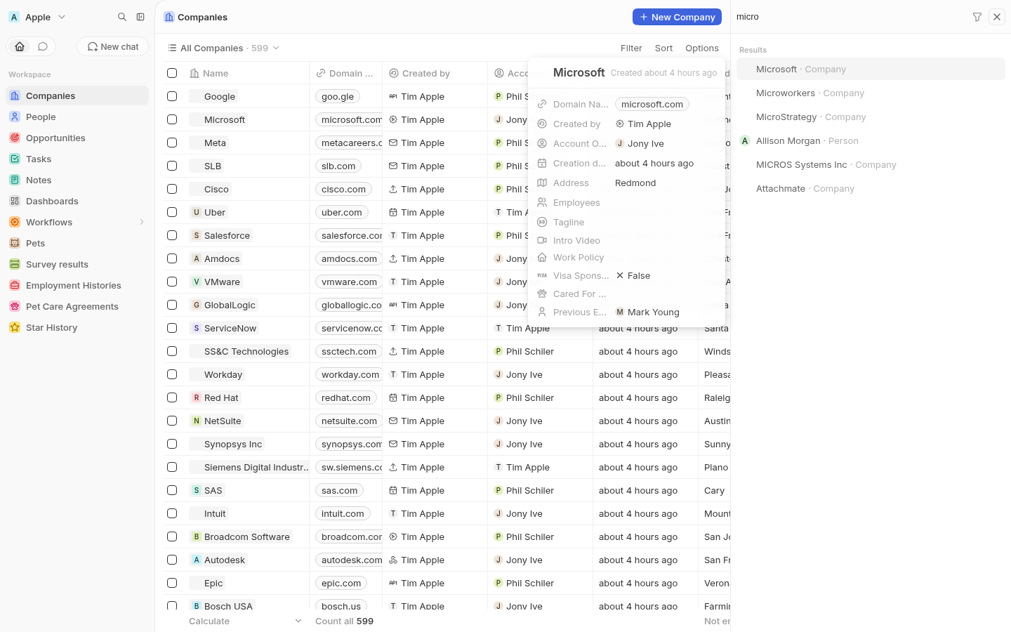 Arrowing to a Person re-anchors the card and renders that object's own index view fields: 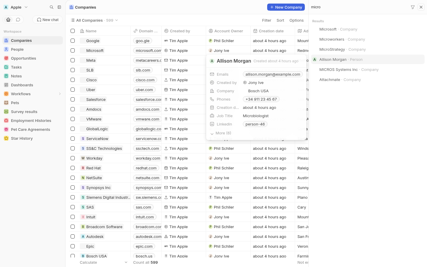 ## Changes - `SidePanelSearchRecordPreviewCard.tsx` — the card: the shared `SidePanelPageInfoLayout` header (avatar + name + created-at), then read-only `FieldDisplay` rows, then the `More (N)` expander. - `useSidePanelSearchRecordPreviewFields.ts` — resolves the object's index view through `useViewOrDefaultView` and splits its `viewFields` into visible and hidden, sorted by position, dropping the label identifier since the card already shows the record name. - `useSidePanelSearchRecordPreviewItem.ts` — resolves the highlighted item from the selectable list, following the selection immediately. - `useSidePanelSearchRecordPreviewRecord.ts` — hydrates the record into the record store so field displays can read their values. The fetch is debounced 200ms so holding an arrow key doesn't fire a `findOne` per row crossed, and it reports whether the record is hydrated yet. - `SidePanelSearchRecordsPage.tsx` — anchors the card with `AppTooltip` (`place="left-start"`, controlled `isOpen`, `clickable` so the expander is reachable) against a per-result anchor id. ## How many fields show Collapsed, the card shows at most seven of the index view's visible columns. Everything past that, plus the columns hidden in that view, sits behind `More (N)`. So the expander appears whenever there are more fields than fit, not only when the view happens to have hidden columns. ## Keeping the card stable while it loads The first cut jumped: measuring it over time gave `288px → unmounted for ~200ms → 232px`. Two separate causes, both fixed. It was **unmounting between records** because the previewed item was debounced and briefly resolved to `null`. The selection is now followed immediately and the *fetch* is what's debounced instead, so the card is reused across records rather than remounted. Its **size was derived from the data**, so every value that arrived nudged the layout. The header, rows (24px) and width are fixed, with skeleton placeholders for values until the record is hydrated. The field list comes from view metadata, which is available synchronously, so the card is its final size on first paint. Measured after that change: a constant `360x328` across 13 consecutive records spanning Person and Workspace Member, and no unmount. The skeleton and loaded states are the same height, so values just fade in. The card still disappears briefly on a brand-new search. That tracks the results list turning over — the anchor row it attaches to is genuinely removed from the DOM — so following the list is the correct behaviour there rather than holding a stale card against a deleted anchor. ## Notes The preview is read-only (`FieldDisplay`, not `RecordInlineCell`) — a floating preview isn't the right place to start an inline edit, and it keeps the card out of the field hover/edit portal machinery. The `More` button is wrapped in a container that prevents the default mousedown focus shift. Without it, clicking the expander moved focus out of the search input and arrow keys started driving the record table behind the panel instead of the results list. The section heading still reads `Results`; the design says `Records`. Left as-is since it is out of scope here. ## Testing - `nx typecheck twenty-front` passes. - `oxlint --type-aware` and `oxfmt` clean on the changed files. - Verified manually against a seeded dev workspace: anchoring and re-anchoring on arrow navigation, Company vs Person rendering their own index view fields, the `More` expander, arrow keys still driving the results list after clicking it, and the card holding a constant size through load. |
||
|
Thomas Trompette
|
b6a4c635ee |
fix(workflow): rename the trigger step through the dedicated mutation (#23450)
## Bug Renaming the **trigger** step from the workflow side panel fails with: > Updating a workflowVersion through the generic mutation is restricted. steps, trigger, status, position, workflowId and coreWorkflowVersionId cannot be changed... Renaming a **regular** step works, which is why this is easy to miss: only the trigger branch is broken. ## Cause This is a regression from #23207. That PR added the server-side denylist on `updateOneWorkflowVersion` and switched `useUpdateWorkflowVersionTrigger` to the dedicated `updateWorkflowVersionTrigger` mutation, but missed the call site in `SidePanelWorkflowStepInfo`, which still did: ```ts if (isTrigger) { await updateOneWorkflowVersion({ // generic mutation, sends `trigger` updateOneRecordInput: { trigger: { ...stepDefinition.definition, name: title } }, }); } else { await updateWorkflowVersionStep({ ... }); // dedicated, unaffected } ``` The observed request confirms it: `UpdateOneWorkflowVersion` with `input.trigger`. ## Fix Route the trigger branch through `updateTrigger`, which already resolves the draft version, calls the dedicated mutation, marks the step for recomputation and updates the cache. `useUpdateWorkflowVersionTrigger` now accepts an **optional** `instanceId`. This matters here: the side panel computes the visualizer instance id explicitly (it already passes it to `useGetUpdatableWorkflowVersionOrThrow`), and without it the hook would resolve the updatable version from a different component instance. Being optional, the four existing callers are unaffected. Also removes the now-redundant `getUpdatableWorkflowVersion()` call on the trigger path, so a rename no longer risks resolving the draft twice. ## Verification - `nx typecheck twenty-front` green - `oxfmt` + `oxlint --type-aware` green on both changed files - `useUpdateWorkflowVersionTrigger` unit tests green (2/2) - Not yet clicked through locally; the reporter hit this on a dev instance and can confirm the rename now succeeds <!-- This is an auto-generated description by cubic. --> <a href="https://cubic.dev/pr/twentyhq/twenty/pull/23450?utm_source=github" target="_blank" rel="noopener noreferrer" data-no-image-dialog="true"><picture><source media="(prefers-color-scheme: dark)" srcset="https://www.cubic.dev/buttons/review-in-cubic-dark.svg"><source media="(prefers-color-scheme: light)" srcset="https://www.cubic.dev/buttons/review-in-cubic-light.svg"><img alt="Review in cubic" src="https://www.cubic.dev/buttons/review-in-cubic-dark.svg"></picture></a> <!-- End of auto-generated description by cubic. --> |
||
|
martmull
|
942755d0dd |
fix(applications): display the installed application icon (#23411)
## Problem

After installing an app, its icon is missing across the UI, while
application *registration* icons render fine.

`Application.logo` holds the manifest path (`public/logo.svg`), which is
package-relative and not displayable. The server exposes a `logoUrl`
resolve field that turns it into
`/public-assets/{workspaceId}/{applicationId}/{logo}`, but on the front
end:

- `APPLICATION_FRAGMENT` and `FIND_MANY_APPLICATIONS` never selected
`Application.logoUrl`.
- So the only source of a usable logo url was
`currentWorkspace.installedApplications`, which is fetched by
`GetCurrentUser` at bootstrap. Nothing refreshed it after
`installApplication`, so a freshly installed app was absent from that
list.
- `useApplicationChipData` then fell through to
`fallbackApplicationData`, which callers populated with the raw `logo`
path. `getAbsoluteImageUrl('public/logo.svg')` yields
`{serverUrl}/public/logo.svg`, which 404s, so the avatar rendered as a
letter placeholder.

## Before / After

An app installed while the applications page is open, so the workspace
snapshot loaded at bootstrap does not know about it yet:

| Before | After |
|---|---|
| <img
src="https://raw.githubusercontent.com/twentyhq/twenty/e27a817fd95c5e44c1fbb64fd4fd68525daeee61/.pr-assets/app-icon-before.png"
width="480"> | <img
src="https://raw.githubusercontent.com/twentyhq/twenty/e27a817fd95c5e44c1fbb64fd4fd68525daeee61/.pr-assets/app-icon-after.png"
width="480"> |

## Changes

- Select `logoUrl` on `Application` in `APPLICATION_FRAGMENT` and
`FIND_MANY_APPLICATIONS`.
- Drop `logo` from `ApplicationDisplayData` and from the `AppChip` /
subtable fallback props, so a package-relative path can no longer reach
an `img` src. Call sites that already passed a url under `logo` now pass
`logoUrl`.
- `SettingsApplicationDetails` and `SettingsApplicationsTable` pass the
application's own `logoUrl`.
- On install, add the returned application to
`currentWorkspace.installedApplications` instead of reloading the
current user, so the chips that resolve by `applicationId` only (nav
menu items, object/field tables, tool rows, workflow nodes) pick it up.
- Stop exposing `logo` on the `Application` GraphQL type: nothing
selects it anymore, and having both `logo` (package-relative path) and
`logoUrl` (display url) was the source of the bug. The column is still
read server-side to build `logoUrl`.
- Regenerated `generated-metadata/graphql.ts`.

## Verification

Ran the stack locally against a seeded workspace with an installed app
whose logo lives at `public/logo.png`:

- `findManyApplications` returns a `logoUrl` under `/public-assets/...`,
and that url serves `200 image/png`.
- Reproduced the bug and the fix in the browser with the scenario shown
above (screenshots taken on the base commit and on this branch).
- `npx nx typecheck twenty-front`, `npx nx typecheck twenty-server`,
`npx nx lint:diff-with-main` on both, and the application settings jest
suites pass.

---
_Generated by [Claude
Code](https://claude.ai/code/session_01N8r4z2dZ553nAnCNe7GxMH)_

[Review in
cubic](https://cubic.dev/pr/twentyhq/twenty/pull/23411?utm_source=github)
|
||
|
Félix Malfait
|
4f31265927 |
Fix 1px gap above the record table header (#23441)
## Problem A transparent 1px slit shows up between the view bar and the table header row, letting the scrolled records show through above the column names. The record table header is `position: sticky; top: 0` inside the table's scroll container. On fractional device pixel ratios (scaled displays, browser zoom) the compositor can land the sticky header half a device pixel below the top edge of the scroll container, so its topmost device pixel row is painted with the scrolled content behind it instead of the header background. ## Repro Reproduced locally on `/objects/companies` with `deviceScaleFactor` 1.25, 1.75 and 2.25 — the slit appears at specific vertical scroll offsets (e.g. `scrollTop` 47 at DPR 1.75), and never at integer ratios. Before (DPR 1.75, `scrollTop` 47) — the row underneath bleeds through above "Name": <img width="960" alt="before" src="https://github.com/user-attachments/assets/00000000-0000-0000-0000-000000000000"> ## Fix Extend the header background 1px upwards with a `box-shadow` on the sticky container, so whatever half-pixel the compositor exposes is always covered. The shadow is painted as part of the sticky layer, so it follows the header wherever it lands. Nothing changes visually otherwise: when the table is scrolled to the top the shadow sits above the scroll container's padding box and is clipped away. ## Verification Scripted pixel scan of the top device-pixel row of the header, over scroll offsets 1-60 at DPR 1.25 / 1.5 / 1.75 / 2.25 / 2.5: | | before | after | |---|---|---| | DPR 1.25 | 3 offsets with a visible slit | 0 | | DPR 1.5 | 0 | 0 | | DPR 1.75 | 2 | 0 | | DPR 2.25 | 3 | 0 | | DPR 2.5 | 0 | 0 | Also checked at rest (`scrollTop` 0) and while scrolled at DPR 1 and 2 that no extra line appears above the header. `oxlint`, `oxfmt` and `nx typecheck twenty-front` pass. --- _Generated by [Claude Code](https://claude.ai/code/session_014gaDhmeDSNjdBeRRepKPAr)_ <!-- This is an auto-generated description by cubic. --> <a href="https://cubic.dev/pr/twentyhq/twenty/pull/23441?utm_source=github" target="_blank" rel="noopener noreferrer" data-no-image-dialog="true"><picture><source media="(prefers-color-scheme: dark)" srcset="https://www.cubic.dev/buttons/review-in-cubic-dark.svg"><source media="(prefers-color-scheme: light)" srcset="https://www.cubic.dev/buttons/review-in-cubic-light.svg"><img alt="Review in cubic" src="https://www.cubic.dev/buttons/review-in-cubic-dark.svg"></picture></a> <!-- End of auto-generated description by cubic. --> |
||
|
Raphaël Bosi
|
9509c737e0 |
Replace the onboarding AI chat feature flag with an environment variable (#23439)
Follow-up to #23199. The AI-chat onboarding is an instance-level rollout decision, not a per-workspace experiment, so `IS_ONBOARDING_AI_CHAT_ENABLED` becomes an instance config variable (default `false`, editable from the admin panel) exposed to the frontend through `ClientConfig`. The workspace feature flag is deleted; leftover `featureFlag` rows are inert since the column is plain text. `IS_WORKSPACE_COMPANY_ENRICHMENT_ENABLED` is removed as redundant: the PDL client already skips everything when no API key is set. Enrichment now runs when the AI chat is on and `PEOPLE_DATA_LABS_API_KEY` is configured. <!-- This is an auto-generated description by cubic. --> <a href="https://cubic.dev/pr/twentyhq/twenty/pull/23439?utm_source=github" target="_blank" rel="noopener noreferrer" data-no-image-dialog="true"><picture><source media="(prefers-color-scheme: dark)" srcset="https://www.cubic.dev/buttons/review-in-cubic-dark.svg"><source media="(prefers-color-scheme: light)" srcset="https://www.cubic.dev/buttons/review-in-cubic-light.svg"><img alt="Review in cubic" src="https://www.cubic.dev/buttons/review-in-cubic-dark.svg"></picture></a> <!-- End of auto-generated description by cubic. --> |
||
|
Félix Malfait
|
884f470982 |
Remove grey corners around navigation menu items on mobile (#23425)
On mobile, folder items in the navigation drawer were wrapped in a faint grey rounded box, showing up as small grey corners around the item. It was not part of any design. ## Cause `NavigationDrawerItemsCollapsableContainer` renders each folder group inside a framer-motion div and animates its chrome through the `animate` object: - collapsed group: `border: '1px solid <2% black>'`, `borderRadius: md`, `backgroundColor: <2% black>` - expanded: `border: 'none'`, `backgroundColor: 'transparent'` `none` is not an animatable value for framer-motion, so once the collapsed border had been applied it was never cleared. `borderRadius` was never part of the expanded target at all, so it stuck too. The inline style on the group container ended up as: ``` width: auto; background-color: transparent; border: 1px solid color(display-p3 0 0 0 / 0.02); border-radius: var(--t-border-radius-md); ``` The drawer starts collapsed on mobile (`isNavigationDrawerExpandedState` defaults to `!isMobile`) and is expanded when the user opens it, so every folder group passed through the collapsed state and kept the hairline box. On desktop the drawer starts expanded, which is why it normally does not show there — but collapsing and re-expanding the sidebar reproduced the exact same leftover. Only folders were affected: the group chrome is applied when `isGroup` is true, which requires more than one folder in the section. ## Fix The group background, border and radius now live in the styled component and are driven by an `isCollapsedGroup` prop, with a CSS transition on the background. framer-motion only animates the width, which it handles correctly. ## Verification Ran the app locally against a seeded workspace with three folders, at 393px width and at 1280px. - Mobile: folder rows no longer carry a border or radius; the group container computes to `border: 0px none`, `border-radius: 0px`, transparent background - Desktop expanded: unchanged, no chrome - Desktop collapsed: group pill still renders as before (1px hairline, 16px radius, 2% black background, 24px wide) - Desktop collapse then re-expand: chrome is now cleared instead of sticking Lint, format and typecheck pass on the changed file. --- _Generated by [Claude Code](https://claude.ai/code/session_018wtVx6vj3ZbHT3vijBLwMW)_ <!-- This is an auto-generated description by cubic. --> <a href="https://cubic.dev/pr/twentyhq/twenty/pull/23425?utm_source=github" target="_blank" rel="noopener noreferrer" data-no-image-dialog="true"><picture><source media="(prefers-color-scheme: dark)" srcset="https://www.cubic.dev/buttons/review-in-cubic-dark.svg"><source media="(prefers-color-scheme: light)" srcset="https://www.cubic.dev/buttons/review-in-cubic-light.svg"><img alt="Review in cubic" src="https://www.cubic.dev/buttons/review-in-cubic-dark.svg"></picture></a> <!-- End of auto-generated description by cubic. --> |
||
|
github-actions[bot]
|
8e5969ea55 |
i18n - translations (#23432)
Created by Github action <!-- This is an auto-generated description by cubic. --> <a href="https://cubic.dev/pr/twentyhq/twenty/pull/23432?utm_source=github" target="_blank" rel="noopener noreferrer" data-no-image-dialog="true"><picture><source media="(prefers-color-scheme: dark)" srcset="https://www.cubic.dev/buttons/review-in-cubic-dark.svg"><source media="(prefers-color-scheme: light)" srcset="https://www.cubic.dev/buttons/review-in-cubic-light.svg"><img alt="Review in cubic" src="https://www.cubic.dev/buttons/review-in-cubic-dark.svg"></picture></a> <!-- End of auto-generated description by cubic. --> --------- Co-authored-by: github-actions <github-actions@twenty.com> |
||
|
Raphaël Bosi
|
f15fabb5d9 |
Enrich workspace company via People Data Labs during onboarding (#23199)
https://github.com/user-attachments/assets/fb9001c4-195d-4735-898b-07ccbab01677 During onboarding, the workspace creator's work-email domain is enriched through People Data Labs and stored client-side. The stacked workspace-setup PR folds it into the invisible prompt that kicks off the setup chat, so the assistant knows the company from its first reply. - New `enrichWorkspaceCompany` mutation: throttled, creator-only, work domains only. Off by default: requires the `IS_WORKSPACE_COMPANY_ENRICHMENT_ENABLED` instance config variable (default false), a `PEOPLE_DATA_LABS_API_KEY`, and the `IS_ONBOARDING_AI_CHAT_ENABLED` workspace feature flag (the enrichment only feeds the AI-chat workspace setup). Every attempt past the throttle is recorded per workspace in a `keyValuePair`. - The frontend fetches once during onboarding and stores a matched result in localStorage. This PR does not deliver it to the model: the hidden-message plumbing it adds (`isHidden` on `agentMessage`, excluded from the chat UI, thread ranking and the admin transcript, included in the model conversation) is what the stacked workspace-setup PR uses to send the context and the setup prompt as one invisible first message. - The PDL wire protocol (base URL, wire types, envelope parsing, error extraction) is kept as a small self-contained copy inside the server `company-enrichment` module. The standalone people-data-labs app keeps its own copy; the two are intentionally not shared, since the app and the core-engine usage are expected to evolve independently. - `WorkspaceCompanyEnrichment` lives in `twenty-shared/workspace` so server and front share one shape. ## Flow ```mermaid flowchart LR effect[Onboarding effect] -- enrichWorkspaceCompany --> checks{creator + work domain?} checks -- no --> unavailable[unavailable] checks -- yes --> throttle{throttle 10/h/workspace} throttle -- limited --> transient[transientError] throttle -- ok --> pdl[PDL GET /company/enrich] pdl --> log[(keyValuePair attempt log)] pdl --> matched[matched] matched --> storage[(localStorage)] storage -- consumed by the stacked workspace-setup PR --> kickoff[hidden kickoff prompt] ``` 1. **Onboarding effect** — mounted app-wide, fires once per session while onboarding is in progress (before workspace activation), guarded by a sessionStorage attempt flag and the cached value. 2. **enrichWorkspaceCompany** — metadata-schema mutation returning a typed `WorkspaceCompanyEnrichmentResult` (`outcome` enum `matched`/`unavailable`/`transientError` + `enrichment` JSON). 3. **Creator + work domain checks** — only the workspace's earliest user, only non-consumer email domains, only when the config flag, API key and `IS_ONBOARDING_AI_CHAT_ENABLED` workspace flag are all on; anything else returns `unavailable` without consuming throttle quota. 4. **Throttle** — token bucket, 10 requests/hour per workspace, the sole cost bound on PDL calls; when limited the mutation returns `transientError` instead of surfacing an error. 5. **PDL call** — `GET /v5/company/enrich` with `website` + `min_likelihood` per the PDL spec; body-level statuses win over HTTP ones, 408/429/5xx map to `transientError`, other failures to `unavailable`. Every attempt past the throttle is recorded (`domain`, the pre-collapse PDL `outcome`, `httpStatus`/`message` when present, `attemptedAt`) in a workspace-scoped `keyValuePair`. 6. **matched** — the PDL payload is mapped to `WorkspaceCompanyEnrichment` through the same sanitizer as client input (all fields length-capped and control-character-stripped; summary 600 chars, 8 tags max) and returned. 7. **localStorage** — the frontend stores only a matched enrichment and never refetches it, making it the only cache; cleared on sign-out. Non-matched outcomes are not persisted; a sessionStorage flag caps retries at one attempt per browser session. 8. **Delivery** — out of scope here. The stacked workspace-setup PR reads the stored enrichment and combines it with the data-model proposal prompt into a single hidden `USER` message when the setup chat starts; it is never injected into the system prompt. Reviewer notes: sending the creator's email domain to a third party at signup is not yet disclosed in onboarding copy. <!-- This is an auto-generated description by cubic. --> <a href="https://cubic.dev/pr/twentyhq/twenty/pull/23199?utm_source=github" target="_blank" rel="noopener noreferrer" data-no-image-dialog="true"><picture><source media="(prefers-color-scheme: dark)" srcset="https://www.cubic.dev/buttons/review-in-cubic-dark.svg"><source media="(prefers-color-scheme: light)" srcset="https://www.cubic.dev/buttons/review-in-cubic-light.svg"><img alt="Review in cubic" src="https://www.cubic.dev/buttons/review-in-cubic-dark.svg"></picture></a> <!-- End of auto-generated description by cubic. --> |
||
|
Etienne
|
902bc6db63 |
fix(ai-node) - scope AI agent node database tools to explicitly granted objects (#23400)
## Context An AI agent node scoped to a single object was still loading CRUD tools for the whole workspace, inflating every run's prompt to ~200k tokens (~110k on a standard seed workspace: 146 tools across 19 objects, 18 of them system objects). Two mechanisms caused this: the roles permissions cache force-grants every system object to every role (`isSystem ? true`), and blanket role flags (`canReadAllObjectRecords`, ...) grant all remaining objects. The per-object rows written by the agent Permissions tab were additive on top of that, so scoping an agent had almost no effect on its tool payload. ## What **Backend: explicit grants only for the agent node** - New opt-in flag `requireExplicitObjectGrants` on `ToolProviderContext`, set only by the workflow agent executor. - With the flag, `DatabaseToolProvider` generates CRUD tools exclusively from the role's explicit `objectPermission` rows: no row means no tools, and each verb gate reads the row directly (`canReadObjectRecords` for find tools, `canUpdateObjectRecords` for create/update/upsert, `canSoftDeleteObjectRecords` for delete). A verb left null is not granted; composed defaults and the system force-grant can no longer leak through. Composed permissions are still used for `restrictedFields`. - Explicit rows are read from the `flatObjectPermissionMaps` workspace cache key, fetched in the same `getOrRecompute` call as `rolesPermissions`: no extra query. - Without the flag (chat, MCP, tool index, workspace stats), behavior is unchanged: composed permissions, verified live (`getToolIndex` for an Admin returns the same 245 CRUD tools as before). - Removed the `CANNOT_ADD_OBJECT_PERMISSION_ON_SYSTEM_OBJECT` guard on `upsertObjectPermissions` so system objects can be granted explicitly. **Frontend: grant system objects from the agent Permissions tab** - The objects picker in the workflow agent side panel ends with a new "System objects" submenu listing all active system objects; picking one opens the same CRUD grant flow as regular objects. - Permissions granted on system objects now resolve their labels in the existing permission list and can be deleted (both previously looked up non-system objects only, which would have hidden such grants). Result: an agent granted one object ships ~10 tools instead of 146, cutting the prompt from ~110k tokens to a few thousand and the per-run cost accordingly. ## Notes - Removing the system-object guard affects the whole upsert path: user roles can also receive explicit system object rows via the API. A `canRead: false` row on a system object now takes effect at the query layer for that role. - The agent role is resolved as the first role of the permission config, matching `getObjectsPermissionsFromRolePermissionConfig` (multi-role is not supported yet). ## Tests - `database-tool.provider.spec.ts`: three new cases for the flag (object without a row emits nothing, partial row emits only granted verbs, absent flag keeps composed behavior even with zero rows, which guards the chat regression). - `object-permission.service.spec.ts`: the system-object case now asserts a successful upsert. - Integration: dropped the failing "system object" upsert case and its snapshot, added a successful system object upsert case. Both suites pass against a live server. <!-- This is an auto-generated description by cubic. --> <a href="https://cubic.dev/pr/twentyhq/twenty/pull/23400?utm_source=github" target="_blank" rel="noopener noreferrer" data-no-image-dialog="true"><picture><source media="(prefers-color-scheme: dark)" srcset="https://www.cubic.dev/buttons/review-in-cubic-dark.svg"><source media="(prefers-color-scheme: light)" srcset="https://www.cubic.dev/buttons/review-in-cubic-light.svg"><img alt="Review in cubic" src="https://www.cubic.dev/buttons/review-in-cubic-dark.svg"></picture></a> <!-- End of auto-generated description by cubic. --> |
||
|
Thomas Trompette
|
4c904aa44c |
fix(workflow): keep Limit and Offset when changing the Search Records object (#23423)
Fixes the second bug reported in #23387. ## Problem In the Search Records action, changing the Object silently reset `Limit` to `1`. A user who had set `Limit = 100` and then switched object (or switched away and back) ended up with a step that returns exactly one arbitrary record, with no indication beyond a small `1` in the side panel. Reproduced on `main` against a local instance, checking the persisted draft version: ```json { "limit": 1, "offset": 0, "objectName": "person" } ``` `handleOptionClick` rebuilt the entire form as `{ objectNameSingular, limit: 1, offset: 0 }`, discarding whatever the user had entered. `1` is the server-side default for a newly created `FIND_RECORDS` step, so this was effectively a revert-to-creation-default on every object change. ## Change Carry `limit` and `offset` over instead of hardcoding them. `filter` and `orderBy` are still dropped by omission, which is correct: they reference fields of the previous object. ## Test Added `KeepsLimitAndOffsetWhenObjectChanges` to the existing story file. It switches the object and asserts `onActionUpdate` receives `{ objectName: 'company', limit: 100, offset: 20 }`. Confirmed the test is not vacuous: reverting the fix makes it fail with exactly the reported symptom (`limit: 100 -> 1`, `offset: 20 -> 0`). ## Not addressed here The headline bug in #23387 (filters made only of value-less operators never persisting) does not reproduce on `main`. I ran the reporter's steps with `Is in past` OR `Is today (UTC)` and both rules plus the `OR` group were written to the draft version correctly. Persistence hangs off `useUpsertRecordFilter`, which fires the advanced-filter `onUpdate` on every upsert, so operand changes save just as value changes do. The reporter is on ~v2.18.x and did not re-test on a recent release. <!-- This is an auto-generated description by cubic. --> <a href="https://cubic.dev/pr/twentyhq/twenty/pull/23423?utm_source=github" target="_blank" rel="noopener noreferrer" data-no-image-dialog="true"><picture><source media="(prefers-color-scheme: dark)" srcset="https://www.cubic.dev/buttons/review-in-cubic-dark.svg"><source media="(prefers-color-scheme: light)" srcset="https://www.cubic.dev/buttons/review-in-cubic-light.svg"><img alt="Review in cubic" src="https://www.cubic.dev/buttons/review-in-cubic-dark.svg"></picture></a> <!-- End of auto-generated description by cubic. --> |
||
|
Thomas Trompette
|
11447bd96f |
fix: make add-select-option work on record detail pages (#23420)
Fixes #23339 Follow-up to #23410, which fixed the neighbouring issue (#23341) for users *without* the `DATA_MODEL` permission. ## Problem In #23339 the reporter added a multiselect field to Person and then found the inline "create option" prompt unresponsive. They clearly have `DATA_MODEL` permission, since they just created the field, so the permission check isn't what's blocking them. The blocker is the *other* precondition. Both hooks read the object name from the router: ```ts const { objectNamePlural } = useParams(); ``` `objectNamePlural` only exists on record index routes (`/objects/:objectNamePlural`). Record **detail** pages are `/object/:objectNameSingular/:objectRecordId`, so on a record page the param is `undefined` and: - `useCanAddSelectOption` returns false via `isNonEmptyString(objectNamePlural)` - `useAddSelectOption` bails out at `if (!fieldName || !objectNamePlural) return;` So the action was dead on record pages for **every** user, admins included, and the navigation target it needed was never reachable from there. ## Fix Resolve the field and its object from `fieldMetadataId`, which `FieldDefinition` already carries, instead of reading the object name off the URL: ```ts const { fieldMetadataItem, objectMetadataItem } = useFieldMetadataItemById(fieldMetadataId); ``` This drops the route dependency entirely, so the action behaves the same wherever the field is rendered, and `canAddSelectOption` now reflects only the real permission check. It also lets both hooks take a single `fieldMetadataId` argument: `fieldMetadataItem.name` is the same value the callers were previously passing as `fieldName`, so that parameter is no longer needed. Resolving both values from one id means the guard and the action can't disagree about which field they're describing. `useFieldMetadataItemById` is used rather than `useFieldMetadataItemByIdOrThrow` because a lookup miss should disable the prompt, not crash the field input. ## Reproduction On the code the reporter was running (immediately before #23410), as an **admin** with full `DATA_MODEL`, on a company record page, typing a value matching no option: - `Add "…" to options` renders - clicking it does nothing — URL unchanged, no navigation - pressing <kbd>Enter</kbd> does nothing either which matches #23339 exactly, including the note about the Enter keypress. After #23410 the same root cause shows up differently: the prompt is no longer rendered at all on record pages, since the guard it's now gated on is false there. Still broken, just silent. ## Testing Verified manually on a local instance, swapping only these files between three states and re-running the identical steps on the same cell. | code state | user | route | result | |---|---|---|---| | before #23410 | Admin | `/object/company/:id` | prompt shown, click and Enter both do nothing | | current main | Admin | `/object/company/:id` | prompt not shown, action unreachable | | **this PR** | Admin | `/object/company/:id` | prompt shown, navigates to `/settings/objects/companies/workPolicy?newOption=…` | | **this PR** | Admin | `/objects/tasks` (`Status`, single select) | still works, navigates to `/settings/objects/tasks/status?newOption=…` | | **this PR** | Member (no `DATA_MODEL`) | `/object/company/:id` | prompt not shown | The settings form opens with the typed value prefilled alongside the existing options, so the end-to-end flow works from a record page for the first time. The Member row confirms #23341 stays fixed: dropping the route dependency doesn't weaken the permission gate. The single-select row covers `SelectFieldInput`, which takes the same change. `nx lint:diff-with-main twenty-front` and `nx typecheck twenty-front` both pass. |
||
|
Félix Malfait
|
3f0236b590 |
fix(page-layout): let the column surface win over the solo presentation (#23412)
## Why In the side panel and on mobile, a tab holding a single widget renders with no gutter at all: the field list sits flush against the panel border. Regression from #23109. `getWidgetCardVariant` checked the derived presentation before the surface: ```ts if (presentation === 'solo') return 'solo'; const isSideColumnContext = isInPinnedTab || isMobile || isInSidePanel; ``` So a single-widget tab resolved to `'solo'` even in the side panel or on mobile, and `'solo'` has no branch in `WidgetCard`'s padding switch, so it falls through to `0`. The same widget used to match `variant === 'side-column' && !isEditable` and get `spacing[3]` (12px). The pinned left panel escaped this only because `PageLayoutLeftPanel` hardcodes `presentation: 'stack'` — the rule was already there ("the pinned left panel is always a column, a surface rule not a widget rule"), just applied at one call site instead of being the rule. ## Why only the Home tab looks broken Every widget that used to live on a `CANVAS` tab carries its own gutter, so losing the card padding costs them nothing: | Widget | Own horizontal padding | |---|---| | Timeline | `spacing[6]` | | Notes | `spacing[6]` | | Files | `spacing[6]` | | Tasks | `spacing[6]` | | **Fields** | **none** | `Fields` was the only widget on a `VERTICAL_LIST` tab, so it was the only one relying on the card for its gutter, and the only one that ends up flush. ## What Resolve the surface first: a column surface (pinned panel, side panel, mobile) is always a column of cards, whatever the tab presentation is. Solo stays a main-tab-area concept. Header visibility is untouched: `showHeader` keys off `presentation`, not the variant, so a solo tab still shows no bare title row. The `Fields` widget does not regain the header it lost in #23109. ## Measured Side panel, custom object whose Home tab holds a single Fields widget (1600x1000, panel at x=1200): | | Card padding | First label x | |---|---|---| | main | `0px` | 1221 | | this PR | `12px` | 1233 | 12px restored, matching what the pinned left panel gives the same widget. ## Trade-off worth a second opinion In the side panel and on mobile, the activity widgets now resolve to `'side-column'` instead of `'solo'`, so they pick up the card's 12px on top of their own 24px, i.e. 36px instead of 24px. Nothing overlaps or clips, but it is a visible change on those tabs. If you would rather keep them at 24px, the follow-up is to drop the intrinsic `spacing[6]` from the activity cards and let the surface own the gutter everywhere. ## Test plan - `getWidgetCardVariant` tests extended: `'side-column'` now wins over `'solo'` for each of `isInPinnedTab` / `isMobile` / `isInSidePanel`. 13 tests pass. - 88 suites / 620 tests across `page-layout/widgets` pass. - `lint:diff-with-main twenty-front` clean. - Verified against a local stack: side panel on a single-widget Home tab, before and after. |
||
|
Thomas Trompette
|
38e9d231bc |
fix: hide add-select-option prompt for users without data model permission (#23410)
Fixes #23341 ## Problem A user whose role lacks the `DATA_MODEL` permission flag still saw the `Add "…" to options` prompt when typing a value that matched no option in a multiselect. Clicking it did nothing. `MultiSelectInput` renders `AddSelectOptionMenuItem` based purely on whether the callback exists: ```tsx {onAddSelectOption && searchFilter && filteredOptionsInDropDown.length === 0 && ( ``` `MultiSelectFieldInput` always passed a callback, and did the permission check *inside* it: ```tsx const handleAddSelectOption = (optionName: string) => { if (!canAddSelectOption) { return; } addSelectOption(optionName); }; ``` So the guard suppressed the click but not the render, which is exactly the reported symptom: the prompt is visible and inert. ## Fix Gate at the prop instead of inside the handler, so the menu item is never rendered when the action is unavailable: ```tsx onAddSelectOption={canAddSelectOption ? addSelectOption : undefined} ``` The wrapper is now redundant and removed; `addSelectOption` already has the matching `(optionName: string) => void` signature. `SelectFieldInput` had the byte-identical bug (`SelectInput` gates on `onAddSelectOption &&` the same way), so it gets the same change. ## Note on scope `useCanAddSelectOption` requires `objectNamePlural` from the route in addition to the permission flag: ```ts const canAddSelectOption = userHasPermissionToEditDataModel && isNonEmptyString(fieldName) && isNonEmptyString(objectNamePlural); ``` Record *detail* pages (`/object/:objectNameSingular/:recordId`) have no `objectNamePlural`, so the prompt was dead there for **every** user, admins included. This change hides it in that case too, which is the correct behavior since the click could never have worked. ## Testing Verified manually against a local instance, toggling the patch in and out on the same cell so before/after is directly comparable. Company `Work Policy` (multiselect) in the Companies table view, typing a string that matches no option: | user | route | before | after | |---|---|---|---| | Member (no `DATA_MODEL`) | `/objects/companies` | prompt shown, click does nothing | prompt hidden | | Admin | `/objects/companies` | prompt shown, click works | prompt shown, click works (navigates to `/settings/objects/companies/workPolicy?newOption=…`) | | Admin | `/object/company/:id` | prompt shown, click does nothing | prompt hidden | `nx lint:diff-with-main twenty-front` and `nx typecheck twenty-front` both pass. <!-- This is an auto-generated description by cubic. --> <a href="https://cubic.dev/pr/twentyhq/twenty/pull/23410?utm_source=github" target="_blank" rel="noopener noreferrer" data-no-image-dialog="true"><picture><source media="(prefers-color-scheme: dark)" srcset="https://www.cubic.dev/buttons/review-in-cubic-dark.svg"><source media="(prefers-color-scheme: light)" srcset="https://www.cubic.dev/buttons/review-in-cubic-light.svg"><img alt="Review in cubic" src="https://www.cubic.dev/buttons/review-in-cubic-dark.svg"></picture></a> <!-- End of auto-generated description by cubic. --> |
||
|
Félix Malfait
|
1064ae835b |
Remove ugly page card top-left rounded corner on mobile (#23414)
On mobile the main page card kept the desktop styling that makes it look attached to the navigation drawer: a rounded top-left corner (`border-radius: lg 0 0 0`) and a 1px ring box-shadow. Since the drawer isn't rendered inline on mobile, the card is full-bleed and the rounded corner plus hairline border look out of place. Changes in `PageCardLayout`: - Card: `border-radius: 0` and `box-shadow: none` below `MOBILE_VIEWPORT`, including the `.dark` override which would otherwise win on specificity - Wrapper: drop the `-3px` margin-left / `4px` padding-left that reserved the drawer seam Verified in the running app at 390px width on both the record show page and the record index, in light and dark mode: no full-width element carries a shadow or top-left radius anymore. --- _Generated by [Claude Code](https://claude.ai/code/session_01N6LfZg7JZ2FiYiJ9QcNucj)_ <!-- This is an auto-generated description by cubic. --> <a href="https://cubic.dev/pr/twentyhq/twenty/pull/23414?utm_source=github" target="_blank" rel="noopener noreferrer" data-no-image-dialog="true"><picture><source media="(prefers-color-scheme: dark)" srcset="https://www.cubic.dev/buttons/review-in-cubic-dark.svg"><source media="(prefers-color-scheme: light)" srcset="https://www.cubic.dev/buttons/review-in-cubic-light.svg"><img alt="Review in cubic" src="https://www.cubic.dev/buttons/review-in-cubic-dark.svg"></picture></a> <!-- End of auto-generated description by cubic. --> |
||
|
github-actions[bot]
|
897d29b603 |
i18n - translations (#23417)
Created by Github action --------- Co-authored-by: github-actions <github-actions@twenty.com> |
||
|
neo773
|
1e58c3073c |
Feat/email composer improvements (#23188)
- Move composer to dedicated page - Add test email option - Auto saved as draft can be revisited from `objects/messageCampaigns` later - Campaign stats component https://github.com/user-attachments/assets/9e523116-e79b-496d-9c9d-3887e0c9213f <!-- This is an auto-generated description by cubic. --> <a href="https://cubic.dev/pr/twentyhq/twenty/pull/23188?utm_source=github" target="_blank" rel="noopener noreferrer" data-no-image-dialog="true"><picture><source media="(prefers-color-scheme: dark)" srcset="https://www.cubic.dev/buttons/review-in-cubic-dark.svg"><source media="(prefers-color-scheme: light)" srcset="https://www.cubic.dev/buttons/review-in-cubic-light.svg"><img alt="Review in cubic" src="https://www.cubic.dev/buttons/review-in-cubic-dark.svg"></picture></a> <!-- End of auto-generated description by cubic. --> --------- Co-authored-by: Félix Malfait <felix.malfait@gmail.com> |
||
|
github-actions[bot]
|
30bbf4149a |
i18n - translations (#23409)
Created by Github action <!-- This is an auto-generated description by cubic. --> <a href="https://cubic.dev/pr/twentyhq/twenty/pull/23409?utm_source=github" target="_blank" rel="noopener noreferrer" data-no-image-dialog="true"><picture><source media="(prefers-color-scheme: dark)" srcset="https://www.cubic.dev/buttons/review-in-cubic-dark.svg"><source media="(prefers-color-scheme: light)" srcset="https://www.cubic.dev/buttons/review-in-cubic-light.svg"><img alt="Review in cubic" src="https://www.cubic.dev/buttons/review-in-cubic-dark.svg"></picture></a> <!-- End of auto-generated description by cubic. --> --------- Co-authored-by: github-actions <github-actions@twenty.com> |
||
|
Raphaël Bosi
|
46cf4cebd1 |
Guard stale chunk auto-reload against loops (#23362)
AppErrorBoundary auto-reloads on stale chunk errors, but if the server keeps returning stale assets (cached index.html, bad deploy) the reload lands back on the same failure and loops forever with no user interaction. Follow-up to #23359, which broadens the errors that trigger this reload. - Reload at most once per 60s per tab (sessionStorage timestamp); within the cooldown the error fallback shows instead, with its manual Reload button still unguarded. - The auto-reload waits for the Sentry capture (`captureException` + `flush`), bounded by a 2s timeout so a broken network cannot stall the reload. |
||
|
Raphaël Bosi
|
2bd1ece952 |
Redesign the external link popup for front components (#23404)
<img width="3840" height="1866" alt="CleanShot 2026-07-28 at 11 52 15@2x" src="https://github.com/user-attachments/assets/de081951-6b1f-4194-8452-8395a90f3746" /> Applies the Figma design to the confirmation popup shown before a front component navigates to an external site. New copy: "Open external link?", the destination as a pill, "Always allow links to this domain", and "Open link" as the confirm button. The popup is now its own component built on `ModalStatefulWrapper` because `ConfirmationModal`'s fixed spacing cannot produce the design's layout. The "always allow" checkbox stays checked by default, as before. The pill is a non-interactive span rather than a `RoundedLink`, so the destination cannot be opened outside the confirm flow, and it ellipsizes the path so the domain stays readable. |
||
|
Etienne
|
74260a161d |
fix(ai): stop double-counting cache-creation tokens in reported token totals (#23405)
## Context Under AI SDK v6 usage normalization, `usage.inputTokens` is the **full prompt**: fresh (noCache) + cache-read + cache-creation tokens. Our `totalTokens` formulas still added `cacheCreationTokens` (extracted from provider metadata) on top of `inputTokens` — a leftover from the pre-v6 SDK generation, where flat `inputTokens` excluded cache tokens. The v6 upgrade changed the semantics under the formula's feet, so every Claude run using prompt caching reported a `totalTokens` inflated by exactly `cacheCreationTokens`. ## Evidence, traced through AI SDK source **1. The Anthropic provider folds cache tokens into `inputTokens`.** The raw Anthropic API reports `input_tokens` *excluding* cache tokens; the provider sums all three components — [`convertAnthropicMessagesUsage`, `@ai-sdk/anthropic@3.0.84`](https://github.com/vercel/ai/blob/%40ai-sdk/anthropic%403.0.84/packages/anthropic/src/convert-anthropic-messages-usage.ts): ```ts inputTokens: { total: inputTokens + cacheCreationTokens + cacheReadTokens, noCache: inputTokens, cacheRead: cacheReadTokens, cacheWrite: cacheCreationTokens, } ``` **2. ai core surfaces that total as the app-visible `usage.inputTokens`** — [`asLanguageModelUsage`, `ai@6.0.97`](https://github.com/vercel/ai/blob/ai%406.0.97/packages/ai/src/types/usage.ts): ```ts inputTokens: usage.inputTokens.total, ... totalTokens: addTokenCounts(usage.inputTokens.total, usage.outputTokens.total), ``` So the SDK's own `totalTokens` is already "full prompt (incl. cache read + creation) + output". **3. The value we were adding on top is the same one already inside `inputTokens`.** The provider also exposes the raw API field in metadata (`@ai-sdk/anthropic` dist): ```ts const anthropicMetadata = { usage: response.usage, cacheCreationInputTokens: response.usage.cache_creation_input_tokens ?? null, ... ``` `extract-cache-creation-tokens.util.ts` reads exactly `providerMetadata.anthropic.cacheCreationInputTokens` — the same `cache_creation_input_tokens` that step 1 already folded into `inputTokens.total`. Adding it again counts it twice. **Worked example** (matches the new pinning test): API returns `input_tokens: 400, cache_read_input_tokens: 600, cache_creation_input_tokens: 200, output_tokens: 500` → app sees `usage.inputTokens = 1200`, `providerMetadata.anthropic.cacheCreationInputTokens = 200` → old formula reported `1200 + 500 + 200 = 1900`; actual tokens processed: `1700`. All snippets are verbatim from the version tags in `vercel/ai` and match the installed `node_modules` dists. ## Provider independence `inputTokens + outputTokens` is correct for every provider Twenty routes through, not just Anthropic: - The v3 provider spec (`@ai-sdk/provider`) defines `inputTokens.total` as "the total number of input (prompt) tokens used", with `noCache`/`cacheRead`/`cacheWrite` as its components — and all 8 installed provider packages comply (verified in dists): `anthropic` and `amazon-bedrock` sum the components explicitly ([`convertBedrockUsage`, `@ai-sdk/amazon-bedrock@4.0.117`](https://github.com/vercel/ai/blob/%40ai-sdk/amazon-bedrock%404.0.117/packages/amazon-bedrock/src/convert-bedrock-usage.ts): `total: inputTokens + cacheReadTokens + cacheWriteTokens`); `openai`, `azure`, `google`, `mistral`, and `openai-compatible` pass through wire values that already include cached tokens; `xai` even detects which wire convention the API used and normalizes either way. - The removed `cacheCreationTokens` term was already 0 for every provider except Anthropic/Bedrock (`extract-cache-creation-tokens.util.ts` only reads those two metadata namespaces), so this PR is a strict no-op for OpenAI-style providers and only removes the double-count where it existed. Caveat: a custom `AI_PROVIDERS` entry pointing at a legacy V2-spec provider package bypasses this normalization (ai core's shim passes flat usage through verbatim); that path could misreport under any formula, and none of the built-in providers use it. ## What changed Four sites computed the inflated total: - `ai-billing.service.ts` — `quantity` on the emitted AI token usage event - `chat-execution.service.ts` — chat-turn usage event - `agent-async-executor.service.ts` — workflow-agent usage event - `build-ai-agent-step-log.util.ts` — workflow step log (display) The first three now compute `totalTokens = inputTokens + outputTokens`; the step-log util uses the SDK's `usage.totalTokens` directly (it receives the `generateText` usage object, where the field is guaranteed). The explicit sum is used where usage objects are hand-assembled or merged — e.g. the streaming path in `stream-agent-chat.job.ts` builds usage literals with no `totalTokens` field at all, so `usage.totalTokens ?? 0` would silently emit 0. Both forms are definitionally identical where the SDK object exists, since ai core computes `totalTokens` as `input + output` (see evidence above). **Impact: reported/analytics quantities only.** Billed credits (`creditsUsedMicro`) come from `computeCostBreakdown`, which already handles the cache-inclusive convention correctly and is unchanged. **Ops note:** `usageEvent.quantity` for cache-heavy workspaces steps down on deploy — dashboards trending this metric may want an annotation. Historical rows are not backfilled (per-row component fields aren't stored, so mixed-era rows can't be reliably corrected). ## How tested - Updated `build-ai-agent-step-log.util.spec.ts` expectation (155 → 150 with `cacheCreationTokens: 5` still present) - New pinning test in `ai-billing.service.spec.ts`: emitted `quantity` is 1700 (not 1900) for inclusive Anthropic usage with `cacheCreationTokens: 200` - New pinning test in `agent-async-executor.service.spec.ts`: emitted total is 150 (not 180) when steps carry `providerMetadata.anthropic.cacheCreationInputTokens` - 3 suites / 20 tests pass; oxlint, oxfmt, and `nx typecheck twenty-server` clean <!-- This is an auto-generated description by cubic. --> <a href="https://cubic.dev/pr/twentyhq/twenty/pull/23405?utm_source=github" target="_blank" rel="noopener noreferrer" data-no-image-dialog="true"><picture><source media="(prefers-color-scheme: dark)" srcset="https://www.cubic.dev/buttons/review-in-cubic-dark.svg"><source media="(prefers-color-scheme: light)" srcset="https://www.cubic.dev/buttons/review-in-cubic-light.svg"><img alt="Review in cubic" src="https://www.cubic.dev/buttons/review-in-cubic-dark.svg"></picture></a> <!-- End of auto-generated description by cubic. --> |
||
|
Thomas Trompette
|
48f4c1661b |
fix(sse): resync records on reconnect and recover from silent query listener errors (#23357)
## Context

Live updates stop working in prod in a way that only a page refresh
fixes. Two independent holes in the SSE self-healing path, both silent.

## 1. Reconnecting restored the stream but never the data

Events emitted while the stream was down are not replayed, so any record
change during the gap stayed missing from the UI indefinitely. On
reconnect `SSEClientEffect` called `resyncMetadataStore()` and
dispatched `SSE_CLIENT_RECONNECTED_EVENT_NAME`, but the only listeners
were `AgentChatMessagesFetchEffect` and
`AgentChatStreamKeepAliveEffect`. No record surface listened. Metadata
self-healed, records did not.

This fires on every deploy, laptop sleep and network blip, and the
reconnect backoff is a uniform random draw up to 2 minutes, so the gap
is routinely long.

The event was also incomplete. It was dispatched on graphql-sse
transport reconnects only. When the keep-alive watchdog or an error set
`shouldDestroyEventStream` and `SSEEventStreamEffect` built a
replacement stream, nothing was dispatched at all.
`useTriggerEventStreamCreation` now dispatches it from the creation path
too, for every stream that replaces an earlier one in the tab.

Each surface is wired to the resync path it already uses, through an
optional `onSseReconnected` on `useListenToEventsForQuery`. That hook is
the single funnel every SSE subscriber already goes through, so the tab
reloads exactly what it declared an interest in and nothing else:

- Record table: reset virtualization, plus
`useRefetchAggregateQueriesForObjectMetadataItem` for the header count,
which is served by a separate aggregate query that the row reset does
not touch.
- Record board: `triggerRecordBoardInitialQuery({ shouldResetScroll:
false })`. Scroll position preserved.
- Workflow versions: `shouldWorkflowRefetchRequest`.

These are the same resets each component already runs on every record
event, so the only new thing is the trigger. `SSEClientEffect` keeps the
metadata store resync, which is genuinely global; that also fixes the
matching gap on the metadata side, since `resyncMetadataStore()` used to
be called straight from the graphql-sse `connected` callback and so
never ran for a watchdog- or error-driven stream re-creation.

**Known gap:** the record show page and workflow run detail are not
covered. Both read through `useFindOneRecord`, but their subscription
lives in a sibling component with no access to `refetch`. Wiring them
needs either `refetch` exposed from `RecordShowEffect` /
`useWorkflowRun`, or the subscription moved into the data owner — the
latter changes subscription lifetime, and `useListenToEventsForQuery`
unregisters by `queryId` on unmount regardless of other consumers. Left
out pending a decision.

## 2. A network error on `addQueryToEventStream` silently unsubscribed a
view forever

`handleError` in `SSEQuerySubscribeEffect` only reacted to
`CombinedGraphQLErrors`. On Apollo Client v4 a network failure or a 5xx
from a rolling pod surfaces as `ServerError` or a plain `Error`, so the
handler was a complete no-op: no Sentry capture, no stream teardown, and
`syncAdditions` returned before recording the listener as active.

Since neither `requiredQueryListeners` nor `activeQueryListeners`
changed, the driving effect never re-ran. That query stayed unregistered
server-side for the rest of the session while the stream looked healthy
and every other view kept updating live. Recovery required remounting
the component or refreshing.

The recovery now runs for every error type.
`getGraphqlErrorExtensionsFromError` is called unconditionally: it
accepts `unknown` and reads `extensions` off any object-shaped error, so
an error carrying a gracefully-handled `code` is still recognised as one
whether or not it is a `CombinedGraphQLErrors`.

Note: errors without extensions now reach Sentry, since
`isGracefullyHandledEventStreamError` returns false for them. That is
new noise during outages, but this failure class is currently completely
invisible.

## Testing

- `nx typecheck twenty-front` and oxlint `--type-aware` + oxfmt pass.
- Verified on a local instance with an A/B/A run. A row inserted
straight into Postgres emits no SSE event, which is exactly the state
after a disconnect; restarting the server then forces a reconnect. With
the fix the row appears and the count updates with no page reload;
reverted to `main` it stays invisible indefinitely. Redis confirmed the
stream had reconnected and re-registered its queries in the negative
run, so that result is the missing resync rather than a dead stream.
- Fix 2 is **not** exercised at runtime — it needs a network-level
failure on the `addQueryToEventStream` mutation specifically. Reasoned
about only.
- There are no existing tests for the `sse-db-event` module.

## Known gap

A tab's very first stream is not treated as a reconnection, since
`isRecreatedEventStream` is derived from
`lastSseEventReceivedTimestampState` already being set. If that first
stream connects but never receives its first message and is then
replaced, no resync is dispatched. That is the separate issue of
`SSEKeepAliveEffect` being gated on `sseEventStreamReady`, which is
itself only set by the first message: a stream that never becomes ready
is never watched and never torn down. Not addressed here.


<!-- This is an auto-generated description by cubic. -->
<a
href="https://cubic.dev/pr/twentyhq/twenty/pull/23357?utm_source=github"
target="_blank" rel="noopener noreferrer"
data-no-image-dialog="true"><picture><source
media="(prefers-color-scheme: dark)"
srcset="https://www.cubic.dev/buttons/review-in-cubic-dark.svg"><source
media="(prefers-color-scheme: light)"
srcset="https://www.cubic.dev/buttons/review-in-cubic-light.svg"><img
alt="Review in cubic"
src="https://www.cubic.dev/buttons/review-in-cubic-dark.svg"></picture></a>
<!-- End of auto-generated description by cubic. -->
|
||
|
Raphaël Bosi
|
3c48e27b2e |
Fix stuck onboarding route on failed chunk preload (#23359)
Fixes [Sentry 7604159654](https://sentry.io/issues/7604159654/) (v2.20.0, Mobile Safari). The onboarding router preloads 7 lazy chunks on entry; Vite's CSS preload for SyncEmails rejected and three defects compounded: - `void SomePage.preload()` discarded the promise, so it became an unhandled rejection and the user got a raw `Unable to preload CSS for /assets/...css` snackbar. - `lazyWithPreload` cached the *rejected* promise and rendered via `throw preload()`. React pings on the rejection, re-renders, the component throws the same settled rejected thenable, the ping listener de-dupes, and the route hangs on its loader forever. - `checkIfItsAViteStaleChunkLazyLoadingError` only matched Chrome's message, so `AppErrorBoundary`'s reload recovery never fired for the CSS-preload or Safari variants. `lazyWithPreload` now records the failure in state instead of rethrowing, so the thenable thrown into Suspense always fulfills, `preload()` returns void and can never reject, and the render path throws the real `Error` to the boundary, which reloads. Two things worth knowing for review: `React.lazy` is not a substitute here (its initializer has no synchronous fast path, so it suspends even when the module is already loaded, reintroducing the loader flash #22392 removed), and the failure is deliberately sticky because Vite marks the dep `seen` before attempting it, so an in-document retry loads the JS without its CSS and silently renders an unstyled page. <!-- This is an auto-generated description by cubic. --> <a href="https://cubic.dev/pr/twentyhq/twenty/pull/23359?utm_source=github" target="_blank" rel="noopener noreferrer" data-no-image-dialog="true"><picture><source media="(prefers-color-scheme: dark)" srcset="https://www.cubic.dev/buttons/review-in-cubic-dark.svg"><source media="(prefers-color-scheme: light)" srcset="https://www.cubic.dev/buttons/review-in-cubic-light.svg"><img alt="Review in cubic" src="https://www.cubic.dev/buttons/review-in-cubic-dark.svg"></picture></a> <!-- End of auto-generated description by cubic. --> |
||
|
Raphaël Bosi
|
590ae069e8 |
Support workspace member Me filter for relation fields in dashboards (#23282)
<img width="3024" height="1484" alt="CleanShot 2026-07-27 at 15 04 22@2x" src="https://github.com/user-attachments/assets/a57797b7-dbe9-4748-aeff-18667f1f69bb" /> Fixes #20225 Workspace member "Me" filters worked for standard actor fields (Created by / Updated by) in dashboard widgets but not for relation fields pointing to a workspace member (e.g. "Account owner"). In the advanced-filter UI, picking such a relation forced a relation traversal and never produced a filter you could set to "Me". For a many-to-one relation targeting workspaceMember, the relation-target sub-menu now offers a "filter by record" entry that creates a direct relation filter with the same "Me" multi-select picker used by view filters. Traversal (e.g. "Account owner -> Name") is preserved. No backend change is needed: the stored value matches view filters and is already resolved server-side. <!-- This is an auto-generated description by cubic. --> <a href="https://cubic.dev/pr/twentyhq/twenty/pull/23282?utm_source=github" target="_blank" rel="noopener noreferrer" data-no-image-dialog="true"><picture><source media="(prefers-color-scheme: dark)" srcset="https://www.cubic.dev/buttons/review-in-cubic-dark.svg"><source media="(prefers-color-scheme: light)" srcset="https://www.cubic.dev/buttons/review-in-cubic-light.svg"><img alt="Review in cubic" src="https://www.cubic.dev/buttons/review-in-cubic-dark.svg"></picture></a> <!-- End of auto-generated description by cubic. --> |
||
|
github-actions[bot]
|
dbbad1bffa |
i18n - translations (#23367)
Created by Github action <!-- This is an auto-generated description by cubic. --> <a href="https://cubic.dev/pr/twentyhq/twenty/pull/23367?utm_source=github" target="_blank" rel="noopener noreferrer" data-no-image-dialog="true"><picture><source media="(prefers-color-scheme: dark)" srcset="https://www.cubic.dev/buttons/review-in-cubic-dark.svg"><source media="(prefers-color-scheme: light)" srcset="https://www.cubic.dev/buttons/review-in-cubic-light.svg"><img alt="Review in cubic" src="https://www.cubic.dev/buttons/review-in-cubic-dark.svg"></picture></a> <!-- End of auto-generated description by cubic. --> --------- Co-authored-by: github-actions <github-actions@twenty.com> |
||
|
Raphaël Bosi
|
2899058b5f |
Warn users before front components navigate to an external site (#23270)
https://github.com/user-attachments/assets/af3fb042-d066-4e0c-9348-f86ea92a6fcd Front component anchors render a real host `<a>`, so clicking a link to another domain performed an uncontrolled full-page navigation. This adds a phishing-resistant "you're leaving Twenty" confirmation modal before navigating to an external origin (Fixes [#23260](https://github.com/twentyhq/twenty/issues/23260)). The renderer intercepts external anchor clicks in `createHtmlHostWrapper` and hands the destination to a host callback via context; twenty-front owns the modal (reuses `ConfirmationModal`) and a per-application list of trusted origins persisted in localStorage. A "Don't ask again for this site" checkbox (checked by default) skips the modal next time for that app. Scope is external cross-origin http(s) links only; same-origin links keep native behavior. External links always open in a new tab, so a component can never navigate the Twenty tab away, even once its origin is trusted. The modal is rendered by the trusted host, so components cannot style or suppress it. <!-- This is an auto-generated description by cubic. --> <a href="https://cubic.dev/pr/twentyhq/twenty/pull/23270?utm_source=github" target="_blank" rel="noopener noreferrer" data-no-image-dialog="true"><picture><source media="(prefers-color-scheme: dark)" srcset="https://www.cubic.dev/buttons/review-in-cubic-dark.svg"><source media="(prefers-color-scheme: light)" srcset="https://www.cubic.dev/buttons/review-in-cubic-light.svg"><img alt="Review in cubic" src="https://www.cubic.dev/buttons/review-in-cubic-dark.svg"></picture></a> <!-- End of auto-generated description by cubic. --> |
||
|
Raphaël Bosi
|
56245a35af |
Stop leaking the refresh token in the social SSO redirect URL (#23061)
The Google/Microsoft callback for a sign-in with no target workspace
redirected to `/sign-in-up?tokenPair={...}`, putting a 60-day refresh
token in a query string. Those persist in browser history, `Referer`
headers and access logs.

It now carries a single-use, 5-minute opaque token in the URL fragment,
which the frontend exchanges over POST. Browsers never send the fragment
on the wire, so the token stays out of access logs, proxies and
`Referer` headers entirely. Redemption claims the row with a `DELETE`
guarded on `revokedAt`/`deletedAt` being null, so concurrent requests
cannot each mint a refresh token and a revoked token cannot redeem.
Enterprise SSO (OIDC/SAML) already used a POST exchange and is
unchanged.

```mermaid
sequenceDiagram
  participant Browser
  participant Server
  participant DB

  Note over Browser,Server: before, the redirect carried access + 60-day refresh in ?tokenPair
  Browser->>Server: GET /auth/google/redirect
  Server->>DB: store sha256(token), expires in 5 min
  Server-->>Browser: 302 /sign-in-up#ssoExchangeToken=opaque
  Note over Browser: fragment never sent back to any server
  Browser->>Server: POST getAuthTokensFromSSOExchangeToken
  Server->>DB: guarded DELETE, single-use claim
  Server-->>Browser: access + refresh token, in the response body
```

Since the token is single-use, the refresh token is minted at redemption
instead of at callback, so an abandoned redirect leaves an inert expired
hash rather than a live credential.

Redemption lives in its own `SignInUpSSOExchangeTokenEffect` +
`useRedeemSSOExchangeToken`, mirroring the existing
`VerifyLoginTokenEffect` + `useVerifyLogin` pair, so
`SignInUpGlobalScopeFormEffect` only loses the vulnerable branch. Like
`useVerifyLogin`, the hook clears any stale token pair before
exchanging. The effect reads `window.location.hash` live and strips it
synchronously, which doubles as the StrictMode double-invocation latch.

Remaining exposure is the browser itself (history until the synchronous
strip, client-side scripts), same as any fragment-based OAuth response.
`loginToken` on the workspace-targeted branch still travels as
`/verify?loginToken=` and is replayable for 15 minutes; moving it to the
fragment too is a separate change.

A fast instance command adds a unique partial index on `("type",
"value")` for live SSO exchange tokens, so redemption is an index lookup
instead of a full scan of the shared token table and at most one row can
ever match.
|
||
|
Shinu Cherian
|
b81ca99162 |
fix(twenty-front): hide layout editor UI when SystemPermissionFlag.LAYOUTS is missing (#23303) (#23343)
## Description Fixes #23303. This PR ensures that the layout editor UI and customization entry points are hidden and protected when a user lacks the `SystemPermissionFlag.LAYOUTS` permission flag. ### Changes Made: 1. **`useEnterLayoutCustomizationMode.ts`**: Added `useHasPermissionFlag(PermissionFlagType.LAYOUTS)` check inside `enterLayoutCustomizationMode` to return `false` and prevent entering customization mode if the user lacks permission. 2. **`WorkspaceSection.tsx`**: Updated the sidebar `WorkspaceSection` component to render the layout edit button (`IconTool`) only when `hasLayoutsPermission` is `true`. 3. **`ObjectLayout.tsx`**: Disabled customize and reset layout controls in the Data Model Object Details settings page if the user lacks `LAYOUTS` permission. 4. **`useEnterLayoutCustomizationMode.test.tsx`**: Added unit tests to verify that `useEnterLayoutCustomizationMode` correctly guards layout customization initialization based on permission. ## Testing - Added unit tests for `useEnterLayoutCustomizationMode` permission checks. <!-- This is an auto-generated description by cubic. --> <a href="https://cubic.dev/pr/twentyhq/twenty/pull/23343?utm_source=github" target="_blank" rel="noopener noreferrer" data-no-image-dialog="true"><picture><source media="(prefers-color-scheme: dark)" srcset="https://www.cubic.dev/buttons/review-in-cubic-dark.svg"><source media="(prefers-color-scheme: light)" srcset="https://www.cubic.dev/buttons/review-in-cubic-light.svg"><img alt="Review in cubic" src="https://www.cubic.dev/buttons/review-in-cubic-dark.svg"></picture></a> <!-- End of auto-generated description by cubic. --> |
||
|
Thomas Trompette
|
22a01dc1c6 |
Fix: password reset link returns FORBIDDEN for logged-in users (#21248) (#23335)
## Problem Fixes #21248. After upgrading, workspace members who open a password reset link while a token pair still exists in local storage get a generic `You do not have permission to perform this action.` (FORBIDDEN) error, blocking account recovery. ## Root cause Every GraphQL request passes through `GraphQLHydrateRequestFromTokenMiddleware` before any resolver. If a token is present it validates it; if no token is present it short-circuits and lets the request through unauthenticated. The reset flow was only ever designed for the unauthenticated case (the user is logged out, so no token exists). Two intended changes broke that assumption: - A token pair now persists in local storage at reset time (unified `accessOrWorkspaceAgnosticToken` + tokenPair moved off session cookies into local storage). - The Apollo auth link attaches `authorization: Bearer <token>` whenever any token pair exists, regardless of the operation. So the public `validatePasswordResetToken` / `updatePasswordViaResetToken` operations now arrive with a token that the middleware rejects, producing FORBIDDEN before the resolver runs. Note: the `PublicEndpointGuard` / `NoPermissionGuard` on these resolvers both just `return true` — they do not inspect headers and are not the gate. The middleware is. ## Fix Add a generic `skipAuthToken` operation-context flag. The auth link omits the `Authorization` header when a request sets it, staying agnostic of any specific operation or endpoint. The two public reset operations opt in at their call site in `PasswordReset.tsx`. This restores the exact unauthenticated path the flow was designed for, regardless of whether a token pair happens to sit in local storage. Nothing is reverted; all authenticated traffic is unaffected. ## Testing Ran the built frontend against a local backend, logged in so a `tokenPairState` was present in local storage, then opened a reset link and inspected the outgoing `ValidatePasswordResetToken` request: - Request headers: `accept`, `content-type`, `x-locale` only. No `authorization` header, despite a token pair being present. - With an invalid token the response is the resolver-level `Token is invalid` error (it reaches the resolver) instead of the middleware's FORBIDDEN. - With a valid token the query succeeds (`validatePasswordResetToken` returns the email + `hasPassword`) and the Set/Change Password form renders, so the recovery flow completes. Lint and typecheck pass on the changed files. |
||
|
Guillaume Flambard
|
710d4da4b1 |
fix(emails): bump @react-email/render to ^2.0.6 to fix empty transactional email bodies (#23323)
## Problem Fixes #23307. Every transactional email (workspace invite, password reset, email verification, etc.) is delivered with an **empty body** — no title, text, or CTA. ## Root cause `twenty-server` pins `@react-email/render` directly at `^1.2.3`: ```jsonc // packages/twenty-server/package.json "@react-email/render": "^1.2.3", ``` In 1.2.3, `render()` reads `renderToReadableStream` **before** the email template's async Suspense boundary (i18n/locale load) has resolved. The result is the Suspense fallback marker instead of the real markup: ```html <!DOCTYPE html ...><!--$!--><template></template><!--/$--> ``` This was fixed upstream in `@react-email/render@2.0.6` (*"await stream.allReady before reading renderToReadableStream output"*). `twenty-emails` already resolves a 2.x render via `react-email@6.5.0`, so the server's direct pin was simply stale — the two were out of sync. ## Fix Bump the direct pin to `^2.0.6` (resolves to `2.1.0`) and regenerate the lockfile. The server's `render()` imports now use the fixed 2.x. > Note: a `1.2.3` entry remains in `yarn.lock` — it is an internal transitive > pin of `@react-email/components@0.5.3`, not the server render path, so it is > expected and harmless. ## Verification Rendering `SendInviteLinkEmail` through the real `render()` (Node 24) now returns full markup (5.7 kB) with no Suspense marker and the resolved invite link + workspace content, instead of the empty fallback. A jest unit test was intentionally not added: `@react-email/render` 2.x uses a dynamic import that jest's CJS runtime rejects ("A dynamic import callback was invoked without --experimental-vm-modules") — which is exactly why the existing email specs mock `render`. The fix was verified with a standalone Node script. <!-- This is an auto-generated description by cubic. --> <a href="https://cubic.dev/pr/twentyhq/twenty/pull/23323?utm_source=github" target="_blank" rel="noopener noreferrer" data-no-image-dialog="true"><picture><source media="(prefers-color-scheme: dark)" srcset="https://www.cubic.dev/buttons/review-in-cubic-dark.svg"><source media="(prefers-color-scheme: light)" srcset="https://www.cubic.dev/buttons/review-in-cubic-light.svg"><img alt="Review in cubic" src="https://www.cubic.dev/buttons/review-in-cubic-dark.svg"></picture></a> <!-- End of auto-generated description by cubic. --> --------- Co-authored-by: Félix Malfait <felix.malfait@gmail.com> |
||
|
Thomas Trompette
|
44ed0d5498 |
Fix phantom targetId field in workflow triggers for morph relations (#23290)
## Problem

In a workflow **record-change trigger** on `noteTarget`, the output
variables offered a `targetId` field that doesn't exist. A morph
relation reaches the frontend as a single field named `target` (the
per-target morph fields are grouped by `morphId`), so the output-schema
generators synthesized its foreign-key column as `` `${field.name}Id` ``
→ `targetId`. But `noteTarget` has no `targetId` column; its FKs are one
per target type: `targetCompanyId`, `targetPersonId`,
`targetOpportunityId`, etc. The phantom `targetId` never matched
anything in the event payload.

## Fix

New helper `getRelationIdFieldNames` returns the actual FK id column(s)
for a relation field:
- normal relation → `[`${name}Id`]`
- morph relation → one column per `morphRelations` target, via the
existing `computeMorphRelationGqlFieldJoinColumnName`
(`targetCompanyId`, `targetPersonId`, ...).

Used by the two output-schema generators:
- `generateRecordEventOutputSchema` — the record-change trigger output
variables (the reported symptom).
- `generateRecordOutputSchema` — record output for
form/find/update-record output schemas.

Scoped strictly to the output schema; no workflow component changes.

## Testing

- Unit tests updated to assert per-target columns instead of the phantom
`targetId` (both generators). 28 passing.
|
||
|
github-actions[bot]
|
32a031ac0b |
i18n - translations (#23336)
Created by Github action <!-- This is an auto-generated description by cubic. --> <a href="https://cubic.dev/pr/twentyhq/twenty/pull/23336?utm_source=github" target="_blank" rel="noopener noreferrer" data-no-image-dialog="true"><picture><source media="(prefers-color-scheme: dark)" srcset="https://www.cubic.dev/buttons/review-in-cubic-dark.svg"><source media="(prefers-color-scheme: light)" srcset="https://www.cubic.dev/buttons/review-in-cubic-light.svg"><img alt="Review in cubic" src="https://www.cubic.dev/buttons/review-in-cubic-dark.svg"></picture></a> <!-- End of auto-generated description by cubic. --> Co-authored-by: github-actions <github-actions@twenty.com> |
||
|
Guillaume Flambard
|
1e5b8e6db4 |
fix(front): add accessible labels to icon-only options dropdown triggers (#23325)
## Problem Refs #23127. Icon-only `LightIconButton` "more options" triggers (`IconDotsVertical`) render without an accessible name, failing WCAG 4.1.2 (button-name) — screen readers announce nothing for them. ## Fix Add `aria-label={t`More options`}` to the affected dropdown triggers. `LightIconButton` already forwards `aria-label` and sets `aria-hidden` on the icon when a label is present, so this is purely additive — no behavioral or visual change. Scoped to a coherent set of options-menu triggers (attachments, public domains, SSO, connected accounts, field group config). Other unlabeled icon buttons can follow in separate PRs. ## Verification `oxlint --type-aware` and `oxfmt` pass on all changed files. The label is i18n-wrapped via the existing `useLingui` macro already imported in each component. <!-- This is an auto-generated description by cubic. --> <a href="https://cubic.dev/pr/twentyhq/twenty/pull/23325?utm_source=github" target="_blank" rel="noopener noreferrer" data-no-image-dialog="true"><picture><source media="(prefers-color-scheme: dark)" srcset="https://www.cubic.dev/buttons/review-in-cubic-dark.svg"><source media="(prefers-color-scheme: light)" srcset="https://www.cubic.dev/buttons/review-in-cubic-light.svg"><img alt="Review in cubic" src="https://www.cubic.dev/buttons/review-in-cubic-dark.svg"></picture></a> <!-- End of auto-generated description by cubic. --> |
||
|
martmull
|
4f9fd6f674 |
feat(applications): restore the application custom settings tab (#23256)
## Summary Restores the application **custom settings tab** feature that was removed in #22156. This reverts that removal so applications can again expose a custom settings tab via a front component. ## Changes - Restore the `SettingsApplicationCustomTab` component and its tab entry/rendering in `SettingsApplicationDetails`. - `ApplicationManifestMigrationService` syncs `settingsCustomTabFrontComponent` from application manifests again (`syncDefaultRoleAndSettingsCustomTab`), resolving the front component from `settingsCustomTabFrontComponentUniversalIdentifier`. - Remove the deprecation annotations added by #22156: - `ApplicationDTO.settingsCustomTabFrontComponentId` (drop GraphQL `@deprecated`) - `ApplicationManifest.settingsCustomTabFrontComponentUniversalIdentifier` - the `settingsCustomTabFrontComponentId` column comment on `ApplicationEntity` - Regenerate the corresponding GraphQL schema/types to drop the `@deprecated` reason. The DB column was never dropped, so no schema migration is required. --- _Generated by [Claude Code](https://claude.ai/code/session_01A6aoLa5kZjba9C3uwo6nay)_ <!-- This is an auto-generated description by cubic. --> <a href="https://cubic.dev/pr/twentyhq/twenty/pull/23256?utm_source=github" target="_blank" rel="noopener noreferrer" data-no-image-dialog="true"><picture><source media="(prefers-color-scheme: dark)" srcset="https://www.cubic.dev/buttons/review-in-cubic-dark.svg"><source media="(prefers-color-scheme: light)" srcset="https://www.cubic.dev/buttons/review-in-cubic-light.svg"><img alt="Review in cubic" src="https://www.cubic.dev/buttons/review-in-cubic-dark.svg"></picture></a> <!-- End of auto-generated description by cubic. --> --------- Co-authored-by: Félix Malfait <felix.malfait@gmail.com> |
||
|
github-actions[bot]
|
a94f2443b3 |
i18n - translations (#23328)
Created by Github action --------- Co-authored-by: github-actions <github-actions@twenty.com> |
||
|
neo773
|
3fb29db28a |
Feat/email settings v2 (#23180)
Settings pages changes - Add `displayName` - Unsubscribers Page <img width="1496" height="844" alt="Screenshot 2026-07-22 at 8 52 15 PM" src="https://github.com/user-attachments/assets/69bc1993-4547-4a64-83a6-b47fef1a4e40" /> <!-- This is an auto-generated description by cubic. --> <a href="https://cubic.dev/pr/twentyhq/twenty/pull/23180?utm_source=github" target="_blank" rel="noopener noreferrer" data-no-image-dialog="true"><picture><source media="(prefers-color-scheme: dark)" srcset="https://www.cubic.dev/buttons/review-in-cubic-dark.svg"><source media="(prefers-color-scheme: light)" srcset="https://www.cubic.dev/buttons/review-in-cubic-light.svg"><img alt="Review in cubic" src="https://www.cubic.dev/buttons/review-in-cubic-dark.svg"></picture></a> <!-- End of auto-generated description by cubic. --> --------- Co-authored-by: Félix Malfait <felix.malfait@gmail.com> |
||
|
github-actions[bot]
|
0b44864f5f |
i18n - translations (#23315)
Created by Github action --------- Co-authored-by: github-actions <github-actions@twenty.com> |
||
|
eeshsaxena
|
472c7c1edc |
fix(workspace): open edit panel for PAGE_LAYOUT sidebar items (#23293)
Fixes #22649. Custom page-layout links in the sidebar (like "Star History") couldn't be removed. Clicking them in edit mode did nothing. **Root cause** `handleNavigationMenuItemClick` in `WorkspaceSection.tsx` switches on `item.type`. `FOLDER` and `LINK` have explicit cases that call `openNavigationMenuItemInSidePanel`. `PAGE_LAYOUT` fell through to `default`, which calls `openViewOrRecordEditPanelAndNavigate`. That function only opens the side panel when `objectMetadataItem` is defined - PAGE_LAYOUT items don't have one - so the panel never opened. **Fix** Add a `PAGE_LAYOUT` case that calls `openNavigationMenuItemInSidePanel` directly, using the item's own label and icon. Same pattern as `LINK`. **How to test** 1. Create a custom page link in the sidebar (Settings > Workspace > Add menu item > Page layout). 2. Click the wrench icon to enter edit mode. 3. Click the custom page item - the edit side panel should now open. 4. Verify you can remove it from the sidebar. <!-- This is an auto-generated description by cubic. --> <a href="https://cubic.dev/pr/twentyhq/twenty/pull/23293?utm_source=github" target="_blank" rel="noopener noreferrer" data-no-image-dialog="true"><picture><source media="(prefers-color-scheme: dark)" srcset="https://www.cubic.dev/buttons/review-in-cubic-dark.svg"><source media="(prefers-color-scheme: light)" srcset="https://www.cubic.dev/buttons/review-in-cubic-light.svg"><img alt="Review in cubic" src="https://www.cubic.dev/buttons/review-in-cubic-dark.svg"></picture></a> <!-- End of auto-generated description by cubic. --> --------- Co-authored-by: prastoin <paul@twenty.com> |
||
|
github-actions[bot]
|
4eb5ad9e32 |
i18n - translations (#23313)
Created by Github action <!-- This is an auto-generated description by cubic. --> <a href="https://cubic.dev/pr/twentyhq/twenty/pull/23313?utm_source=github" target="_blank" rel="noopener noreferrer" data-no-image-dialog="true"><picture><source media="(prefers-color-scheme: dark)" srcset="https://www.cubic.dev/buttons/review-in-cubic-dark.svg"><source media="(prefers-color-scheme: light)" srcset="https://www.cubic.dev/buttons/review-in-cubic-light.svg"><img alt="Review in cubic" src="https://www.cubic.dev/buttons/review-in-cubic-dark.svg"></picture></a> <!-- End of auto-generated description by cubic. --> --------- Co-authored-by: github-actions <github-actions@twenty.com> |
||
|
Gueye Papa Djadji
|
93066ae800 |
fix(a11y): add aria-label to navigation drawer collapse button (WCAG … (#23287)
…4.1.2) Fixes #23131 Added `aria-label` to the navigation drawer collapse/expand button (LightIconButton with IconLayoutSidebarLeftCollapse/RightCollapse), which previously had no accessible name for screen readers. Verified with axe DevTools scan on localhost — the button-name violation for this element no longer appears. <!-- This is an auto-generated description by cubic. --> <a href="https://cubic.dev/pr/twentyhq/twenty/pull/23287?utm_source=github" target="_blank" rel="noopener noreferrer" data-no-image-dialog="true"><picture><source media="(prefers-color-scheme: dark)" srcset="https://www.cubic.dev/buttons/review-in-cubic-dark.svg"><source media="(prefers-color-scheme: light)" srcset="https://www.cubic.dev/buttons/review-in-cubic-light.svg"><img alt="Review in cubic" src="https://www.cubic.dev/buttons/review-in-cubic-dark.svg"></picture></a> <!-- End of auto-generated description by cubic. --> --------- Co-authored-by: Thomas Trompette <thomas.trompette@sfr.fr> |
||
|
github-actions[bot]
|
70e1e94e55 |
i18n - translations (#23288)
Created by Github action <!-- This is an auto-generated description by cubic. --> <a href="https://cubic.dev/pr/twentyhq/twenty/pull/23288?utm_source=github" target="_blank" rel="noopener noreferrer" data-no-image-dialog="true"><picture><source media="(prefers-color-scheme: dark)" srcset="https://www.cubic.dev/buttons/review-in-cubic-dark.svg"><source media="(prefers-color-scheme: light)" srcset="https://www.cubic.dev/buttons/review-in-cubic-light.svg"><img alt="Review in cubic" src="https://www.cubic.dev/buttons/review-in-cubic-dark.svg"></picture></a> <!-- End of auto-generated description by cubic. --> --------- Co-authored-by: github-actions <github-actions@twenty.com> |
||
|
Félix Malfait
|
6cc7ed7570 |
Make solo tabs first-class: derived presentation, native editing, unified widget header (#23109)
## Why

Full-page record tabs (Timeline, Tasks, Notes, Files, Emails, Calendar,
Flow) were encoded by storing a `CANVAS` layout mode. That made them a
separate species: editing one didn't feel native (no drag handles, no
way to add a second widget, the tab couldn't adapt), and the widget
pipeline was full of `layoutMode === CANVAS` branches.

This PR replaces the stored mode with two derived rules and one unified
header grammar:

> **Presentation is derived from content, never stored.**
> A list tab with exactly **one widget** renders it **solo**
(full-bleed, it owns the tab). Anything else is a **stack** of boxed
cards. **Edit mode always shows the stack structure.**

No widget taxonomy, no per-type branches: any lone widget owns its tab.

## What

**Presentation model**
- `getTabPresentation({ widgets, layoutMode, isInEditMode })`: solo iff
a list tab has exactly one widget in view mode; grid tabs (dashboards)
and edit mode are always stacks. The pinned left panel is always a
column (a surface rule, not a widget rule).
- Solo view rendering is identical to the old CANVAS rendering
(container height, internal scroll).
- Stacked widgets in the main tab area get one bounded slot rule
(`max-height` + own scroll) so no widget swallows the tab;
pinned/side-column stacks keep their flowing behavior. This only binds
on user-composed mixed tabs, which could not exist before.

**Native editing (the point of the PR)**
- Every record-page tab is edited through the same vertical-list editor:
drag handle, reorder, remove, add widget. Add a second widget to a
Timeline tab and it becomes a stack; remove back down to one and it's
solo again. Nothing is stored, nothing to migrate.
- Fixes the stuck-drag bug found while testing the preview: widgets
publishing header info republished a fresh object on every render
(activity cards build their action from non-memoized hook returns), and
since the widget chrome reads that state above the widget content, any
tab with an activity card sat in an infinite render loop. The loop
starved React's transition lane, which dnd-kit's drop teardown waits on,
so the drag clone and drop outlines froze on screen after a drop. The
header hook now republishes only on real value changes and routes
onClick through a stable wrapper, so callers need no memoization. The
page-layout drag provider also disables the Feedback drop animation so
clone cleanup is synchronous at drop time.

**Unified widget header API**
- A widget's content can publish header info to its chrome via
`usePublishWidgetHeaderInfo({ count, primaryAction })`: a count rendered
in grey next to the title, and a primary action (icon button with
accessible name) on the right in view mode. Instance-scoped state keyed
by widget id, so third-party widgets (front components) can use the same
seam later; the hook no-ops outside a page layout (stories, previews)
and is safe to call with inline, non-memoized values.
- A solo widget's header only appears when the widget published
something: the tab label already names it, so a bare title row adds
nothing. Timeline/Flow tabs stay exactly as today.
- Emails, Tasks, Notes, Files, Calendar publish their count (query
totals, not loaded-page lengths) and action (Compose, New task, New
note, Add file) and stop rendering internal title rows ("Inbox 12", "All
5"): exactly one header per widget everywhere, same grammar.
`ComposeEmailButton`, `AddTaskButton` and the title/button plumbing in
`NoteList`/`AttachmentList`/`TaskList` are deleted.

**Object-aware tabs**
- The hardcoded `SYSTEM_OBJECT_TABS` title allowlist is gone. A tab
renders based on whether the target object supports its widgets: widgets
that read through a relation (Tasks, Notes, Files, Timeline) require the
relation field to exist and be active, while Emails and Calendar
aggregate through the messaging timeline, so a missing participants
relation is fine (Company) and a deactivated one is an explicit opt-out.
System objects on the shared default layout keep exactly Home +
Timeline, now by derivation instead of hardcoded titles.

**Data cleanup**
- Seeds (frontend defaults, server standard template, `twenty app`
scaffolder, docs) write `VERTICAL_LIST`;
`PageLayoutTabLayoutMode.CANVAS` is `@deprecated`, kept read-only for
layouts persisted before this change (they render correctly through the
derivation; no data migration, by design: an in-place flip can't pass
the widget-position/tab-layoutMode validator atomically, and it isn't
needed).
- Locale catalogs are intentionally untouched: the i18n pipeline
extracts and translates the new header labels on main; they fall back to
their English source until then.

## Deliberate view-mode changes (approved)

- A lone widget of any type now owns its tab full-bleed: lone Fields tab
(mobile/side panel), lone rich-text Note tab, lone chart, and the
message-thread page lose their card box.
- Activity tabs show the unified header (title, grey count, + action)
instead of their internal "Inbox 12"-style rows.

Everything else is pixel-parity, including solo scroll behavior and
dashboards.

## Test plan
- `nx typecheck twenty-front` / `twenty-server`: clean; oxlint/oxfmt on
the changeset: clean
- 239 suites / 1474 tests across page-layout, activities, side-panel
pass, including new tests for `getTabPresentation` (count-based,
edit-mode override) and `usePublishWidgetHeaderInfo` (publish, cleanup
on unmount, no-op outside a widget, referential stability across
re-renders with inline actions, latest-onClick wrapper)
- `getTabsRenderableForTargetObject` tests covering missing vs
deactivated relations, Emails/Calendar without a participants relation,
and non-relation widgets
- Stuck-drag repro verified fixed end to end against a local stack with
an instrumented dnd-kit: before the fix the affected tab committed ~65
renders/second at idle and drops never tore down; after it, idle commits
are flat and every drop cleans up
|