## Summary
- add a subtle left-side page card shadow in light and dark mode
- preserve the existing border-ring box shadow
- give the page card wrapper enough left padding for the shadow to
render


<img width="904" height="1116" alt="image"
src="https://github.com/user-attachments/assets/2948fe4a-81ff-4045-ad6f-c0bc9b58be26"
/>

---------

Co-authored-by: Charles Bochet <charles@twenty.com>
Migrates `twenty-front`, `twenty-sdk`, and
`twenty-front-component-renderer` from `twenty-ui-deprecated` to
`twenty-ui` (mechanical import swap — the packages have API parity) and
deletes the deprecated package along with its workspace/CI/config
wiring.

Also adds `@linaria/react`/`@linaria/core` as direct deps of
`twenty-front` (it used them transitively via the deprecated package).

Note: move the required status check from `ci-ui-status-check` to
`ci-new-ui-status-check`.

Argos: the Storybook box-model/button-reset baseline shift (the bulk of
the visual diffs) is isolated in #21665 — Storybook now loads
twenty-ui's global `reset.scss`, which the production app already ships.
Once #21665 merges and this branch is rebased, the remaining Argos diffs
are component-level visual-parity items only.
## Summary

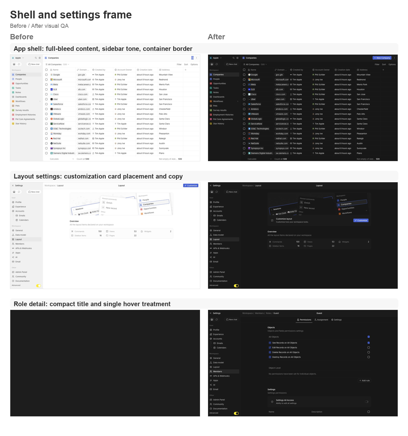
This PR groups the requested second UI polish pass across the app shell,
settings pages, data model, community, AI tools, and developer setup
surfaces.

### Shell and navigation polish
- Lets the app content card fill the available viewport and removes the
bottom-left radius on the main container.
- Uses an outside-looking container border treatment so the rounded
top-left edge matches the Figma frame without a double border.
- Restores the separator between the AI chat side panel and the record
container.
- Updates navigation drawer background/skeleton tones to use gray/3
consistently.
- Simplifies the full-screen backend error fallback so the white screen
fills the viewport.

### Settings page polish
- Moves the layout customization action from the settings navbar into a
settings card under the hero.
- Tightens layout page copy now that the customization surfaces are not
directly manageable yet.
- Aligns role detail title sizing and hover treatment with other
settings headers.
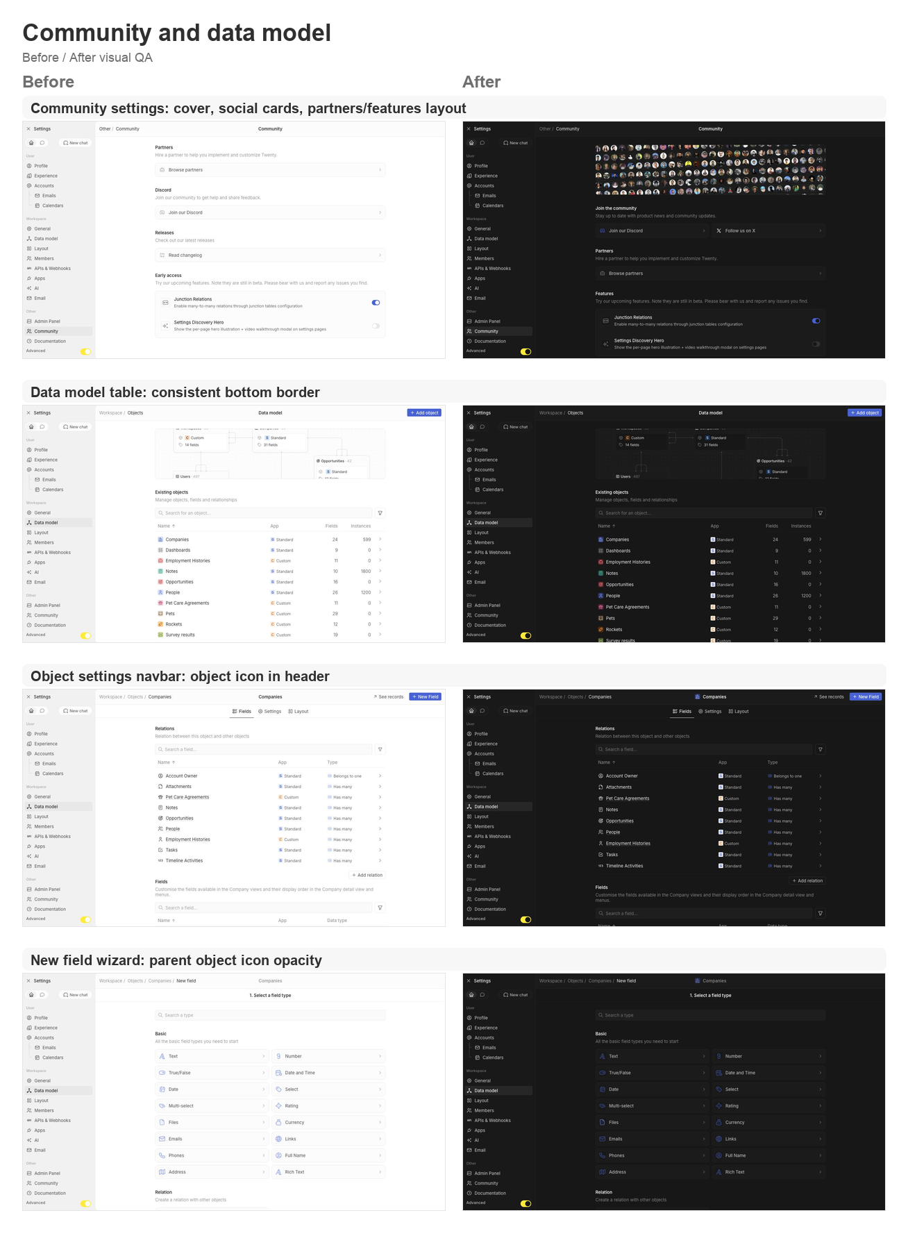
- Supports settings card brand icon colors, then restores Discord and X
brand logos on the Community page.
- Adds the Community discovery cover, moves community/social content to
the top, and reorganizes Partners and Features.
- Keeps setting card subtitle and separator behavior available for the
updated settings cards.

### Data model and object settings polish
- Adds a shared data-model table body wrapper so object, field, and
relation tables all keep the expected bottom border.
- Displays the object icon in the object settings navbar.
- Shares the new-field wizard parent object icon wrapper and keeps the
object icon at 64% opacity in wizard headers.
- Updates the new-field type selector icon treatment to match the wizard
header opacity behavior.

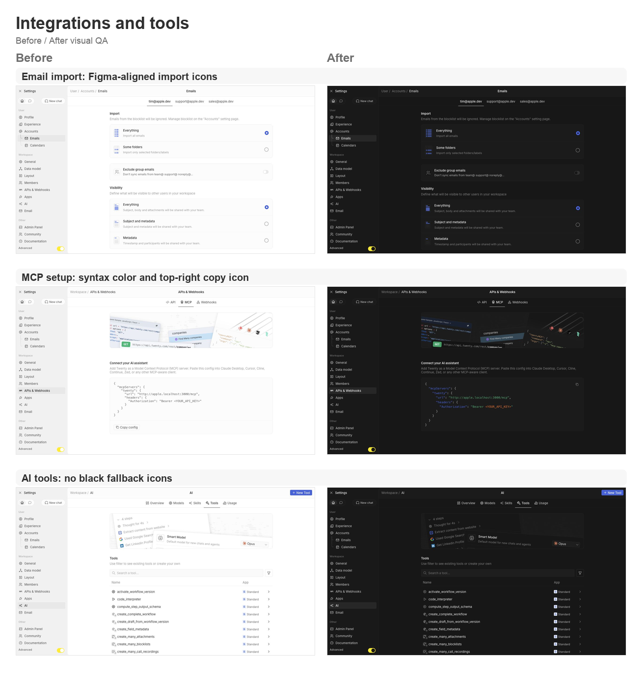
### Integrations, tools, and API polish
- Reworks the MCP setup config card with light syntax coloring and a
top-right copy icon button instead of the bottom copy section.
- Fixes email import icons to match the Figma asset shape.
- Ensures AI tool table icons and chevrons never fall back to black.

## Validation

- `npx nx lint:diff-with-main twenty-front`
- `npx tsc -p packages/twenty-front/tsconfig.json --noEmit`
- `git diff --check`
- Manual local visual pass on `apple.localhost:3001` for companies,
settings/community, data model, object settings, new-field wizard,
layout settings, account import, MCP setup, AI tools, and role detail
pages.

## Visual QA

### Shell and settings frame

<img width="1308" height="1397" alt="Shell and settings frame
before/after board"
src="https://raw.githubusercontent.com/twentyhq/twenty/pr-assets/ui-fixes-2/visual-qa/ui-fixes-2/shell-settings-frame.png"
/>

### Community and data model

<img width="1308" height="1806" alt="Community and data model
before/after board"
src="https://raw.githubusercontent.com/twentyhq/twenty/pr-assets/ui-fixes-2/visual-qa/ui-fixes-2/community-data-model.png"
/>

### Integrations and tools

<img width="1308" height="1397" alt="Integrations and tools before/after
board"
src="https://raw.githubusercontent.com/twentyhq/twenty/pr-assets/ui-fixes-2/visual-qa/ui-fixes-2/integrations-tools.png"
/>


<!-- This is an auto-generated description by cubic. -->
<a
href="https://cubic.dev/pr/twentyhq/twenty/pull/21540?utm_source=github"
target="_blank" rel="noopener noreferrer"
data-no-image-dialog="true"><picture><source
media="(prefers-color-scheme: dark)"
srcset="https://www.cubic.dev/buttons/review-in-cubic-dark.svg"><source
media="(prefers-color-scheme: light)"
srcset="https://www.cubic.dev/buttons/review-in-cubic-light.svg"><img
alt="Review in cubic"
src="https://www.cubic.dev/buttons/review-in-cubic-dark.svg"></picture></a>
<!-- End of auto-generated description by cubic. -->
Fast-follows for the new layout / flat redesign (master:
twentyhq/core-team-issues#2478).

## Changes
- **Main navbar 48px** (twentyhq/core-team-issues#2479) —
`SIDE_PANEL_TOP_BAR_HEIGHT` 40 → 48, so `PageCardHeader` matches the
Figma target. The side panel top bar shares this constant and stays
aligned.
- **Content panel 12px radius** (twentyhq/core-team-issues#2480) —
`PageCardLayout` card gets a full border + 12px radius and an 8px inset
(`spacing[2]`) so it floats on the shell instead of square full-bleed.
- **Square three-dots button** (twentyhq/core-team-issues#2481) — added
a `square` option to `AnimatedButton`; the page-header side-panel toggle
now renders a 24×24 square icon button instead of a 32×24 pill.
- **Table checkbox sizing** (twentyhq/core-team-issues#2482) — restored
`box-sizing: content-box` on the checkbox box. Its border is declared
outside the label size, so the global `border-box` reset (#21349) was
shrinking it (14px → 12px). Same fix pattern as #21349.
- **Tertiary navbar background** (twentyhq/core-team-issues#2483) — left
navbar / app shell use `background/tertiary` instead of the noisy
surface (`DefaultLayout`, `UserOrMetadataLoader`).
- **Skeleton loading** (twentyhq/core-team-issues#2484) — metadata +
content loading now match the new layout: tertiary shell, 12px rounded
content panel, 48px navbar, sparse bars, empty body (removed the dense
full-width rows). Left-panel skeleton bars use `quaternary` so they stay
visible on the tertiary shell.

## Verification
- typecheck (tsgo) + oxlint + oxfmt pass for all changed files.
- Verified live against a running workspace: measured navbar = 48px,
three-dots = 24×24, checkbox box-sizing = content-box (14px), card
radius = 12px, shell background = tertiary (no noisy image).
Content-loading skeleton matches the target.
Replaces #21279 and #21282 with one clean PR from `main`.

Generalizes the settings primary-bar / secondary-bar card chrome to the
record index, record show and standalone pages via a shared
`PageCardLayout` + `PageCardHeader` (the side panel sits as a sibling of
the content card), and applies the new flat design direction: square
corners on the card, side panel and loading skeletons.

Iterating toward the new design (Figma node 102282-221623); the
confirmed direction and the explicit "remove rounded corners" change are
in, remaining designer specifics to follow.
 Thomas des Francs