## Summary

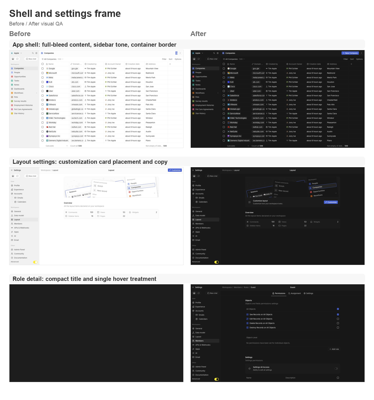
This PR groups the requested second UI polish pass across the app shell,
settings pages, data model, community, AI tools, and developer setup
surfaces.

### Shell and navigation polish
- Lets the app content card fill the available viewport and removes the
bottom-left radius on the main container.
- Uses an outside-looking container border treatment so the rounded
top-left edge matches the Figma frame without a double border.
- Restores the separator between the AI chat side panel and the record
container.
- Updates navigation drawer background/skeleton tones to use gray/3
consistently.
- Simplifies the full-screen backend error fallback so the white screen
fills the viewport.

### Settings page polish
- Moves the layout customization action from the settings navbar into a
settings card under the hero.
- Tightens layout page copy now that the customization surfaces are not
directly manageable yet.
- Aligns role detail title sizing and hover treatment with other
settings headers.
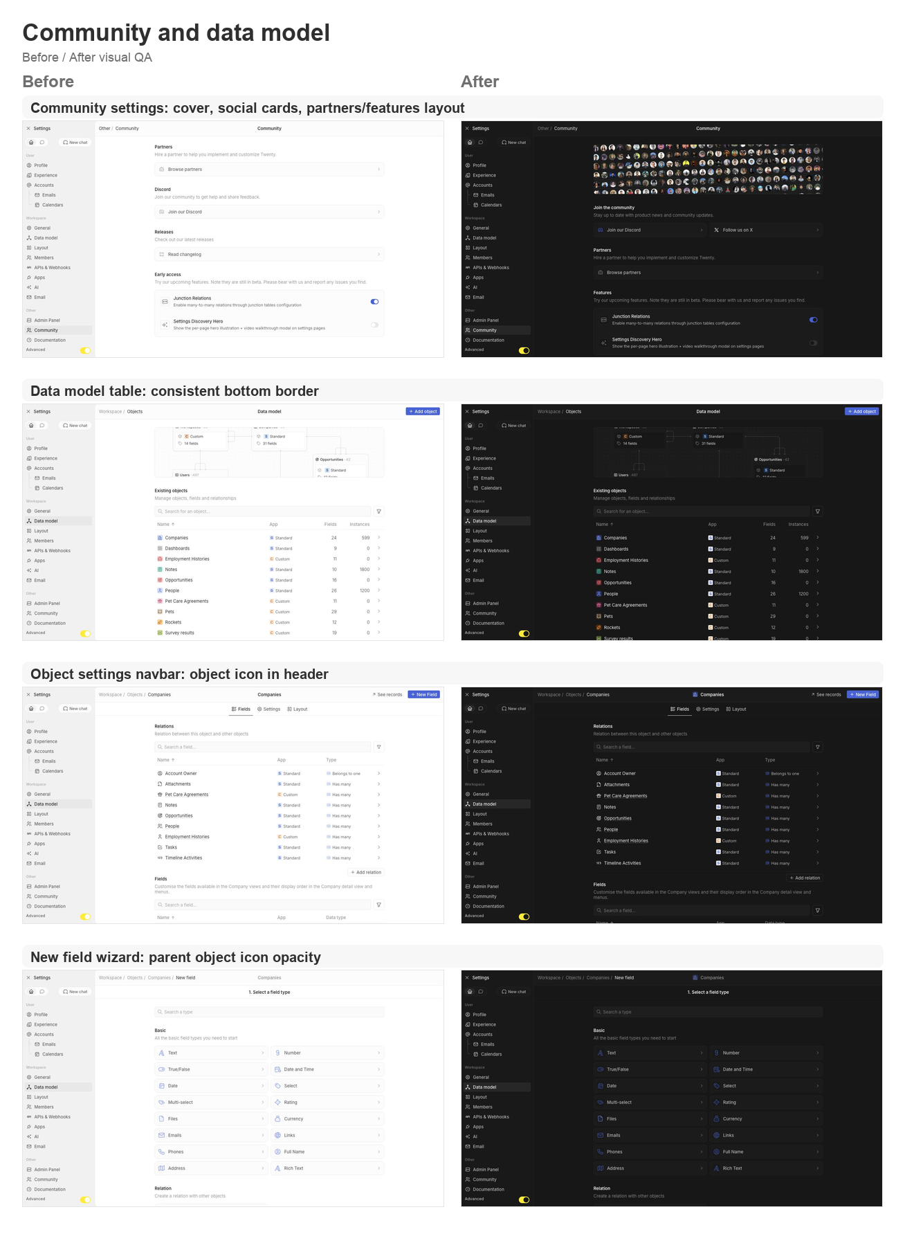
- Supports settings card brand icon colors, then restores Discord and X
brand logos on the Community page.
- Adds the Community discovery cover, moves community/social content to
the top, and reorganizes Partners and Features.
- Keeps setting card subtitle and separator behavior available for the
updated settings cards.

### Data model and object settings polish
- Adds a shared data-model table body wrapper so object, field, and
relation tables all keep the expected bottom border.
- Displays the object icon in the object settings navbar.
- Shares the new-field wizard parent object icon wrapper and keeps the
object icon at 64% opacity in wizard headers.
- Updates the new-field type selector icon treatment to match the wizard
header opacity behavior.

### Integrations, tools, and API polish
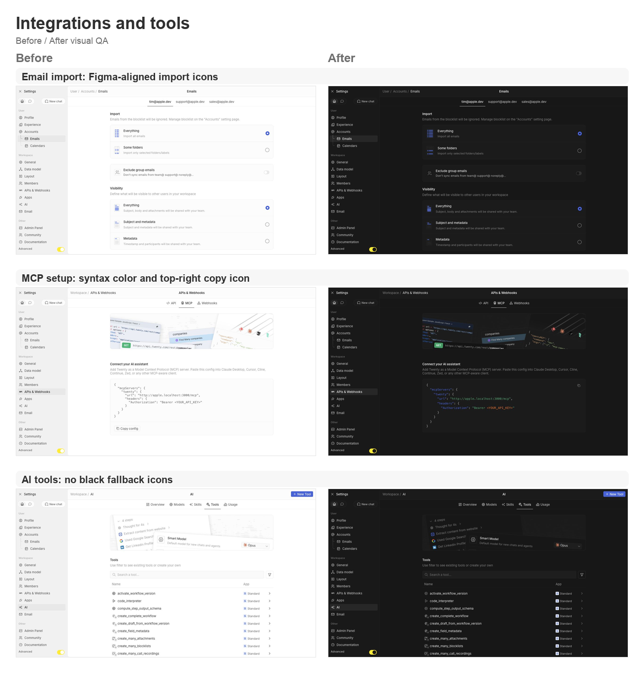
- Reworks the MCP setup config card with light syntax coloring and a
top-right copy icon button instead of the bottom copy section.
- Fixes email import icons to match the Figma asset shape.
- Ensures AI tool table icons and chevrons never fall back to black.

## Validation

- `npx nx lint:diff-with-main twenty-front`
- `npx tsc -p packages/twenty-front/tsconfig.json --noEmit`
- `git diff --check`
- Manual local visual pass on `apple.localhost:3001` for companies,
settings/community, data model, object settings, new-field wizard,
layout settings, account import, MCP setup, AI tools, and role detail
pages.

## Visual QA

### Shell and settings frame

<img width="1308" height="1397" alt="Shell and settings frame
before/after board"
src="https://raw.githubusercontent.com/twentyhq/twenty/pr-assets/ui-fixes-2/visual-qa/ui-fixes-2/shell-settings-frame.png"
/>

### Community and data model

<img width="1308" height="1806" alt="Community and data model
before/after board"
src="https://raw.githubusercontent.com/twentyhq/twenty/pr-assets/ui-fixes-2/visual-qa/ui-fixes-2/community-data-model.png"
/>

### Integrations and tools

<img width="1308" height="1397" alt="Integrations and tools before/after
board"
src="https://raw.githubusercontent.com/twentyhq/twenty/pr-assets/ui-fixes-2/visual-qa/ui-fixes-2/integrations-tools.png"
/>


<!-- This is an auto-generated description by cubic. -->
<a
href="https://cubic.dev/pr/twentyhq/twenty/pull/21540?utm_source=github"
target="_blank" rel="noopener noreferrer"
data-no-image-dialog="true"><picture><source
media="(prefers-color-scheme: dark)"
srcset="https://www.cubic.dev/buttons/review-in-cubic-dark.svg"><source
media="(prefers-color-scheme: light)"
srcset="https://www.cubic.dev/buttons/review-in-cubic-light.svg"><img
alt="Review in cubic"
src="https://www.cubic.dev/buttons/review-in-cubic-dark.svg"></picture></a>
<!-- End of auto-generated description by cubic. -->
## Context
Closes#21522
Large values in the dashboard **Number** widget are always abbreviated
(e.g. `1300090` → `1.3m`) with no way to display the full number.
Following a discussion with the core team who were interested in this
feature
(https://discordapp.com/channels/1130383047699738754/1509604545381142649)
, this adds a **Format** option in the **Style** section of the Number
(aggregate chart) widget, letting users choose between **Short**
(abbreviated, current behavior) and **Full** (complete number with
thousand separators).
Only the displayed value of the Number widget is affected — axes, labels
and tooltips of other chart types are intentionally left untouched.
## What's inside
**Server**
- New `ChartNumberFormat` GraphQL enum (`SHORT` / `FULL`), following the
`AxisNameDisplay` pattern
- The existing — and previously unused — `format` field on
`AggregateChartConfigurationDTO` is now typed with this enum and
validated with `@IsEnum`
- The dashboard AI tool schema (`widget.schema.ts`) accepts the new
`format` option
- Regenerated GraphQL types and the `twenty-client-sdk` metadata client
to reflect the enum
**Front**
- New **Format** setting in the Style section of the Number widget
settings, with a Short/Full selection dropdown (same pattern as the Axis
name setting)
- `transformAggregateRawValueIntoAggregateDisplayValue` takes an
optional `numberFormat`:
- `FULL` → full number via `formatNumber` (currency values keep up to 2
decimals)
- `SHORT` → abbreviated via `formatToShortNumber`
- not set → behavior unchanged (currency short, number full), so
existing widgets and the record table/board footers render exactly as
before
## Screenshots
| Full UI Look |
<img width="1917" height="955" alt="Twenty_Showcas_FullShort"
src="https://github.com/user-attachments/assets/05d05779-395d-4e1a-8ff0-964f6fbef182"
/>
| Menu UI Look |
<img width="291" height="308" alt="Screenshot_2"
src="https://github.com/user-attachments/assets/82b5a1de-32fe-46ec-a9b8-add11ab4c6cd"
/>
## Tests
- Extended `transformAggregateRawValueIntoAggregateDisplayValue` unit
tests with SHORT/FULL cases for currency and number fields
- Updated the page-layout-widget creation/update integration tests and
snapshots to use `ChartNumberFormat.SHORT`
<!-- This is an auto-generated description by cubic. -->
<a
href="https://cubic.dev/pr/twentyhq/twenty/pull/21521?utm_source=github"
target="_blank" rel="noopener noreferrer"
data-no-image-dialog="true"><picture><source
media="(prefers-color-scheme: dark)"
srcset="https://www.cubic.dev/buttons/review-in-cubic-dark.svg"><source
media="(prefers-color-scheme: light)"
srcset="https://www.cubic.dev/buttons/review-in-cubic-light.svg"><img
alt="Review in cubic"
src="https://www.cubic.dev/buttons/review-in-cubic-dark.svg"></picture></a>
<!-- End of auto-generated description by cubic. -->
---------
Co-authored-by: Charles Bochet <charles@twenty.com>
Marketing/campaign emails on top of the emailing-domain (SES) feature:
send a broadcast to a hand-picked list, with per-customer-domain
unsubscribe links and opt-out-only **unsubscribe topics**.

## Model

Standard objects (workspace schema, flat-metadata):
- `messageCampaign` — a campaign send (subject, body template, from
address, status, list, optional unsubscribe topic).
- `messageList` + `messageListMember` — the hand-picked audience (person
↔ list join). A campaign's recipients are its list's members; everyone
is sendable unless suppressed.

Core entities (`core` schema, workspace-scoped — readable by the public
unsubscribe flow without a workspace context):
- `unsubscribeTopic` — an opt-out-only category (name, description,
visibility). There is no opt-in subscription state.
- `messageSuppression` — the single consent store: a row with
`unsubscribeTopicId` NULL is a global block; a row with an
`unsubscribeTopicId` and reason `UNSUBSCRIBE` is a per-topic opt-out.
Two partial unique indexes dedupe global vs per-topic rows (Postgres
treats NULLs as distinct).
- `emailingDomain` — the workspace's SES sending domain,
auto-provisioned when an email channel is added (and cleaned up when its
last channel is removed), with verification status + DNS records.

Campaign messages reuse the existing `message` / `messageThread` /
`messageParticipant` model — one outbound `message` per recipient with a
`deliveryStatus` state machine.

## Sending

- `sendMessageCampaign` resolves the audience **under the caller's
permissions**, creates the campaign, and enqueues a single fan-out job
(the request never materializes per-recipient rows or jobs).
- The fan-out job materializes one QUEUED message per recipient
(deterministic ids → idempotent re-runs, reconciles crash-orphaned rows)
and fans out per-recipient send jobs carrying **only ids**.
- Each send job renders per-recipient `{{variable}}` merge fields and
sends via `EmailingDomainSenderService`, which applies suppression
(global + per-topic) and the unsubscribe footer/headers. Suppressed
recipients are recorded `SKIPPED`.
- The campaign finalizes `SENT`, or `SENT_WITH_ERRORS` if any recipient
terminally failed.
- `previewMessageCampaignAudience` returns a pre-send breakdown (total /
without-email / duplicate / globally-unsubscribed / topic-unsubscribed /
sendable), shown as a hint under the composer pickers.

## Unsubscribe

- Encrypted (AES-256-GCM) token carrying workspaceId, address, optional
`unsubscribeTopicId`, `issuedAt`, and a `preview` flag.
- One-click POST (RFC 8058) + `mailto:` — topic-scoped when the token
carries a topic, global otherwise.
- Preferences page: a checkbox per visible topic (checked = still
receiving); submitting creates per-topic opt-outs for unchecked topics
and lifts re-checked ones (UNSUBSCRIBE only — never
`BOUNCE`/`COMPLAINT`, never a global block).
- A **Preview** action in settings opens the live page via a
preview-claim token; opt-out POSTs are no-ops for preview tokens, so
previewing never mutates state.
- SES webhooks: inbound unsubscribe + outbound bounce/complaint →
suppression (race-safe against at-least-once delivery, with reason
escalation that never downgrades).
- Per-customer unsubscribe hostname (Cloudflare DNS); sends are gated on
it being active, except in LOG/demo mode.

## Architecture

Campaign orchestration, suppression, the sender, the unsubscribe
controller, and the SES webhook handlers live in `src/modules/emailing`
+ `src/modules/messaging-webhooks` (the workspace-feature layer).
`core-modules/emailing-domain` keeps the SES driver, domain
provisioning, the `unsubscribeTopic` / `messageSuppression` core
entities, and the unsubscribe token/hostname plumbing. Domain creation
is validated (`CreateEmailingDomainInput` — domain-format regex,
lowercased) before any value reaches SES or the unsubscribe hostname.

## Frontend

- Campaign composer side panel (from / list / unsubscribe topic /
subject / body) with a live audience-preview hint.
- Email settings: email channels each showing their auto-provisioned
sending domain in a single section (status + DNS records + a "Check
verification" action), plus an **Unsubscribe Topics** section to
create/manage topics and preview the recipient page. A demo-mode banner
is shown when the LOG driver is active.

---------

Co-authored-by: Félix Malfait <felix@twenty.com>
Co-authored-by: Félix Malfait <felix.malfait@gmail.com>
## Context
Second PR of the overridable-entities track (after #21436 for views):
command menu items become overridable so that edits on non-owned items
are stored as overrides instead of mutating the row, and
deletion/deactivation becomes reversible.

 ## What this does

- `CommandMenuItemEntity` now extends
`OverridableEntity<CommandMenuItemOverrides>` (adds `isActive` +
`overrides`). All editable properties are overridable for now (to
discuss).
- **Update**: mutations on a command item not owned by the caller
(standard items) are written into `overrides`; reads merge them in the
DTO. The command palette edit mode (pin,
reorder, shortLabel) now preserves standard values, "Reset label to
default" gains true post-save semantics.
- **Delete**: protected items are deactivated (`isActive = false`)
instead of deleted; custom items still hard-delete.
- **Object deactivate/enable toggle**: now flips `isActive` on the
command item (merged into the main migration call) instead of
delete/recreate; a create-if-missing fallback covers legacy deactivated
objects.
- **Front**: inactive command items are filtered out of the palette
selector.


<!-- This is an auto-generated description by cubic. -->
<a
href="https://cubic.dev/pr/twentyhq/twenty/pull/21486?utm_source=github"
target="_blank" rel="noopener noreferrer"
data-no-image-dialog="true"><picture><source
media="(prefers-color-scheme: dark)"
srcset="https://www.cubic.dev/buttons/review-in-cubic-dark.svg"><source
media="(prefers-color-scheme: light)"
srcset="https://www.cubic.dev/buttons/review-in-cubic-light.svg"><img
alt="Review in cubic"
src="https://www.cubic.dev/buttons/review-in-cubic-dark.svg"></picture></a>
<!-- End of auto-generated description by cubic. -->

---------

Co-authored-by: Charles Bochet <charles@twenty.com>
Fast-follows for the new layout — the remaining open sub-issues of
twentyhq/core-team-issues#2478.
## Changes
- **Command menu items should not have extra right padding**
(twentyhq/core-team-issues#2500)
`SidePanelList` set `width: calc(100% - spacing[4])` on top of its own
8px left/right padding. Under the global `box-sizing: border-box`, that
extra `-16px` shrinks the list and, because it's left-aligned, dumps the
whole gap on the right. Switched to `width: 100%` so item highlights
inset 8px symmetrically. This is shared by every side-panel list — they
all had the same right-only gutter, so they're all corrected the same
way.
- **Field options should not be cropped and should keep row gaps**
(twentyhq/core-team-issues#2503)
The option row used a fixed `height: spacing[6]`, so under border-box
the `6px` vertical padding was absorbed and consecutive rows sat flush.
Changed `height` → `min-height` so the padding separates the rows again.
- **Logs table with filters should use Background secondary**
(twentyhq/core-team-issues#2505)
The Logs filter card and the upgrade card defaulted to a transparent
background, showing the white page through. Passed
`backgroundColor={themeCssVariables.background.secondary}`, matching
`SettingsTableCard`. The results table stays on the primary surface, per
the Figma reference.
- **Command menu back chevron** (twentyhq/core-team-issues#2504)
`SidePanelTopBar` showed a back chevron whenever the nav stack had more
than one entry. A command-menu page is the root of a fresh command-menu
session, so it now only shows the chevron when it was opened from
another command-menu page. Every other side-panel page keeps standard
history-based back navigation, so workflow / page-layout / record stacks
are unaffected.
## Verification
- oxlint (`--type-aware`, full `src/`): 0 errors
- oxfmt: clean
- tsgo typecheck: no errors in the changed files (the one reported error
is pre-existing in `RestPlayground.tsx`, which this PR does not touch)
- Verified live at apple.localhost:
- #2500 — command menu item highlight insets measured 8px left / 8px
right (was 8 / 24)
- #2503 — option rows render at 38px tall with ~14px gaps, text no
longer cropped
- #2505 — filter + upgrade cards compute to background-secondary;
results table stays on primary
- #2504 — direct command menu shows the close-X with no chevron; pages
opened from the command menu still show the chevron
## Open question for review (#2504)
The issue also describes the page-header three-dots toggle: *"the three
dots icon button should remain visible if the side panel is on a page
that is not a child of the command menu (AI chat, or a page opened
directly)."* Today that toggle morphs to an X for any non-command-menu
side-panel page (e.g. Ask AI). Honoring that touches the shared
`SidePanelToggleButton`, and there's a related decision: search / Ask AI
opened from the command menu currently reset the nav stack rather than
push, so they don't get a "back to command menu" chevron. I left those
out here since they're a behavior change to a shared control with a
product call attached — happy to follow up once you confirm the intended
toggle behavior.
Closestwentyhq/core-team-issues#2500Closestwentyhq/core-team-issues#2503Closestwentyhq/core-team-issues#2505
Refs twentyhq/core-team-issues#2504
Refs twentyhq/core-team-issues#2478
Second batch of new-layout fast-follows (master:
twentyhq/core-team-issues#2478). All changes verified live against a
running workspace.

## Settings drawer & header
- **twentyhq/core-team-issues#2489** — sidebar icons render as plain
16px icons, no background tiles.
- **twentyhq/core-team-issues#2488** — Advanced toggle spans the full
drawer width; yellow dot removed.
- **twentyhq/core-team-issues#2497** — page title stays centered in the
settings header (breadcrumb stays left).
- **twentyhq/core-team-issues#2490** — Exit Settings control aligned to
the workspace switcher (24px, matching padding/gap).
- **twentyhq/core-team-issues#2499** — 2px vertical gap restored between
collapsible drawer section items.
- **twentyhq/core-team-issues#2491** — settings drawer rhythm now
matches the main app (28px items, 2px gaps, 28px section headers).
- **twentyhq/core-team-issues#2492** — Home/Chat tab switch no longer
flickers: both tab subtrees stay mounted (a shared
`NavigationDrawerTabbedContent` toggles visibility instead of remounting
+ flashing the chat skeleton).

## Loading states
- **twentyhq/core-team-issues#2486** — metadata loading shows an empty
body (no dense skeleton rows).
- **twentyhq/core-team-issues#2487** — settings table keeps its layout
while loading, with the shimmer localized to the first row's first cell.

## Command menu & navigation
- **twentyhq/core-team-issues#2501** — navigation section header height
matches the nav item rhythm (28px).
- **twentyhq/core-team-issues#2502 (part 1)** — the page side-panel
toggle stays as the dots glyph while the command menu is open, instead
of morphing into a second close control.

## New-field flow
- **twentyhq/core-team-issues#2494** — the new-field stepper moved from
a breadcrumb dropdown into a centered secondary wizard bar (back chevron
+ Save on the configure step); breadcrumb stays clean and the object
label is the centered title.

## Descoped (substantive bugs already fixed)
- **twentyhq/core-team-issues#2500** — command-menu highlight right
gutter: the menu-item base measures full-width, so it's likely a
scrollbar gutter on the list, not the shared component. Left for a
focused follow-up.
- **twentyhq/core-team-issues#2502 part 2** — moving the command-menu
close from left to right is cosmetic (the duplicate-control bug is fixed
by part 1) and would touch the shared `SidePanelTopBar` used by
search/AI panels.

## Verification
typecheck (tsgo) + oxlint + oxfmt green for all changed files; each
change DOM-measured / screenshotted in the running app.
Fast-follows for the new layout / flat redesign (master:
twentyhq/core-team-issues#2478).

## Changes
- **Main navbar 48px** (twentyhq/core-team-issues#2479) —
`SIDE_PANEL_TOP_BAR_HEIGHT` 40 → 48, so `PageCardHeader` matches the
Figma target. The side panel top bar shares this constant and stays
aligned.
- **Content panel 12px radius** (twentyhq/core-team-issues#2480) —
`PageCardLayout` card gets a full border + 12px radius and an 8px inset
(`spacing[2]`) so it floats on the shell instead of square full-bleed.
- **Square three-dots button** (twentyhq/core-team-issues#2481) — added
a `square` option to `AnimatedButton`; the page-header side-panel toggle
now renders a 24×24 square icon button instead of a 32×24 pill.
- **Table checkbox sizing** (twentyhq/core-team-issues#2482) — restored
`box-sizing: content-box` on the checkbox box. Its border is declared
outside the label size, so the global `border-box` reset (#21349) was
shrinking it (14px → 12px). Same fix pattern as #21349.
- **Tertiary navbar background** (twentyhq/core-team-issues#2483) — left
navbar / app shell use `background/tertiary` instead of the noisy
surface (`DefaultLayout`, `UserOrMetadataLoader`).
- **Skeleton loading** (twentyhq/core-team-issues#2484) — metadata +
content loading now match the new layout: tertiary shell, 12px rounded
content panel, 48px navbar, sparse bars, empty body (removed the dense
full-width rows). Left-panel skeleton bars use `quaternary` so they stay
visible on the tertiary shell.

## Verification
- typecheck (tsgo) + oxlint + oxfmt pass for all changed files.
- Verified live against a running workspace: measured navbar = 48px,
three-dots = 24×24, checkbox box-sizing = content-box (14px), card
radius = 12px, shell background = tertiary (no noisy image).
Content-loading skeleton matches the target.
Some bugs fixed in this PR
1. From UI any field could be chosen to group the query by it, while for
instance, RAW_JSON type (eg workflowRun.state) is not supported by
PostgreSQL to group a query by. Fix: removed it from the "group by"
fields options in FE + in BE -->
2. The BE check existed (isFlatFieldMetadataSupportedInGroupBy) but the
signature was malformed: it expected`{ fieldMetadataType,
fieldMetadataName, fieldMetadataIsSystem }` while every caller passes a
flat field metadata object with type/name/isSystem. So the check is
mis-wired — at runtime the destructured props are undefined, making it
always return true (validation bypassed). Fixed this.
3. Group by does not work with Morph relations if their direction is
ONE_TO_MANY. Added that constraint.
4. Group by with morph relations were broken even for MANY_TO_ONE,
because a morph is stored as one field per target
(polymorphicOwnerRocket, polymorphicOwnerSurveyResult…), each with its
own join column, but the frontend collapsed them into a single
polymorphicOwner field — so the backend tried to resolve a non-existent
polymorphicOwnerId. Fix: Frontend: added a target picker so you choose
the specific morph target (then its sub-field), storing the real
per-target field id. Backend: fixed validate-relation-subfield to use
the per-target field's own relationTargetObjectMetadataId instead of the
multi-target resolver that returned null.
5. (improvement) When an error occured in the query, the graph showed
"No data". Updated it to "error". (screenshot 1)
6. When a field used as a filter on a graph is deleted, it is not
deleted as a graph filter (which is ok because it would involve parsing
all the graph's configuration json to find whether a field is
referenced; there is no foreign key), which prevented from further
modifying the graph's filters. Fixed this + add an indicator that the
filter is can/should be removed (see screenshot 2)
7. "Ambiguous column name" PG error occurs when ordering by "creation
date" of a related field, because both objects have createdAt field.
Fixed it by adding table alias as prefix.
8. (improvement) While working on #5 I did not understand why we could
directly do `"objectMetadataNameSingular"."columnName" `while I expected
that for custom objects it would have to be
`_objectMetadataNameSingular`. that's simply because we use an alias
from the beginning. To add clarity, within groupBy code I replaced
`objectMetadataNameSingular` with `objectAlias` everywhere it is indeed
inherited from us using objectAlias.

<img width="685" height="391" alt="Screenshot 2026-06-08 at 12 01 45"
src="https://github.com/user-attachments/assets/f2b15ca5-da39-4114-8188-69f58f3c4cbf"
/>

<img width="598" height="341" alt="Screenshot 2026-06-08 at 11 53 55"
src="https://github.com/user-attachments/assets/66372811-4a37-40d9-b43a-4af51f89b6e6"
/>
Replaces #21279 and #21282 with one clean PR from `main`.

Generalizes the settings primary-bar / secondary-bar card chrome to the
record index, record show and standalone pages via a shared
`PageCardLayout` + `PageCardHeader` (the side panel sits as a sibling of
the content card), and applies the new flat design direction: square
corners on the card, side panel and loading skeletons.

Iterating toward the new design (Figma node 102282-221623); the
confirmed direction and the explicit "remove rounded corners" change are
in, remaining designer specifics to follow.
## Description

Promotes the next-gen UI library (formerly `twenty-new-ui`) to the name
**`twenty-ui`** (v0.1.0, publishable) and renames the old package to
**`twenty-ui-deprecated`**. Rewrites ~1,730 `twenty-ui` imports →
`twenty-ui-deprecated`, updates all configs/CI/Docker/deps, and migrates
twenty-front's `Toggle` to the new package (first consumer) as a
drop-in.

## Next steps
- Wire the `ui/v*` publish dispatch (`cd-deploy-tag.yaml` +
`.yarnrc.yml`), then tag `ui/v0.1.0` to publish.
- Continue migrating components from `twenty-ui-deprecated` →
`twenty-ui`.
Surfaces per-step "Logs" tabs in the workflow run side panel so users
can see what each step actually did (model + tokens + tool calls for AI,
console output for serverless functions, request/response for HTTP,
recipients/body for Email).

<img width="546" height="501" alt="ai_agent_without_websearch"
src="https://github.com/user-attachments/assets/c6ca3518-9489-4484-a570-3d0569ff3b03"
/>

## Storage

- New `stepLogs` JSONB column on the `workflowRun` workspace entity,
typed as `Record<string, WorkflowRunStepLog>` (keyed by step id).
- Schema lives in `twenty-shared`: `workflowRunStepLogSchema` with a
discriminated `details.type` union for `AI_AGENT | CODE | HTTP_REQUEST |
EMAIL` — frontends and backends consume the same Zod-inferred type.
- Field is added to existing workspaces via a workspace upgrade command
(`2-9 add-workflow-run-step-logs-field`); the standard-object metadata
declares it for new workspaces.
- Writes happen atomically per step in
`WorkflowRunStepLogWorkspaceService.setStepLog` using `jsonb_set`. That
lets concurrent steps in the same run write their own keys without
contending with the existing lock around `workflowRun.state`.
- Per-step payload is hard-capped at 256 KB; anything larger is dropped
with a `logger.warn`, so a pathological tool call can never bloat a row.
See below for more information.

## How logs are produced

**Aalmost everything was already being collected; this PR mostly
persists and renders it.**

- **AI agent** — `AgentAsyncExecutorService` already tracked token
usage, model id, native web-search count, and the AI SDK's `steps[]`. We
map those into the log via `mapAiStepsToToolCallLogs` (`searchVector`
stripped from record outputs, per-call input/output capped at 32/64 KB,
max 200 tool calls per step). The only new measurement is a wall-clock
`durationMs` taken around `executeAgent`, and we now fold native
web-search cost into the displayed `totalCostInDollars` (it was already
billed, just not shown).
- **Code / serverless function** — reuses the `console.log` output the
function runner already returns (`logsByLevel`);
`build-code-step-log.util` only repackages it.
- **HTTP request** — built from the action's existing input/output via
`build-http-request-step-log.util`. No new signals collected.
- **Email (send / draft)** — added `sanitizedHtmlBody` + `plainTextBody`
to the existing tool outputs (a small additive change), then
`build-email-step-log.util` consumes them.

No additional AI inference or external calls are made for logging — the
cost is a small CPU overhead per step plus the JSONB write.

## Security

The log surface intentionally shows whatever the workflow touched, which
made redaction and sanitization the main design concern.

- **HTTP — secrets in headers**: existing `SENSITIVE_HEADER_NAMES` set
(Authorization, Cookie, …) replaced with `[redacted]` in both request
and response.
- **HTTP — secrets in URLs**: `SENSITIVE_URL_PARAM_NAMES` (e.g.
`api_key`, `token`, `access_token`) replaced in the query string via
`URL`-based parsing.
- **HTTP — secrets in bodies**: `SENSITIVE_BODY_KEY_REGEX` deep-walks
JSON request/response bodies (object input or stringified JSON) and
redacts matching keys. Applied to the `error` field too, since
transport-layer errors sometimes embed structured payloads.
- **Email — XSS risk in body preview**: tool outputs now expose a
server-side `sanitizedHtmlBody`; the log builder prefers it over the raw
user-authored `input.body`, with `plainTextBody` as a second fallback.
The original raw body is only used if sanitization didn't happen (e.g.
tool failed before composing).
- **AI — internal/noisy data**: `searchVector` (Postgres tsvector
strings) is stripped from record outputs returned by Twenty tools to
avoid leaking internal full-text-search payloads.
- **DB bloat / runaway agents**: 256 KB per-step cap + 32 KB / 64 KB
per-tool-call input/output cap + 200 tool calls per step.

<img width="547" height="307" alt="logic_function"
src="https://github.com/user-attachments/assets/dd4a3d16-67f2-434b-95b3-bdcaf9ed053d"
/>

## More details on Log size & truncation

Logs are stored in `workflowRun.stepLogs` (JSONB), keyed by `stepId`.

### Per-step cap

Each step's log is hard-capped at **256 KB** (`MAX_STEP_LOG_BYTES` in
`WorkflowRunStepLogWorkspaceService.setStepLog`).

For ~99% of workflows this is roomy — typical real-world sizes:
- Code / serverless function: 1–20 KB
- HTTP request: 5–70 KB
- Email: 5–30 KB
- AI agent (a handful of tool calls): 5–50 KB

### Two layers of bounding

1. **Per-field truncation** in each builder (before writing):
   - **Code**: ≤ 500 entries, ≤ 4 KB per message, ≤ 8 KB stack trace
   - **HTTP**: ≤ 32 KB per body (request + response), UTF-8 byte-aware
   - **Email**: ≤ 8 KB body preview, UTF-8 byte-aware
- **AI agent**: ≤ 32 KB tool input, ≤ 64 KB tool output, ≤ 200 tool
calls/step

2. **Global per-step safety net** at write time: if the assembled
`stepLog` still exceeds 256 KB, the write is **dropped entirely** with a
`logger.warn`. The workflow itself keeps running unaffected.

### What this means in practice

- **Safe**: workflow execution, step results, downstream steps — never
blocked by log size.
- **Safe**: iterators (each iteration overwrites the previous log for
that `stepId`, so they can't accumulate).
- **Safe**: step retries (same `stepId` is overwritten, not appended).
- **Possible**: an AI agent step with many large tool outputs (e.g., 50+
heavy `web_search` calls) can exceed 256 KB → the **entire** step's log
is dropped, side panel shows "No logs were recorded for this step". The
user has no explicit signal that the log was dropped due to size (only
server-side warn).
- **Possible** (theoretical): a workflow with hundreds of distinct steps
could push the row toward Postgres's internal ~256 MB jsonb limit.
Beyond that, individual `jsonb_set` writes would error and be swallowed
by the action's try/catch — workflow still completes.

### Possible future hardening (not in this PR)

- Replace "drop entire log" with a stub that preserves the summary card
(cost, duration, status) and marks `truncated.reason = 'size_cap'`.
- Surface size-drops in the UI (similar to the existing
`<StyledTruncatedNotice>`).
- Emit a metric so dropped logs are observable in dashboards.
## What & why

The left-sidebar **Favorites** section was hidden whenever the user had
no favorites, so it was effectively undiscoverable — and personal
favorites could only be created via the record-level "Add to favorites"
action or drag-drop.

This PR:
- **Always shows the Favorites section**, with an empty-state **"Add a
favorite"** call-to-action.
- Adds a **"+" on the Favorites header that opens the same "New menu
item" side panel** the Workspace section already uses, so users can add
personal **Objects, Views, Records, Links and Folders** directly from
the sidebar.

## How

Favorites and workspace navigation are the same `NavigationMenuItem`
entity (a personal favorite simply has `userWorkspaceId` set). Rather
than build a separate favorites-only flow, the shared add/edit
side-panel subsystem is made **section-aware**
(`NavigationMenuItemSection = 'workspace' | 'favorite'`):

- a new `navigationMenuItemEditSectionState` atom records which section
the panel is operating on;
- a new `useNavigationMenuItemEditController` forks persistence — the
**workspace** section stages changes in the draft (saved on
layout-customization exit), while the **favorite** section
creates/updates/deletes personal items **immediately** with
`userWorkspaceId = current member`. This mirrors the existing
`useHandleNavigationMenuItemDragAndDrop` fork.

The existing add/edit hooks, pickers and title editors were rerouted
through the controller and a section-aware items hook, so they work for
both sections with no behavior change to the workspace flow.

**Backend: no changes** — `canUserCreateNavigationMenuItem` already
authorizes personal navigation menu items of every type for any
authenticated user.

## Decisions & tradeoffs

- **Folder button → unified "+":** the folder-only header button is
replaced by the single "+" (Folder is one of the panel's options),
matching the Workspace section. This removed the inline folder-create
code path.
- **Click-to-add only in v1:** dragging items from the panel directly
into Favorites is deferred — those drag handles are disabled in the
favorite section (the drag path is hardwired to workspace layout mode),
with a defense-in-depth no-op in the drop handler.
- **Persist-on-commit:** favorite title/URL edits hit the network once
on blur/enter, never per keystroke.
- **Personal color edits** change only the favorite's own color, never
the shared object metadata (that remains a workspace-customization
behavior).
- The change touches ~37 files because it generalizes the shared
subsystem rather than duplicating it; net diff is slightly negative
(+605 / −636).

## Testing

- `npx nx typecheck twenty-front` — passes
- `npx nx lint twenty-front` (oxlint + oxfmt) — passes
- `navigation-menu-item` unit tests — pass (incl. an updated
`computeInsertIndexAndPosition` test covering personal items)
- Manual end-to-end walkthrough still recommended before merge.
## Summary
Fixes scroll behavior in the rich text editor.
Long content was unbounded — the popup grew off-screen, the
expand-to-side-panel button became unreachable, and the side panel
itself didn't scroll either.
Closes#20309
## Changes
- `RichTextFieldInput`: cap the popup at `min(60vh, 500px)` and wrap the
editor in a scrollable region. Collapse button stays at the top via
`align-items: flex-start`.
- `RecordInlineCellEditMode`: add `shift()` middleware to keep the popup
inside the viewport after `flip()` triggers (previously the popup could
extend above the viewport top with the collapse button out of reach).
- `SidePanelContainer` / `SidePanelRouter`: add `min-height: 0` to the
flex-column chain so the existing `overflow-y: auto` on the content area
can actually clip and scroll long children.
The previous attempt in #20310 added the same `min-height: 0` plus a
nested overflow wrapper inside the rich-text page; the nested wrapper
turned out to be the reason scrolling didn't work.
## Test plan
- [x] Open a record with a long `RICH_TEXT` field
- [x] Click the field — popup opens bounded; long content scrolls inside
- [x] Click the expand button (top-right) — side panel opens
- [x] Side panel: long content scrolls vertically
- [x] Popup near the bottom of the viewport flips upward and stays fully
inside the viewport (collapse button remains visible)
- [x] `lint:diff-with-main`, `typecheck`, prettier — green
https://github.com/user-attachments/assets/827be881-aadd-49ed-9ddc-7566c00cf4be
---------
Co-authored-by: Claude Opus 4.7 (1M context) <noreply@anthropic.com>
## Summary
- Added `color: ${themeCssVariables.font.color.primary}` to
`StyledPageInfoTitleContainer` in `SidePanelPageInfoLayout.tsx`
- The "Update records" title had no explicit color, so it didn't adapt
to dark mode and was nearly invisible against the dark background
- Now correctly uses the theme-aware primary font color
## Changes
-
`packages/twenty-front/src/modules/side-panel/components/SidePanelPageInfoLayout.tsx`
Fixes#20627
**Stacked on #20527**


https://github.com/user-attachments/assets/48995655-401a-4c35-8094-e88da8408bdd


## Summary

Surfaces the one-hop relation traversal added in #20527 through the
existing **composite sub-field dropdown pattern**. Clicking a
MANY_TO_ONE relation field in the "+ Filter" picker now opens the same
second-level dropdown that composite fields (FULL_NAME, ADDRESS,
CURRENCY, etc.) already use — populated with the target object's
filterable fields. Picking one (e.g. `Company → Name`) builds a filter
that serializes to the nested GraphQL filter the backend now accepts: `{
company: { name: { ilike: "%X%" } } }`.

No new components. The whole feature reuses
`AdvancedFilterSubFieldSelectMenu` + the existing
`subFieldNameUsedInDropdownComponentState` + the existing `MenuItem
hasSubMenu` indicator. Only the conditions that gate the sub-menu (and
the sub-menu's content for relations) were broadened.

## What landed

| File | Change |
|---|---|
| `ObjectFilterDropdownFilterSelectMenuItem` | Sub-menu chevron now
shows on MANY_TO_ONE relations (`isManyToOneRelationField` util). |
| `AdvancedFilterFieldSelectMenu` | Relation clicks open the sub-menu
alongside composite clicks. |
| `AdvancedFilterSubFieldSelectMenu` | New branch: when the sub-menu
type is `'RELATION'`, render the target object's filterable fields via
`useFilterableFieldMetadataItems(targetObjectMetadataId)`. Composite
logic untouched. |
| `objectFilterDropdownSubMenuFieldType` state | Widened to accept a
`'RELATION'` sentinel. Role-permissions sub-field menu narrows it back
out (it doesn't traverse relations). |
| `useSelectFieldUsedInAdvancedFilterDropdown` | New optional
`targetFieldMetadataItem` arg. When present, the stored RecordFilter's
`type` is the target field's type so the operand picker and value input
render the target's operands (`'TEXT'` operators when filtering
`company.name`, etc.). |
| `turnRecordFilterIntoGqlOperationFilter` (shared) | When the filter
targets a `RELATION` field with a `subFieldName`, synthesize a
field-metadata for the target, recurse to build the inner filter, then
wrap it under the relation field's name → `{ relationName: {
targetFieldName: { ...operator } } }`. |

`RecordFilter.subFieldName` stays narrowly typed as
`CompositeFieldSubFieldName` so the wide downstream consumers
(`shouldShowFilterTextInput`, composite handlers in the serializer,
etc.) don't change. The relation target field's name is stored through a
narrowly-scoped cast at the dropdown's storage point — the serializer
checks `filter.type === 'RELATION'` before interpreting it as a target
field name, so the cast can't be mis-read by composite-only code paths.

## Test plan

- [ ] Open a table view on People, click "+ Filter", click "Company" →
sub-menu opens with Company's filterable fields
- [ ] Pick "Name" → operand picker shows TEXT operators (Contains,
Equals, …)
- [ ] Type "Airbnb" → filter applies, table shows people whose company
name contains "Airbnb"
- [ ] Verify network tab: the GraphQL filter variable is `{ company: {
name: { ilike: "%Airbnb%" } } }`
- [ ] Same flow with a composite target field (e.g. `Company →
annualRecurringRevenue → amountMicros`) — should work end-to-end
(backend supports composite-within-relation; #20527 has an integration
test covering this)
- [ ] Composite fields (FULL_NAME, ADDRESS) still open their normal
sub-menu and filter correctly — no regression
- [ ] Role-permissions field-select sub-field menu is unaffected (it
bails out early on the RELATION sentinel)

## Out of scope

- ONE_TO_MANY traversal (no backend support yet)
- Aggregates (`people.count > 5`)
- Persisting relation-traversal filters into a saved view (ViewFilter
has no `relationPath` column yet; that's a separate slice)
- REST API DSL changes
- AI Tools

🤖 Generated with [Claude Code](https://claude.com/claude-code)

---------

Co-authored-by: Claude Opus 4.7 <noreply@anthropic.com>
## Summary

Removes gauge chart from the chart-type picker and deletes existing
gauge widgets via a workspace migration. The gauge was rendering a
hardcoded `0.7 / "Progress"` stub regardless of configuration -- never
wired to real data.

The contract stays in place. We keep
`WidgetConfigurationType.GAUGE_CHART`, the DTO, the GraphQL union
member, and the gauge folder -- so stored gauge JSON still resolves
through the schema. The render path falls through to `default: return
null`, so any un-migrated gauge widget renders as an empty cell, not a
crash.

This PR just removes existing gauge widgets if there are any (via
`upgrade:2-3:delete-gauge-widgets`). The deliberate cleanup -- deleting
the type definitions, the gauge folder, the DTO -- comes in a follow-up
PR after the migration has run.

---------

Co-authored-by: Charles Bochet <charles@twenty.com>
## Summary

Replaces the bolted-on `isTool` + `toolInputSchema` fields on
`LogicFunctionManifest` with two distinct, opt-in triggers that align
with the existing `cron` / `databaseEvent` / `httpRoute` trigger
pattern:

- **`toolTriggerSettings`** — exposes the function as an AI tool (chat /
MCP / function calling). Uses standard JSON Schema (the format LLMs
natively understand).
- **`workflowActionTriggerSettings`** — exposes the function as a step
in the visual workflow builder. Uses Twenty's rich `InputSchema` so the
builder can render proper `FieldMetadataType`-aware editors, variable
pickers, labels, and an optional `outputSchema`.

A function can opt into none, one, or both. Each surface gets the schema
format appropriate for it.

### Why

`isTool: true` previously exposed the function as both an AI tool AND a
workflow node, with the same JSON Schema feeding both — but the workflow
builder really wants Twenty's `InputSchema` (with `CURRENCY`,
`RELATION`, `EMAILS`, etc.) and the AI surface really wants standard
JSON Schema. Today the workflow builder hacks around this by treating
JSON Schema as `InputSchema`, which silently breaks for any
non-primitive field type. Splitting the triggers fixes that and lets
each surface evolve independently.

### Migration

- **Fast** instance command adds the two new nullable columns.
- **Slow** instance command backfills `toolTriggerSettings` +
`workflowActionTriggerSettings` from `isTool=true` rows (preserving
today's both-surfaces behaviour) then drops the legacy columns.

### Stacked

Stacked on top of #20181. Merge that first, then this.

## Test plan

- [ ] CI green (oxlint, typecheck, jest, vitest)
- [ ] Run `--include-slow` upgrade against a workspace with existing
`isTool=true` logic functions; verify both new columns populated and old
columns dropped
- [ ] Verify AI chat sees migrated tool functions (Linear create-issue,
Exa search) and can call them with the JSON Schema
- [ ] Add an AI-tool function from the Settings UI (toggles
`toolTriggerSettings`) and verify it shows up in chat
- [ ] Add a workflow-action function from the Settings UI (toggles
`workflowActionTriggerSettings`) and verify it appears in the workflow
node picker
- [ ] In the workflow builder, edit a `LOGIC_FUNCTION` step and verify
input fields render (no more JSON-Schema-as-InputSchema hack)
- [ ] Try defining a function with no triggers in the SDK and verify
`defineLogicFunction` rejects it

🤖 Generated with [Claude Code](https://claude.com/claude-code)

---------

Co-authored-by: Claude Opus 4.6 <noreply@anthropic.com>
Co-authored-by: martmull <martmull@hotmail.fr>
# Introduction

Support multiple selected record ids for headless front components

### Changes

**Added:**
- `recordIds: string[]` field to `FrontComponentExecutionContext`
- `useRecordIds()` hook to get all selected record IDs

**Deprecated:**
- `recordId` field - use `recordIds` instead
- `useRecordId()` hook - use `useRecordIds()` instead

Backward compatibility is preserved
## Summary

- Fix side panel hotkeys (Ctrl+K, Escape, etc.) breaking when opening
records from the record index table
- Ensure `side-panel-focus` is always restored in the focus stack when
navigating within an already-open side panel
- Remove stale `globalHotkeysConfig` on `record-index` focus item that
persisted after the side panel closed

## Problem

When clicking records in the table to open them in the side panel,
`useLeaveTableFocus` called `resetFocusStackToRecordIndex` which wiped
the entire focus stack, including the `side-panel-focus` entry. Since
`openSidePanel` early-returned when the panel was already open,
`side-panel-focus` was never restored. Additionally,
`resetFocusStackToRecordIndex` set `enableGlobalHotkeysWithModifiers:
false` on the remaining `record-index` item when the side panel was
open, and this stale config persisted after the panel closed,
permanently blocking all hotkeys.

## Fix

- **`useNavigateSidePanel.ts`**: Move `pushFocusItemToFocusStack` before
the `isSidePanelOpened` early-return so the side panel's focus entry is
always present in the stack
- **`useResetFocusStackToRecordIndex.ts`**: Always set
`enableGlobalHotkeysWithModifiers: true` on the `record-index` item.
Hotkey scoping when the side panel is open is handled by
`side-panel-focus` sitting on top of the focus stack


https://github.com/user-attachments/assets/ad25befb-338d-4166-9580-18d4e92d6f9b
## Summary
- AI is now GA, so the public/lab `IS_AI_ENABLED` flag is removed from
`FeatureFlagKey`, the public flag catalog, and the dev seeder.
- Drops every backend `@RequireFeatureFlag(IS_AI_ENABLED)` guard (agent,
agent chat, chat subscription, role-to-agent assignment, workflow AI
step creation) and the now-unused `FeatureFlagModule`/`FeatureFlagGuard`
wiring in the AI and workflow modules.
- Removes frontend gating from settings nav, role
permissions/assignment/applicability, command menu hotkeys, side panel,
mobile/drawer nav, and the agent chat provider so AI UI is always on.
Tests and generated GraphQL/SDK schemas updated accordingly.

## Test plan
- [x] `npx nx typecheck twenty-shared`
- [x] `npx nx typecheck twenty-server`
- [x] `npx nx typecheck twenty-front`
- [x] `npx nx lint:diff-with-main twenty-server`
- [x] `npx nx lint:diff-with-main twenty-front`
- [x] `npx jest --config=packages/twenty-server/jest.config.mjs
feature-flag`
- [x] `npx jest --config=packages/twenty-server/jest.config.mjs
workspace-entity-manager`
- [ ] Manual smoke test: AI features still accessible without any flag
row in `featureFlag`

🤖 Generated with [Claude Code](https://claude.com/claude-code)

---------

Co-authored-by: Claude Opus 4.7 (1M context) <noreply@anthropic.com>
## Summary

The "AI" acronym was rendered inconsistently across the codebase. The
backend AI module had settled on PascalCase `Ai` (`AiAgentModule`,
`AiBillingService`, `AiChatModule`, `AiModelRegistryService`, etc.),
while frontend components, several DTOs, a few types, and shared
identifiers still used all-caps `AI` (`AIChatTab`,
`AISystemPromptPreviewDTO`, `SettingsPath.AIPrompts`, ...). CLAUDE.md
specifies PascalCase for classes; this PR normalizes everything internal
to `Ai`.

**This is a pure internal rename.** The GraphQL schema is untouched —
`@ObjectType` decorator string arguments, resolver method names (which
become Query/Mutation field names), gql template contents, and the
`generated-metadata/graphql.ts` file are preserved verbatim. The only
visible change is TypeScript identifiers and file names.

## Also folded in (adjacent cleanups)

- **`AgentModelConfigService` → `AiModelConfigService`**. Lives in
`ai-models/` and is used by multiple AI code paths, not just the Agent
entity. The "Agent" prefix was misleading.
- **`generate-text-input.dto.ts` → `generate-text.input.ts`**. The
`ai-agent/dtos/` folder already uses `<entity>.input.ts` convention for
Input classes (`create-agent.input.ts` etc.); the old path mixed
`.dto.ts` file extension with a class that has no DTO suffix. File
rename only; class stays `GenerateTextInput`.
- **Removed stale TODO** in `ai-model-config.type.ts` that asked for the
`AiModelConfig` rename that this PR performs.

## Rename methodology

Bulk rename via perl with anchored regex
`(?<!['"])(?<![A-Z.])AI([A-Z])(?=[a-z])/Ai$1/g`:

- **Lookbehind for non-uppercase** skips adjacent acronyms (`MOSAIC`,
`OIDCSSO`) and leaves `AIRBNB_ID` alone.
- **Lookbehind for non-quote** protects most string literals.
- **Lookahead for lowercase** restricts matches to PascalCase
identifiers (`AIChatTab`), leaving SCREAMING_SNAKE constants untouched.

Strict file-scope exclusions: `generated-metadata/**`, `generated/**`,
`locales/**`, `migrations/**`, `illustrations/**`, `halftone/**`, and
the two gql template files (`queries/getAISystemPromptPreview.ts`,
`mutations/uploadAIChatFile.ts`).

Post-rename reverts for identifiers where the regex was too eager:
- Backend resolver method names kept: `getAISystemPromptPreview`,
`uploadAIChatFile` (they are GraphQL field names).
- `@ObjectType('AdminAIModels')` / `('AISystemPromptPreview')` /
`('AISystemPromptSection')` kept as-is.
- Backend classes `ClientAIModelConfig` / `AdminAIModelConfig` kept
as-is (they use `@ObjectType()` with no argument, so the class name IS
the schema name).
- External-library symbols restored: `OpenAIProvider`,
`createOpenAICompatible`, `vercelAIIntegration`.

File renames use a two-step rename to work on macOS case-insensitive
filesystems: `git mv X.tsx X.tsx.tmp && git mv X.tsx.tmp renamed.tsx`.

## Diff audit

- 0 changes to migrations
- 0 changes to locale `.po` / `.ts` files
- 0 changes to `generated-metadata/graphql.ts`
- 0 changes to website illustration files (base64 blobs preserved)
- 0 renames inside user-facing translation strings (`t\`…\``,
`msg\`…\``, `<Trans>…</Trans>`)

## Test plan

- [x] `npx nx typecheck twenty-server` — PASS
- [x] `npx nx typecheck twenty-front` — PASS
- [x] `npx jest ai-model admin agent-role` — 79/79 PASS
- [x] `npx oxlint --type-aware` on 118 changed files — 0 errors
- [x] `npx prettier --check` on 118 changed files — clean
- [ ] CI
Adds the ability to change the icon of a record page layout tab from the
side panel in tab edit mode, and sets a default icon for newly-created
record page tabs (no default for dashboards).

<img width="916" height="312" alt="Screenshot 2026-04-17 at 19 55 51"
src="https://github.com/user-attachments/assets/d9f57e89-d40d-483e-b508-5d7318df1ef5"
/>
## Context
"Reset to default" action is rejected by the backend for custom entities
because there is no "default" concept for them

## Implementation
Grey out the Reset to default action on record page-layout tabs and
widgets when the entity either has no applicationId yet (unsaved draft —
previously slipped through the existing check), or belongs to the
workspace custom application.

<img width="926" height="370" alt="Screenshot 2026-04-17 at 18 50 31"
src="https://github.com/user-attachments/assets/c7c163f4-17a6-4b69-a66d-90f9085d27a2"
/>
## Summary

- `SettingsApplicationCustomTab` renders `FrontComponentRenderer` which
calls `useFrontComponentExecutionContext` →
`useLayoutRenderingContext()`, but the settings page never provided a
`LayoutRenderingProvider`
- Every other render site (side panel, command menu, record pages) wraps
`FrontComponentRenderer` with this provider — it was just missed here
- Opening the "Custom" tab in Settings → Applications crashes with:
`LayoutRenderingContext Context not found`
- Fix: wrap with `LayoutRenderingProvider` using `DASHBOARD` layout type
and no target record, matching the pattern used in
`SidePanelFrontComponentPage`

## Test plan

- [ ] Open Settings → Applications → any app with a custom settings tab
- [ ] Click the "Custom" tab — should render the front component without
crashing

🤖 Generated with [Claude Code](https://claude.com/claude-code)

---------

Co-authored-by: Claude Opus 4.6 <noreply@anthropic.com>
Co-authored-by: Charles Bochet <charles@twenty.com>
Add support for standalone pages: a new `PageLayout` type
(`STANDALONE_PAGE`) that can be rendered independently at
`/page/:pageLayoutId`, not tied to any record or object context.

- New `STANDALONE_PAGE` page layout type
- New `PAGE_LAYOUT` navigation menu item type: adds a `pageLayoutId`
foreign key to `NavigationMenuItemEntity`, allowing sidebar items to
link directly to standalone pages
- New `GLOBAL_OBJECT_CONTEXT` command menu availability type: separates
object-context-dependent commands (Create Record, Import, Export, See
Deleted, Create View, Hide Deleted) from truly global ones, so
standalone pages only show relevant commands
- Frontend routing & rendering: adds a `/page/:pageLayoutId` route with
its own page component, header, and command menu
- Widget rendering refactor
- Instance commands: two fast 1.22 migrations: `pageLayoutId` column +
`STANDALONE_PAGE` enum, and `GLOBAL_OBJECT_CONTEXT` availability type
enum
- Workspace command: backfills existing command menu items from `GLOBAL`
to `GLOBAL_OBJECT_CONTEXT` where appropriate
- Dev seeds: adds a sample "Star History" standalone page with an iframe
widget for local development
## Context
Moving isActive filtering to the frontend for page layout tabs and
widgets, hiding inactive entities from the UI while keeping them in
state for future reactivation

Next we will implement deactivated standard tab re-activation during tab
creation (cc @Devessier)
<img width="234" height="303" alt="📋 Menu (Slots)"
src="https://github.com/user-attachments/assets/17a25ac6-55e2-4778-b7f0-e7554ed69704"
/>
## Summary
- Removes the `IS_RECORD_TABLE_WIDGET_ENABLED` feature flag, making the
record table widget unconditionally available in dashboard widget type
selection
- The flag was already seeded as `true` for all new workspaces and only
gated UI visibility in one component
(`SidePanelPageLayoutDashboardWidgetTypeSelect`)
- Cleans up the flag from `FeatureFlagKey` enum, dev seeder, and test
mocks

## Analysis
The flag only controlled whether the "View" (Record Table) widget option
appeared in the dashboard widget type selector. The entire record table
widget infrastructure (rendering, creation hooks, GraphQL types,
`RECORD_TABLE` enum in `WidgetType`) is independent of the flag and
fully implemented. No backend logic depends on this flag.

---------

Co-authored-by: Claude Opus 4.6 <noreply@anthropic.com>
Co-authored-by: Charles Bochet <charles@twenty.com>
## PR description

- The command menu in the side panel now reads directly from
`MAIN_CONTEXT_STORE_INSTANCE_ID` instead of snapshotting the main
context store into a separate side-panel instance when opening. This
keeps the command menu always in sync with the current page state
(selection, filters, view, etc.).
- Removed the broadening/reset-to-selection feature (Backspace to clear
context, "Reset to" button) since the command menu no longer maintains
its own copy of the context.

## Video QA


https://github.com/user-attachments/assets/5d5bc664-b6d4-431d-a271-6ce23d8a4ae0
- Defer backend view creation for FIELDS widgets to prevent orphan views
when users cancel or leave before saving. Views are now created
optimistically in Jotai state (client-side UUID) and only persisted to
the database when the page layout is saved.
- Align the frontend's default field groups fallback with the backend
logic: split into General/Other groups, hide relation fields by default,
and filter invisible fields consistently across all code paths.
## Summary
Refactored AI chat state management to use component family states
instead of global atoms. This change enables proper state isolation per
chat thread, preventing state leakage between different chat instances.

## Key Changes

- **Converted global atoms to component family states:**
  - `agentChatErrorState` → `agentChatErrorComponentFamilyState`
- `agentChatIsStreamingState` →
`agentChatIsStreamingComponentFamilyState`
- `agentChatFirstLiveSeqState` →
`agentChatFirstLiveSeqComponentFamilyState`
- `agentChatHandleEventCallbackState` →
`agentChatHandleEventCallbackComponentFamilyState`
  - `agentChatUsageState` → `agentChatUsageComponentFamilyState`
- `currentAIChatThreadTitleState` →
`currentAIChatThreadTitleComponentFamilyState`

- **Updated state access patterns:**
- Introduced `useAtomComponentFamilyStateCallbackState` hook to get
family state callbacks
- Changed from direct atom access to family key-based access using `{
threadId }` as the family key
- Updated all components and hooks to use the new family state patterns

- **Removed instance ID dependency:**
  - Eliminated `AGENT_CHAT_INSTANCE_ID` constant usage
- Simplified state access by using thread ID directly as the family key

- **Updated affected components and hooks:**
- `useAgentChatSubscription`: Now creates family state atoms per thread
- `AgentChatMessagesFetchEffect`: Uses family state callbacks for event
handling
- `AgentChatThreadInitializationEffect`: Sets family state values per
thread
  - `useAIChatThreadClick`: Updates family states when switching threads
- `AIChatErrorUnderMessageList`, `AIChatLastMessageWithStreamingState`,
`AIChatEmptyState`, `AIChatStandaloneError`, `SendMessageButton`,
`AIChatContextUsageButton`, `SidePanelAskAIInfo`: Updated to use family
state values with thread ID

## Implementation Details

- All new component family states use
`AgentChatComponentInstanceContext` for proper component-level isolation
- Family key structure: `{ threadId: string | null }`
- Removed `disposed` flag logic as it's no longer needed with proper
state isolation
- Updated dependency arrays in hooks to include family callback
functions

https://claude.ai/code/session_01D8syiJtCXu5bEHSr5KYkCt

---------

Co-authored-by: Claude <noreply@anthropic.com>
## Summary

Fixes the side panel close animation cleanup
(`sidePanelCloseAnimationCompleteCleanup`) never running during the
close transition.

This eventually fixes the issue where in navbar edit mode, clicking on a
nav item sometimes doesn't get selected, the side panel opens but shows
`Select a navigation item to edit` instead of the selected item's
settings. The root cause was stale `isSidePanelClosing` state from a
previous close that wasn't cleaned up, causing the next open to run
cleanup synchronously (without emitting the close event), which
interfered with the navigation item selection flow.

### Root cause

The CSS `transition` on `StyledSidePanelWrapper` used
`${themeCssVariables.animation.duration.normal}s`, which Linaria
converts to a CSS custom property value like `width
var(--t-animation-duration-normal)s`. After CSS variable substitution,
`0.3` and `s` become two separate tokens, not a valid `<time>` dimension
(`0.3s`). The browser rejects the entire transition declaration, falls
back to `all 0s`, and the width change happens instantly with no
`transitionend` event.

### Fix

- Use `calc(var(--t-animation-duration-normal) * 1s)` to properly
construct the `<time>` value (consistent with ~30 other usages in the
codebase).
- Filter `handleTransitionEnd` to only process `width` transitions on
the wrapper element itself, ignoring bubbled child `background-color`
transitions.


## Before


https://github.com/user-attachments/assets/496ccbff-dc96-487d-a994-451dbf2a5165


## After


https://github.com/user-attachments/assets/78255240-1d7d-42cd-9b56-25627613883a
 Marie
Marie