23f5ba9ebfb5bca64918dd22393a018fd9d5eefb
1273 Commits
| Author | SHA1 | Message | Date | |
|---|---|---|---|---|
 Raphaël Bosi Raphaël Bosi
|
1f6c2b89fd |
Accessibility guardrails and component hardening for twenty-ui (#21848)
Builds on twenty-ui's existing runtime axe gate by adding a static
enforcement layer and fixing accessibility gaps in shared components.
Color contrast is intentionally out of scope (still deferred via
`A11Y_DEFER_COLOR_CONTRAST`).

## What changed
- **Static guardrails:** enabled oxlint's `jsx-a11y` plugin
(keyboard-operability rules at `error`), and added a custom
`twenty/no-storybook-a11y-disable` rule that blocks `a11y: { test: 'off'
| 'todo' }` so the axe gate can't be silently disabled again.
- **Focus visibility:** wired the existing `focus-ring` mixin into all
buttons for real `:focus-visible` rings (was `outline: none`).
- **Decorative icons:** `aria-hidden` on icons inside labeled buttons
(added to `IconComponentProps` + render sites).
- **Inputs:** accessible-name support on `SearchInput` and `Checkbox`.
- **Interactive components:** `Tag` renders a real `<button>` when
clickable; the non-semantic clickable `div`s (`Avatar`, `Status`,
`ColorSchemeCard`, `NavigationBarItem`, etc.) are now keyboard-operable
via a shared `handleClickableElementKeyDown` helper, role and accessible
name.

## Notes for reviewers
- Two `oxlint-disable` lines remain on genuine non-interactive capture
wrappers (`CodeEditor`, `OverflowingTextWithTooltip`).
- 8 lint warnings remain by design: conditional-interactivity
`no-static-element-interactions` and legitimate `autoFocus` on
`SearchInput`.
- `NavigationBarItem` gained a required `ariaLabel`; its only consumer
(`MobileNavigationBar`) is updated with translated labels.

## Follow-ups (separate PRs)
- Enforced accessible names on icon-only buttons
(`IconButton`/`LightIconButton`) — breaking, ~128 call sites.
- `aria-activedescendant` wiring for the dropdown/listbox keyboard
layer.

<!-- This is an auto-generated description by cubic. -->
<a
href="https://cubic.dev/pr/twentyhq/twenty/pull/21848?utm_source=github"
target="_blank" rel="noopener noreferrer"
data-no-image-dialog="true"><picture><source
media="(prefers-color-scheme: dark)"
srcset="https://www.cubic.dev/buttons/review-in-cubic-dark.svg"><source
media="(prefers-color-scheme: light)"
srcset="https://www.cubic.dev/buttons/review-in-cubic-light.svg"><img
alt="Review in cubic"
src="https://www.cubic.dev/buttons/review-in-cubic-dark.svg"></picture></a>
<!-- End of auto-generated description by cubic. -->
|
||
|
Dilan Melvin T
|
1bd7be36e0 |
fix(front): recompute ExpandableList visible chips on resize (#21139)
## Summary

Relation field cells in the record table render their chips through
`ExpandableList`, which measured how many chips fit only once (during
the
children ref pass) and cached the cutoff. It recomputed on item-count
and
hover changes, but never when the cell's available width changed — so a
cell
measured while narrow stayed stuck on that count even after the column
grew
wider. This is the "only ~3 items shown even when the cell is larger"
bug.

This PR adds a `ResizeObserver` on the outer container that resets the
first
hidden child index whenever the available width changes, so the list
reveals
as many chips as fit (and re-trims when narrowed). The outer container
is
observed because its width tracks the available width independently of
how
many chips are currently rendered, which avoids a
measure → trim → shrink → re-measure feedback loop. The observer is
cleaned
up on unmount.

## Test plan

- [x] Added a Storybook interaction test
(`RecomputesVisibleChipsOnResize`)
that renders the list in a narrow container, widens it, and asserts more
      chips become visible.
- [x] Verified the test fails without the fix and passes with it.
- [x] `oxfmt` and `oxlint` pass on the changed files.
- Manual: open a record table with a to-many relation field that has
several
  linked records, widen the column, and confirm more chips appear.

Fixes #12039

---------

Co-authored-by: Charles Bochet <charles@twenty.com>
|
||
|
Parship Chowdhury
|
4de9f45015 |
fix: Edit Layout keeping the command menu open (#21161)
## Summary - Fixes https://github.com/twentyhq/core-team-issues/issues/2460 - Engine/headless commands always skipped closing the menu (`closeSidePanelOnCommandMenuListExecution: false`), even when the item was not pinned. Edit Layout is `isPinned: false`, so the menu should close like other list-only actions. ## Approach - Option 1 (I chose this one): Derive close behavior from `item.isPinned` -> pinned commands keep the menu open; non-pinned ones close it. - Option 2 (not chosen): remove the engine command override totally and use the default close behavior for all commands. Option 1 is more targeted: it fixed Edit Layout without changing pinned commands (e.g. Export progress in the menu list). Option 2 is simpler but widens the blast radius to every engine command clicked from the side panel list. ## Screenshots ### Before https://github.com/user-attachments/assets/70b8dc75-af00-4917-81a1-646381f571d5 ### After https://github.com/user-attachments/assets/f733d696-9330-4e6c-993b-8a8133c53e0d --------- Signed-off-by: Parship Chowdhury <parshipchowdhury@gmail.com> Co-authored-by: Charles Bochet <charles@twenty.com> |
||
|
Félix Malfait
|
5674f693d7 |
fix: prevent Create Workspace redirect from being cancelled (#21835)
## Summary

Clicking **Create Workspace** in the multi-workspace dropdown did
nothing.

The handler closed the dropdown right before redirecting:

```ts
const createWorkspace = () => {
  closeDropdown(MULTI_WORKSPACE_DROPDOWN_ID); // unmounts this component
  redirectToDefaultDomain({ ... });           // schedules window.open ~1ms later
};
```

`redirectToDefaultDomain` → `useRedirect` wraps the navigation in
`useDebouncedCallback(..., 1)`. `closeDropdown` flips the dropdown
content to `{isDropdownOpen && ...}` → `false`, unmounting
`MultiWorkspaceDropdownDefaultComponents` — the component that owns that
debounced callback. `use-debounce` drops the pending call on unmount, so
the queued `window.open` never fires. React commits the unmount before
the 1ms timer, so it loses every time. Regression from #21723, which
added the `closeDropdown` call.

## Fix

Remove the `closeDropdown` call. The redirect navigates the whole page
away, so closing the dropdown first is unnecessary — and it mirrors the
sibling "switch workspace" handler, which already redirects without
closing.

## Why not reorder, or drop the debounce?

The 1ms debounce in `useRedirect` is intentional (#9079, "sleep before
redirect"). Callers set cookie-backed state immediately before
redirecting — e.g. `redirectToDefaultDomain` clears the
`lastAuthenticateWorkspaceDomain` cookie via `useCookieStorage`.
Deferring the hard navigation by one macrotask lets that cookie write
flush before the page tears down; removing it risks dropping the write.
Reordering wouldn't help either, since the unmount still beats the
timer. So the debounce is left untouched.

## Logout is not affected

`signOut` → `clearSession` navigates with `window.location.assign(...)`
directly (synchronous, not debounced) and never calls `closeDropdown`,
so it can't hit this race.

## Testing

- Before: clicking Create Workspace → `window.open` called 0 times, page
unchanged.
- After: navigates to
`<defaultDomain>/welcome?action=create-new-workspace` and renders the
"Create your workspace" form.
- Switch-workspace and Log out both still work.


<!-- This is an auto-generated description by cubic. -->
<a
href="https://cubic.dev/pr/twentyhq/twenty/pull/21835?utm_source=github"
target="_blank" rel="noopener noreferrer"
data-no-image-dialog="true"><picture><source
media="(prefers-color-scheme: dark)"
srcset="https://www.cubic.dev/buttons/review-in-cubic-dark.svg"><source
media="(prefers-color-scheme: light)"
srcset="https://www.cubic.dev/buttons/review-in-cubic-light.svg"><img
alt="Review in cubic"
src="https://www.cubic.dev/buttons/review-in-cubic-dark.svg"></picture></a>
<!-- End of auto-generated description by cubic. -->
|
||
|
Félix Malfait
|
6a1b28bc12 |
feat(auth): collect the workspace logo on the sign-up creation step (#21723)
## What & why A single, consistent **workspace-creation step** for both multi-workspace and single-workspace self-host — collecting **name + logo** (and the **subdomain** in multi-workspace) — which **removes the duplicate name/logo prompt** that previously reappeared on the workspace subdomain (reported after #21641). ## Changes **One creation form for both modes** - With 0 workspaces, both multi-workspace and single-workspace route to the shared `SignInUpWorkspaceCreationForm`; `SignInUp` renders it for the `WorkspaceCreation` step regardless of domain/scope. - The subdomain field shows only in multi-workspace; single-workspace keeps its fixed address. **Logo on the creation step** - New scoped `uploadNewWorkspaceLogo(workspaceId, file)` mutation: the creator sets a logo on their just-created `PENDING_CREATION` workspace via the workspace-agnostic token (membership enforced — only the creator is a member at that point), reusing `uploadWorkspacePicture`. Upload size is capped via `settings.storage.maxFileSize` (also applied to the existing logo / profile-picture uploads). - The picked file is held locally (object-URL preview, revoked on unmount) and uploaded right after creation (non-fatal on failure). **Onboarding step → pure activation loader** - The old "Create your workspace" form (name + logo) is removed. The onboarding step now activates the pending workspace on mount and shows the loader, with a **Retry** action on failure. ## Testing - typecheck (front + server) ✅; oxlint + oxfmt clean on changed files ✅ - Unit tests: `auth.resolver.spec`, `useWorkspaceSubdomainField`, `SignInUpWorkspaceCreationForm` (multi + single-workspace), `useAuth` ✅ - Metadata GraphQL + `twenty-client-sdk` schema regenerated. Follow-up to #21641. 🤖 Generated with [Claude Code](https://claude.com/claude-code) https://claude.ai/code/session_01Xw37hR5seiCyWnppG9z4op --------- Co-authored-by: Claude Opus 4.8 (1M context) <noreply@anthropic.com> |
||
|
Raphaël Bosi
|
8034c7725f |
Reorganize twenty-ui into best-practice component domains and per-component folders (#21745)
Reorganizes `twenty-ui`'s component organization to follow how the best
UI libraries (MUI, Mantine, Base UI, Polaris) structure their source,
now that the package has stabilized.

**Taxonomy** — dissolves the meaningless `components/` junk-drawer and
the 107-file `display/` mega-category. New domains/subpaths:
`data-display`, `typography`, `icon`, `surfaces`; `feedback` and
`layout` absorb the rest (banners/callout/info + placeholders →
feedback; modal/card → surfaces; motion + separators → layout).

**Per-component layout** — every component is now
`<domain>/<ComponentName>/<ComponentName>.tsx` with colocated
styles/stories/types, `internal/` for private helpers and `parts/` for
re-exported compound sub-parts. The redundant inner `/components/` is
gone. `icon` and `json-visualizer` are kept as cohesive subsystems.

**Also:** adds a tree-shakeable root barrel (`import { Button } from
'twenty-ui'`), the generator now owns `individual-entry.ts`, and a real
barrel-leak bug is fixed (private `internals/` parts were leaking into
the public API).

Consumer imports (~1.2k files) and the `twenty-sdk` UI aggregator were
updated by codemod. The change is **export-neutral** except 16
intentionally-removed private internals symbols (all verified
unconsumed). Gates green: typecheck, lint, build, size-limit, storybook.


<!-- This is an auto-generated description by cubic. -->
<a
href="https://cubic.dev/pr/twentyhq/twenty/pull/21745?utm_source=github"
target="_blank" rel="noopener noreferrer"
data-no-image-dialog="true"><picture><source
media="(prefers-color-scheme: dark)"
srcset="https://www.cubic.dev/buttons/review-in-cubic-dark.svg"><source
media="(prefers-color-scheme: light)"
srcset="https://www.cubic.dev/buttons/review-in-cubic-light.svg"><img
alt="Review in cubic"
src="https://www.cubic.dev/buttons/review-in-cubic-dark.svg"></picture></a>
<!-- End of auto-generated description by cubic. -->
|
||
|
Thomas Trompette
|
8130fa1c45 |
feat(workflow): use workspace member as variable sender for emails (#21582)
## Summary

Lets the email workflow node sender be driven by a variable: the
connected-account field accepts a `{{variable}}`, and the backend
resolves it to a connected account at run time.

<img width="436" height="195" alt="Capture d’écran 2026-06-16 à 11 59
27"
src="https://github.com/user-attachments/assets/18eee21e-aed6-4447-9bf4-5cb0e2cfc371"
/>

### Email sender by variable
- The connected-account field now accepts a `{{variable}}` via the
variable picker (uses `FormSelectFieldInput` with
`WorkflowVariablePicker`), with a hint to pick a connected account or
set a workspace member as a variable.
- The email workflow action resolves the stored sender value explicitly:
if it is a `workspaceMemberId` (a UUID matching a workspace member), it
resolves that member's first connected account; otherwise the value is
used directly as a `connectedAccountId`.
- Resolution lives in `EmailWorkflowActionBase` and applies to both
`SEND_EMAIL` and `DRAFT_EMAIL`. If a matching member has no connected
account, the run fails fast with a clear message (no silent fallback).
- `DRAFT_EMAIL` also fails fast when the resolved connected account is
missing the required OAuth scopes (`gmail.compose` / `Mail.Send`), via a
server-side `getMissingDraftEmailScopes` util that mirrors the front-end
check.
- Existing workflows with a hardcoded `connectedAccountId` keep working
unchanged (no migration needed).

> Note: exposing the running workspace member as a manual-trigger
variable (`_metadata.workspaceMemberId`) is split into a follow-up PR.

## Test plan
- [x] Backend unit tests for `draft-email-tool`,
`get-missing-draft-email-scopes`, and the `send-email` / `draft-email`
workflow actions (incl. workspace-member sender resolution)
- [x] Lints clean on all changed files
- [x] Manual: configure an email node with a workspace-member variable
sender and confirm it resolves and drafts/sends
- [x] Manual: confirm a member lacking compose permission fails the run
with the permission message

<!-- This is an auto-generated description by cubic. -->
<a
href="https://cubic.dev/pr/twentyhq/twenty/pull/21582?utm_source=github"
target="_blank" rel="noopener noreferrer"
data-no-image-dialog="true"><picture><source
media="(prefers-color-scheme: dark)"
srcset="https://www.cubic.dev/buttons/review-in-cubic-dark.svg"><source
media="(prefers-color-scheme: light)"
srcset="https://www.cubic.dev/buttons/review-in-cubic-light.svg"><img
alt="Review in cubic"
src="https://www.cubic.dev/buttons/review-in-cubic-dark.svg"></picture></a>
<!-- End of auto-generated description by cubic. -->


---

### Update — scoped to Draft Email only

The sender variable picker is now exposed **only on the Draft Email
node**. The Send Email node keeps a plain account select (no variable
picker, no variable hint) until we enable it there in a follow-up.
Backend resolution still lives in `EmailWorkflowActionBase` and remains
generic, so enabling the picker for Send Email later requires no backend
change.
|
||
|
Thomas des Francs
|
ca7ffb97b9 |
Added page card box-shadow (#21688)
## Summary - add a subtle left-side page card shadow in light and dark mode - preserve the existing border-ring box shadow - give the page card wrapper enough left padding for the shadow to render <img width="904" height="1116" alt="image" src="https://github.com/user-attachments/assets/2948fe4a-81ff-4045-ad6f-c0bc9b58be26" /> --------- Co-authored-by: Charles Bochet <charles@twenty.com> |
||
|
Raphaël Bosi
|
9c9c34fccf |
Remove twenty-ui-deprecated and migrate frontend to twenty-ui (#21596)
Migrates `twenty-front`, `twenty-sdk`, and `twenty-front-component-renderer` from `twenty-ui-deprecated` to `twenty-ui` (mechanical import swap — the packages have API parity) and deletes the deprecated package along with its workspace/CI/config wiring. Also adds `@linaria/react`/`@linaria/core` as direct deps of `twenty-front` (it used them transitively via the deprecated package). Note: move the required status check from `ci-ui-status-check` to `ci-new-ui-status-check`. Argos: the Storybook box-model/button-reset baseline shift (the bulk of the visual diffs) is isolated in #21665 — Storybook now loads twenty-ui's global `reset.scss`, which the production app already ships. Once #21665 merges and this branch is rebased, the remaining Argos diffs are component-level visual-parity items only. |
||
|
Thomas des Francs
|
079040f1c0 |
Fix selectable list arrow focus (#21679)
## Summary Tested on all select fields one by one - Keep searchable selectable-list inputs focused while ArrowUp/ArrowDown moves the selected item. - Remove the old global "grid focused" mode and blur/refocus recovery path. - Scroll the selected item into view with `block: 'nearest'`, which restores keyboard scrolling in long relation pickers without forcing the row to the top. - Add focused regressions for command-menu input focus and selected-item scrolling. ## Root Cause `SelectableList` hotkeys blurred the active input before arrow navigation and stored a global grid-focused state. That let ArrowDown move selection, but focus could fall back to the underlying page/table instead of remaining in the command menu input. ## Recording ### Before https://github.com/user-attachments/assets/a802cbc3-4cfd-4466-bc22-274935a77715 ### After https://github.com/user-attachments/assets/9c315d2e-dcb1-424d-80c9-a5942eb1b6bd ## QA Note I checked all inputs one by one with a 2h30 agent in goal mode. <!-- This is an auto-generated description by cubic. --> <a href="https://cubic.dev/pr/twentyhq/twenty/pull/21679?utm_source=github" target="_blank" rel="noopener noreferrer" data-no-image-dialog="true"><picture><source media="(prefers-color-scheme: dark)" srcset="https://www.cubic.dev/buttons/review-in-cubic-dark.svg"><source media="(prefers-color-scheme: light)" srcset="https://www.cubic.dev/buttons/review-in-cubic-light.svg"><img alt="Review in cubic" src="https://www.cubic.dev/buttons/review-in-cubic-dark.svg"></picture></a> <!-- End of auto-generated description by cubic. --> |
||
|
Raphaël Bosi
|
d4c1fc86e3 |
Stabilize flaky Argos stories in twenty-front storybook (#21691)
Three twenty-front stories rendered non-deterministically and intermittently tripped Argos as false positives (flaky on `main`, not caused by any recent change). Each is now deterministic: - **SettingsDataModelFieldSettingsFormCard › WithRelationForm**: the relation preview was screenshotted mid-settle — it briefly shows the fallback object/record before the form default and the sample record load. Added a `play` that waits for the settled state so Argos captures it consistently. - **MultiSelectInput › SingleSelection**: the final deselect click left a transient hover/tooltip. The play now moves the pointer off the option and waits for the tooltip to disappear. - **Breadcrumb › Default**: ambiguous intrinsic width made the last crumb flip between "New" and "N…". Gave the story a fixed container width. Verified the three stories pass in the Storybook vitest runner across repeated runs. <!-- This is an auto-generated description by cubic. --> <a href="https://cubic.dev/pr/twentyhq/twenty/pull/21691?utm_source=github" target="_blank" rel="noopener noreferrer" data-no-image-dialog="true"><picture><source media="(prefers-color-scheme: dark)" srcset="https://www.cubic.dev/buttons/review-in-cubic-dark.svg"><source media="(prefers-color-scheme: light)" srcset="https://www.cubic.dev/buttons/review-in-cubic-light.svg"><img alt="Review in cubic" src="https://www.cubic.dev/buttons/review-in-cubic-dark.svg"></picture></a> <!-- End of auto-generated description by cubic. --> |
||
|
Charles Bochet
|
88b9294afd |
feat(front): persist metadata store cache in IndexedDB instead of localStorage (#21586)
## Problem The metadata store cache (object/field metadata, views, page layouts, command menu items, …) is persisted client-side to power **cache-first boot**: the app renders instantly from the cache, then `MinimalMetadataLoadEffect` revalidates per-collection hashes and only refetches what's stale. It was persisted to **localStorage**, which Safari/WebKit caps at **~5 MB per origin, counted in UTF-16 (2 bytes/char)** → an effective ceiling of ~2.5 M characters. Measured on the seeded demo workspace (33 objects, 612 fields): | Bucket | Safari quota (UTF-16) | |---|---| | `metadataStoreState__*` (26 keys) | **1.9 MB — 37%** | | Whole origin | **2.47 MB — 48%** | A workspace ~2.5× the demo's schema blows past 5 MB, and there is **no `QuotaExceededError` handling** — `setItem` throws and breaks the app. This is what large-workspace users on Safari have been hitting. ## Fix Move **only the metadata store** to **IndexedDB** (multi-GB, disk-based quota), keeping a **fully synchronous read path** so the ~24 consumers that read these atoms with `useAtomValue` never suspend. The auth/UI atoms (incl. the synchronously-read `tokenPair`) stay on localStorage — intentionally scoped. - **`createIndexedDbBackedJotaiStorage.ts`** — a synchronous Jotai storage facade backed by an in-memory map, hydrated once from IndexedDB at boot and written through on every set. IndexedDB access uses the **`idb-keyval`** library (by the IndexedDB spec co-author, ~0.6 KB) rather than a hand-rolled wrapper. Each cache gets its own database + BroadcastChannel (`twenty-front-<cacheName>`), so it's safely reusable. Swallowed errors are surfaced via `logError`. When IndexedDB is unavailable the cache stays in memory only (re-fetched each boot). - **`createAtomFamilyState`** — gains an optional `storage` param; `metadataStoreState` uses the IndexedDB-backed storage. - **`index.tsx`** — awaits hydration before mounting so atoms (`getOnInit: true`) read the persisted snapshot synchronously → cache-first boot preserved. - **No migration**: the facade does not touch localStorage at all. Pre-existing localStorage snapshots are ignored — on first boot of the new code the IndexedDB cache is empty and atoms re-fetch from the network (a one-time reconnect). Old `metadataStoreState__*` localStorage keys are left in place (cleared by the existing logout/reset cleanup); new writes only ever go to IndexedDB. - **Cross-tab sync**: the old localStorage atoms synced across tabs for free via `storage` events; the IndexedDB facade had no equivalent, so a schema change in one tab left others stale until reload. Restored by implementing the Jotai storage `subscribe` contract over a **`BroadcastChannel`** — writes broadcast to other tabs, which update their in-memory map and notify `atomWithStorage` subscribers so mounted atoms re-render live. (BroadcastChannel doesn't echo to the sender, so no feedback loop; guarded for environments without it.) ## Why a synchronous facade (not async `atomWithStorage`) Consumers use `useAtomValue` directly; an async storage would make the atoms resolve to Promises and **suspend** every reader. The in-memory facade keeps reads synchronous (zero ripple on consumers) and confines the async part to a single bulk read at boot, which the existing `MinimalMetadataGater` loader already covers. ## Tests ### Automated - Unit test (10 cases) for the storage facade: synchronous read/write, IndexedDB write-through, hydration from IndexedDB, `removeItem`/`clear`, per-cache DB namespacing, persist-failure logging, in-memory-only behaviour when IndexedDB is unavailable, distinguishing a stored `undefined` from a missing key, and cross-tab subscriber registration. - Existing metadata-store tests (`useIsLayoutCustomizationDirty`, `useDefaultHomePagePath`) still pass. - `nx typecheck twenty-front` and `nx lint:diff-with-main twenty-front` clean. ### Manual (local seeded workspace, two tabs, Playwright) Storage: - After login the metadata cache lives in **IndexedDB (24 keys, ~945 KB)** and **localStorage drops 48% → 11%** of the Safari quota (the remainder is `currentUserState` + auth, out of scope). - Reload boots from the cache (no heavy refetch). Scenarios: | Scenario | Result | |---|---| | **Sign out** | auth cleared, redirect to sign-in, no leftover localStorage, no errors | | **Sign back in** | metadata `up-to-date`, company table renders, token restored | | **Add object** (`Gadget`) | write-through to IndexedDB; survives reload via cache-first hydration | | **Add view** (`QA Cross Tab View`, TABLE) | persisted to the `views` collection (`up-to-date`) | | **Two tabs open** | second tab boots cleanly from the shared IndexedDB — no lock/crash under concurrent access | | **Cross-tab live sync** | creating an object in tab A makes it appear in tab B's open settings object list **without a reload** | Verified by design (no regression): - Runtime sign-out (`clearSession`) clears session keys and does a full `window.location.assign` reload; the metadata-clearing path (`resetJotaiStore`) is test-only, so there's no async-`clear()`-vs-sign-in race. Metadata persisting across sign-out is unchanged from the old localStorage behavior (it's schema, revalidated by hash on next login). ## Notes / follow-ups (not in this PR) - **IndexedDB query capabilities** are not used yet: the cache stores one blob per collection (as it did in localStorage), so this is still a pure key-value use (`idb-keyval`). If we later want to query individual metadata records — e.g. fields by `objectMetadataId` via an index/cursor, or partial hydration — that means record-level storage and a richer wrapper (`idb` for a thin near-native layer, or **Dexie** for a full query API + reactive `liveQuery` that could also replace the BroadcastChannel sync). - IndexedDB still has a (large) quota and Safari ITP eviction applies to both stores — the cache-first design already tolerates eviction by revalidating. - Complementary "load less" wins remain: the denormalized per-field `relation` block (~700 chars/field of pure duplication) and persisting `currentUser.workspaceMembers` (the ~0.5 MB still in localStorage). <!-- This is an auto-generated description by cubic. --> <a href="https://cubic.dev/pr/twentyhq/twenty/pull/21586?utm_source=github" target="_blank" rel="noopener noreferrer" data-no-image-dialog="true"><picture><source media="(prefers-color-scheme: dark)" srcset="https://www.cubic.dev/buttons/review-in-cubic-dark.svg"><source media="(prefers-color-scheme: light)" srcset="https://www.cubic.dev/buttons/review-in-cubic-light.svg"><img alt="Review in cubic" src="https://www.cubic.dev/buttons/review-in-cubic-dark.svg"></picture></a> <!-- End of auto-generated description by cubic. --> |
||
|
Raphaël Bosi
|
ecc7b38b75 |
Remove randomness from flaky twenty-front Storybook stories (#21594)
Several twenty-front Storybook stories were flagged flaky by Argos because they render different pixels across runs. This removes the non-determinism behind them. **What changed** - **Images** — replaced random `picsum.photos` URLs in the Logo and TabList stories with the existing `AVATAR_URL_MOCK`, and added global MSW handlers in `.storybook/preview.tsx` that serve a deterministic image for every remote host (picsum, twenty-icons.com, twentyhq.github.io, etc.) so no story depends on a network image load. - **Numbers** — the line-chart story built its data with `Math.random()`; now uses a deterministic formula. - **Dates** — the terminal "long output" story stamped its lines with `new Date()`; now uses a fixed base timestamp. The calendar-channel date/time format previews and example event used render-time `Date.now()`/`new Date()` in shared components; they now use a fixed reference date (`DateTimeSettingsPreviewDate`). - **Lazy-load timing** — the date-picker story now waits for the lazily-loaded calendar before the snapshot. <!-- This is an auto-generated description by cubic. --> <a href="https://cubic.dev/pr/twentyhq/twenty/pull/21594?utm_source=github" target="_blank" rel="noopener noreferrer" data-no-image-dialog="true"><picture><source media="(prefers-color-scheme: dark)" srcset="https://www.cubic.dev/buttons/review-in-cubic-dark.svg"><source media="(prefers-color-scheme: light)" srcset="https://www.cubic.dev/buttons/review-in-cubic-light.svg"><img alt="Review in cubic" src="https://www.cubic.dev/buttons/review-in-cubic-dark.svg"></picture></a> <!-- End of auto-generated description by cubic. --> |
||
|
Charles Bochet
|
fb4608e437 |
chore(deps): upgrade Tier-1 deps (googleapis 173, gaxios 7, express 5, jsdom 29, date-fns 4, stripe 20) (#21570)
## What Security-driven upgrade of the biggest-drift Tier-1 dependencies (staying on latest = staying patched). Bundled because they share the lockfile and the googleapis/gaxios pair must move together. | Package | From | To | Gap | |---|---|---|---| | googleapis | 105.0.0 | **173.0.0** | 68 majors | | gaxios | 5.1.3 | **7.1.5** | 2 majors | | express | 4.22.2 | **5.2.1** | 1 major | | jsdom | 26.1.0 | **29.1.1** | 3 majors | | date-fns | 2.30.0 | **4.4.0** | 2 majors | | date-fns-tz | 2.0.0 | **3.2.0** | 1 major | | stripe | 19.3.1 | **20.4.1** | 1 major | `yarn npm audit` reports **0 high/critical** advisories before and after. ## Code changes - **gaxios v7** — `GaxiosError.code` is now `string | number` (guard the calendar network-error check by `typeof`); `GaxiosError` config/response use `URL` + `Headers`; and crucially the v7 constructor drops `response.data` unless `bodyUsed` is set — updated the synthetic gmail error mocks accordingly (production gaxios sets it, so real error parsing is unaffected). - **google-auth-library / gaxios dedup** — `googleapis-common@8.0.2` exact-pins `google-auth-library@10.5.0` + `gaxios@7.1.3` while `googleapis` pulls `^10.2.0`; the two copies made `OAuth2Client`/`GaxiosError` type-identities diverge across every gmail/calendar service. Added two singleton `resolutions` (documented inline in root `package.json`). - **express 5** — no source changes. `@nestjs/platform-express@11.1.24` already resolves `express@5.2.1` internally; the old `4.22.2` pin was the override. - **jsdom 29** — no source changes, but it now pulls ESM-only transitive deps (`@csstools/*` `.mjs`, `parse5`, `entities`, `tough-cookie`, `@exodus/bytes`). Extended the server jest `transformIgnorePatterns` allowlist and added `.mjs` to the transform/extensions so jest can load jsdom. - **stripe 20** — `Subscription` gained a required `customer_account` field; added to mocks. No runtime changes. - **date-fns v4** — `Locale` is no longer ambient (import explicitly in 5 files); per-locale entrypoints dropped the typed `default` export (the locale loader now reads the single named export); fixed the default locale import in `formatTimeZoneLabel`. ## Tests - Full suites green locally: **twenty-server 5709 passed**, **twenty-front 4937 passed**, twenty-ui / twenty-ui-deprecated green; typecheck + builds (swc + vite) + lint all pass. - Added regression tests for the two runtime behaviors these upgrades touch and that had no coverage: - `getDateFnsLocale` — named-export locale resolution (date-fns v4). - `sanitizeFile` — jsdom 29 + DOMPurify still strips `<script>`/event handlers from uploaded SVGs (security guard). ## Deliberately deferred (not in this PR) - **stripe → 21/22**: stripe **21** bundles a runtime `Decimal` type for money fields **and** jumps the pinned API version to `2026-03-25.dahlia` (changes webhook/billing payload behavior) — too risky to fold into a deps bump on billing code. stripe **22** additionally drops the node10-resolvable `types` entry, which would force a repo-wide `moduleResolution` change. Capped at the latest clean **20.x**. - **openid-client → 6**: v6 is a full functional rewrite and its passport strategy manages the OAuth `state` internally, but our SSO flow uses `state` to carry `identityProviderId` across the shared `/auth/oidc/callback`. That needs an auth-flow redesign (session-carried provider id) on Enterprise SSO code with no integration harness — it deserves its own focused PR rather than riding along here. ## Tier-1 source Originated from a dependency-drift audit; remaining Tier-1 items (date-fns done here) plus Tier-2/3 follow-ups tracked separately. <!-- This is an auto-generated description by cubic. --> <a href="https://cubic.dev/pr/twentyhq/twenty/pull/21570?utm_source=github" target="_blank" rel="noopener noreferrer" data-no-image-dialog="true"><picture><source media="(prefers-color-scheme: dark)" srcset="https://www.cubic.dev/buttons/review-in-cubic-dark.svg"><source media="(prefers-color-scheme: light)" srcset="https://www.cubic.dev/buttons/review-in-cubic-light.svg"><img alt="Review in cubic" src="https://www.cubic.dev/buttons/review-in-cubic-dark.svg"></picture></a> <!-- End of auto-generated description by cubic. --> |
||
|
Félix Malfait
|
adfef5c830 |
fix(twenty-front): prevent stale transition page from blocking scroll (#21551)
## Problem Switching from the app to Settings sometimes makes every settings page unscrollable until a full page reload. ## Cause `MainAppLayoutOutlet` cross-fades between the app and settings with `AnimatePresence`, rendering both pages into the same grid cell (`grid-area: 1 / 1`). When an exit animation doesn't clean up, the outgoing page stays mounted on top of the active one. With the default `pointer-events: auto`, that (now invisible) stale node intercepts wheel/scroll events before they reach the page underneath — so the page won't scroll even though its own scroll container is fine. The node lives in the always-mounted layout, which is why it survives in-app navigation and only a reload clears it. A broken vs. working DOM snapshot differs only in the number of children in the transition grid cell (2 vs 1) and which element sits under the cursor; the scroll container, its CSS, and the whole flex/height chain are identical. ## Fix Set `pointer-events: none` on exiting pages so a stale exit node can't capture input from the active page. Tested by reproducing the stale-node-on-top state and confirming `pointer-events: none` lets wheel/scroll reach the live page across the content area, while the entering page stays interactive. <!-- This is an auto-generated description by cubic. --> <a href="https://cubic.dev/pr/twentyhq/twenty/pull/21551?utm_source=github" target="_blank" rel="noopener noreferrer" data-no-image-dialog="true"><picture><source media="(prefers-color-scheme: dark)" srcset="https://www.cubic.dev/buttons/review-in-cubic-dark.svg"><source media="(prefers-color-scheme: light)" srcset="https://www.cubic.dev/buttons/review-in-cubic-light.svg"><img alt="Review in cubic" src="https://www.cubic.dev/buttons/review-in-cubic-dark.svg"></picture></a> <!-- End of auto-generated description by cubic. --> |
||
|
Charles Bochet
|
7c0136b97b |
feat(deps): migrate frontend to React 19 (#21531)
## What Migrates the frontend stack from **React 18.3 → 19.2**. The website, sdk, companion and emails packages were already on React 19; this brings the remaining holdouts (`twenty-front`, `twenty-ui`, `twenty-ui-deprecated`, `twenty-front-component-renderer`) and `twenty-server`'s email rendering onto 19, and pins a single React version repo-wide. ## Why React 18.x is now the legacy line. Staying current keeps us on the patched/maintained branch and unblocks downstream library majors (react-router 7, mantine 9, etc.) that require React 19 peers. ## Dependency bumps (required by React 19 peers / removed APIs) | Package | From | To | Reason | |---|---|---|---| | react / react-dom | 18.3.1 | 19.2.3 | core | | @hello-pangea/dnd | 16 | 18 | peer `^18 \|\| ^19` | | react-datepicker | 6 | 9 | v<7 used removed `findDOMNode`; drops `@types/react-datepicker` | | react-data-grid | beta.13 | beta.59 | peer `^19.2`; new render API | | graphiql (+ @graphiql/react, plugin-explorer) | 3 / 0.23 / 1 | 5 / 0.37 / 5.1 | peer `^18 \|\| ^19` | | react-helmet-async | 1.3 | **@dr.pogodin/react-helmet** 3.2 | upstream caps peer at `^18`; drop-in React 19 fork | A `resolutions` pin enforces a single React (19.2.3) + `@types/react` (19.2.14) across the monorepo to avoid duplicate copies / type-identity splits. Versions are the aged lockfile patches (clears the `npmMinimalAgeGate`). ## Code changes - **Global `JSX` shim** (`react-jsx-global.d.ts` per package): React 19 moved the `JSX` namespace under `React.JSX`; several deps' published types (notably `@linaria/react`'s `styled.d.ts`, which types every `styled.x` via `keyof JSX.IntrinsicElements`) still reference the global namespace. Without the shim, every styled component degrades to `any` props. - **Ref nullability**: `useRef<T>(null)` now returns `RefObject<T | null>`; widened consumer prop/hook ref types accordingly (incl. the shared `useListenClickOutside`). - **react-datepicker v9**: `onChange`/`onSelect` accept `Date | null`, `calendarStartDay` typing, `ReactDatePickerProps`→`DatePickerProps`, relaxed the dynamic `selectsMultiple` discriminated union. - **react-data-grid beta.59**: `formatter`→`renderCell`, `editor`→`renderEditCell`, `headerRenderer`→`renderHeaderCell`, `components`→`renderers`, `onRowClick`→`onCellClick`, object-shaped `useRowSelection`, Set-based selection. - **dnd style cast**: `@radix-ui/react-popper` augments `CSSProperties` with a `--radix-*` index signature that dnd's closed `DraggingStyle` doesn't satisfy → cast at the spread. ## Status / testing - ✅ `typecheck` green: twenty-front, twenty-ui, twenty-ui-deprecated, twenty-front-component-renderer, twenty-server - ⏳ build / lint / unit tests / storybook+argos / runtime smoke-test in progress Draft until local + CI verification completes. Notable behavior to QA manually: spreadsheet import (data-grid), date pickers, drag-and-drop boards/lists, GraphQL playground, page titles/favicon. <!-- This is an auto-generated description by cubic. --> <a href="https://cubic.dev/pr/twentyhq/twenty/pull/21531?utm_source=github" target="_blank" rel="noopener noreferrer" data-no-image-dialog="true"><picture><source media="(prefers-color-scheme: dark)" srcset="https://www.cubic.dev/buttons/review-in-cubic-dark.svg"><source media="(prefers-color-scheme: light)" srcset="https://www.cubic.dev/buttons/review-in-cubic-light.svg"><img alt="Review in cubic" src="https://www.cubic.dev/buttons/review-in-cubic-dark.svg"></picture></a> <!-- End of auto-generated description by cubic. --> |
||
|
Thomas des Francs
|
d06e687b77 |
Fix settings UI polish pass 2 (#21540)
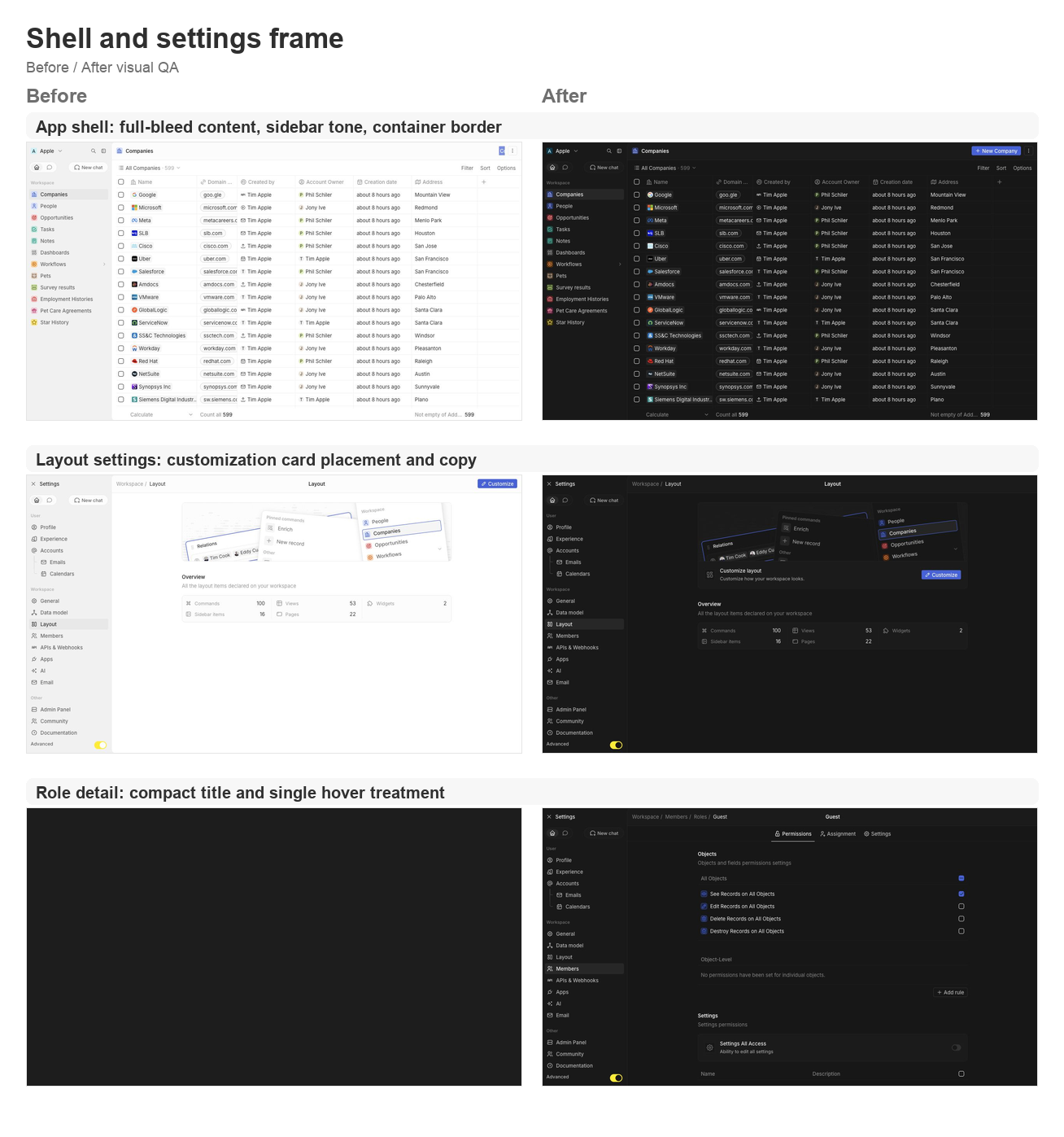
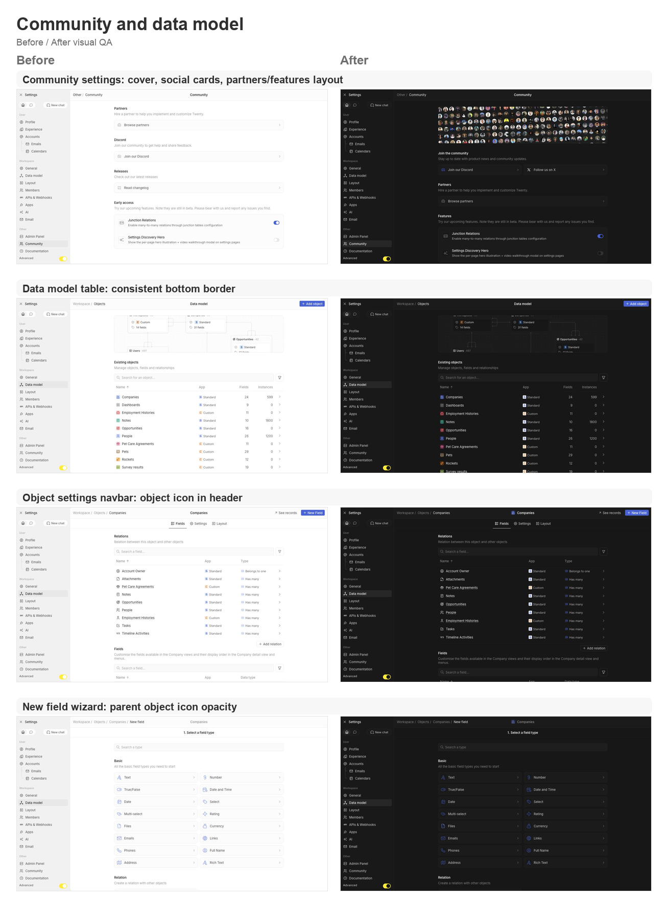
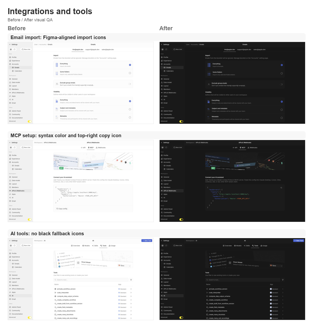
## Summary This PR groups the requested second UI polish pass across the app shell, settings pages, data model, community, AI tools, and developer setup surfaces. ### Shell and navigation polish - Lets the app content card fill the available viewport and removes the bottom-left radius on the main container. - Uses an outside-looking container border treatment so the rounded top-left edge matches the Figma frame without a double border. - Restores the separator between the AI chat side panel and the record container. - Updates navigation drawer background/skeleton tones to use gray/3 consistently. - Simplifies the full-screen backend error fallback so the white screen fills the viewport. ### Settings page polish - Moves the layout customization action from the settings navbar into a settings card under the hero. - Tightens layout page copy now that the customization surfaces are not directly manageable yet. - Aligns role detail title sizing and hover treatment with other settings headers. - Supports settings card brand icon colors, then restores Discord and X brand logos on the Community page. - Adds the Community discovery cover, moves community/social content to the top, and reorganizes Partners and Features. - Keeps setting card subtitle and separator behavior available for the updated settings cards. ### Data model and object settings polish - Adds a shared data-model table body wrapper so object, field, and relation tables all keep the expected bottom border. - Displays the object icon in the object settings navbar. - Shares the new-field wizard parent object icon wrapper and keeps the object icon at 64% opacity in wizard headers. - Updates the new-field type selector icon treatment to match the wizard header opacity behavior. ### Integrations, tools, and API polish - Reworks the MCP setup config card with light syntax coloring and a top-right copy icon button instead of the bottom copy section. - Fixes email import icons to match the Figma asset shape. - Ensures AI tool table icons and chevrons never fall back to black. ## Validation - `npx nx lint:diff-with-main twenty-front` - `npx tsc -p packages/twenty-front/tsconfig.json --noEmit` - `git diff --check` - Manual local visual pass on `apple.localhost:3001` for companies, settings/community, data model, object settings, new-field wizard, layout settings, account import, MCP setup, AI tools, and role detail pages. ## Visual QA ### Shell and settings frame <img width="1308" height="1397" alt="Shell and settings frame before/after board" src="https://raw.githubusercontent.com/twentyhq/twenty/pr-assets/ui-fixes-2/visual-qa/ui-fixes-2/shell-settings-frame.png" /> ### Community and data model <img width="1308" height="1806" alt="Community and data model before/after board" src="https://raw.githubusercontent.com/twentyhq/twenty/pr-assets/ui-fixes-2/visual-qa/ui-fixes-2/community-data-model.png" /> ### Integrations and tools <img width="1308" height="1397" alt="Integrations and tools before/after board" src="https://raw.githubusercontent.com/twentyhq/twenty/pr-assets/ui-fixes-2/visual-qa/ui-fixes-2/integrations-tools.png" /> <!-- This is an auto-generated description by cubic. --> <a href="https://cubic.dev/pr/twentyhq/twenty/pull/21540?utm_source=github" target="_blank" rel="noopener noreferrer" data-no-image-dialog="true"><picture><source media="(prefers-color-scheme: dark)" srcset="https://www.cubic.dev/buttons/review-in-cubic-dark.svg"><source media="(prefers-color-scheme: light)" srcset="https://www.cubic.dev/buttons/review-in-cubic-light.svg"><img alt="Review in cubic" src="https://www.cubic.dev/buttons/review-in-cubic-dark.svg"></picture></a> <!-- End of auto-generated description by cubic. --> |
||
|
Thomas des Francs
|
b14195428a |
Fix navigation and settings UI polish (#21523)
## Summary This PR groups the requested UI polish pass across navigation, settings, AI settings, data model, community/lab, and dashboard chips. ### Navigation and drawer polish - Smooths app/settings route switching with a 300ms content transition. - Smooths app menu/settings menu drawer swaps with a fade transition while preserving the existing drawer dimensions. - Keeps navigation and AI chat history panes mounted to avoid flicker when switching tabs. - Aligns the first app/settings section with the AI chat history section title. - Removes the main app navigation "Other" section. - Aligns the settings exit header with the workspace switcher header. - Sets the settings exit icon gap to 8px, uses the small icon stroke token, and keeps the icon color on text-secondary. - Makes the workspace switcher button 28px high inside its 32px container, moves the dropdown up so the workspace name does not jump, and keeps a 2px gap between header icon buttons. - Moves Settings below Support in the workspace switcher menu. - Pins the Advanced toggle to the bottom of the settings drawer and aligns its right padding with nav items. ### Settings surface polish - Fixes vertically cropped dropdown menu headers. - Makes wizard parent titles tertiary when a nested wizard title is visible. - Places danger-zone buttons side by side. - Uses a 32px Visualize button. - Restores 8px top/bottom padding on settings tables. - Separates AI overview counts into three columns like layout overview. - Adds separators inside setting cards, including the Smart Model / Fast Model card. - Groups lab/early-access toggles into one card with separators and full-width row backgrounds. - Replaces deprecated Enterprise adornment tags with the Organization adornment on gated AI/security/settings surfaces. - Uses the Discord brand icon in Community while keeping the standard icon component rendering pattern. - Tightens Skills/Tools search-to-table spacing so switching tabs does not shake the table top. - Fixes the small gap in nested navigation breadcrumbs between Emails and Calendars. ### Dashboard/data table polish - Fixes vertically cropped "Not shared" chips on dashboards. - Keeps table row/header spacing stable after the settings table padding restoration. ## Validation - `npx nx lint:diff-with-main twenty-front` - `npx tsc -p packages/twenty-front/tsconfig.json --noEmit` - Manual Chrome pass on `apple.localhost:3001` for profile, app navigation, workspace switcher, AI overview/models/skills/tools/usage, community/lab, data model, new-field wizard, and dashboards. ## Visual QA ### Settings surface fixes <img width="1324" height="2668" alt="Settings surface fixes before/after board" src="https://github.com/user-attachments/assets/312131fa-3922-4724-9460-46fd373754d1" /> ### Navigation drawer fixes <img width="1324" height="1816" alt="Navigation drawer fixes before/after board" src="https://github.com/user-attachments/assets/ca0b29e5-e393-46c0-81f7-e6bed2557b59" /> ### Tables, wizards, gates and chips <img width="1324" height="2242" alt="Tables, wizards, gates and chips before/after board" src="https://github.com/user-attachments/assets/5f358240-c31c-4c15-8ca8-04ed761fbf85" /> |
||
|
Charles Bochet
|
869680a5a1 |
fix(deps): esbuild ^0.28.1 floors + vite 7→8 (rolldown) upgrade (#21517)
## What this does Resolves the remaining esbuild security alerts on packages we own, and upgrades the repo to **Vite 8** (which drops esbuild entirely in favour of rolldown/oxc). ### 1. esbuild → `^0.28.1` (security) - Raised the declared `esbuild` floor in `twenty-sdk` and the logic-function common-layer (both were `^0.25.0`, which can only resolve to a vulnerable version). These are our packages, so this is just declaring the patched version — clears Dependabot **#1467** and **#1468**. ### 2. Vite 7 → 8 - Bumped `vite` to `^8` in the 5 packages that declare it, and `@vitejs/plugin-react-swc` to `^4.3.1` (the only plugin that needed a bump for Vite 8; everything else already supports it). - `twenty-front` keeps esbuild minification, so esbuild is now an explicit (patched) devDependency there — Vite 8 no longer ships it. ### Two Vite-8 fallout fixes (bundler internals changed) - **Storybook tests:** added React to `optimizeDeps.include` so Vite's dep optimizer doesn't re-bundle React mid-run and break in-flight imports in browser-mode tests. - **`hex-rgb`:** it's ESM-only and broke rolldown's CJS interop (a default import resolved to the wrong thing under jest). Replaced its one use with a tiny inline hex→rgb parse and dropped the dependency. ## Verified Vite resolves to a single `8.0.16` with no esbuild in its tree. Builds pass on Vite 8/rolldown: `twenty-front` production build, the SDKs, and Storybook; the previously-failing front and storybook test jobs now pass; `yarn install --immutable` is clean. ## Note This doesn't close root alert **#1469** — esbuild is still pulled by other third-party tools (storybook, tsx, lingui, zapier, etc.) that haven't shipped a patched release. The vulnerable code path (esbuild's dev server) isn't used here, so that one is best dismissed as not-affected. |
||
|
Charles Bochet
|
d22fa377e7 |
fix(front): store auth tokenPair in localStorage instead of a cookie (#21507)
## Problem A client hit an AWS S3 `RequestHeaderSectionTooLarge` error (`MaxSizeAllowed 8192`) when opening a `https://<workspace>.twenty.com/verify?loginToken=<JWT>` link — the request to load the `/verify` SPA page is served from S3, which rejects it before the app loads. The dominant cause is the **`tokenPair` cookie**. The auth tokenPair (access + refresh JWTs, ~2–5KB) was persisted in a host-scoped, JS-readable cookie. Nothing server-side ever reads it — the access token is sent to the API via an `Authorization: Bearer` header set in the Apollo auth link (`ExtractJwt.fromAuthHeaderAsBearerToken()` on the backend; no `cookie-parser`). Yet the browser attached that cookie to **every** request to the origin, including static assets and the `/verify` page. Combined with the `loginToken` in the URL, the request header section exceeds S3's 8192-byte limit. ## Fix Move `tokenPair` from cookie storage to **localStorage**, which is never transmitted in request headers. - `tokenPairState` now uses `useLocalStorage` (with `getOnInit: true`). - `getTokenPair` (the synchronous read used by the Apollo auth link) reads from localStorage under the same key. - A one-time migration (`migrateTokenPairCookieToLocalStorage`) runs before React renders: it ports any existing `tokenPair` cookie into localStorage and **deletes the cookie**, so already-authenticated users aren't logged out and the oversized cookie stops being sent. ## Why this is safe **Behavior:** equivalent. The cookie was host-scoped (no `domain` attribute), so it never provided cross-subdomain sharing — cross-workspace auth already re-establishes the token per-origin via the `loginToken`-in-URL → `/verify` handoff. localStorage has identical origin scoping. **Security:** neutral-to-positive. - No XSS protection lost — the cookie was **not** `httpOnly` (it can't be; JS reads it to build the Bearer header), so it was already XSS-exposed exactly like localStorage. - No CSRF surface change — the token was never sent as a cookie credential (no `credentials: 'include'`). - **Reduced exposure** — the token no longer leaks into CDN/proxy/server access logs or request headers, which is the actual bug. - Server-side revocation (`revokedAt`) and the 60-day refresh-token JWT expiry govern validity, so localStorage's lack of auto-expiry is moot. ## Testing - `getTokenPair` unit tests updated to localStorage. - New unit tests for the migration util (port, no-op, no-clobber, error-safety). - `nx test twenty-front` auth + apollo suites: 125 passing. - `lint:diff-with-main` clean; changed files typecheck clean. <!-- This is an auto-generated description by cubic. --> <a href="https://cubic.dev/pr/twentyhq/twenty/pull/21507?utm_source=github" target="_blank" rel="noopener noreferrer" data-no-image-dialog="true"><picture><source media="(prefers-color-scheme: dark)" srcset="https://www.cubic.dev/buttons/review-in-cubic-dark.svg"><source media="(prefers-color-scheme: light)" srcset="https://www.cubic.dev/buttons/review-in-cubic-light.svg"><img alt="Review in cubic" src="https://www.cubic.dev/buttons/review-in-cubic-dark.svg"></picture></a> <!-- End of auto-generated description by cubic. --> |
||
|
Matt Van Horn
|
cb653e4ecc |
feat: inline image thumbnails and legacy-label fallback for FILES field chips (#21294)
## Summary Custom FILES field chips now show an inline image thumbnail for image attachments and fall back to the legacy label when an attachment predates filename storage. This covers two of the UX complaints n2ojim collected in #20942: image files were indistinguishable from other attachments, and older attachments rendered with an empty chip label. The 10-file cap from the same issue already shipped in #20950; the gallery/grid layout and hover-delete affordances are deliberately left for follow-ups per the maintainer's cost notes on the thread. ## Why this matters #20942 is founder-tagged UX feedback on the new custom FILES field: once a record carries more than a couple of attachments, users scan chips visually, and a thumbnail answers "which one is the screenshot" without opening anything. The fallback keeps old records readable instead of showing blank chips. Changes stay inside `FileChip.tsx` and follow the existing file-display patterns; Storybook stories cover both behaviors. ## Testing Added 9 Storybook stories: image attachment (thumbnail), non-image (icon unchanged), missing filename (legacy fallback label), long names, and combinations. Targeted typecheck of the changed files surfaced no errors; the monorepo's CI lint/build covers the rest. Refs #20942 --------- Co-authored-by: Matt Van Horn <455140+mvanhorn@users.noreply.github.com> Co-authored-by: Etienne <45695613+etiennejouan@users.noreply.github.com> |
||
|
Charles Bochet
|
184c4948d6 |
security: strip Node dev headers from images + lingui 5.9.5 (drops vulnerable esbuild) (#21448)
## Context

AWS Inspector flags the `prod-twenty` image (built from current main)
with 16 findings, and Dependabot alert 174 flags esbuild. This PR fixes
the OpenSSL scanner findings and the esbuild CVE. The typeorm bump
(CVE-2025-60542) was **pulled out of this PR** — see "typeorm status"
below.

## Changes

### Strip `/usr/local/include/node` from runtime stages
(`twenty-server`, `twenty-app-dev`)
15 OpenSSL CVEs (June 9 advisory, incl. CRITICAL CVE-2026-34182) are all
detected via **Node's bundled OpenSSL dev headers**: 3 GENERIC
`openssl/openssl` 3.5.6 detections per CVE at
`/usr/local/include/node/openssl/archs/linux-x86_64/{asm,asm_avx2,no-asm}/include/openssl/opensslv.h`.
The headers are only needed by node-gyp and native addons are compiled
in the build stages — nothing compiles at runtime. Dropping them clears
all 45 detection instances and permanently ends this class of finding
(third occurrence: 3.5.5 → 3.5.6 → 3.5.7). None of these CVEs are
reachable through Node (no CMS/PKCS#7 API, `pfx` is operator-supplied,
Node's QUIC uses ngtcp2, ASN.1 issues need ~2GB inputs).

**Follow-up (~June 17, 2026):** the `node` binary itself still
statically links OpenSSL 3.5.6 — invisible to the scanner after this PR
and unreachable in practice, but the real fix is bumping the pinned
`node:24-alpine` digest once the [announced June 17 Node.js security
releases](https://nodejs.org/en/blog/vulnerability/june-2026-security-releases)
ship a 24.x linking OpenSSL ≥ 3.5.7 (verify via
`deps/openssl/openssl/VERSION.dat` on the release tag — 24.16.0 is still
on 3.5.6). A dated TODO sits next to the cleanup in the Dockerfile.

### esbuild dev-server CORS CVE (Dependabot alert 174,
GHSA-67mh-4wv8-2f99)
`@lingui/cli@5.1.2` (pins `esbuild ^0.21.5`) was the last parent
resolving a vulnerable esbuild (≤ 0.24.2 lets any website send requests
to the dev server and read responses). Instead of a resolution override,
this bumps the lockstepped **lingui suite 5.1.2 → 5.9.5** (within-major;
lingui adopted `esbuild ^0.25.1` in 5.4.1), which:

- removes `esbuild@0.21.5` and all its platform packages from the
lockfile with no forced ranges;
- drops the `@lingui/core` lockstep resolution (its comment marked it
droppable on the next coordinated lingui bump — the tree now resolves a
single `@lingui/core@5.9.5`);
- `@lingui/swc-plugin` stays at `^5.11.0` (peers on `@lingui/core: 5`;
its 6.x line targets lingui 6).

**lingui 5.9.5 behavioral fallout handled here:**
- Translation functions now **throw without an active locale** (5.1.2
fell back silently). The global `i18n` singleton that backs server-side
`` t`…` `` calls only had a messages compiler set, never an activated
locale → activate the source locale in `I18nService.loadTranslations()`,
mirrored in the server jest setup (unit tests bypass Nest bootstrap).
- `msg`/`t` placeholders are now strictly typed (reject
`null`/`undefined`/`unknown`) → one server call site and 16 twenty-front
files adapted with minimal nullish-coalescing fixes that preserve
rendering.
- `.po`/compiled-catalog churn from the new extractor/compiler
(reference reordering, sorted keys — verified content-identical on
unchanged `.po` inputs) is intentionally not committed: the scheduled
i18n workflows regenerate those.

## typeorm status (pulled out)

typeorm 0.3.20 → 0.3.26 was originally in this PR but **made workspace
metadata sync intermittently lossy**: `example-app-postcard` failed
twice with a *different* field missing from the synced PostCard object
each run, and one integration shard's `DataSeedWorkspaceCommand` died
with "Could not find flat entity with universal identifier …" — versus
zero such failures on recent main. Local runs (db reset + seed, group-by
integration suite 19/19) pass, so it is a nondeterministic
CI-load-sensitive regression that needs dedicated debugging (typeorm
changed LIMIT/OFFSET 0 semantics, lazy count for `getManyAndCount`,
upsert WHERE construction, and topological-sort internals in that
range). The resolutions comment documents this as the blocker;
CVE-2025-60542 is MySQL-driver-only (`sqlstring`), so Postgres-only
Twenty is not exposed in the meantime.

## Verification

- `npx nx typecheck twenty-server` / `twenty-front` — clean (no cache)
- `npx nx test twenty-server` — full suite green
- `lingui:extract` + `lingui:compile` — clean for twenty-server /
twenty-emails / twenty-front
- `oxfmt --check` — clean for both packages
- Lockfile diff: lingui 5.9.5 entries, `esbuild@0.21.5` +
`@esbuild/*@0.21.5` platform packages removed, no typeorm changes
|
||
|
Félix Malfait
|
adba66caea |
fix(twenty-front): new layout fast-follows — settings drawer, loading & command menu (#21389)
Second batch of new-layout fast-follows (master: twentyhq/core-team-issues#2478). All changes verified live against a running workspace. ## Settings drawer & header - **twentyhq/core-team-issues#2489** — sidebar icons render as plain 16px icons, no background tiles. - **twentyhq/core-team-issues#2488** — Advanced toggle spans the full drawer width; yellow dot removed. - **twentyhq/core-team-issues#2497** — page title stays centered in the settings header (breadcrumb stays left). - **twentyhq/core-team-issues#2490** — Exit Settings control aligned to the workspace switcher (24px, matching padding/gap). - **twentyhq/core-team-issues#2499** — 2px vertical gap restored between collapsible drawer section items. - **twentyhq/core-team-issues#2491** — settings drawer rhythm now matches the main app (28px items, 2px gaps, 28px section headers). - **twentyhq/core-team-issues#2492** — Home/Chat tab switch no longer flickers: both tab subtrees stay mounted (a shared `NavigationDrawerTabbedContent` toggles visibility instead of remounting + flashing the chat skeleton). ## Loading states - **twentyhq/core-team-issues#2486** — metadata loading shows an empty body (no dense skeleton rows). - **twentyhq/core-team-issues#2487** — settings table keeps its layout while loading, with the shimmer localized to the first row's first cell. ## Command menu & navigation - **twentyhq/core-team-issues#2501** — navigation section header height matches the nav item rhythm (28px). - **twentyhq/core-team-issues#2502 (part 1)** — the page side-panel toggle stays as the dots glyph while the command menu is open, instead of morphing into a second close control. ## New-field flow - **twentyhq/core-team-issues#2494** — the new-field stepper moved from a breadcrumb dropdown into a centered secondary wizard bar (back chevron + Save on the configure step); breadcrumb stays clean and the object label is the centered title. ## Descoped (substantive bugs already fixed) - **twentyhq/core-team-issues#2500** — command-menu highlight right gutter: the menu-item base measures full-width, so it's likely a scrollbar gutter on the list, not the shared component. Left for a focused follow-up. - **twentyhq/core-team-issues#2502 part 2** — moving the command-menu close from left to right is cosmetic (the duplicate-control bug is fixed by part 1) and would touch the shared `SidePanelTopBar` used by search/AI panels. ## Verification typecheck (tsgo) + oxlint + oxfmt green for all changed files; each change DOM-measured / screenshotted in the running app. |
||
|
Félix Malfait
|
02aa086866 |
fix(twenty-front): new layout fast-follows (#21360)
Fast-follows for the new layout / flat redesign (master: twentyhq/core-team-issues#2478). ## Changes - **Main navbar 48px** (twentyhq/core-team-issues#2479) — `SIDE_PANEL_TOP_BAR_HEIGHT` 40 → 48, so `PageCardHeader` matches the Figma target. The side panel top bar shares this constant and stays aligned. - **Content panel 12px radius** (twentyhq/core-team-issues#2480) — `PageCardLayout` card gets a full border + 12px radius and an 8px inset (`spacing[2]`) so it floats on the shell instead of square full-bleed. - **Square three-dots button** (twentyhq/core-team-issues#2481) — added a `square` option to `AnimatedButton`; the page-header side-panel toggle now renders a 24×24 square icon button instead of a 32×24 pill. - **Table checkbox sizing** (twentyhq/core-team-issues#2482) — restored `box-sizing: content-box` on the checkbox box. Its border is declared outside the label size, so the global `border-box` reset (#21349) was shrinking it (14px → 12px). Same fix pattern as #21349. - **Tertiary navbar background** (twentyhq/core-team-issues#2483) — left navbar / app shell use `background/tertiary` instead of the noisy surface (`DefaultLayout`, `UserOrMetadataLoader`). - **Skeleton loading** (twentyhq/core-team-issues#2484) — metadata + content loading now match the new layout: tertiary shell, 12px rounded content panel, 48px navbar, sparse bars, empty body (removed the dense full-width rows). Left-panel skeleton bars use `quaternary` so they stay visible on the tertiary shell. ## Verification - typecheck (tsgo) + oxlint + oxfmt pass for all changed files. - Verified live against a running workspace: measured navbar = 48px, three-dots = 24×24, checkbox box-sizing = content-box (14px), card radius = 12px, shell background = tertiary (no noisy image). Content-loading skeleton matches the target. |
||
|
Raphaël Bosi
|
7606dd75a8 |
Fix: pinned command-menu actions run with empty selection (#21366)
## Cause PR #21308 ("generalize the page primary/secondary bars") swapped the old `PageHeader` for the new `PageCardHeader` on the record-index, record-show, and standalone pages. The old header set `data-click-outside-id="page-action-container"` on its action container — an id that the record table/board/calendar click-outside listeners exclude so header clicks don't clear the current selection. The new `PageCardHeader` dropped that attribute. ## Implications With the attribute gone, clicking a pinned command-menu item registered as a click *outside* the table/board, which reset the selected records before the action read them. As a result, pinned actions and workflows triggered from the top bar ran with an empty selection. ## Fix Re-add `data-click-outside-id={PAGE_ACTION_CONTAINER_CLICK_OUTSIDE_ID}` to `PageCardHeader`'s action container. Since all three migrated headers route their buttons through this shared component, the single change covers every affected page. |
||
|
Raphaël Bosi
|
92502efacc |
Restore content-box sizing for components broken by the global border-box reset (#21361)
Since [#21315](https://github.com/twentyhq/twenty/pull/21315), the new twenty-ui's global border-box reset applies app-wide, shrinking legacy content-box components: most visibly, off-center checkboxes. [#21349](https://github.com/twentyhq/twenty/pull/21349) missed a few; this adds box-sizing: content-box to Checkbox, Radio, ColorSample, MenuItemHotKeys, Tag, ImageInput, and OnboardingModalCircularIcon. |
||
|
Félix Malfait
|
8a3e6e645a |
fix(ui): restore content-box sizing for components broken by the global border-box reset (#21349)
## Problem Since the `twenty-ui` → `twenty-ui-deprecated` / `twenty-new-ui` → `twenty-ui` rename (#21315), many deprecated components render with **compacted height** — e.g. dropdown menu items collapse from 32px to 16px, and chips from ~24px to 16px. ## Root cause The new `twenty-ui` (formerly `twenty-new-ui`) ships a global reset in `packages/twenty-ui/src/styles/base/reset.scss`: ```css *, *::before, *::after { box-sizing: border-box; } ``` This is bundled into `twenty-ui/style.css`, which the app imports in `index.tsx`. #21315 did not change the `import 'twenty-ui/style.css'` line, but it changed what `twenty-ui` resolves to (old → new), so this **global `border-box` reset now applies app-wide**. Several deprecated components were authored against the **content box**, e.g. `StyledMenuItemBase`: ```css height: calc(32px - 2 * var(--vertical-padding)); padding: var(--vertical-padding) var(--horizontal-padding); ``` With `content-box` the padding sits *outside* the declared height → 32px total. Under the new `border-box` reset the padding is folded *inside* → 16px total. (`Chip` uses `height: spacing[4]` + outside padding — same failure mode.) Verified in the running app: the collapsed menu item computes `box-sizing: border-box`, matched by the rule `*, ::before, ::after { box-sizing: border-box }`; `height` resolves to `calc(32px - 2 * 8px) = 16px`. ## Fix Add `box-sizing: content-box` to the affected deprecated components. A class selector outranks the universal `*` reset, so this restores their intended sizing **without touching the global reset** (which the new `twenty-ui` components rely on). Affected: `StyledMenuItemBase` (and its hoverable variant), `MenuItemSelect`, `MenuItemSuggestion`, `Chip`. |
||
|
Félix Malfait
|
bfefcd3755 |
feat(twenty-front): generalize the page primary/secondary bars (flat redesign) (#21308)
Replaces #21279 and #21282 with one clean PR from `main`. Generalizes the settings primary-bar / secondary-bar card chrome to the record index, record show and standalone pages via a shared `PageCardLayout` + `PageCardHeader` (the side panel sits as a sibling of the content card), and applies the new flat design direction: square corners on the card, side panel and loading skeletons. Iterating toward the new design (Figma node 102282-221623); the confirmed direction and the explicit "remove rounded corners" change are in, remaining designer specifics to follow. |
||
|
Raphaël Bosi
|
c596a5e342 |
Rename twenty-ui to twenty-ui-deprecated and twenty-new-ui to twenty-ui to prepare package release (#21315)
## Description Promotes the next-gen UI library (formerly `twenty-new-ui`) to the name **`twenty-ui`** (v0.1.0, publishable) and renames the old package to **`twenty-ui-deprecated`**. Rewrites ~1,730 `twenty-ui` imports → `twenty-ui-deprecated`, updates all configs/CI/Docker/deps, and migrates twenty-front's `Toggle` to the new package (first consumer) as a drop-in. ## Next steps - Wire the `ui/v*` publish dispatch (`cd-deploy-tag.yaml` + `.yarnrc.yml`), then tag `ui/v0.1.0` to publish. - Continue migrating components from `twenty-ui-deprecated` → `twenty-ui`. |
||
|
Félix Malfait
|
c3dd6b25a6 |
fix: use canonical oxlint rule id in lint-disable directives (#21253)
## What Many `oxlint-disable` / `eslint-disable` directives across the repo carry a corrupted rule id — `@typescripttypescript/<rule>` — most likely a find-and-replace accident that mangled the eslint-era `@typescript-eslint/` prefix. oxlint matches disable directives **loosely by rule name**, so these still suppress in practice (not a silent no-op), but the id is malformed and misleading. ## Change Replace them with the **canonical oxlint id** `typescript/<rule>` — matching the plugin name and rule keys declared in `.oxlintrc.json` — **127 files, 262 directives**: | rule | count | | --- | ----- | | `typescript/no-explicit-any` | 250 | | `typescript/ban-ts-comment` | 6 | | `typescript/no-misused-promises` | 4 | | `typescript/no-empty-object-type` | 2 | - `twenty-server`: 122 files - `twenty-front`: 5 files Comment-only — no code or runtime changes. ## Verification `oxlint --type-aware -c .oxlintrc.json` reports **0 warnings / 0 errors** for both `twenty-server` and `twenty-front`. Every changed line is exactly the id correction inside a disable directive (262 insertions / 262 deletions, no collateral edits). > Addresses the cubic review, which flagged that the canonical oxlint id is `typescript/...` (no `@`). Worth noting the original `@typescripttypescript/` was not actually a silent no-op — oxlint matches these directives loosely by rule name — but `typescript/` is the correct, config-aligned id. |
||
|
Félix Malfait
|
2ac515894b |
feat(settings): add Logs as a dedicated tab in General settings (#21180)
## What & why The audit-log viewer lived as a full-screen page reachable only via a "View Logs" button buried in the **Security** tab. This surfaces it as the **third tab in General settings** (`General | Security | Logs`), consistent with the other tabs. ## Changes - **Relocated** the event-logs module `pages/settings/security/event-logs/` → `modules/settings/event-logs/` and render it as tab content instead of a `FullScreenContainer` page. Dropped `SettingsPath.EventLogs`, its route, and the fullscreen handling in favor of the `general#logs` hash tab. - **Security tab:** removed the "View Logs" entry; kept the log-retention setting there. - **In-tab gating** (shown to users with the Security permission): Enterprise upgrade card when not entitled, a clear "ClickHouse not configured" placeholder otherwise (derived from client config), and the query is skipped when disabled. Replaces a bespoke error component that string-matched error messages with the shared `SettingsEmptyPlaceholder` / `SettingsEnterpriseFeatureGateCard`. - **Layout:** boxed content column with the table selector + filters grouped in a `Card` and the results table below, matching settings conventions. Kept the existing fixed filters (page/event name, member, period) rather than recreating the record-view filter chips (those are tightly coupled to record/view context). Frontend + `twenty-shared` only — no changes to the log query or data. ## Test plan - [x] `npx nx typecheck twenty-front` and `npx nx lint twenty-front` pass - [x] Settings → General shows three tabs; Logs is the third; breadcrumb stays "Workspace / General" - [x] With Enterprise + ClickHouse: table selector, filters, refresh, and the paginated table work - [x] Non-Enterprise: Enterprise upgrade card shown; no failing query fires - [ ] Enterprise without ClickHouse: shows the "ClickHouse not configured" placeholder - [ ] Security tab still shows the log-retention setting and the "View Logs" button is gone - [ ] A user without the Security permission sees neither the Security nor Logs tab |
||
|
Marie
|
4b15b949f3 |
Provide additional logsobservability to workflow runs (per node) (#21142)
Surfaces per-step "Logs" tabs in the workflow run side panel so users can see what each step actually did (model + tokens + tool calls for AI, console output for serverless functions, request/response for HTTP, recipients/body for Email). <img width="546" height="501" alt="ai_agent_without_websearch" src="https://github.com/user-attachments/assets/c6ca3518-9489-4484-a570-3d0569ff3b03" /> ## Storage - New `stepLogs` JSONB column on the `workflowRun` workspace entity, typed as `Record<string, WorkflowRunStepLog>` (keyed by step id). - Schema lives in `twenty-shared`: `workflowRunStepLogSchema` with a discriminated `details.type` union for `AI_AGENT | CODE | HTTP_REQUEST | EMAIL` — frontends and backends consume the same Zod-inferred type. - Field is added to existing workspaces via a workspace upgrade command (`2-9 add-workflow-run-step-logs-field`); the standard-object metadata declares it for new workspaces. - Writes happen atomically per step in `WorkflowRunStepLogWorkspaceService.setStepLog` using `jsonb_set`. That lets concurrent steps in the same run write their own keys without contending with the existing lock around `workflowRun.state`. - Per-step payload is hard-capped at 256 KB; anything larger is dropped with a `logger.warn`, so a pathological tool call can never bloat a row. See below for more information. ## How logs are produced **Aalmost everything was already being collected; this PR mostly persists and renders it.** - **AI agent** — `AgentAsyncExecutorService` already tracked token usage, model id, native web-search count, and the AI SDK's `steps[]`. We map those into the log via `mapAiStepsToToolCallLogs` (`searchVector` stripped from record outputs, per-call input/output capped at 32/64 KB, max 200 tool calls per step). The only new measurement is a wall-clock `durationMs` taken around `executeAgent`, and we now fold native web-search cost into the displayed `totalCostInDollars` (it was already billed, just not shown). - **Code / serverless function** — reuses the `console.log` output the function runner already returns (`logsByLevel`); `build-code-step-log.util` only repackages it. - **HTTP request** — built from the action's existing input/output via `build-http-request-step-log.util`. No new signals collected. - **Email (send / draft)** — added `sanitizedHtmlBody` + `plainTextBody` to the existing tool outputs (a small additive change), then `build-email-step-log.util` consumes them. No additional AI inference or external calls are made for logging — the cost is a small CPU overhead per step plus the JSONB write. ## Security The log surface intentionally shows whatever the workflow touched, which made redaction and sanitization the main design concern. - **HTTP — secrets in headers**: existing `SENSITIVE_HEADER_NAMES` set (Authorization, Cookie, …) replaced with `[redacted]` in both request and response. - **HTTP — secrets in URLs**: `SENSITIVE_URL_PARAM_NAMES` (e.g. `api_key`, `token`, `access_token`) replaced in the query string via `URL`-based parsing. - **HTTP — secrets in bodies**: `SENSITIVE_BODY_KEY_REGEX` deep-walks JSON request/response bodies (object input or stringified JSON) and redacts matching keys. Applied to the `error` field too, since transport-layer errors sometimes embed structured payloads. - **Email — XSS risk in body preview**: tool outputs now expose a server-side `sanitizedHtmlBody`; the log builder prefers it over the raw user-authored `input.body`, with `plainTextBody` as a second fallback. The original raw body is only used if sanitization didn't happen (e.g. tool failed before composing). - **AI — internal/noisy data**: `searchVector` (Postgres tsvector strings) is stripped from record outputs returned by Twenty tools to avoid leaking internal full-text-search payloads. - **DB bloat / runaway agents**: 256 KB per-step cap + 32 KB / 64 KB per-tool-call input/output cap + 200 tool calls per step. <img width="547" height="307" alt="logic_function" src="https://github.com/user-attachments/assets/dd4a3d16-67f2-434b-95b3-bdcaf9ed053d" /> ## More details on Log size & truncation Logs are stored in `workflowRun.stepLogs` (JSONB), keyed by `stepId`. ### Per-step cap Each step's log is hard-capped at **256 KB** (`MAX_STEP_LOG_BYTES` in `WorkflowRunStepLogWorkspaceService.setStepLog`). For ~99% of workflows this is roomy — typical real-world sizes: - Code / serverless function: 1–20 KB - HTTP request: 5–70 KB - Email: 5–30 KB - AI agent (a handful of tool calls): 5–50 KB ### Two layers of bounding 1. **Per-field truncation** in each builder (before writing): - **Code**: ≤ 500 entries, ≤ 4 KB per message, ≤ 8 KB stack trace - **HTTP**: ≤ 32 KB per body (request + response), UTF-8 byte-aware - **Email**: ≤ 8 KB body preview, UTF-8 byte-aware - **AI agent**: ≤ 32 KB tool input, ≤ 64 KB tool output, ≤ 200 tool calls/step 2. **Global per-step safety net** at write time: if the assembled `stepLog` still exceeds 256 KB, the write is **dropped entirely** with a `logger.warn`. The workflow itself keeps running unaffected. ### What this means in practice - **Safe**: workflow execution, step results, downstream steps — never blocked by log size. - **Safe**: iterators (each iteration overwrites the previous log for that `stepId`, so they can't accumulate). - **Safe**: step retries (same `stepId` is overwritten, not appended). - **Possible**: an AI agent step with many large tool outputs (e.g., 50+ heavy `web_search` calls) can exceed 256 KB → the **entire** step's log is dropped, side panel shows "No logs were recorded for this step". The user has no explicit signal that the log was dropped due to size (only server-side warn). - **Possible** (theoretical): a workflow with hundreds of distinct steps could push the row toward Postgres's internal ~256 MB jsonb limit. Beyond that, individual `jsonb_set` writes would error and be swallowed by the action's try/catch — workflow still completes. ### Possible future hardening (not in this PR) - Replace "drop entire log" with a stub that preserves the summary card (cost, duration, status) and marks `truncated.reason = 'size_cap'`. - Surface size-drops in the UI (similar to the existing `<StyledTruncatedNotice>`). - Emit a metric so dropped logs are observable in dashboards. |
||
|
Félix Malfait
|
431f6ae98f |
feat(settings): move settings chrome into a single rounded card (#21131)
## What Replaces `SubMenuTopBarContainer` with a settings-specific `SettingsPageLayout` that puts the whole page chrome — breadcrumb, centered title, actions, an optional secondary bar (tabs or wizard step), and the 760px body — inside **one rounded card**, with `SidePanelForDesktop` as a sibling. Title, tabs and body content share one centered vertical axis at every card width. Supersedes #21122. One PR, no feature flag. ## New components (`@/settings/components/layout/`) - **SettingsPageLayout** — owns the rounded card + side-panel sibling, `useCommandMenuHotKeys`, mobile command menu - **SettingsPageHeader** — breadcrumb · centered title · actions in a symmetric `1fr auto 1fr` grid (symmetric padding throughout) - **SettingsSecondaryBar** — the secondary row, bracketed by top + bottom borders - **SettingsTabBar** — centered tabs reusing `activeTabIdComponentState` + `TabListFromUrlOptionalEffect` for URL-hash sync (does not touch the shared `TabList`) - **SettingsWizardStepBar** — back arrow · "N. Label" · optional trailing slot ## Migrations - Bulk rename across ~80 call sites (`SubMenuTopBarContainer` → `SettingsPageLayout`); old component deleted. - 5 tab pages (AI, APIs & Webhooks, Applications, Members, Role) + the Data Model object-detail page render their tabs in `secondaryBar` (object-detail keeps "See records" / "New Field" in the header actions). - The 2 role object-level steps render the wizard step bar with working back navigation. - Accounts consolidated into **General / Emails / Calendars** tabs; standalone `SettingsAccountsEmails` / `SettingsAccountsCalendars` pages + routes + stories removed. `SettingsPath.AccountsEmails` / `AccountsCalendars` now resolve to `accounts#emails` / `accounts#calendars`, so existing `getSettingsPath()` links deep-link to the right tab via the existing hash sync — no call-site changes. ## Verification - `nx typecheck twenty-front` and `nx lint twenty-front` both clean. - Browser (logged-in workspace): title / tab / body / card centers align on a single axis at multiple widths — width-invariant, so alignment holds when the AI side panel (a sibling) shrinks the card. Rounded card with even gaps on all four sides; tab row bracketed by two 1px lines; no-tab pages render header → body with no lines; wizard back navigation works; `…/accounts#emails` opens the Emails tab. The shared `PageHeader` and `TabList` are untouched. The settings side panel itself isn't wired to open yet — that's a follow-up PR. |
||
|
Félix Malfait
|
75df1f3997 |
chore(settings): address review comments from PR 21072 (#21121)
## Summary Round through bosiraphael's 31 review threads on the merged PR #21072 (discovery hero + ephemeral playground token). The user asked to apply each suggestion only where it adds value, so this PR is split into three buckets. ### Comments (~17 threads) - Tightened security-rationale / CSS-gotcha / API-doc comments to one or two factual lines - Kept (shortened) the comments above `RequireAccessTokenGuard` call sites — without them a future reader could remove the guard and silently reopen the escalation hole - Kept (shortened) the in-memory-only rationale on `playgroundApiKeyState` for the same reason - Kept `flex: 1 + min-height: 0` CSS gotcha on `SubMenuTopBarContainer` — non-obvious and easy to break ### Structure / extraction - Move `WEBHOOK_TABLE_ROW_GRID_TEMPLATE_COLUMNS` to its own constants file (one-export-per-file) - Split `SettingsAgentToolsTab` and `SettingsAgentToolsTable` across queries/, hooks/, types/, utils/: - `graphql/queries/findManyApplicationsForToolTable.ts` - `graphql/queries/findManyMarketplaceAppsForToolTable.ts` - `hooks/useSettingsAgentToolsTable.ts` (data loading + index merging) - `types/SettingsAgentToolItem|Application|MarketplaceApp` - `utils/getToolApplicationId|getToolLink` - Extract `SettingsAiModelsTab` optimistic mutations into `hooks/useSettingsAiModelsActions` (handleModelFieldChange, handleUseRecommendedToggle, handleModelToggle, handleToggleAllVisibleModels) - Extract `SettingsAI.handleCreateTool` into `hooks/useCreateTool` - Drop unnecessary `useMemo` wrappers on `heroTabs` arrays (SettingsObjects, SettingsLayout) - Simplify `MenuItemToggle` handler in SettingsAgentSkillsTab: `onToggleChange={setShowDeactivated}` (no longer wrapping with arrow + read of stale `!showDeactivated`) ### Hero assets - Replace placeholder `customize-illustration` with per-page exports - Rename `layout/customize-illustration-{light,dark}.png` → `layout/cover-{light,dark}.png` - Add `cover-{light,dark}.png` for **applications** and **members** (they were both pointing at the layout placeholder as a TODO) - Overwrite `data-model/cover-*.png`, `playground/cover-*.png`, `ai/ai-tools-cover-*.png` with the new exports ## Test plan - [ ] `npx nx typecheck twenty-front` ✅ - [ ] `npx nx typecheck twenty-server` ✅ - [ ] `npx nx lint twenty-front` ✅ (oxlint + oxfmt, 0 warnings/errors) - [ ] `/settings/layout`, `/settings/data-model`, `/settings/applications`, `/settings/ai`, `/settings/api-webhooks`, `/settings/members` each render the new hero illustration (light + dark) - [ ] AI tab: tool list still loads, search + Custom/Managed/Standard filters still work, "New Tool" still navigates to detail - [ ] AI tab: Models tab — smart/fast model select, "Use best models only" toggle, per-model checkboxes, toggle-all all still optimistic+revert on error - [ ] Skills tab: "Deactivated" toggle still flips show/hide - [ ] Webhooks table still uses the 1fr 28px grid |
||
|
Félix Malfait
|
b338a7a1d2 |
feat(settings): discovery hero rollout + ephemeral playground token (#21072)
## Summary

Two intertwined streams of work:

### UI — discovery hero pattern, settings shell, AI/API redesign
- **Generalize `SettingsDiscoveryHeroCard`** and use it on Layout, Data
Model, Apps, AI, API/Webhooks, Members. Drops 4 per-page wrapper files
(`SettingsObjectCoverImage`, `SettingsLayoutCoverImage`,
`SettingsLayoutCustomizeVideoModal`,
`SettingsDataModelVisualizeVideoModal`). Each page now supplies cover
src, modal id, and tab list.
- **Modal**: swap `<video>` placeholder for the Vimeo iframe pattern
from `twenty-docs`, per-tab `vimeoId`. Drop the parallel border-bottom
on the header (TabList draws its own baseline) and the grey background
behind the video. Note: Vimeo's embed allowlist applies — the iframes
load with the correct URL on `localhost` but the player itself requires
the video owner to allow the dev/staging domains in Vimeo settings.
- **AI page** rebuilt into a Cockpit pattern (Overview / Models / Skills
/ Tools / Usage). New `SettingsAiOverviewTab` with default Smart/Fast
pickers, at-a-glance stats, and an MCP signpost that deep-links to
`/settings/api-webhooks#mcp`. System Prompt link moved under Models.
Advanced tab removed.
- **API & Webhooks** now has 4 tabs (Playground / MCP / API Keys /
Webhooks). Hero card above tabs. Playground tab inverted to "Core API" /
"Metadata API" sections, each containing REST + GraphQL cards — schema
is the meaningful axis, protocol is secondary. Hash deep-link sync
delegated to the shared `TabListFromUrlOptionalEffect`.
- **Settings shell**: unified drawer outer padding (kill `isSettings`
branch), extract `CollapsibleNavigationDrawerSection`, add `iconColor`
on settings nav items, fix Exit Settings button alignment, 880px content
cap.

### Backend — strategy C: ephemeral playground token
The legacy paste-your-API-key flow is replaced by an on-demand
short-lived token scoped to the calling user's permissions. No shared
"Playground" API key to manage or revoke.

- New `JwtTokenTypeEnum.PLAYGROUND`. `PlaygroundTokenJwtPayload =
Omit<AccessTokenJwtPayload, 'type' | impersonation fields>` so any
future ACCESS claim flows through automatically.
- `AccessTokenService.generatePlaygroundToken` signs an access-shaped
JWT with `type: PLAYGROUND` and a configurable short TTL. A shared
private `resolveTokenSubject` helper parallelizes the user / workspace /
userWorkspace lookups for both generators.
- `JwtAuthStrategy.validateAccessToken` widened to accept
`AccessTokenJwtPayload | PlaygroundTokenJwtPayload`; impersonation gated
on `payload.type === ACCESS` so the union narrows without `as unknown
as` casts. The two branches in `validate()` collapse into one.
- New `PLAYGROUND_TOKEN_EXPIRES_IN` config var (default `2h`).
- New `generatePlaygroundToken` mutation (`WorkspaceAuthGuard`, no args,
returns `AuthToken`).
- Frontend `useOpenPlayground` hook centralizes mint → atom write →
navigate, with Apollo `onError` snackbar and a "use cached PLAYGROUND
token if still fresh" short-circuit (decodes via `jwt-decode`, checks
both `type` AND `exp`). Old API_KEY tokens left in localStorage from the
prior paste-form flow are rejected on `type` alone and force a re-mint —
this is what was causing the "This API Key is revoked" symptom on stale
browsers.

### Drive-by cleanups
- `PlaygroundToken` DTO removed (identical shape to `AuthToken` already
in use).
- 5 `customize-sidebar.webm` imports and the dead placeholder pipeline
removed.

## Test plan

### Discovery hero
- [ ] `/settings/layout`, `/settings/data-model`,
`/settings/applications`, `/settings/ai`, `/settings/api-webhooks`,
`/settings/members` each render the discovery hero card with its
illustration + play button + tabbed modal
- [ ] Modal tabs show the correct Vimeo embed URL per tab; aspect ratio
stays at 1440/900; no parallel border-bottom jog at the tab baseline
- [ ] AI Overview tab shows Smart/Fast model pickers + stats grid + MCP
signpost card; the MCP card lands on `/settings/api-webhooks#mcp` with
the MCP tab active

### API playground (ephemeral token)
- [ ] With an empty `playgroundApiKeyState` in localStorage, clicking
REST or GraphQL playground card opens the playground and the cached
token has `type: "PLAYGROUND"` with ~2h exp
- [ ] Clicking the card again within the freshness window does **not**
re-mint (`iat` / fingerprint stable across visits)
- [ ] Planting a fake API_KEY-shaped JWT in localStorage and clicking
the card forces a fresh mint (old token rejected on `type`)
- [ ] `GET /rest/companies?limit=1` with the cached token returns 200 +
real data
- [ ] `POST /graphql { __typename }` returns 200

### Settings shell
- [ ] Settings nav matches main app drawer padding; sections collapse;
Exit Settings button aligns with the workspace links above
- [ ] Active nav items have a right-gap (cleaner active state)
- [ ] Content area capped at 880px

### Verify
- [ ] `npx nx typecheck twenty-front` passes
- [ ] `npx nx typecheck twenty-server` passes
- [ ] `npx nx lint:diff-with-main twenty-front` passes
- [ ] `npx nx lint:diff-with-main twenty-server` passes
|
||
|
nitin
|
5ff8c3b219 |
revert(navigation-drawer): unwanted desktop design changes from #20634 (#20955)
Follow-up to #20634. Removes three desktop design changes that bled in unintentionally: - `font-weight: regular` → restored to `medium` on nav item labels - `MenuItemIconBoxContainer` wrap around bare icons → removed - Section title `padding-right/top` tweak → restored to original values Mobile-specific fixes from #20634 (slide-over drawer width, min-width overflow fixes, breadcrumb cleanup, etc.) are preserved. |
||
|
fujiwara
|
951ead5a1e |
fix(front): ignore IME composition Enter in input hotkeys (#20958)
## What Pressing Enter to confirm an IME (CJK) composition no longer submits the input. The Enter / Escape / Tab handlers now ignore key events fired while a composition is in progress (`isComposing`, or the legacy `keyCode === 229`). Fixes #20954 ## Why `isComposing` was not checked anywhere in `twenty-front`, so the Enter that confirms a Japanese / Chinese / Korean conversion was also consumed as a submit / escape / tab hotkey — making it very hard to type CJK text into any input that submits on Enter. ## Changes - `useHotkeysOnFocusedElement` — central guard; covers every input wired through `useRegisterInputEvents` (~13 components) and all hotkeys routed through this hook. - Direct `onKeyDown` Enter handlers: `CreateWorkspace`, `SettingsDevelopersApiKeysNew`, `SettingsAccountsBlocklistInput`. ## Notes - No effect on non-IME (Latin) typing — `isComposing` is only true during an active composition. It also improves accented / dead-key input on Latin layouts. - `react-hotkeys-hook@4` does not handle IME composition on its own, so the guard is explicit. ## Testing Manually verified with a Japanese IME on Chrome (macOS) against the v2.8.3 self-hosted image: romaji + Enter now only confirms the conversion; a second Enter on committed text submits as expected. The GIF in #20954 shows the original buggy behavior. Co-authored-by: Claude Opus 4.7 <noreply@anthropic.com> |
||
|
martmull
|
a051490ec9 |
Basic app logo fixes (#20919)
as title, took the quick win fixes from https://github.com/twentyhq/twenty/pull/20909/changes#diff-3367344412b2f44f0273d8019c1bc36396198244b9558d02921b135f62522baaR180 and leave the main fix for later as it requires an architectural update |
||
|
Thomas des Francs
|
015dca95fc |
Edit actor chip icon style & read-only behavior (#18552)
https://github.com/user-attachments/assets/925f4380-e3e2-430d-a8e3-7e1242298900 Removed background color from icons for consistency Removed chip hover state as chips are not navigable Updated read-only design (text/secondary on chip hover) --------- Co-authored-by: Félix Malfait <felix@twenty.com> |
||
|
Félix Malfait
|
d602f35cbd |
feat(data-model): custom-indexes management UI and mutations (#20846)
## Summary

Brings indexes management into the per-object Settings tab as a section
under Search (no feature flag, advanced mode only). Admins can create /
delete non-unique indexes with the UI; apps can declare indexes in code
with `defineIndex`. Composite-typed fields are now indexable by picking
a specific sub-column (e.g. `Address > City`).

A few related polish items also land here (invite-user dropdown lands on
the Invite tab; standard warning callout above the new-index form).

## What ships

### UI — custom indexes on per-object Settings
- New section directly under Search, wrapped in
`AdvancedSettingsWrapper`.
- Filter dropdown on the search bar toggles system-index visibility
(shown by default since advanced mode).
- **+ Add Index** button (disabled with tooltip once the per-object cap
is reached) navigates to a dedicated `SettingsObjectNewIndex` page
(matches the field-creation pattern, not a modal):
- Field picker mirrors the webhook event-form layout (rows of dropdowns,
implicit trailing empty row).
- Composite fields surface their sub-properties (`Address > City`,
`Currency > Amount`, …).
  - BTREE / GIN type selector.
- Standard warning Callout: "Use indexes sparingly — each one speeds
reads but slows writes."
- Trash icon on `isCustom: true` rows → confirmation modal →
`deleteOneIndex`.

### Server — `createOneIndex` / `deleteOneIndex` mutations
- Gated by `SettingsPermissionGuard(DATA_MODEL)`.
- `IndexMetadataService` wraps the existing migration runner via
`WorkspaceMigrationValidateBuildAndRunService` so the metadata row and
the SQL index land atomically.
- Validation: rejects empty fields, duplicate `(fieldMetadataId,
subFieldName)` pairs, fields not on the object, requires `subFieldName`
for composite parents, forbids `subFieldName` on scalar/relation,
enforces `MAX_CUSTOM_INDEXES_PER_OBJECT = 10`.
- Delete refuses on `isCustom: false` rows so system indexes can't be
removed via this API.
- Dedicated GraphQL exception handler maps each typed error to the right
transport error class.

### Composite sub-field indexing
- Adds `subFieldName: string | null` column to
`IndexFieldMetadataEntity` (fast instance command).
- The flat-entity flow (`UniversalFlatIndexFieldMetadata`,
`FlatIndexFieldMetadata`, `from-universal-flat-index-to-flat-index`,
runner column resolution) all carry `subFieldName` through.
- For composite parents, the runner uses
`computeCompositeColumnName({...}, property)` for the picked sub-column;
for non-composite parents, behavior is unchanged.
- The `'::'` separator encodes `(fieldMetadataId, subFieldName)` for
dedup on the wire; the frontend uses the same separator inside the
Select component's string value.

### Apps can declare indexes in code (`defineIndex`)
- New `IndexManifest` + `IndexFieldManifest` types in
`twenty-shared/application` wired into the `Manifest` type.
- `defineIndex` SDK helper + `IndexConfig`. CLI manifest builder +
extractor recognize `defineIndex` / `ManifestEntityKey.Indexes`.
- Server: `from-index-manifest-to-universal-flat-index` converter
resolves field IDs, validates composite/scalar `subFieldName` rules, and
delegates to `generateFlatIndexMetadataWithNameOrThrow` for the
deterministic name.
- Orchestrator wires the loop after the field-resolution pass;
per-object cap enforced inline against the manifest.
- Cascade on uninstall is automatic — when an app disappears its indexes
drop with it (universal-flat-entity diff handles it).
- Rich-app fixture ships a real `defineIndex` on `PostCard.status`,
exercising the full manifest → install path in CI.

### Closed for now (open later if needed)
- Apps cannot declare `isUnique` indexes — unique constraints stay with
the field-creation flow.
- Apps cannot use a partial-`indexWhereClause` — the UI surface keeps
the framework's hardcoded allowlist.
- UI cannot create unique or partial indexes either; same reasons.

### Cleanups along the way
- Reused the existing `getCompositeSubFieldLabel` +
`COMPOSITE_FIELD_SUB_FIELD_LABELS` (deleted the duplicates I'd created
early in the PR).
- Moved `MAX_CUSTOM_INDEXES_PER_OBJECT` to `twenty-shared/constants`
(single source for FE + BE).
- Replaced inline `isDefined(x) && x !== ''` with `isNonEmptyString`
(from `@sniptt/guards`).
- Hoisted the per-object fields Map + inlined the cap counter into the
indexes orchestrator loop (drops the install scan from O(indexes ×
totalFields) to O(totalFields + indexes)).
- Per design-feedback: page-based create flow (not a modal), filter
dropdown on the SearchInput (not a separate toggle), webhook-style
picker, field icons.

### Unrelated polish that lands here
- "Invite user" link in the multi-workspace dropdown now lands on the
Invite tab directly (`#invite`) instead of the first tab of the members
page.

## Test plan
- [ ] `npx nx typecheck twenty-server / twenty-front / twenty-sdk /
twenty-shared` — passes
- [ ] `npx nx lint:diff-with-main twenty-server / twenty-front` — clean
- [ ] `npx jest index-metadata.service.spec` — green
- [ ] `npx jest from-index-manifest-to-universal-flat-index` — green
(new converter spec, 8 cases)
- [ ] `npx vitest run
src/sdk/define/indexes/__tests__/define-index.spec.ts` (twenty-sdk) —
green (6 cases)
- [ ] `npx vitest run --config vitest.integration.config.ts -t
"rich-app"` — green (rich-app app-dev integration exercises the new
manifest path with the PostCard.status index)
- [ ] Advanced mode → Settings → any object → Settings tab → Indexes
section is visible under Search
- [ ] Create a single-field BTREE index, confirm SQL index exists
(verify via `pg_indexes`)
- [ ] Create a composite-field index (`Address > City`) and confirm the
column is `addressAddressCity`
- [ ] Create an index spanning two columns; column order matches the
picker order
- [ ] Attempt to create an 11th custom index → button is disabled with
tooltip
- [ ] Delete a custom index → confirmation modal → row disappears, PG
index dropped
- [ ] System indexes have no trash icon and are hidden by default
|
||
|
Thomas des Francs
|
c721fa8502 |
Add editor mode for text field widgets (#20779)
## Summary Tested ↓ <img width="3456" height="1990" alt="CleanShot 2026-05-20 at 21 14 04@2x" src="https://github.com/user-attachments/assets/b4e0d3d3-715f-4ad7-bd03-e8e1922b3c6c" /> - Enable `FieldDisplayMode.EDITOR` for plain `TEXT` field widgets while keeping `FIELD` as the default display mode. - Add a plain multiline text editor renderer for `TEXT + EDITOR` field widgets with optimistic record-store/cache updates and debounced persistence. - Reuse the shared `TextArea` component through a transparent, uncapped variant so the editor has no input chrome and lets the widget grow. - Add unit coverage for text display-mode config and a Storybook scenario for a text field widget in editor mode. ## useEffect cleanup note `FieldWidgetTextEditor` flushes the debounced persist callback in a `useEffect` cleanup: ```ts useEffect(() => () => persistTextDebounced.flush(), [persistTextDebounced]); ``` This follows the existing debounced autosave cleanup pattern already used in `WorkflowEditActionHttpRequest`. It ensures pending text changes are persisted when the widget unmounts, while `onBlur` still flushes immediately for normal editor exits. ## Validation - `npx nx test twenty-front --testPathPattern=page-layout` - `npx nx typecheck twenty-front` - `npx nx lint twenty-front` - Browser check on `http://apple.localhost:3001/object/company/20202020-a305-41e7-8c72-ba44072a4c58` for transparent textarea, no internal max-height/scroll, equal padding, and widget growth. Note: lint passes with two unrelated existing warnings in `NavigationDrawerItem.tsx` and `ConfigVariableEdit.tsx`. --------- Co-authored-by: Charles Bochet <charles@twenty.com> |
||
|
nitin
|
4ba9c0ca0b |
[Navigation Drawer] Multiple fixes in settings and app drawer (#20634)
closes - https://discord.com/channels/1130383047699738754/1487720717192527942 https://github.com/user-attachments/assets/6db2df8b-be01-4b5f-a958-575d87b41559 ~~waiting on @Bonapara 's feedback!~~ |
||
|
Shubham Singh
|
45ac3e8218 |
fix(front): align currency icon vertically with amount text (#20646)
## Summary - Replaced inline `<span>` wrapping the currency icon with a Linaria styled component using `display: flex` and `align-items: center` - The icon was misaligned with the amount text in table views and settings because the inline span didn't vertically center the SVG icon ## Changes - `packages/twenty-front/src/modules/ui/field/display/components/CurrencyDisplay.tsx` Fixes #20640 |
||
|
Etienne
|
695a374efd |
fix - nav drawer expansion (#20545)
[PR](https://github.com/twentyhq/twenty/pull/20505), I merge, does not fix the whole issue Closes https://github.com/twentyhq/twenty/issues/20502 |
||
|
gusfromspace
|
068fc9363d |
fix(navigation): settings drawer should never appear collapsed (#20505)
## Summary Fixes #20502 /claim #20502 The navigation drawer's collapsed state is persisted to \`localStorage\` via \`isNavigationDrawerExpandedState\`. When a user collapses the drawer in the main app and then opens settings via a **direct URL, refresh, or new tab**, the settings layout renders in collapsed mode — no \`useOpenSettingsMenu\` call is made in those paths to force expansion. \`StyledAnimatedContainer\` (which controls the outer drawer width) used raw \`isNavigationDrawerExpanded\` with no settings-route override. Inner components (\`NavigationDrawerItemsCollapsableContainer\`) already guard with \`isExpanded = isNavigationDrawerExpanded || isSettingsPage\` — the outer container simply needed the same treatment. **Fix:** derive \`isExpanded = isSettingsDrawer || isNavigationDrawerExpanded\` using the already-in-scope \`useIsSettingsDrawer()\` result and pass it to both \`StyledAnimatedContainer\` and \`StyledContainer\`. 1 derived variable, 2 prop changes, no new hooks or state. **Changed files:** - \`packages/twenty-front/src/modules/ui/navigation/navigation-drawer/components/NavigationDrawer.tsx\` ## Test plan Verified via code review and CI. The fix is structurally identical to the existing \`isSettingsPage\` guard already used in \`NavigationDrawerItemsCollapsableContainer\` — the outer container simply lacked the same treatment. No new hooks, no side effects, no state mutations. Manual UI verification (collapse → navigate to settings → confirm expanded) was not performed against a running instance. If the maintainers want to verify, the logic path is the same as the inner component guard that already ships in production. > **Note (2026-05-12):** PR #20508 was submitted after this PR with a \`useEffect\`-based approach. That approach has already received a review comment from a team member noting that \`useEffect\` should be a last resort per the project's own React guidelines. This fix uses no effects or imperative state — only a derived variable. --- > [!NOTE] > **AI-Assisted Contribution** > This patch was generated by [Mesopredator](https://github.com/GusFromSpace), an autonomous code intelligence system. > Static analysis located the bug, the fix was written and verified with \`tsc --noEmit\` + \`node\` test suite, and reviewed by a human before submission. > Please treat this as a community contribution and request changes if needed. |
||
|
Félix Malfait
|
4da8878697 |
feat: add email forwarding message channel (#19535)
## Summary - Add email forwarding as a new message channel type, allowing users to forward emails from addresses like `support@mycompany.com` into Twenty - Inbound emails arrive via S3 (SES → S3 bucket), are polled by a cron job, parsed, routed to the correct workspace/channel, and persisted as messages - Dedicated settings page at `/settings/accounts/new-email-forwarding` where users provide their source email handle and receive a unique forwarding address - Forwarding channels bypass the IMAP/mailbox sync state machine — they skip cron-driven sync, relaunch, and message-list-fetch lifecycle stages - Forwarding address section shown at the top of the Emails settings page so users can find/copy their addresses after initial setup - Tab names for forwarding channels display the user-provided handle (e.g. `support@mycompany.com`) instead of the internal routing address - Shared utilities extracted from IMAP driver: `extractThreadId`, `extractParticipants`, `extractAddresses` to avoid code duplication - Uses the existing S3 bucket (STORAGE_S3_*) with `inbound-email/` prefix — no separate bucket needed - Feature gated behind `isEmailForwardingEnabled` client config (requires `INBOUND_EMAIL_DOMAIN` + S3 storage) ## New backend modules - `InboundEmailS3ClientProvider` — lazy-initialized S3 client using existing storage config - `InboundEmailStorageService` — S3 operations (get, move to processed/unmatched/failed) - `InboundEmailParserService` — RFC 822 parsing via `postal-mime`, builds `MessageWithParticipants` - `InboundEmailImportService` — orchestrates download → parse → route → persist → archive - `MessagingInboundEmailPollCronJob` — polls S3 `incoming/` prefix, enqueues import jobs - `CreateEmailForwardingChannelInput` DTO — accepts user-provided `handle` ## New frontend components - `SettingsAccountsNewEmailForwardingChannel` — dedicated page with handle input form + forwarding address result - `SettingsAccountsEmailForwardingSection` — forwarding address list on the Emails settings page - `useConnectedAccountHandleMap` — shared hook for account ID → handle lookup - `useCreateEmailForwardingChannel` — mutation hook accepting handle parameter ## Test plan - [x] 17 unit tests for inbound email import service (all outcomes: imported, unmatched, loop_dropped, unconfigured, parse_failed, persist_failed) - [x] 16 tests for `computeSyncStatus` including EMAIL_FORWARDING cases - [x] 11 tests for `extractEnvelopeRecipient` utility - [x] TypeScript typechecks pass for both twenty-server and twenty-front - [x] Lint passes for both packages - [ ] Manual: create forwarding channel, verify forwarding address generated - [ ] Manual: send email to forwarding address, verify it appears in Twenty https://claude.ai/code/session_01KpyF6p4cUEnuaT4h8DP5Pm --------- Co-authored-by: Claude <noreply@anthropic.com> Co-authored-by: Copilot Autofix powered by AI <223894421+github-code-quality[bot]@users.noreply.github.com> Co-authored-by: claude[bot] <41898282+claude[bot]@users.noreply.github.com> Co-authored-by: neo773 <62795688+neo773@users.noreply.github.com> Co-authored-by: neo773 <neo773@protonmail.com> |
||
|
Charles Bochet
|
ee6c0ef904 |
Replace sign-in mocked metadata with hardcoded BackgroundMock (#20308)
## Summary When the user is logged out, we render the auth modal on top of a sample table to make the empty page feel alive. So far this was achieved by **loading a full set of mocked object / field / view / navigation-menu metadata into the runtime metadata store** and then mounting the real `RecordTable` and `AppNavigationDrawer` behind the modal. This had a few downsides: - Significant bundle weight pulled in for unauthenticated users (mocked GraphQL fixtures + the real `RecordTable` virtualization stack). - Plenty of code paths that had to know about the "showAuthModal" case (`useRecordIndexTableQuery`, `useTriggerInitialRecordTableDataLoad`, `MainContextStoreProvider`, `IsMinimalMetadataReadyEffect`...). - Any change to metadata-store internals or to the record-table runtime risked breaking the logged-out background. This PR replaces the entire flow with a small, self-contained `BackgroundMock` component tree that **does not consume any metadata** and **does not load any mocked metadata at runtime**. ### What changed - New module under `sign-in-background-mock`: - `BackgroundMockPage` + `BackgroundMockViewBar` + `BackgroundMockTable` + `BackgroundMockTableRow` render a hardcoded "Companies" table that visually mirrors the real one. - `BackgroundMockNavigationDrawer` renders a hardcoded sidebar with People / Companies / Opportunities / Tasks / Notes (with their standard colors). - Hardcoded constants in `BackgroundMockCompanies.ts`, `BackgroundMockColumns.ts`, `BackgroundMockNavigationItems.ts`. - `MinimalMetadataLoadEffect` no longer calls `loadMockedMetadataAtomic` for unauthenticated users — it just doesn't load anything. - `IsMinimalMetadataReadyEffect` now reports ready immediately when there is no access token pair, so the skeleton loader doesn't hang waiting for metadata that will never come. - `MainContextStoreProvider`, `useRecordIndexTableQuery`, and `useTriggerInitialRecordTableDataLoad` drop their `showAuthModal` branches — the real `RecordTable` is no longer mounted behind the modal. - `DefaultLayout` and `NotFound` now lazily load `BackgroundMockPage` / `BackgroundMockNavigationDrawer` instead of the deleted `SignInBackgroundMockPage` / `SignInAppNavigationDrawerMock`. - Removed: `SignInBackgroundMockPage`, `SignInBackgroundMockContainer`, `SignInBackgroundMockContainerEffect`, `SignInAppNavigationDrawerMock`, `SignInBackgroundMockColumnDefinitions`, `SignInBackgroundMockCompanies`, `SignInBackgroundMockViewFields`. `useLoadMockedMetadata` and `preloadMockedMetadata` are kept on purpose: Storybook decorators (`ObjectMetadataItemsDecorator`, `WorkflowStepDecorator`) still rely on the mocked metadata fixtures, but **production** unauthenticated runtime no longer touches them. ### Visual parity Side-by-side at 1440×900 on `/sign-in`: **Before** (loads mocked metadata + real RecordTable):  **After** (purely hardcoded BackgroundMock):  ## Test plan - [ ] `npx nx typecheck twenty-front` ✅ (passes locally) - [ ] `npx nx lint:diff-with-main twenty-front` ✅ (oxlint + prettier clean) - [ ] `npx jest useRecordIndexTableQuery` ✅ - [ ] Manually verify `/sign-in` renders the table + nav drawer behind the modal - [ ] Manually verify `/not-found` still renders the background - [ ] Verify CI: storybook, unit tests, e2e tests |
||
|
Félix Malfait
|
9e94045fa5 |
feat(apps): generic OAuth provider support for app SDK (#20181)
## Summary

App developers can now declare third-party OAuth integrations (GitHub,
Linear, Slack, etc.) in their manifest and the platform handles the full
authorize → callback → token-exchange → refresh → injection lifecycle.
The dev writes ~10 lines of config and reads tokens via
`useOAuth('linear')` inside any logic function.

```ts
// app/src/oauth-providers/linear.ts
export default defineOAuthProvider({
  universalIdentifier: '...',
  name: 'linear',
  displayName: 'Linear',
  authorizationEndpoint: 'https://linear.app/oauth/authorize',
  tokenEndpoint: 'https://api.linear.app/oauth/token',
  scopes: ['read', 'write'],
  connectionMode: 'per-user',
  clientIdVariable: 'LINEAR_CLIENT_ID',
  clientSecretVariable: 'LINEAR_CLIENT_SECRET',
  tokenRequestContentType: 'form-urlencoded',
});

// app/src/logic-functions/handlers/...
const { accessToken } = useOAuth('linear'); // throws OAuthNotConnectedError if missing
```

## Architecture

- **Storage**: extends the existing `connectedAccount` table — new
nullable `applicationOAuthProviderId` FK + new `app` value on the
`ConnectedAccountProvider` enum. Existing Google/Microsoft flows are
untouched.
- **OAuth flow**: a single `/apps/oauth/authorize` +
`/apps/oauth/callback` controller pair handles every app provider. State
travels in a JWT signed via the existing `JwtWrapperService` (new
`APP_OAUTH_STATE` token type).
- **Token exchange**: goes through
`SecureHttpClientService.createSsrfSafeFetch()` (so an installed app
can't point `tokenEndpoint` at internal hosts).
- **Refresh**: piggybacks on the existing
`ConnectedAccountRefreshTokensService` dispatch — Google/Microsoft
drivers untouched, new app driver lives engine-side under
`application-oauth-provider/refresh/`.
- **Injection**: the executor injects refreshed tokens as env vars
(`OAUTH_<NAME>_ACCESS_TOKEN`, `_HANDLE`, `_SCOPES`, `_CONNECTED`); the
SDK helpers `useOAuth` / `useOptionalOAuth` read them.
- **Frontend**: auto-rendered "OAuth Connections" section under each
app's settings tab (no custom front component needed). App-managed
connections are filtered out of `/settings/accounts` so the
email/calendar page stays focused.
- **Disconnect**: best-effort revoke against the manifest's
`revokeEndpoint` before deleting the row.

## Reference app

`packages/twenty-apps/internal/twenty-linear/` exercises the full
pipeline:

- `defineOAuthProvider` for Linear
- `POST /linear/create-issue` and `GET /linear/teams` HTTP-route logic
functions
- Vitest tests for the handlers

## Tests

- 14 server-side Jest tests: token-exchange util (form-urlencoded vs
JSON, PKCE, error paths), flow service (authorize URL shape, state
binding, ConnectedAccount upsert on first/reconnect, per-workspace mode,
invalid state)
- 8 app-level Vitest tests: handler error paths, GraphQL request shape,
Linear error propagation
- All 4 packages clean: `npx nx lint:diff-with-main` and `npx tsc
--noEmit`

## Test plan

- [ ] Apply migration on a dev DB: `npx nx run
twenty-server:database:migrate:prod`
- [ ] Regenerate frontend types: `npx nx run
twenty-front:graphql:generate --configuration=metadata`
- [ ] Create a Linear OAuth app at
https://linear.app/settings/api/applications/new with redirect URI
`<SERVER_URL>/apps/oauth/callback`
- [ ] Deploy + install `twenty-linear` on a workspace, paste the Linear
client id/secret into the app's variables
- [ ] Click "Connect Linear" in the app's settings tab → complete OAuth
→ verify `connectedAccount` row created with `provider = 'app'`
- [ ] Trigger `POST /linear/create-issue` with a valid teamId → verify
issue lands in Linear
- [ ] Disconnect → verify the row is deleted and (if Linear's revoke
endpoint is configured in the manifest) the revoke call fires
- [ ] Verify `/settings/accounts` does NOT show the Linear connection —
it appears only under the Linear app's settings tab

## Out of scope (deliberately)

- **Cron + per-user providers**: a cron-triggered function with a
per-user OAuth provider currently returns `CONNECTED=false` (no user
context). The follow-up design is `useOAuthForUser(name,
userWorkspaceId)` paired with a `POST /apps/oauth/connection-token`
endpoint, deferred to keep this PR focused.
- **Token encryption at rest**: tokens stored as plain `varchar`
matching the existing Google/Microsoft pattern. Worth a separate
cross-cutting PR.
- **Manifest endpoint pinning**: a malicious app upgrade could change
`tokenEndpoint` silently. Same trust model as logic-function source code
(which already runs arbitrary server-side); worth tightening across the
whole upgrade pipeline rather than just OAuth.
- **CLI helpers** (`twenty oauth show-callback-url`, `twenty oauth
connect`): manual setup for v1.

🤖 Generated with [Claude Code](https://claude.com/claude-code)

---------

Co-authored-by: Claude Opus 4.6 <noreply@anthropic.com>
|
||
|
nitin
|
e1828b6f41 |
[AI] Add thread actions, filters, and archive support (#20068)
## PR Description ### Summary - Add AI chat thread actions: rename, archive (soft-delete via `deletedAt`), and hard-delete with confirmation. - Add chat thread filtering by status (active/archived/all), group-by mode, and last activity. - Rework drawer/side-panel thread lists to share thread sections, item menus, archive icons, and empty-state behavior. - Extend server chat thread model/API with `deletedAt`, mutations, broadcasts, and archive-aware stream guards. ### Decisions - Two-stage lifecycle: Archive sets `deletedAt` (soft); Delete is a separate action on archived threads that hard-deletes the row. Aligns with Twenty's soft-delete convention (Felix's suggestion). - `lastMessageAt` is derived from `MAX(agentMessage.createdAt)` on read, not stored. List query does inline aggregation for sort; `@ResolveField` covers single-thread / mutation paths so the schema contract is honest everywhere. Matches `timeline-messaging.service.ts` precedent and the existing `totalInputCredits` / `totalOutputCredits` `@ResolveField` pattern in the same resolver. - Replaced auto-CRUD `chatThreads` (cursor-paginated Connection) with a custom `[AgentChatThreadDTO!]` resolver. Frontend metadata-store treats threads as a flat collection and filters/sorts client-side, so cursor pagination was performative. - Sending in an archived chat unarchives it optimistically on the client and authoritatively on the server. - Grouping and last-activity filtering use `lastMessageAt ?? updatedAt` so archive/rename don't bump threads in the list. - Kept metadata-store core API unchanged; AI chat uses the same local cast pattern already used by other metadata-store partial updates. https://github.com/user-attachments/assets/1b179b7b-1a2a-4a7a-aa0a-c88f6f051a87 |
||
|
neo773
|
11628d19a3 |
add recurring calendar events for google cal (#19748)
Co-authored-by: Charles Bochet <charles@twenty.com> |