## Summary

This PR groups the requested second UI polish pass across the app shell,
settings pages, data model, community, AI tools, and developer setup
surfaces.

### Shell and navigation polish
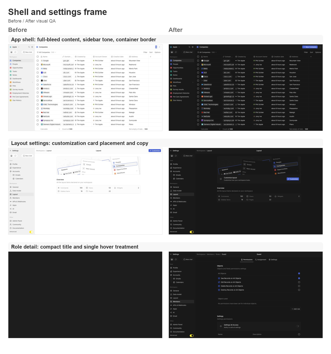
- Lets the app content card fill the available viewport and removes the
bottom-left radius on the main container.
- Uses an outside-looking container border treatment so the rounded
top-left edge matches the Figma frame without a double border.
- Restores the separator between the AI chat side panel and the record
container.
- Updates navigation drawer background/skeleton tones to use gray/3
consistently.
- Simplifies the full-screen backend error fallback so the white screen
fills the viewport.

### Settings page polish
- Moves the layout customization action from the settings navbar into a
settings card under the hero.
- Tightens layout page copy now that the customization surfaces are not
directly manageable yet.
- Aligns role detail title sizing and hover treatment with other
settings headers.
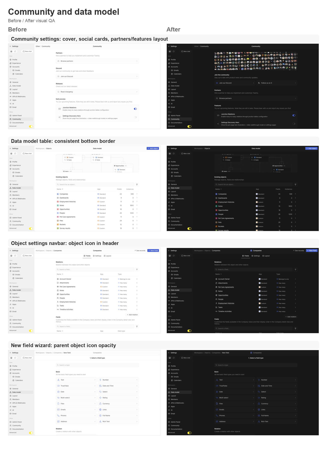
- Supports settings card brand icon colors, then restores Discord and X
brand logos on the Community page.
- Adds the Community discovery cover, moves community/social content to
the top, and reorganizes Partners and Features.
- Keeps setting card subtitle and separator behavior available for the
updated settings cards.

### Data model and object settings polish
- Adds a shared data-model table body wrapper so object, field, and
relation tables all keep the expected bottom border.
- Displays the object icon in the object settings navbar.
- Shares the new-field wizard parent object icon wrapper and keeps the
object icon at 64% opacity in wizard headers.
- Updates the new-field type selector icon treatment to match the wizard
header opacity behavior.

### Integrations, tools, and API polish
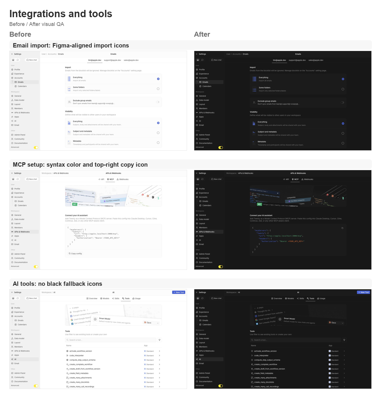
- Reworks the MCP setup config card with light syntax coloring and a
top-right copy icon button instead of the bottom copy section.
- Fixes email import icons to match the Figma asset shape.
- Ensures AI tool table icons and chevrons never fall back to black.

## Validation

- `npx nx lint:diff-with-main twenty-front`
- `npx tsc -p packages/twenty-front/tsconfig.json --noEmit`
- `git diff --check`
- Manual local visual pass on `apple.localhost:3001` for companies,
settings/community, data model, object settings, new-field wizard,
layout settings, account import, MCP setup, AI tools, and role detail
pages.

## Visual QA

### Shell and settings frame

<img width="1308" height="1397" alt="Shell and settings frame
before/after board"
src="https://raw.githubusercontent.com/twentyhq/twenty/pr-assets/ui-fixes-2/visual-qa/ui-fixes-2/shell-settings-frame.png"
/>

### Community and data model

<img width="1308" height="1806" alt="Community and data model
before/after board"
src="https://raw.githubusercontent.com/twentyhq/twenty/pr-assets/ui-fixes-2/visual-qa/ui-fixes-2/community-data-model.png"
/>

### Integrations and tools

<img width="1308" height="1397" alt="Integrations and tools before/after
board"
src="https://raw.githubusercontent.com/twentyhq/twenty/pr-assets/ui-fixes-2/visual-qa/ui-fixes-2/integrations-tools.png"
/>


<!-- This is an auto-generated description by cubic. -->
<a
href="https://cubic.dev/pr/twentyhq/twenty/pull/21540?utm_source=github"
target="_blank" rel="noopener noreferrer"
data-no-image-dialog="true"><picture><source
media="(prefers-color-scheme: dark)"
srcset="https://www.cubic.dev/buttons/review-in-cubic-dark.svg"><source
media="(prefers-color-scheme: light)"
srcset="https://www.cubic.dev/buttons/review-in-cubic-light.svg"><img
alt="Review in cubic"
src="https://www.cubic.dev/buttons/review-in-cubic-dark.svg"></picture></a>
<!-- End of auto-generated description by cubic. -->
Second batch of new-layout fast-follows (master:
twentyhq/core-team-issues#2478). All changes verified live against a
running workspace.

## Settings drawer & header
- **twentyhq/core-team-issues#2489** — sidebar icons render as plain
16px icons, no background tiles.
- **twentyhq/core-team-issues#2488** — Advanced toggle spans the full
drawer width; yellow dot removed.
- **twentyhq/core-team-issues#2497** — page title stays centered in the
settings header (breadcrumb stays left).
- **twentyhq/core-team-issues#2490** — Exit Settings control aligned to
the workspace switcher (24px, matching padding/gap).
- **twentyhq/core-team-issues#2499** — 2px vertical gap restored between
collapsible drawer section items.
- **twentyhq/core-team-issues#2491** — settings drawer rhythm now
matches the main app (28px items, 2px gaps, 28px section headers).
- **twentyhq/core-team-issues#2492** — Home/Chat tab switch no longer
flickers: both tab subtrees stay mounted (a shared
`NavigationDrawerTabbedContent` toggles visibility instead of remounting
+ flashing the chat skeleton).

## Loading states
- **twentyhq/core-team-issues#2486** — metadata loading shows an empty
body (no dense skeleton rows).
- **twentyhq/core-team-issues#2487** — settings table keeps its layout
while loading, with the shimmer localized to the first row's first cell.

## Command menu & navigation
- **twentyhq/core-team-issues#2501** — navigation section header height
matches the nav item rhythm (28px).
- **twentyhq/core-team-issues#2502 (part 1)** — the page side-panel
toggle stays as the dots glyph while the command menu is open, instead
of morphing into a second close control.

## New-field flow
- **twentyhq/core-team-issues#2494** — the new-field stepper moved from
a breadcrumb dropdown into a centered secondary wizard bar (back chevron
+ Save on the configure step); breadcrumb stays clean and the object
label is the centered title.

## Descoped (substantive bugs already fixed)
- **twentyhq/core-team-issues#2500** — command-menu highlight right
gutter: the menu-item base measures full-width, so it's likely a
scrollbar gutter on the list, not the shared component. Left for a
focused follow-up.
- **twentyhq/core-team-issues#2502 part 2** — moving the command-menu
close from left to right is cosmetic (the duplicate-control bug is fixed
by part 1) and would touch the shared `SidePanelTopBar` used by
search/AI panels.

## Verification
typecheck (tsgo) + oxlint + oxfmt green for all changed files; each
change DOM-measured / screenshotted in the running app.
## Description

Promotes the next-gen UI library (formerly `twenty-new-ui`) to the name
**`twenty-ui`** (v0.1.0, publishable) and renames the old package to
**`twenty-ui-deprecated`**. Rewrites ~1,730 `twenty-ui` imports →
`twenty-ui-deprecated`, updates all configs/CI/Docker/deps, and migrates
twenty-front's `Toggle` to the new package (first consumer) as a
drop-in.

## Next steps
- Wire the `ui/v*` publish dispatch (`cd-deploy-tag.yaml` +
`.yarnrc.yml`), then tag `ui/v0.1.0` to publish.
- Continue migrating components from `twenty-ui-deprecated` →
`twenty-ui`.
fix CSS selector > button not reaching Button component's inner element
### Reproduce
- when you click Data model and create a new field, you will see this
bug.
- When you import record and check the height of remove button in the
final validation step.

### Root Reason
the Button component internally renders a wrapper div around the
<button> element, so > button only reaches the intermediate div, not the
actual button.

### Fix
- padding-right not applied → chevron overlapped with text
- ValidationStep: height: 24px not applied → Remove button was 32px
instead of 24px

<img width="1288" height="376" alt="image"
src="https://github.com/user-attachments/assets/885cd8b0-1fe2-484a-8425-70f52b784ecb"
/>

<img width="1001" height="291" alt="image"
src="https://github.com/user-attachments/assets/0b489478-8fbc-4f7e-886a-38012eeb07ef"
/>
## Summary

Completes the migration of the frontend styling system from **Emotion**
(`@emotion/styled`, `@emotion/react`) to **Linaria** (`@linaria/react`,
`@linaria/core`), a zero-runtime CSS-in-JS library where styles are
extracted at build time.

This is the final step of the migration — all ~494 files across
`twenty-front`, `twenty-ui`, `twenty-website`, and `twenty-sdk` are now
fully converted.

## Changes

### Styling Migration (across ~480 component files)
- Replaced all `@emotion/styled` imports with `@linaria/react`
- Converted runtime theme access patterns (`({ theme }) => theme.x.y`)
to build-time `themeCssVariables` CSS custom properties
- Replaced `useTheme()` hook (from Emotion) with
`useContext(ThemeContext)` where runtime theme values are still needed
(e.g., passing colors to non-CSS props like icon components)
- Removed `@emotion/react` `css` helper usages in favor of Linaria
template literals

### Dependency & Configuration Changes
- **Removed**: `@emotion/react`, `@emotion/styled` from root
`package.json`
- **Added**: `@wyw-in-js/babel-preset`, `next-with-linaria` (for
twenty-website SSR support)
- Updated Nx generator defaults from `@emotion/styled` to
`@linaria/react` in `nx.json`
- Simplified `vite.config.ts` (removed Emotion-specific configuration)
- Updated `twenty-website/next.config.js` to use `next-with-linaria` for
SSR Linaria support

### Storybook & Testing
- Removed `ThemeProvider` from Emotion in Storybook previews
(`twenty-front`, `twenty-sdk`)
- Now relies solely on `ThemeContextProvider` for theme injection

### Documentation
- Removed the temporary `docs/emotion-to-linaria-migration-plan.md`
(migration complete)
- Updated `CLAUDE.md` and `README.md` to reflect Linaria as the styling
stack
- Updated frontend style guide docs across all locales

## How it works

Linaria extracts styles at build time via the `@wyw-in-js/vite` plugin.
All expressions in `styled` template literals must be **statically
evaluable** — no runtime theme objects or closures over component state.

- **Static styles** use `themeCssVariables` which map to CSS custom
properties (`var(--theme-color-x)`)
- **Runtime theme access** (for non-CSS use cases like icon `color`
props) uses `useContext(ThemeContext)` instead of Emotion's `useTheme()`
## Summary
This PR adds the `lingui/no-unlocalized-strings` ESLint rule to detect
untranslated strings and fixes translation issues across multiple
components.

## Changes

### ESLint Configuration (`eslint.config.react.mjs`)
- Added comprehensive `ignore` patterns for non-translatable strings
(CSS values, HTML attributes, technical identifiers)
- Added `ignoreNames` for props that don't need translation (className,
data-*, aria-*, etc.)
- Added `ignoreFunctions` for console methods, URL APIs, and other
non-user-facing functions
- Disabled rule for debug files, storybook, and test files

### Components Fixed (~19 files)
- Object record components (field inputs, pickers, merge dialogs)
- Settings components (accounts, admin panel)
- Serverless function components
- Record table and title cell components

## Status
🚧 **Work in Progress** - ~124 files remaining to fix

This PR is being submitted as draft to allow progressive fixing of
remaining translation issues.

## Testing
- Run `npx eslint "src/**/*.tsx"` in `packages/twenty-front` to check
remaining issues
## Problem

**CRITICAL:** Two PRs were accidentally reverted when PR #14347 "Prevent
csv export injections" was merged:

1. **PR #14348** "[Page Layout] - Review Refactor" - ✅ **RESTORED**
2. **PR #14352** "Fix wrong path used by backend" - ✅ **RESTORED**

## Root Cause Analysis

During the merge of PR #14347, there was a complex merge conflict with
PR #14352 "Fix wrong path used by backend". The merge commit
`324d7204bb` in the PR #14347 branch brought in changes from PR #14352,
but during the conflict resolution, **BOTH PR #14348 and PR #14352's
changes were accidentally overwritten**.

## What This PR Restores

This PR restores **BOTH** PRs by cherry-picking their commits:

### ✅ PR #14348 Changes Restored:
- `GraphWidgetRenderer.tsx` - was deleted, now restored
- `WidgetRenderer.tsx` - was missing, now restored
- `SettingsPageLayoutTabsInstanceId.ts` - was deleted, now restored
- `useUpdatePageLayoutWidget.ts` - was renamed back, now restored with
correct name
- Multiple test files that were deleted
- Several hook files that were renamed/reverted
- File renames: `usePageLayoutWidgetUpdate.ts` →
`useUpdatePageLayoutWidget.ts`
- Hook refactoring and test file organization
- Page layout component improvements

### ✅ PR #14352 Changes Restored:
- **Types moved to twenty-shared:**
  - `packages/twenty-shared/src/types/AppBasePath.ts` ✅ RESTORED
  - `packages/twenty-shared/src/types/AppPath.ts` ✅ RESTORED
  - `packages/twenty-shared/src/types/SettingsPath.ts` ✅ RESTORED
- **Navigation utilities moved to twenty-shared:**
- `packages/twenty-shared/src/utils/navigation/getAppPath.ts` ✅ RESTORED
- `packages/twenty-shared/src/utils/navigation/getSettingsPath.ts` ✅
RESTORED
- **200+ import statements updated** across the codebase to use
twenty-shared
- **Old type files deleted** from twenty-front/src/modules/types/

## Evidence of Complete Restoration

**Before (reverted state):**
- ❌ Types were in `packages/twenty-front/src/modules/types/`
- ❌ Page layout files missing
- ❌ Hook files incorrectly named

**After (this PR):**
- ✅ Types correctly in `packages/twenty-shared/src/types/`
- ✅ All page layout files restored
- ✅ Hook files correctly named
- ✅ All import statements updated

## Verification

**Total changes:**
- PR #14348: 36 files changed, 863 insertions(+), 442 deletions(-)
- PR #14352: 243 files changed, 492 insertions(+), 461 deletions(-)
- **Combined: 279 files changed, 1355 insertions(+), 903 deletions(-)**

## Impact

This completely restores both PRs that were accidentally lost, ensuring:
1. Page layout refactoring work is back
2. Type organization and path utilities are correctly in twenty-shared
3. Backend email paths work correctly again
4. No functionality is lost

Fixes the reversion caused by the merge conflict in PR #14347.

---------

Co-authored-by: nitin <142569587+ehconitin@users.noreply.github.com>
**Small Security Issue:** CSV exports were vulnerable to formula
injection attacks when users entered values starting with =, +, -, or @.
(only happens if a logged-in user injects corrupted data)

Solution:
- Added ZWJ (Zero-Width Joiner) protection that prefixes dangerous
values with invisible Unicode character
- This is the best way to preserve original data while preventing Excel
from executing formulas
- Added import cleanup to restore original values when re-importing

Changes:
- New sanitizeValueForCSVExport() function for security
- Updated all CSV export paths to use both security + formatting
functions
- Added comprehensive tests covering attack vectors and international
characters
- Also added cursor rules for better code consistency

---------

Co-authored-by: Charles Bochet <charlesBochet@users.noreply.github.com>
After moving a section on the frontend, this broke the path that was
sent by email on the backend.
This kind of error comes back every ~2-3 month under different forms so
we need a more robust solution: I moved routes to the shared folder,
that way we will share one common source of truth between the frontend
and the backend.
Fixes#14343
This PR replaces the many calls of useDropdown by the new standalone
hooks : useCloseDropdown, useOpenDropdown and useToggleDropdown.

This will allow to remove useDropdown and then the dropdown recoil
component state v1.

A big round of QA has been made, with some bugs caught along the way.

Closes https://github.com/twentyhq/core-team-issues/issues/1155
Closes https://github.com/twentyhq/core-team-issues/issues/618

## QA

Component|Status|Comment
|---|---|---|
CurrentWorkspaceMemberFavorites|Ok|
FavoriteFolderPickerFooter|Ok|
AdvancedFilterAddFilterRuleSelect|Ok|
AdvancedFilterRecordFilterGroupOptionsDropdown|Ok|
AdvancedFilterRecordFilterOperandSelectContent|Ok|
AdvancedFilterRecordFilterOptionsDropdown|Ok|
useAdvancedFilterFieldSelectDropdown|Ok|
ObjectFilterDropdownBooleanSelect|Ok|
ObjectFilterDropdownOptionSelect|Ok|
ObjectOptionsDropdown|Ok|
ObjectOptionsDropdownLayoutContent|Ok|
ObjectSortDropdownButton|Ok|
useCloseSortDropdown|Ok|
FormDateTimeFieldInput|Ok|Bug detected, cannot select a month or a year,
see issue https://github.com/twentyhq/twenty/issues/12922
FormSingleRecordPicker|Ok|
MultiItemFieldMenuItem|Ok|
RecordDetailRelationRecordsListItem|Ok|
RecordDetailRelationSection|Ok|
RecordDetailRelationSectionDropdownToMany|Ok|
RecordDetailRelationSectionDropdownToOne|Ok|
RecordTableColumnAggregateFooterDropdownSubmenuContent|Ok|
RecordTableColumnAggregateFooterAggregateOperationMenuItems|Ok|
RecordTableColumnAggregateFooterMenuContent|Ok|
RecordTableColumnAggregateFooterValueCell|Ok|
RecordTableColumnHeadDropdownMenu|Ok|
RecordTableHeaderPlusButtonContent|Ok|
useTriggerActionMenuDropdown|Ok|
MultipleSelectDropdown|Ok|
RecordBoardColumnHeaderAggregateDropdownButton|Ok|
SettingsDataModelFieldSelectFormOptionRow|Ok|
SettingsDataModelNewFieldBreadcrumbDropDown|Ok|
SettingsObjectFieldActiveActionDropdown|Ok|
SettingsObjectFieldInactiveActionDropdown|Ok|
SettingsObjectInactiveMenuDropDown|Ok|
SettingsSecurityApprovedAccessDomainRowDropdownMenu|Couldn’t test|
SettingsSecuritySSORowDropdownMenu|Couldn’t test|
SettingsAccountsRowDropdownMenu|Ok|
SettingsRoleAssignment|Ok|
SettingsServerlessFunctionTabEnvironmentVariableTableRow|Couldn’t test|
MatchColumnToFieldSelect|Ok|
SubMatchingSelectDropdownButton|Ok|Removed conflicting duplicate open
dropdown
SubMatchingSelectRowRightDropdown|Ok|
CurrencyPickerDropdownButton|Ok|
IconPicker|Ok|
DateTimePicker|Ok|
PhoneCountryPickerDropdownButton|OK|
Select|Ok|
Dropdown|Ok|Not QAing all dropdowns in the app because the ones of this
QA are enough to show up that Dropdown is behaving correctly on a lot of
use cases
DropdownMenuInnerSelect|Ok|
TabList|Ok|Removed onClickOutside called in dropdown clickable
component, validated with Raph who recently worked on this
DateInput|Ok|
MultiWorkspaceDropdownDefaultComponents|Ok|
AdvancedFilterChip|Ok|
EditableFilterDropdownButton|Ok|
UpdateViewButtonGroup|Ok|
ViewBarDetailsAddFilterButton|Ok|
ViewBarFilterButton|Ok|
ViewBarFilterDropdown|Ok|
ViewBarFilterDropdownAdvancedFilterButton|Ok|
ViewPickerDropdown|Ok|
ViewPickerListContent|Ok|
ViewPickerOptionDropdown|Ok|
WorkflowEditTriggerDatabaseEventForm|Ok|
WorkflowVariablesDropdownWorkflowStepItems|Ok|
AttachmentDropdown|Ok|
SupportDropdown|Ok|

Co-authored-by: Charles Bochet <charlesBochet@users.noreply.github.com>
Co-authored-by: Charles Bochet <charles@twenty.com>
This PR is the first part of a refactoring aiming to deprecate the
hotkey scopes api in favor of the new focus stack api which is more
robust.

The refactored components in this PR are the dropdowns and the side
panel/command menu.

- Replaced `useScopedHotkeys` by `useHotkeysOnFocusedElement` for all
dropdown components, selectable lists and the command menu
- Introduced `focusId` for all dropdowns and created a common hotkey
scope `DropdownHotkeyScope` for backward compatibility
- Replaced `setHotkeyScopeAndMemorizePreviousScope` occurrences with
`usePushFocusItemToFocusStack` and `goBackToPreviousHotkeyScope` with
`removeFocusItemFromFocusStack`

Note: Test that the shorcuts and arrow key navigation still work
properly when interacting with dropdowns and the command menu.

Bugs that I have spotted during the QA but which are already present on
main:
- Icon picker select with arrow keys doesn’t work inside dropdowns
- Some dropdowns are not selectable with arrow keys (no selectable list)
- Dropdowns in dropdowns don’t reset the hotkey scope correctly when
closing
- The table click outside is not triggered after closing a table cell
and clicking outside of the table
This PR refactors all the dropdown content wrapping mechanism across the
entire app.

It refactors the internals of the `Dropdown` component and introduces a
new generic `DropdownContent` component that is a generic wrapper used
for each dropdown.

## Why this PR ?

Because we’ve been experiencing continuous regressions for months on the
dropdown content width, with weird scrolling behaviors in some and not
in others, and every time a solution was found for a particular set of
dropdowns, it broke another set of dropdowns, which wasn’t noticed
because doing the QA of all dropdowns of the app is very difficult for
fixing an apparently small bug.

## Don’t we already have a `DropdownMenu` component ?

Indeed, this new `DropdownContent` is almost like `DropdownMenu` and
took inspiration from it but `DropdownContent` acts as a generic content
container that sets the width of the whole dropdown, whether we have a
menu or not.

## Why don’t we put it directly in Dropdown internals ?

Because the Dropdown component is using a complex logic with floating-ui
middleware to compute its position and size, and for this logic to work
correctly, it cannot be responsible for the “wanted” width of its
content, because the children components, which the dropdown is not
aware of, can request different widths after the dropdown has been
mounted.

A good example with multiple use cases inside the same dropdown can be
found in `AdvancedFilterDropdownFilterInput`

Thus, it is the responsibility of the content of the dropdown to
determine the width it wants to have.

## What is the difference with DropdownMenuItemsContainer ?

We can have multiple `DropdownMenuItemsContainer` in a dropdown,
alongside other components like `DropdownMenuSeparator` or
`DropdownMenuHeader`, and each of those components behaves differently
regarding to its width, paddings, etc. Therefore it is logical that the
`DropdownMenuItemsContainer` cannot be responsible for the whole
dropdown content width, and trying to do so has been the cause of many
regressions for months.

Now `DropdownMenuItemsContainer` is taking a width of `auto` by default,
which is the best to adapt to a parent which has a defined width.

## How do I set the width of my dropdown now ?

By passing a pixel width to the props `widthInPixels` of
`DropdownContent`, which only accepts numbers to avoid any confusion
with `auto` , `100%` or `160px` and other specific width variables.

The `dropdownWidth` props has been removed from `<Dropdown>` to avoid
any confusion.

Also the `DropdownMenuItemsContainer` is now using `auto` as its default
width to fill the available space inside `DropdownContent` .

It is highly recommended to use the enum `GenericDropdownContentWidt` to
define your width.

## Where to use this new `DropdownContent` component ?

There are two main use cases.

If the dropdown content is defined directly inline in the Dropdown
props, then it is recommended to use it here too.

On the other hand if the dropdown content is abstracted in another
component, it’s recommended to use this new component alongside the
others components like `DropdownMenuItemsContainer`.

A good rule of thumb is to place `DropdownContent` where
`DropdownMenuItemsContainer`, `DropdownMenuSearchInput`, etc. are
placed.

## What if I have a custom width ?

Just define a constant like `ICON_PICKER_DROPDOWN_CONTENT_WIDTH` and use
it with the props `widthInPixels` .

Otherwise there’s a `GenericDropdownContentWidth` enum. The default
value being `GenericDropdownContentWidth.Medium` (or 200px), which most
dropdowns use.

## QA


Component | Comment
-- | --
AttachmentDropdown | Fixed overflowing (thanks to DropdownContent)
RecordIndexActionMenuDropdown |
CommandMenuActionMenuDropdown |
SupportDropdown | Fixed overflowing (thanks to DropdownContent)
MessageThreadSubscribersDropdownButton | Removed because unused
FavoriteFolderNavigationDrawerItemDropdown | Set width at Narrow
FavoriteFolderPicker |
ViewPickerOptionDropdown |
PageFavoriteFolderDropdown | Removed because unused
AdvancedFilterAddFilterRuleSelect |
AdvancedFilterAddFilterRuleSelect |
AdvancedFilterFieldSelectMenu |
AdvancedFilterRecordFilterGroupOptionsDropdown |
AdvancedFilterRecordFilterOperanceSelect | Set width at Narrow
AdvancedFilterLogicalOperatorDropdown | Set width at Narrow
AdvancedFilterRecordFilterOptionsDropdown |
AdvancedFilterRootRecordFilterGroup | Fixed broken horizontal scrolling
behavior
AdvancedFilterSubFieldSelectMenu |
AdvancedFilterDropdownFilterInput |
ObjectFilterDropdownBooleanSelect |
ObjectFilterDropdownCountrySelect | Fixed broken menu items container
ObjectFilterDropdownCurrencySelect | Set width to Large
ObjectFilterDropdownFilterInput |
ObjectFilterDropdownOperandDropdown | Fixed width that was not fixed
ObjectFilterDropdownFilterInput | Fixed width that wasn’t the same for
EditableFilterChip
ObjectFilterDropdownOperandSelect | Refactored
ObjectOptionsDropdownRecordGroupFieldsContent | Added missing separator
ObjectOptionDropdownFieldsContent |
ObjectOptionsDropdownHiddenFieldsContent |
ObjectOptionsDropdownLayoutContent |
ObjectOptionsDropdownLayoutOpenInContent |
ObjectOptionsDropdownMenuContent |
ObjectOptionsDropdownRecordGroupFieldsContent |
ObjectOptionsDropdownRecordGroupsContent |
ObjectOptionsDropdownRecordGroupSortContent |
ObjectOptionsDropdownHiddenRecordGroupsContent | Removed unnecessary
DropdownMenuItemsContainer
RecordBoardColumnHeaderAggregateDropdown | Fixed overflowing (thanks to
DropdownContent)
RecordBoardColumnHeaderAggregateDropdownFieldsContent | Fixed
overflowing (thanks to DropdownContent)
RecordBoardColumnHeaderAggregateDropdownMenuContent | Fixed overflowing
(thanks to DropdownContent)
RecordBoardColumnHeaderAggregateDropdownOptionsContent | Fixed
overflowing (thanks to DropdownContent)
MultiItemFieldInput | Fixed overflowing (thanks to DropdownContent)
MultiItemFieldMenuItem |
MultipleRecordPicker | Fixed overflowing (thanks to DropdownContent)
SingleRecordPicker |
RecordTableColumnAggregateDropdownSubmenuContent |
RecordTableColumnAggregateFooterMenuContent |
RecordTableColumnHeadDropdownMenu | Fixed overflowing (thanks to
DropdownContent)
RecordTableHeaderPlusButtonContent |
MultipleSelectDropdown | Broken width fixed
ObjectSortDropdownButton |
RecordDetailRelationRecordsListItem |
ConfigVariableDatabaseInput |
ConfigVariableOptionsDropdownContent |
SettingsObjectFieldActiveActionDropdown | Fixed overflowing (thanks to
DropdownContent)
SettingsObjectFieldDisabledActionDropdown | Set width at Narrow
SettingsObjectSummaryCard | Removed because unused
SettingsDataModelFieldSelectFormOptionRow |
SettingsDataModelNewFieldBreadcrumbDropdown |
SettingsObjectInactiveMenuDropDown |
SettingsRoleAssignementWorkspaceMemberPickerDropdown |
SettingsRolePermissionObjectLevelObjectPickerDropdownContent |
SettingsSecurityApprovedAccessDomainRowDropdownMenu | Couldn’t test
SettingsSecuritySSORowDropdownMenu | Couldn’t test
SettingsAccountsRowDropdownMenu | Fixed overflowing (thanks to
DropdownContent)
SettingsIntegrationDatabaseConnectionSummaryCard | Couldn’t test
SettingsServerlessFunctionTablEnvironmentVariableTableRow | Deactivated
scope
MatchColumnSelectFieldSelectDropdownContent | Removed now unnecessary
width on DropdownMenuItemsContainer
MatchColumnSelectSubFieldSelectDropdownContent |
SubMatchingSelectInput |
CurrencyPickerDropdownSelect |
IconPicker | Fixed overflowing (thanks to DropdownContent)
PhoneCountryPickerDropdownSelect |
Select | Refactored to drilldown wanted width of content, in this case
it’s intended
ExpandedListDropdown |
ShowPageAddButton | Removed because unused
MultiWorkspaceDropdownDefaultComponent |
MultiWorkspaceDropdownThemesComponent |
MultiWorkspaceDropdownWorkspacesListComponent |
AdvancedFilterDropdownButton |
EditableFilterChip |
EditableFilterDropdownButton |
UpdateViewButtonGroup |
ViewBarFilterDropdown |
ViewBarFilterDropdownFieldSelectMenu |
ViewPickerContentCreateMode |
ViewPickerContentEditMode |
ViewPickerListContent |
WorkflowEditTriggerDatabaseEventForm |
WorkflowVariablesDropdownFieldItems |
WorkflowVariablesDropdownObjectItems |
WorkflowVariablesDropdownWorkflowStepItems |
CommandMenuContextChipGroups |
RecordBoardColumnDropdownMenu |
MultiSelectInput |
SelectInput |
CustomSlashMenu |
DropdownMenu | Removed and replaced by DropdownContent
OverlayContainer and around |


<!-- notionvc: 1e23bdb8-2dda-4f8d-a64d-ecc829a768a2 -->

## Miscellaneous

Side notes :

- The `Select` component is now wrapping the `DropdownContent` because
it computes a dynamic width.
- The advanced filter dropdown has been fixed, it was broken when
resizing the window horizontally, we couldn’t scroll. This specific edge
case was taken into account when refactoring the whole dropdown content
system
- As discussed with Nitin, data-select-disable will probably be removed
entirely, so I let it as is, because right now it is not used by the
refactored d&d selection.
- Duplicate separators under DropdownMenuHeader have been removed.

Fixes : https://github.com/twentyhq/twenty/issues/12327
Fixes : https://github.com/twentyhq/core-team-issues/issues/951
# Introduction
closes https://github.com/twentyhq/core-team-issues/issues/591
Same than for `twenty-shared` made in
https://github.com/twentyhq/twenty/pull/11083.

## TODO
- [x] Manual migrate twenty-website twenty-ui imports

## What's next:
- Generate barrel and migration script factorization within own package
+ tests
- Refactoring using preconstruct ? TimeBox
- Lint circular dependencies
- Lint import from barrel and forbid them

### Preconstruct
We need custom rollup plugins addition, but preconstruct does not expose
its rollup configuration. It might be possible to handle this using the
babel overrides. But was a big tunnel.
We could give it a try afterwards ! ( allowing cjs interop and stuff
like that )
Stuck to vite lib app

Closed related PRs:
- https://github.com/twentyhq/twenty/pull/11294
- https://github.com/twentyhq/twenty/pull/11203
# Introduction

In this PR we've migrated `twenty-shared` from a `vite` app
[libary-mode](https://vite.dev/guide/build#library-mode) to a
[preconstruct](https://preconstruct.tools/) "atomic" application ( in
the future would like to introduce preconstruct to handle of all our
atomic dependencies such as `twenty-emails` `twenty-ui` etc it will be
integrated at the monorepo's root directly, would be to invasive in the
first, starting incremental via `twenty-shared`)

For more information regarding the motivations please refer to nor:
- https://github.com/twentyhq/core-team-issues/issues/587
-
https://github.com/twentyhq/core-team-issues/issues/281#issuecomment-2630949682

close https://github.com/twentyhq/core-team-issues/issues/589
close https://github.com/twentyhq/core-team-issues/issues/590

## How to test
In order to ease the review this PR will ship all the codegen at the
very end, the actual meaning full diff is `+2,411 −114`
In order to migrate existing dependent packages to `twenty-shared` multi
barrel new arch you need to run in local:
```sh
yarn tsx packages/twenty-shared/scripts/migrateFromSingleToMultiBarrelImport.ts && \
npx nx run-many -t lint --fix -p twenty-front twenty-ui twenty-server twenty-emails twenty-shared twenty-zapier
```
Note that `migrateFromSingleToMultiBarrelImport` is idempotent, it's atm
included in the PR but should not be merged. ( such as codegen will be
added before merging this script will be removed )

## Misc
- related opened issue preconstruct
https://github.com/preconstruct/preconstruct/issues/617

## Closed related PR
- https://github.com/twentyhq/twenty/pull/11028
- https://github.com/twentyhq/twenty/pull/10993
- https://github.com/twentyhq/twenty/pull/10960

## Upcoming enhancement: ( in others dedicated PRs )
- 1/ refactor generate barrel to export atomic module instead of `*`
- 2/ generate barrel own package with several files and tests
- 3/ Migration twenty-ui the same way
- 4/ Use `preconstruct` at monorepo global level

## Conclusion
As always any suggestions are welcomed !
As per title, add ~200 missing translations in different places of app.
Most places are now available for translation with AI but still some
aren't available - some enums (like in MenuItemSelectColor.tsx) or
values in complex types (like in
SettingsNonCompositeFieldTypeConfigs.ts) or values where are injected
some variables (like in SettingsDataModelFieldNumberForm.tsx)

---------

Co-authored-by: Félix Malfait <felix@twenty.com>
# Introduction
Avoid having multiple `isDefined` definition across our pacakges
Also avoid importing `isDefined` from `twenty-ui` which exposes a huge
barrel for a such little util function

## In a nutshell
Removed own `isDefined.ts` definition from `twenty-ui` `twenty-front`
and `twenty-server` to move it to `twenty-shared`.
Updated imports for each packages, and added explicit dependencies to
`twenty-shared` if not already in place

Related PR https://github.com/twentyhq/twenty/pull/9941
# Introduction
For motivations and context please have a look to
https://github.com/twentyhq/twenty/pull/9394 whom this PR results from.
In this pull-request we remove any `metadataField` and `objectMetadata`
sluggification. We directly consume `objectMetadata.namePlural` and
`metadataField.name`, ***it seems like that historically the consumed
`metadataField.name`*** are we sure that we wanna change this behavior ?

## Notes
Unless I'm mistaken by reverting the `kebabcase` url formatting we might
be creating deadlinks that user could have save beforehand => Discussed
with Charles said it's controlled risk.

---------

Co-authored-by: Paul Rastoin <paulrastoin@Pauls-MacBook-Pro.local>
This PR was created by [GitStart](https://gitstart.com/) to address the
requirements from this ticket:
[TWNTY-7536](https://clients.gitstart.com/twenty/5449/tickets/TWNTY-7536).
---
### Description
Migrate all menu items components to twenty ui and update imports.
```typescript
MenuItem
MenuItemAvata
MenuItemCommand
MenuItemCommandHotKeys
MenuItemDraggable
MenuItemMultiSelect
MenuItemMultiSelectAvatar
MenuItemMultiSelectTag
MenuItemNavigate
MenuItemSelect
MenuItemSelectAvatar
MenuItemSelectColor
MenuItemSelectTag
MenuItemSuggestion
MenuItemToggle
```
\
Also migrate all other dependent components and utilities like
`Checkbox` & `Toggle`\
\
Fixestwentyhq/private-issues#82
---------
Co-authored-by: gitstart-twenty <gitstart-twenty@users.noreply.github.com>
Co-authored-by: gitstart-twenty <140154534+gitstart-twenty@users.noreply.github.com>
Co-authored-by: Lucas Bordeau <bordeau.lucas@gmail.com>
Issue #6496
Hi team,

Is this the right approach for handling type selection with states and
conditional rendering, or should these be managed on separate pages
altogether? Please let me know Ill make changes accordingly :)

I’m also working on styling the buttons according to the Figma design
and will be moving constants like categoryDescriptions and categories to
the constants folder.

Thanks for your guidance!


https://github.com/user-attachments/assets/452bea9f-4d0a-4472-9941-421b54cda47f

---------

Co-authored-by: Lucas Bordeau <bordeau.lucas@gmail.com>
Co-authored-by: Charles Bochet <charles@twenty.com>
- Adds an util `toSpliced`. We cannot used the native Javascript
`Array.prototype.toSpliced` method as Chromatic servers don't support
it.
- Makes sure Select field options have sequential positions after
removing an option (form validation schema checks that positions are
sequential and considers options invalid otherwise).
In this PR, we are refactoring two things:
- leverage field.defaultValue for Select and MultiSelect settings form
(instead of option.isDefault)
- use quoted string (ex: "'USD'") for string default values to embrace
backend format

---------

Co-authored-by: Thaïs Guigon <guigon.thais@gmail.com>
After discussing with @charlesBochet, several fixes are needed on
fields:
- [x] Disable Boolean field `defaultValue` edition for now (On
`defaultValue` update, newly created records are not taking the updated
`defaultValue` into account. Setting the `defaultValue` on creation is
fine.)
- [x] Disable Phone field creation for now
- [x] For the Person object, display the "Phone" field as a field of
type Phone (right now its type is Text; later we'll migrate it to a
proper Phone field).
- [x] Fix RawJson field display (displaying `[object Object]` in Record
Table cells).
- [x] In Settings/Data Model, on Relation field creation/edition,
"Object destination" select is not working properly if an object was not
manually selected (displays Companies by default but creates a relation
to another random object than Companies).
Closes#4295
Note: for the sake of an easier code review, I did not rename/move some
files and added "todo" comments instead so Github is able to match those
files with their previous version.
Backend: Adding a new util function that throw an error if the
objectMetadata is remote

Frontend: hiding the save button when remote

Also renaming `useObjectMetadataItemForSettings` since this hook is used
in other places than settings and is not in the settings repo. Name can
definitely be challenged!

---------

Co-authored-by: Thomas Trompette <thomast@twenty.com>
* default value boolean fixed

* fixed creation, fixed updating a value to false

* fixed default value for default value if boolean

* fixed tests

---------

Co-authored-by: Félix Malfait <felix.malfait@gmail.com>
 Thomas des Francs