16a92f52a44ba53fa58486a0e5d157867910f7f6
457 Commits
| Author | SHA1 | Message | Date | |
|---|---|---|---|---|
 Charles Bochet Charles Bochet
|
7c0136b97b |
feat(deps): migrate frontend to React 19 (#21531)
## What Migrates the frontend stack from **React 18.3 → 19.2**. The website, sdk, companion and emails packages were already on React 19; this brings the remaining holdouts (`twenty-front`, `twenty-ui`, `twenty-ui-deprecated`, `twenty-front-component-renderer`) and `twenty-server`'s email rendering onto 19, and pins a single React version repo-wide. ## Why React 18.x is now the legacy line. Staying current keeps us on the patched/maintained branch and unblocks downstream library majors (react-router 7, mantine 9, etc.) that require React 19 peers. ## Dependency bumps (required by React 19 peers / removed APIs) | Package | From | To | Reason | |---|---|---|---| | react / react-dom | 18.3.1 | 19.2.3 | core | | @hello-pangea/dnd | 16 | 18 | peer `^18 \|\| ^19` | | react-datepicker | 6 | 9 | v<7 used removed `findDOMNode`; drops `@types/react-datepicker` | | react-data-grid | beta.13 | beta.59 | peer `^19.2`; new render API | | graphiql (+ @graphiql/react, plugin-explorer) | 3 / 0.23 / 1 | 5 / 0.37 / 5.1 | peer `^18 \|\| ^19` | | react-helmet-async | 1.3 | **@dr.pogodin/react-helmet** 3.2 | upstream caps peer at `^18`; drop-in React 19 fork | A `resolutions` pin enforces a single React (19.2.3) + `@types/react` (19.2.14) across the monorepo to avoid duplicate copies / type-identity splits. Versions are the aged lockfile patches (clears the `npmMinimalAgeGate`). ## Code changes - **Global `JSX` shim** (`react-jsx-global.d.ts` per package): React 19 moved the `JSX` namespace under `React.JSX`; several deps' published types (notably `@linaria/react`'s `styled.d.ts`, which types every `styled.x` via `keyof JSX.IntrinsicElements`) still reference the global namespace. Without the shim, every styled component degrades to `any` props. - **Ref nullability**: `useRef<T>(null)` now returns `RefObject<T | null>`; widened consumer prop/hook ref types accordingly (incl. the shared `useListenClickOutside`). - **react-datepicker v9**: `onChange`/`onSelect` accept `Date | null`, `calendarStartDay` typing, `ReactDatePickerProps`→`DatePickerProps`, relaxed the dynamic `selectsMultiple` discriminated union. - **react-data-grid beta.59**: `formatter`→`renderCell`, `editor`→`renderEditCell`, `headerRenderer`→`renderHeaderCell`, `components`→`renderers`, `onRowClick`→`onCellClick`, object-shaped `useRowSelection`, Set-based selection. - **dnd style cast**: `@radix-ui/react-popper` augments `CSSProperties` with a `--radix-*` index signature that dnd's closed `DraggingStyle` doesn't satisfy → cast at the spread. ## Status / testing - ✅ `typecheck` green: twenty-front, twenty-ui, twenty-ui-deprecated, twenty-front-component-renderer, twenty-server - ⏳ build / lint / unit tests / storybook+argos / runtime smoke-test in progress Draft until local + CI verification completes. Notable behavior to QA manually: spreadsheet import (data-grid), date pickers, drag-and-drop boards/lists, GraphQL playground, page titles/favicon. <!-- This is an auto-generated description by cubic. --> <a href="https://cubic.dev/pr/twentyhq/twenty/pull/21531?utm_source=github" target="_blank" rel="noopener noreferrer" data-no-image-dialog="true"><picture><source media="(prefers-color-scheme: dark)" srcset="https://www.cubic.dev/buttons/review-in-cubic-dark.svg"><source media="(prefers-color-scheme: light)" srcset="https://www.cubic.dev/buttons/review-in-cubic-light.svg"><img alt="Review in cubic" src="https://www.cubic.dev/buttons/review-in-cubic-dark.svg"></picture></a> <!-- End of auto-generated description by cubic. --> |
||
|
Thomas des Francs
|
d06e687b77 |
Fix settings UI polish pass 2 (#21540)
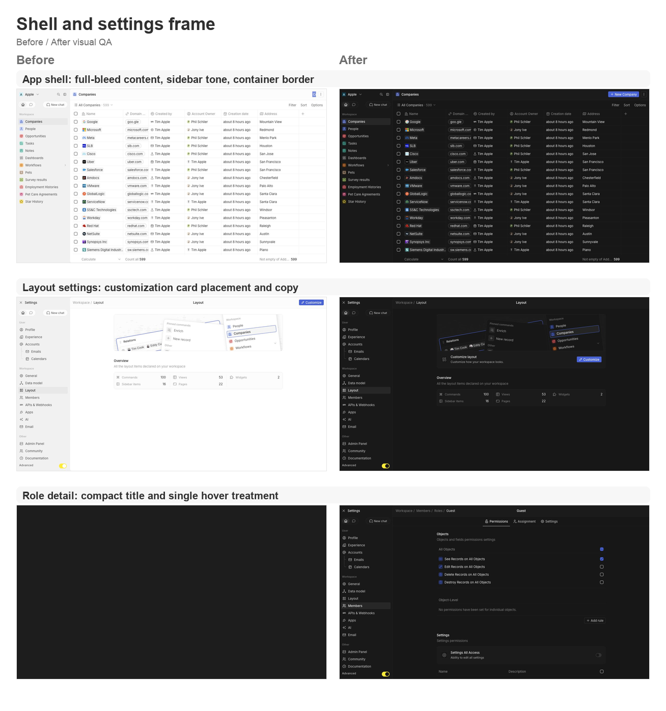
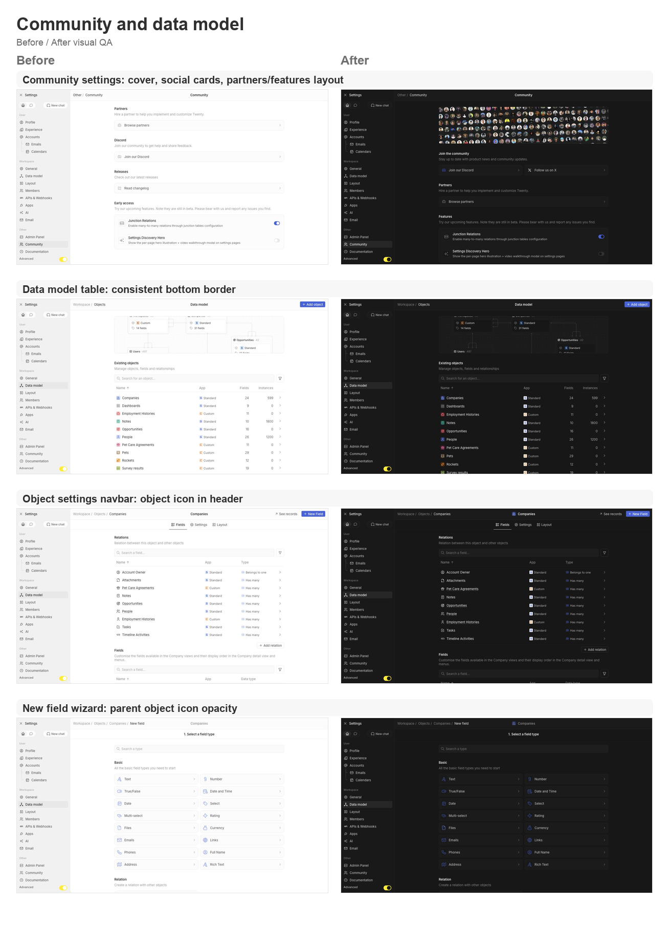
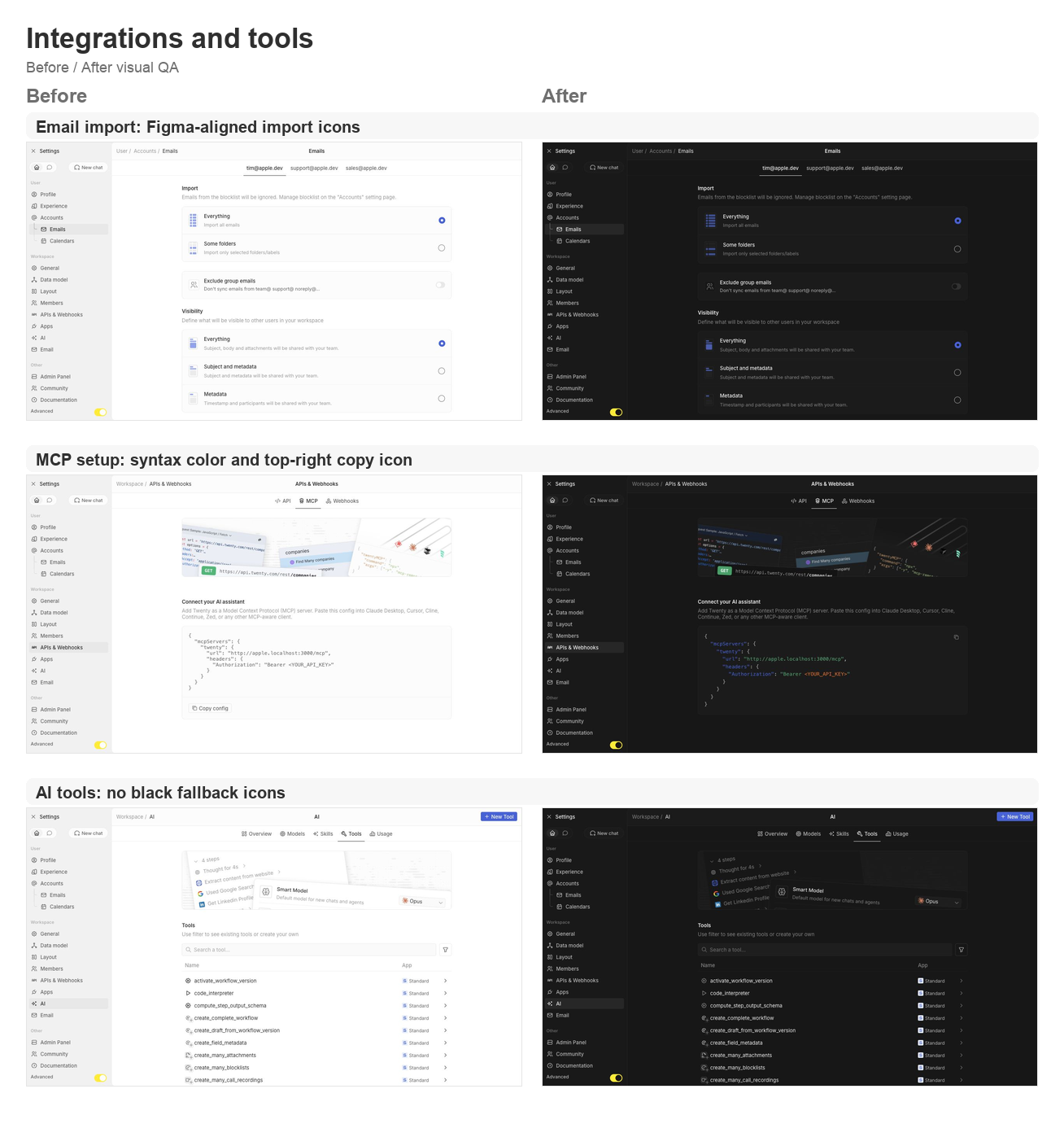
## Summary This PR groups the requested second UI polish pass across the app shell, settings pages, data model, community, AI tools, and developer setup surfaces. ### Shell and navigation polish - Lets the app content card fill the available viewport and removes the bottom-left radius on the main container. - Uses an outside-looking container border treatment so the rounded top-left edge matches the Figma frame without a double border. - Restores the separator between the AI chat side panel and the record container. - Updates navigation drawer background/skeleton tones to use gray/3 consistently. - Simplifies the full-screen backend error fallback so the white screen fills the viewport. ### Settings page polish - Moves the layout customization action from the settings navbar into a settings card under the hero. - Tightens layout page copy now that the customization surfaces are not directly manageable yet. - Aligns role detail title sizing and hover treatment with other settings headers. - Supports settings card brand icon colors, then restores Discord and X brand logos on the Community page. - Adds the Community discovery cover, moves community/social content to the top, and reorganizes Partners and Features. - Keeps setting card subtitle and separator behavior available for the updated settings cards. ### Data model and object settings polish - Adds a shared data-model table body wrapper so object, field, and relation tables all keep the expected bottom border. - Displays the object icon in the object settings navbar. - Shares the new-field wizard parent object icon wrapper and keeps the object icon at 64% opacity in wizard headers. - Updates the new-field type selector icon treatment to match the wizard header opacity behavior. ### Integrations, tools, and API polish - Reworks the MCP setup config card with light syntax coloring and a top-right copy icon button instead of the bottom copy section. - Fixes email import icons to match the Figma asset shape. - Ensures AI tool table icons and chevrons never fall back to black. ## Validation - `npx nx lint:diff-with-main twenty-front` - `npx tsc -p packages/twenty-front/tsconfig.json --noEmit` - `git diff --check` - Manual local visual pass on `apple.localhost:3001` for companies, settings/community, data model, object settings, new-field wizard, layout settings, account import, MCP setup, AI tools, and role detail pages. ## Visual QA ### Shell and settings frame <img width="1308" height="1397" alt="Shell and settings frame before/after board" src="https://raw.githubusercontent.com/twentyhq/twenty/pr-assets/ui-fixes-2/visual-qa/ui-fixes-2/shell-settings-frame.png" /> ### Community and data model <img width="1308" height="1806" alt="Community and data model before/after board" src="https://raw.githubusercontent.com/twentyhq/twenty/pr-assets/ui-fixes-2/visual-qa/ui-fixes-2/community-data-model.png" /> ### Integrations and tools <img width="1308" height="1397" alt="Integrations and tools before/after board" src="https://raw.githubusercontent.com/twentyhq/twenty/pr-assets/ui-fixes-2/visual-qa/ui-fixes-2/integrations-tools.png" /> <!-- This is an auto-generated description by cubic. --> <a href="https://cubic.dev/pr/twentyhq/twenty/pull/21540?utm_source=github" target="_blank" rel="noopener noreferrer" data-no-image-dialog="true"><picture><source media="(prefers-color-scheme: dark)" srcset="https://www.cubic.dev/buttons/review-in-cubic-dark.svg"><source media="(prefers-color-scheme: light)" srcset="https://www.cubic.dev/buttons/review-in-cubic-light.svg"><img alt="Review in cubic" src="https://www.cubic.dev/buttons/review-in-cubic-dark.svg"></picture></a> <!-- End of auto-generated description by cubic. --> |
||
|
Félix Malfait
|
9d7f0c405f |
fix(twenty-front): new layout fast-follows — command menu, field options & logs (#21429)
Fast-follows for the new layout — the remaining open sub-issues of
twentyhq/core-team-issues#2478.

## Changes

- **Command menu items should not have extra right padding**
(twentyhq/core-team-issues#2500)
`SidePanelList` set `width: calc(100% - spacing[4])` on top of its own
8px left/right padding. Under the global `box-sizing: border-box`, that
extra `-16px` shrinks the list and, because it's left-aligned, dumps the
whole gap on the right. Switched to `width: 100%` so item highlights
inset 8px symmetrically. This is shared by every side-panel list — they
all had the same right-only gutter, so they're all corrected the same
way.

- **Field options should not be cropped and should keep row gaps**
(twentyhq/core-team-issues#2503)
The option row used a fixed `height: spacing[6]`, so under border-box
the `6px` vertical padding was absorbed and consecutive rows sat flush.
Changed `height` → `min-height` so the padding separates the rows again.

- **Logs table with filters should use Background secondary**
(twentyhq/core-team-issues#2505)
The Logs filter card and the upgrade card defaulted to a transparent
background, showing the white page through. Passed
`backgroundColor={themeCssVariables.background.secondary}`, matching
`SettingsTableCard`. The results table stays on the primary surface, per
the Figma reference.

- **Command menu back chevron** (twentyhq/core-team-issues#2504)
`SidePanelTopBar` showed a back chevron whenever the nav stack had more
than one entry. A command-menu page is the root of a fresh command-menu
session, so it now only shows the chevron when it was opened from
another command-menu page. Every other side-panel page keeps standard
history-based back navigation, so workflow / page-layout / record stacks
are unaffected.

## Verification
- oxlint (`--type-aware`, full `src/`): 0 errors
- oxfmt: clean
- tsgo typecheck: no errors in the changed files (the one reported error
is pre-existing in `RestPlayground.tsx`, which this PR does not touch)
- Verified live at apple.localhost:
- #2500 — command menu item highlight insets measured 8px left / 8px
right (was 8 / 24)
- #2503 — option rows render at 38px tall with ~14px gaps, text no
longer cropped
- #2505 — filter + upgrade cards compute to background-secondary;
results table stays on primary
- #2504 — direct command menu shows the close-X with no chevron; pages
opened from the command menu still show the chevron

## Open question for review (#2504)
The issue also describes the page-header three-dots toggle: *"the three
dots icon button should remain visible if the side panel is on a page
that is not a child of the command menu (AI chat, or a page opened
directly)."* Today that toggle morphs to an X for any non-command-menu
side-panel page (e.g. Ask AI). Honoring that touches the shared
`SidePanelToggleButton`, and there's a related decision: search / Ask AI
opened from the command menu currently reset the nav stack rather than
push, so they don't get a "back to command menu" chevron. I left those
out here since they're a behavior change to a shared control with a
product call attached — happy to follow up once you confirm the intended
toggle behavior.

Closes twentyhq/core-team-issues#2500
Closes twentyhq/core-team-issues#2503
Closes twentyhq/core-team-issues#2505
Refs twentyhq/core-team-issues#2504
Refs twentyhq/core-team-issues#2478
|
||
|
Félix Malfait
|
adba66caea |
fix(twenty-front): new layout fast-follows — settings drawer, loading & command menu (#21389)
Second batch of new-layout fast-follows (master: twentyhq/core-team-issues#2478). All changes verified live against a running workspace. ## Settings drawer & header - **twentyhq/core-team-issues#2489** — sidebar icons render as plain 16px icons, no background tiles. - **twentyhq/core-team-issues#2488** — Advanced toggle spans the full drawer width; yellow dot removed. - **twentyhq/core-team-issues#2497** — page title stays centered in the settings header (breadcrumb stays left). - **twentyhq/core-team-issues#2490** — Exit Settings control aligned to the workspace switcher (24px, matching padding/gap). - **twentyhq/core-team-issues#2499** — 2px vertical gap restored between collapsible drawer section items. - **twentyhq/core-team-issues#2491** — settings drawer rhythm now matches the main app (28px items, 2px gaps, 28px section headers). - **twentyhq/core-team-issues#2492** — Home/Chat tab switch no longer flickers: both tab subtrees stay mounted (a shared `NavigationDrawerTabbedContent` toggles visibility instead of remounting + flashing the chat skeleton). ## Loading states - **twentyhq/core-team-issues#2486** — metadata loading shows an empty body (no dense skeleton rows). - **twentyhq/core-team-issues#2487** — settings table keeps its layout while loading, with the shimmer localized to the first row's first cell. ## Command menu & navigation - **twentyhq/core-team-issues#2501** — navigation section header height matches the nav item rhythm (28px). - **twentyhq/core-team-issues#2502 (part 1)** — the page side-panel toggle stays as the dots glyph while the command menu is open, instead of morphing into a second close control. ## New-field flow - **twentyhq/core-team-issues#2494** — the new-field stepper moved from a breadcrumb dropdown into a centered secondary wizard bar (back chevron + Save on the configure step); breadcrumb stays clean and the object label is the centered title. ## Descoped (substantive bugs already fixed) - **twentyhq/core-team-issues#2500** — command-menu highlight right gutter: the menu-item base measures full-width, so it's likely a scrollbar gutter on the list, not the shared component. Left for a focused follow-up. - **twentyhq/core-team-issues#2502 part 2** — moving the command-menu close from left to right is cosmetic (the duplicate-control bug is fixed by part 1) and would touch the shared `SidePanelTopBar` used by search/AI panels. ## Verification typecheck (tsgo) + oxlint + oxfmt green for all changed files; each change DOM-measured / screenshotted in the running app. |
||
|
Weiko
|
9c66975520 |
isCustom deprecation for Objects and Fields (#21228)
## Context

`isCustom` was a legacy denormalized boolean on `ObjectMetadataEntity`
and `FieldMetadataEntity`.
Now that every metadata row carries `applicationId` (via
`SyncableEntity`), "is this custom" is fully derivable, and the stored
boolean was a redundant second source of truth that could drift.

The real meaning of `isCustom` is **"the owning application is not the
twenty-standard application"** — i.e. `!belongsToTwentyStandardApp`.
Note this is *not* "belongs to the workspace custom app" as I initially
thought: third-party-application
objects/fields are custom too.
The standard application has a globally stable `universalIdentifier`, so
the value derives with no per-workspace lookup.

## Changed
## `isCustom` checks — before → after

`isCustom` is no longer a stored column. The table below lists every
site that branched on it and how it resolves now. The unifying rule:
`isCustom ≡
!isTwentyStandardApplicationUniversalIdentifier(applicationUniversalIdentifier)`.

### Server — behavioural checks

| Location | Purpose | Before | Now |
|---|---|---|---|
| `utils/compute-object-target-table.util.ts` | Physical table name `_`
prefix | `computeTableName(nameSingular, objectMetadata.isCustom)` |
derives from `applicationUniversalIdentifier` (single source for all
table-name callers) |
| `twenty-orm/factories/entity-schema.factory.ts` +
`…/entity-schema-metadata.type.ts` | ORM table name (hot path) |
`object.isCustom` | `object.applicationId !== standardApplicationId`
(computed in `buildEntitySchemaMetadataMaps`) |
|
`twenty-orm/repository/workspace-{delete,soft-delete,update}-query-builder.ts`
| Table name for mutations | `computeTableName(nameSingular,
objectMetadata.isCustom)` | `computeObjectTargetTable(objectMetadata)` |
| `index-metadata/utils/generate-deterministic-index-name-v2.ts` | Index
name hash (must stay bit-identical) | `flatObjectMetadata.isCustom` |
derives from `applicationUniversalIdentifier` |
| `object-metadata/object-record-count.service.ts` | Table name for
record count | `computeTableName(nameSingular, isCustom)` |
`computeObjectTargetTable(flatObjectMetadata)` |
|
`workspace-manager/dev-seeder/data/services/dev-seeder-data.service.ts`
| Match seed config by table name | `computeTableName(item.nameSingular,
item.isCustom)` | `computeObjectTargetTable(item)` |
| `commands/workspace-export/workspace-export.service.ts` +
`…/utils/generate-workspace-schema-ddl.util.ts` | Export table name (raw
entity) | `objectMetadata.isCustom` |
`!isTwentyStandard…(objectMetadata.application?.universalIdentifier)` |
|
`flat-field-metadata/services/flat-field-metadata-type-validator.service.ts`
| Block users creating reserved field types |
`args.flatEntityToValidate.isCustom` |
`!args.flatEntityToValidate.isSystem` |
| `api/common/.../common-create-many-query-runner.service.ts` | Don't
let client overwrite system `createdBy` |
`createdByFieldMetadata.isCustom === false` |
`createdByFieldMetadata.isSystem === true` |
|
`field-metadata/utils/resolve-field-metadata-standard-override.util.ts`
| Skip i18n/overrides for custom fields | `if (fieldMetadata.isCustom)
return raw` | **removed** — falls through on
`isDefined(standardOverrides)` |
|
`object-metadata/utils/resolve-object-metadata-standard-override.util.ts`
| Skip i18n/overrides for custom objects | `if (objectMetadata.isCustom)
return raw` | **removed** — same fall-through |
|
`command-menu-item/utils/build-navigation-interpolation-context.util.ts`
| Override context for nav labels | passed `isCustom` into resolver |
dropped (resolver no longer needs it) |
| `api/common/.../data-arg-processor.service.ts` | `isCustom` for
record-position table name | `flatObjectMetadata.isCustom` | derives
from `applicationUniversalIdentifier` |
| `metadata-modules/minimal-metadata/minimal-metadata.service.ts` |
Minimal DTO + override context | `flatObjectMetadata.isCustom` | derives
from `applicationUniversalIdentifier` |
|
`commands/upgrade-version-command/1-23/…backfill-record-page-layouts.command.ts`
| Filter to custom objects | `objectMetadata.isCustom` |
`!isTwentyStandard…(applicationUniversalIdentifier)` |

### Server — DTO / API population

| Location | Before | Now |
|---|---|---|
|
`flat-object-metadata/utils/from-flat-object-metadata-to-object-metadata-dto.util.ts`
| passthrough `isCustom` | derives from `applicationUniversalIdentifier`
|
|
`flat-field-metadata/utils/from-flat-field-metadata-to-field-metadata-dto.util.ts`
| passthrough `isCustom` | derives from `applicationUniversalIdentifier`
|
|
`object-metadata/utils/from-object-metadata-entity-to-object-metadata-dto.util.ts`
(REST) | `entity.isCustom` | `entity.applicationId !==
standardApplicationId` |
|
`field-metadata/utils/from-field-metadata-entity-to-field-metadata-dto.util.ts`
(REST) | `entity.isCustom` | `entity.applicationId !==
standardApplicationId` |
| `dataloaders/dataloader.service.ts` | passed
`flatFieldMetadata.isCustom` into override resolver | dropped (resolver
no longer needs it) |

> REST controllers (`object-metadata.controller.ts`,
`field-metadata.controller.ts`) resolve `standardApplicationId` once per
request from the cached `flatApplicationMaps`.

### Frontend

| Location | Purpose | Before | Now |
|---|---|---|---|
| `settings/.../SettingsObjectFieldDisabledActionDropdown.tsx` | Whether
an inactive field is deletable | `isDeletable = isCustomField` |
`isDeletable = isCustomField && !isSystemField` |

### Unchanged (out of scope)

`isCustom` on `IndexMetadata` / `View` / `Skill` / `Agent` and their
guards still read the persisted column.

Breaking change is on the isCustom filter on field and object APIs, this
is never used in the FE and unlikely used by external consumers
|
||
|
Raphaël Bosi
|
c596a5e342 |
Rename twenty-ui to twenty-ui-deprecated and twenty-new-ui to twenty-ui to prepare package release (#21315)
## Description Promotes the next-gen UI library (formerly `twenty-new-ui`) to the name **`twenty-ui`** (v0.1.0, publishable) and renames the old package to **`twenty-ui-deprecated`**. Rewrites ~1,730 `twenty-ui` imports → `twenty-ui-deprecated`, updates all configs/CI/Docker/deps, and migrates twenty-front's `Toggle` to the new package (first consumer) as a drop-in. ## Next steps - Wire the `ui/v*` publish dispatch (`cd-deploy-tag.yaml` + `.yarnrc.yml`), then tag `ui/v0.1.0` to publish. - Continue migrating components from `twenty-ui-deprecated` → `twenty-ui`. |
||
|
Félix Malfait
|
4658d44d8b |
fix(settings): ship borderless hero cover images (#21277)
## What The settings discovery hero images (AI, Applications, Page Layouts, Members, Data Model, APIs & Webhooks) baked the rounded border into the pixels — transparent rounded corners plus a 1px edge stroke. Rendered inside `Card rounded` — which already draws a 1px border + border-radius and clips children with `overflow: hidden` — this produced a doubled, slightly misaligned border. This replaces all 12 files (light + dark per section) with clean full-bleed exports (opaque square corners), so the border and rounding come entirely from CSS. ## Notes - Pure asset swap, no component changes. - The MCP section's `.svg` cover is untouched (no new export provided). Billing's unused cover is left as-is. ## Verification - Each new image confirmed 1388×300, opaque square corners (no baked border), correct light/dark variant. - `Card` (twenty-ui) provides `border` + `border-radius` + `overflow: hidden`, so the square images are clipped to the rounded card. |
||
|
Félix Malfait
|
75df1f3997 |
chore(settings): address review comments from PR 21072 (#21121)
## Summary Round through bosiraphael's 31 review threads on the merged PR #21072 (discovery hero + ephemeral playground token). The user asked to apply each suggestion only where it adds value, so this PR is split into three buckets. ### Comments (~17 threads) - Tightened security-rationale / CSS-gotcha / API-doc comments to one or two factual lines - Kept (shortened) the comments above `RequireAccessTokenGuard` call sites — without them a future reader could remove the guard and silently reopen the escalation hole - Kept (shortened) the in-memory-only rationale on `playgroundApiKeyState` for the same reason - Kept `flex: 1 + min-height: 0` CSS gotcha on `SubMenuTopBarContainer` — non-obvious and easy to break ### Structure / extraction - Move `WEBHOOK_TABLE_ROW_GRID_TEMPLATE_COLUMNS` to its own constants file (one-export-per-file) - Split `SettingsAgentToolsTab` and `SettingsAgentToolsTable` across queries/, hooks/, types/, utils/: - `graphql/queries/findManyApplicationsForToolTable.ts` - `graphql/queries/findManyMarketplaceAppsForToolTable.ts` - `hooks/useSettingsAgentToolsTable.ts` (data loading + index merging) - `types/SettingsAgentToolItem|Application|MarketplaceApp` - `utils/getToolApplicationId|getToolLink` - Extract `SettingsAiModelsTab` optimistic mutations into `hooks/useSettingsAiModelsActions` (handleModelFieldChange, handleUseRecommendedToggle, handleModelToggle, handleToggleAllVisibleModels) - Extract `SettingsAI.handleCreateTool` into `hooks/useCreateTool` - Drop unnecessary `useMemo` wrappers on `heroTabs` arrays (SettingsObjects, SettingsLayout) - Simplify `MenuItemToggle` handler in SettingsAgentSkillsTab: `onToggleChange={setShowDeactivated}` (no longer wrapping with arrow + read of stale `!showDeactivated`) ### Hero assets - Replace placeholder `customize-illustration` with per-page exports - Rename `layout/customize-illustration-{light,dark}.png` → `layout/cover-{light,dark}.png` - Add `cover-{light,dark}.png` for **applications** and **members** (they were both pointing at the layout placeholder as a TODO) - Overwrite `data-model/cover-*.png`, `playground/cover-*.png`, `ai/ai-tools-cover-*.png` with the new exports ## Test plan - [ ] `npx nx typecheck twenty-front` ✅ - [ ] `npx nx typecheck twenty-server` ✅ - [ ] `npx nx lint twenty-front` ✅ (oxlint + oxfmt, 0 warnings/errors) - [ ] `/settings/layout`, `/settings/data-model`, `/settings/applications`, `/settings/ai`, `/settings/api-webhooks`, `/settings/members` each render the new hero illustration (light + dark) - [ ] AI tab: tool list still loads, search + Custom/Managed/Standard filters still work, "New Tool" still navigates to detail - [ ] AI tab: Models tab — smart/fast model select, "Use best models only" toggle, per-model checkboxes, toggle-all all still optimistic+revert on error - [ ] Skills tab: "Deactivated" toggle still flips show/hide - [ ] Webhooks table still uses the 1fr 28px grid |
||
|
Félix Malfait
|
b338a7a1d2 |
feat(settings): discovery hero rollout + ephemeral playground token (#21072)
## Summary

Two intertwined streams of work:

### UI — discovery hero pattern, settings shell, AI/API redesign
- **Generalize `SettingsDiscoveryHeroCard`** and use it on Layout, Data
Model, Apps, AI, API/Webhooks, Members. Drops 4 per-page wrapper files
(`SettingsObjectCoverImage`, `SettingsLayoutCoverImage`,
`SettingsLayoutCustomizeVideoModal`,
`SettingsDataModelVisualizeVideoModal`). Each page now supplies cover
src, modal id, and tab list.
- **Modal**: swap `<video>` placeholder for the Vimeo iframe pattern
from `twenty-docs`, per-tab `vimeoId`. Drop the parallel border-bottom
on the header (TabList draws its own baseline) and the grey background
behind the video. Note: Vimeo's embed allowlist applies — the iframes
load with the correct URL on `localhost` but the player itself requires
the video owner to allow the dev/staging domains in Vimeo settings.
- **AI page** rebuilt into a Cockpit pattern (Overview / Models / Skills
/ Tools / Usage). New `SettingsAiOverviewTab` with default Smart/Fast
pickers, at-a-glance stats, and an MCP signpost that deep-links to
`/settings/api-webhooks#mcp`. System Prompt link moved under Models.
Advanced tab removed.
- **API & Webhooks** now has 4 tabs (Playground / MCP / API Keys /
Webhooks). Hero card above tabs. Playground tab inverted to "Core API" /
"Metadata API" sections, each containing REST + GraphQL cards — schema
is the meaningful axis, protocol is secondary. Hash deep-link sync
delegated to the shared `TabListFromUrlOptionalEffect`.
- **Settings shell**: unified drawer outer padding (kill `isSettings`
branch), extract `CollapsibleNavigationDrawerSection`, add `iconColor`
on settings nav items, fix Exit Settings button alignment, 880px content
cap.

### Backend — strategy C: ephemeral playground token
The legacy paste-your-API-key flow is replaced by an on-demand
short-lived token scoped to the calling user's permissions. No shared
"Playground" API key to manage or revoke.

- New `JwtTokenTypeEnum.PLAYGROUND`. `PlaygroundTokenJwtPayload =
Omit<AccessTokenJwtPayload, 'type' | impersonation fields>` so any
future ACCESS claim flows through automatically.
- `AccessTokenService.generatePlaygroundToken` signs an access-shaped
JWT with `type: PLAYGROUND` and a configurable short TTL. A shared
private `resolveTokenSubject` helper parallelizes the user / workspace /
userWorkspace lookups for both generators.
- `JwtAuthStrategy.validateAccessToken` widened to accept
`AccessTokenJwtPayload | PlaygroundTokenJwtPayload`; impersonation gated
on `payload.type === ACCESS` so the union narrows without `as unknown
as` casts. The two branches in `validate()` collapse into one.
- New `PLAYGROUND_TOKEN_EXPIRES_IN` config var (default `2h`).
- New `generatePlaygroundToken` mutation (`WorkspaceAuthGuard`, no args,
returns `AuthToken`).
- Frontend `useOpenPlayground` hook centralizes mint → atom write →
navigate, with Apollo `onError` snackbar and a "use cached PLAYGROUND
token if still fresh" short-circuit (decodes via `jwt-decode`, checks
both `type` AND `exp`). Old API_KEY tokens left in localStorage from the
prior paste-form flow are rejected on `type` alone and force a re-mint —
this is what was causing the "This API Key is revoked" symptom on stale
browsers.

### Drive-by cleanups
- `PlaygroundToken` DTO removed (identical shape to `AuthToken` already
in use).
- 5 `customize-sidebar.webm` imports and the dead placeholder pipeline
removed.

## Test plan

### Discovery hero
- [ ] `/settings/layout`, `/settings/data-model`,
`/settings/applications`, `/settings/ai`, `/settings/api-webhooks`,
`/settings/members` each render the discovery hero card with its
illustration + play button + tabbed modal
- [ ] Modal tabs show the correct Vimeo embed URL per tab; aspect ratio
stays at 1440/900; no parallel border-bottom jog at the tab baseline
- [ ] AI Overview tab shows Smart/Fast model pickers + stats grid + MCP
signpost card; the MCP card lands on `/settings/api-webhooks#mcp` with
the MCP tab active

### API playground (ephemeral token)
- [ ] With an empty `playgroundApiKeyState` in localStorage, clicking
REST or GraphQL playground card opens the playground and the cached
token has `type: "PLAYGROUND"` with ~2h exp
- [ ] Clicking the card again within the freshness window does **not**
re-mint (`iat` / fingerprint stable across visits)
- [ ] Planting a fake API_KEY-shaped JWT in localStorage and clicking
the card forces a fresh mint (old token rejected on `type`)
- [ ] `GET /rest/companies?limit=1` with the cached token returns 200 +
real data
- [ ] `POST /graphql { __typename }` returns 200

### Settings shell
- [ ] Settings nav matches main app drawer padding; sections collapse;
Exit Settings button aligns with the workspace links above
- [ ] Active nav items have a right-gap (cleaner active state)
- [ ] Content area capped at 880px

### Verify
- [ ] `npx nx typecheck twenty-front` passes
- [ ] `npx nx typecheck twenty-server` passes
- [ ] `npx nx lint:diff-with-main twenty-front` passes
- [ ] `npx nx lint:diff-with-main twenty-server` passes
|
||
|
Félix Malfait
|
3c97d9648b |
fix(address): show saved address in record detail when street1 is null (#21033)
## Fixes #20084 ### Problem A saved address is visible in the **table view** but shows **"Empty"** in the **record detail page** when `addressStreet1` is `null`. This reproduces with the default seed data out of the box — e.g. **Google** (city "Mountain View", no street), **Microsoft** (Redmond), **Meta** (Menlo Park) — which is why several users reported hitting it immediately. ### Root cause The frontend zod schema required `addressStreet1` to be a **non-null** string: ```ts // isFieldAddressValue.ts export const addressSchema = z.object({ addressStreet1: z.string(), // ← required non-null addressStreet2: z.string().nullable(), ... }); ``` …but the backend composite type marks it `isRequired: false` (`address.composite-type.ts`), and the DB column is nullable. So the API legitimately returns `addressStreet1: null` when only other subfields are filled. The two views diverge on how they render: - **Record detail** gates the value behind `useIsFieldEmpty()` → `isFieldValueEmpty()`, which for addresses calls `isFieldAddressValue()`. With `addressStreet1: null` the `safeParse` **fails**, so `isFieldValueEmpty` returns `true` and the `"Empty"` placeholder is shown (`RecordInlineCellDisplayMode`). - **Table view** (`RecordTableCellDisplayMode`) renders `AddressFieldDisplay` directly with **no** empty check, so the address stays visible. This was a latent mismatch since the address guard was introduced. ### Fix Make `addressStreet1` nullable to match the backend and the other subfields: - `addressSchema` → `addressStreet1: z.string().nullable()` - `FieldAddressValue.addressStreet1` → `string | null` - `FieldAddressDraftValue.addressStreet1` → `string | null` (keeps the input/draft type consistent; the text input already renders `?? ''`) The change is strictly more permissive — persisting and the settings default-value form still accept string values; they now also accept `null`. ### Tests - `isFieldAddressValue.test.ts` — guard returns `true` for `addressStreet1: null` with other subfields filled. - `isFieldValueEmpty.test.ts` — new address coverage: empty address is empty; **`street1: null` + city filled is NOT empty**; normal address is not empty. (Added an `addressFieldDefinition` mock.) Both new assertions were confirmed to **fail before the fix** and pass after. ### Verification - `npx jest isFieldValueEmpty isFieldAddressValue normalize-address-field-value-for-persist` → 17 passed - `npx nx typecheck twenty-front` → pass - `npx nx lint:diff-with-main twenty-front` → 0 warnings, 0 errors |
||
|
Félix Malfait
|
d602f35cbd |
feat(data-model): custom-indexes management UI and mutations (#20846)
## Summary

Brings indexes management into the per-object Settings tab as a section
under Search (no feature flag, advanced mode only). Admins can create /
delete non-unique indexes with the UI; apps can declare indexes in code
with `defineIndex`. Composite-typed fields are now indexable by picking
a specific sub-column (e.g. `Address > City`).

A few related polish items also land here (invite-user dropdown lands on
the Invite tab; standard warning callout above the new-index form).

## What ships

### UI — custom indexes on per-object Settings
- New section directly under Search, wrapped in
`AdvancedSettingsWrapper`.
- Filter dropdown on the search bar toggles system-index visibility
(shown by default since advanced mode).
- **+ Add Index** button (disabled with tooltip once the per-object cap
is reached) navigates to a dedicated `SettingsObjectNewIndex` page
(matches the field-creation pattern, not a modal):
- Field picker mirrors the webhook event-form layout (rows of dropdowns,
implicit trailing empty row).
- Composite fields surface their sub-properties (`Address > City`,
`Currency > Amount`, …).
  - BTREE / GIN type selector.
- Standard warning Callout: "Use indexes sparingly — each one speeds
reads but slows writes."
- Trash icon on `isCustom: true` rows → confirmation modal →
`deleteOneIndex`.

### Server — `createOneIndex` / `deleteOneIndex` mutations
- Gated by `SettingsPermissionGuard(DATA_MODEL)`.
- `IndexMetadataService` wraps the existing migration runner via
`WorkspaceMigrationValidateBuildAndRunService` so the metadata row and
the SQL index land atomically.
- Validation: rejects empty fields, duplicate `(fieldMetadataId,
subFieldName)` pairs, fields not on the object, requires `subFieldName`
for composite parents, forbids `subFieldName` on scalar/relation,
enforces `MAX_CUSTOM_INDEXES_PER_OBJECT = 10`.
- Delete refuses on `isCustom: false` rows so system indexes can't be
removed via this API.
- Dedicated GraphQL exception handler maps each typed error to the right
transport error class.

### Composite sub-field indexing
- Adds `subFieldName: string | null` column to
`IndexFieldMetadataEntity` (fast instance command).
- The flat-entity flow (`UniversalFlatIndexFieldMetadata`,
`FlatIndexFieldMetadata`, `from-universal-flat-index-to-flat-index`,
runner column resolution) all carry `subFieldName` through.
- For composite parents, the runner uses
`computeCompositeColumnName({...}, property)` for the picked sub-column;
for non-composite parents, behavior is unchanged.
- The `'::'` separator encodes `(fieldMetadataId, subFieldName)` for
dedup on the wire; the frontend uses the same separator inside the
Select component's string value.

### Apps can declare indexes in code (`defineIndex`)
- New `IndexManifest` + `IndexFieldManifest` types in
`twenty-shared/application` wired into the `Manifest` type.
- `defineIndex` SDK helper + `IndexConfig`. CLI manifest builder +
extractor recognize `defineIndex` / `ManifestEntityKey.Indexes`.
- Server: `from-index-manifest-to-universal-flat-index` converter
resolves field IDs, validates composite/scalar `subFieldName` rules, and
delegates to `generateFlatIndexMetadataWithNameOrThrow` for the
deterministic name.
- Orchestrator wires the loop after the field-resolution pass;
per-object cap enforced inline against the manifest.
- Cascade on uninstall is automatic — when an app disappears its indexes
drop with it (universal-flat-entity diff handles it).
- Rich-app fixture ships a real `defineIndex` on `PostCard.status`,
exercising the full manifest → install path in CI.

### Closed for now (open later if needed)
- Apps cannot declare `isUnique` indexes — unique constraints stay with
the field-creation flow.
- Apps cannot use a partial-`indexWhereClause` — the UI surface keeps
the framework's hardcoded allowlist.
- UI cannot create unique or partial indexes either; same reasons.

### Cleanups along the way
- Reused the existing `getCompositeSubFieldLabel` +
`COMPOSITE_FIELD_SUB_FIELD_LABELS` (deleted the duplicates I'd created
early in the PR).
- Moved `MAX_CUSTOM_INDEXES_PER_OBJECT` to `twenty-shared/constants`
(single source for FE + BE).
- Replaced inline `isDefined(x) && x !== ''` with `isNonEmptyString`
(from `@sniptt/guards`).
- Hoisted the per-object fields Map + inlined the cap counter into the
indexes orchestrator loop (drops the install scan from O(indexes ×
totalFields) to O(totalFields + indexes)).
- Per design-feedback: page-based create flow (not a modal), filter
dropdown on the SearchInput (not a separate toggle), webhook-style
picker, field icons.

### Unrelated polish that lands here
- "Invite user" link in the multi-workspace dropdown now lands on the
Invite tab directly (`#invite`) instead of the first tab of the members
page.

## Test plan
- [ ] `npx nx typecheck twenty-server / twenty-front / twenty-sdk /
twenty-shared` — passes
- [ ] `npx nx lint:diff-with-main twenty-server / twenty-front` — clean
- [ ] `npx jest index-metadata.service.spec` — green
- [ ] `npx jest from-index-manifest-to-universal-flat-index` — green
(new converter spec, 8 cases)
- [ ] `npx vitest run
src/sdk/define/indexes/__tests__/define-index.spec.ts` (twenty-sdk) —
green (6 cases)
- [ ] `npx vitest run --config vitest.integration.config.ts -t
"rich-app"` — green (rich-app app-dev integration exercises the new
manifest path with the PostCard.status index)
- [ ] Advanced mode → Settings → any object → Settings tab → Indexes
section is visible under Search
- [ ] Create a single-field BTREE index, confirm SQL index exists
(verify via `pg_indexes`)
- [ ] Create a composite-field index (`Address > City`) and confirm the
column is `addressAddressCity`
- [ ] Create an index spanning two columns; column order matches the
picker order
- [ ] Attempt to create an 11th custom index → button is disabled with
tooltip
- [ ] Delete a custom index → confirmation modal → row disappears, PG
index dropped
- [ ] System indexes have no trash icon and are hidden by default
|
||
|
Thomas des Francs
|
c721fa8502 |
Add editor mode for text field widgets (#20779)
## Summary Tested ↓ <img width="3456" height="1990" alt="CleanShot 2026-05-20 at 21 14 04@2x" src="https://github.com/user-attachments/assets/b4e0d3d3-715f-4ad7-bd03-e8e1922b3c6c" /> - Enable `FieldDisplayMode.EDITOR` for plain `TEXT` field widgets while keeping `FIELD` as the default display mode. - Add a plain multiline text editor renderer for `TEXT + EDITOR` field widgets with optimistic record-store/cache updates and debounced persistence. - Reuse the shared `TextArea` component through a transparent, uncapped variant so the editor has no input chrome and lets the widget grow. - Add unit coverage for text display-mode config and a Storybook scenario for a text field widget in editor mode. ## useEffect cleanup note `FieldWidgetTextEditor` flushes the debounced persist callback in a `useEffect` cleanup: ```ts useEffect(() => () => persistTextDebounced.flush(), [persistTextDebounced]); ``` This follows the existing debounced autosave cleanup pattern already used in `WorkflowEditActionHttpRequest`. It ensures pending text changes are persisted when the widget unmounts, while `onBlur` still flushes immediately for normal editor exits. ## Validation - `npx nx test twenty-front --testPathPattern=page-layout` - `npx nx typecheck twenty-front` - `npx nx lint twenty-front` - Browser check on `http://apple.localhost:3001/object/company/20202020-a305-41e7-8c72-ba44072a4c58` for transparent textarea, no internal max-height/scroll, equal padding, and widget growth. Note: lint passes with two unrelated existing warnings in `NavigationDrawerItem.tsx` and `ConfigVariableEdit.tsx`. --------- Co-authored-by: Charles Bochet <charles@twenty.com> |
||
|
Félix Malfait
|
e16977f97b |
[breaking: deploy server before front] feat(view-sort): pick sort sub-field inline on the chip (#20445)
## Summary Lets users choose which sub-field of a composite column to sort by — directly from the sort chip — by clicking the sub-field label and picking from a dropdown. Persists per view via a new nullable \`subFieldName\` column on \`ViewSort\`. Replaces #20438, which proposed a field-settings (admin) configuration for the same problem. The chip-level approach is more discoverable (the option lives where the user is looking) and per-view, so different views on the same object can sort by different sub-fields. ### What changes for users - **FullName columns**: previously sorted by \`firstName\` and \`lastName\` together as a stable dual-key sort. Now the user can pick which sub-field is primary (the other is the tie-breaker). Default remains \`firstName\` primary, \`lastName\` tie-breaker. - **Address columns**: previously not sortable at all (not in \`SORTABLE_FIELD_METADATA_TYPES\`). Now sortable, with a chip dropdown listing each enabled sub-field. Default is \`addressCity\` if enabled, else the first enabled sub-field. Disabling a sub-field at the field-metadata level (existing setting) removes it from the dropdown. - **Other composite types** (Currency, Phones, Emails, Links, Actor) and scalar fields keep their existing single-key sort behavior. ### UX ``` ┌─────────────────────────┐ ┌─────────────────────────┐ │ ↑ Name · Last name ✕ │ │ ↑ Address · City ✕ │ └────────┬────────────────┘ └────────┬────────────────┘ ▼ (click sub-field) ▼ ┌────────────┐ ┌────────────┐ │ First name │ │ Address 1 │ │ Last name ✓│ │ Address 2 │ └────────────┘ │ City ✓│ │ State │ │ Postcode │ │ Country │ └────────────┘ ``` The chip body still toggles direction on click — the \`Dropdown\`'s internal wrapper calls \`stopPropagation\` so the sub-field click doesn't bubble to the chip's onClick. ## What changed **Backend:** - \`ViewSortEntity\` — new nullable \`subFieldName: varchar\` column - \`ViewSortDTO\`, \`CreateViewSortInput\`, \`UpdateViewSortInputUpdates\` — new \`@Field(() => String, { nullable: true })\` - \`FLAT_VIEW_SORT_EDITABLE_PROPERTIES\` — \`'subFieldName'\` added so the property flows through the update merge path - \`ALL_ENTITY_PROPERTIES_CONFIGURATION_BY_METADATA_NAME.viewSort\` — new \`subFieldName\` entry with \`toCompare: true\` so cache diffs notice it - \`fromCreateViewSortInputToFlatViewSortToCreate\` — threads \`subFieldName\` through - Instance command migration (\`add-sub-field-name-to-view-sort\`) — single \`ALTER TABLE core.viewSort ADD subFieldName varchar\` / \`DROP\` **Frontend:** - \`RecordSort\` and \`ViewSort\` types — \`subFieldName?: string | null\` - \`VIEW_SORT_FRAGMENT\` — adds \`subFieldName\` so the field round-trips - \`mapRecordSortToViewSort\` + \`areViewSortsEqual\` — carry the new field through, include it in the diff so the usual \`useSaveRecordSortsToViewSorts\` create/update flow fires when it changes - \`useSaveRecordSortsToViewSorts\` — passes \`subFieldName\` in both \`CreateViewSortInput\` and \`UpdateViewSortInputUpdates\` - \`getOrderByForFieldMetadataType(field, direction, subFieldName?)\` — new optional third arg. \`turnSortsIntoOrderBy\` threads \`sort.subFieldName\` into it. - \`Address\` added to \`SORTABLE_FIELD_METADATA_TYPES\` - New helpers: \`getEnabledAddressSubFields\` (filters by the field's \`subFields\` setting, falls back to the 6 default visible address sub-fields), \`getDefaultSortSubFieldForAddress\`, \`getDefaultSortSubFieldForFullName\` - New shared types/constants: \`AllowedFullNameSubField\`, \`ALLOWED_FULL_NAME_SUBFIELDS\`, \`DEFAULT_VISIBLE_ADDRESS_SUBFIELDS\` - \`SortOrFilterChip\` — new \`labelSubField?: ReactNode\` slot; renders as \` · {sub-field}\` with subdued weight after the main label - \`EditableSortChip\` — builds options from field metadata (\`ALLOWED_FULL_NAME_SUBFIELDS\` for FullName, \`getEnabledAddressSubFields\` for Address), uses i18n-wrapped labels, persists picks via \`upsertRecordSort\` ## Test plan - [x] \`npx nx typecheck\` passes for twenty-shared, twenty-front, twenty-server - [x] \`oxlint --type-aware\` on all 19 frontend + 9 server changed files: 0 errors - [x] \`prettier --check\`: clean - [x] 16 unit tests pass — \`getOrderByForFieldMetadataType\` covers the new \`subFieldName\` override branch for FULL_NAME and ADDRESS; \`getDefaultSortSubFieldForAddress\` covers the city/first-enabled fallback path; \`getDefaultSortSubFieldForFullName\` exercises its constant - [ ] Manual: sort a People view by Full Name → click the chip's sub-field label → switch between First name and Last name → reload page → choice is preserved - [ ] Manual: sort a Company view by Address → confirm dropdown lists only enabled sub-fields → disable Address \`addressCity\` in field settings → confirm dropdown options update and runtime falls back to the first enabled sub-field 🤖 Generated with [Claude Code](https://claude.com/claude-code) --------- Co-authored-by: Claude Opus 4.7 <noreply@anthropic.com> Co-authored-by: claude[bot] <41898282+claude[bot]@users.noreply.github.com> |
||
|
MkDev11
|
bbc55193f5 |
Fix phone unique constraints (#20261)
## Summary Closes #20195 Fix phone field unique constraints so phone numbers are considered unique by both `primaryPhoneNumber` and `primaryPhoneCallingCode`. - Include `primaryPhoneCallingCode` in the shared phone composite unique constraint metadata - Align the frontend settings composite field config with the backend metadata - Return all included unique composite subfields when building create-many conflict fields - Match composite unique conflict fields as a group during create-many upserts ## Root Cause Phone composite metadata only marked `primaryPhoneNumber` as part of the unique constraint. That made different international phone numbers with the same national number conflict, for example `+1 123456789` and `+32 123456789`. ## Test Plan - `yarn workspace twenty-shared build` - `jest --runTestsByPath <index action handler and create-many utility specs>` - `prettier --check <touched files>` - `oxlint --type-aware <touched files>` - `nx run twenty-shared:typecheck` - `nx run twenty-server:typecheck` - `nx run twenty-front:typecheck` --------- Co-authored-by: mkdev11 <MkDev11@users.noreply.github.com> Co-authored-by: Etienne <45695613+etiennejouan@users.noreply.github.com> Co-authored-by: prastoin <paul@twenty.com> |
||
|
Thomas des Francs
|
68d509e98d |
Update settings application illustrations and app metadata previews (#19964)
## Summary - Refresh the settings application visuals with new light/dark PNG covers for the data model card - Replace the custom and standard application carousel assets with the new provided illustrations - Align app chips, type tags, and application detail previews with the updated icon and description treatment - Keep the data model cover container and overlay button behavior intact while swapping the underlying imagery ## Testing - Not run (not requested) - Existing frontend typecheck and formatting checks were exercised during implementation --------- Co-authored-by: Charles Bochet <charles@twenty.com> |
||
|
Charles Bochet
|
96fc98e710 |
Fix Apps UI: replace 'Managed' label with actual app name and unify app icons (#19897)
## Summary

- The Data Model table was labeling core Twenty objects (e.g. Person,
Company) as **Managed** even though they are part of the standard
application. This PR teaches the frontend to resolve an `applicationId`
back to its real application name (`Standard`, `Custom`, or any
installed app), and removes the misleading **Managed** label entirely.
- Introduces a single, consistent way to render an "app badge" across
the settings UI:
- new `Avatar` variant `type="app"` (rounded 4px corners + 1px
deterministic border derived from `placeholderColorSeed`)
- new `AppChip` component (icon + name) backed by a new
`useApplicationChipData` hook
- new `useApplicationsByIdMap` hook + `CurrentApplicationContext` so the
chip can render **This app** when shown inside the matching app's detail
page
- Reuses these primitives on:
- the application detail page header (`SettingsApplicationDetailTitle`)
  - the Installed / My apps tables (`SettingsApplicationTableRow`)
  - the NPM packages list (`SettingsApplicationsDeveloperTab`)
- Backend: exposes a minimal `installedApplications { id name
universalIdentifier }` field on `Workspace` (resolved from the workspace
cache, soft-deleted entries filtered out) so the frontend can resolve
`applicationId` -> name without N+1 fetches.
- Cleanup: deletes `getItemTagInfo` and inlines its tiny
responsibilities into the components that need them, matching the
`RecordChip` pattern.
|
||
|
Weiko
|
56d6e13b5d |
Fix fields widget flash during reset (#19726)
Summary - Remove the evictViewMetadataForViewIds step from the page-layout reset flow. It synchronously cleared viewFields/viewFieldGroups rows from the metadata store, leaving a window where useFieldsWidgetGroups saw a view with no fields and fell back to buildDefaultFieldsWidgetGroups, briefly rendering a synthetic "General" + "Other" layout before the real reset defaults arrived. - invalidateMetadataStore() alone is sufficient: it marks the collections stale and triggers MinimalMetadataLoadEffect to refetch, which replaces current atomically. The UI now transitions old-layout → new-default with no synthetic flash. - Simplified refreshPageLayoutAfterReset to no longer take a collectAffectedViewIds callback, and updated both tab/widget reset call sites plus ObjectLayout.tsx accordingly. - Deleted the now-unused evictViewMetadataForViewIds and collectViewIdsFromWidgets utils. |
||
|
Weiko
|
edba7fe085 |
Reset to default page layout (#19682)
- Add resetPageLayoutToDefault GraphQL mutation that resets an entire page layout (all tabs, widgets, view field groups, and view fields) to their default state in a single operation - Add a "Reset to default" button in the settings Layout tab (/settings/objects/:object#layout) with a confirmation modal <img width="673" height="426" alt="Screenshot 2026-04-14 at 13 13 53" src="https://github.com/user-attachments/assets/002d33c9-9ea1-49f2-bef6-179ce034c126" /> |
||
|
martmull
|
64a7725ac7 |
Add banner for not vetted apps (#19655)
https://github.com/user-attachments/assets/4038e21a-d5d9-4b93-8589-7a4baf35ef5b --------- Co-authored-by: cubic-dev-ai[bot] <191113872+cubic-dev-ai[bot]@users.noreply.github.com> |
||
|
Abdul Rahman
|
34a903b4fa |
Object icon visual parity (#19374)
## Summary Aligns **object metadata** icons with the **tinted tile** look everywhere we show a workspace object, and **retires** the navigation-only `NavigationMenuItemStyleIcon` wrapper in favor of **shared** UI primitives under `@/ui/display` and `@/object-metadata`. ## What changed ### Global tinted icon building blocks (`@/ui/display`) - **`TintedIconTile`** / **`StyledTintedIconTileContainer`** support optional **`size`** and **`stroke`**, and grow the tile when **`size`** is set so layouts match previous `theme.icon` usage. - Shared helpers and constants for theme color parsing and tinted backgrounds/borders/icon color (e.g. **`getTintedIconTileStyleFromColor`**, **`parseThemeColor`**, **`getColorFromTheme`**, related constants). ### Object metadata icon (`@/object-metadata`) - **`ObjectMetadataIcon`** composes **`TintedIconTile`** with **`getObjectColorWithFallback`**, forwards optional **`size`** / **`stroke`** for **visual parity** with old `getIcon` + explicit sizing. - **`getSelectOptionIconFromObjectMetadataItem`** returns an **`IconComponent`** for selects/menus that expect a component, not a React node. ### Navigation module cleanup - **Removed** **`NavigationMenuItemStyleIcon`**; call sites use **`ObjectMetadataIcon`**, **`TintedIconTile`**, and/or the shared **`getTintedIconTileStyleFromColor`** pipeline so the same treatment is **not** tied to the navigation package. - **`NavigationMenuItemIcon`**, view/link overlays, DnD handle, and sidebar editor flows updated to use the shared pattern where they render object (or tinted) icons. ### Product surfaces updated (non-exhaustive) - **Settings:** role object picker/rows, data model tables/graph/overview, object preview summary, webhooks entity list, morph relation multiselect. - **Workflows:** create/update/delete/upsert/find records, triggers, filters, variables dropdowns, AI agent object rows, object dropdowns. - **Shell:** side panel object filter / data sources / folder chrome where object icons appear. - **Records:** index header icon, show breadcrumb styling. - **Activity:** timeline event icon when linked object metadata applies. - **`NavigationDrawerItem`:** tinted branch aligned with shared **`TintedIconTile`** behavior. --------- Co-authored-by: Etienne <45695613+etiennejouan@users.noreply.github.com> |
||
|
Félix Malfait
|
67e7f05a68 |
feat: email attachments and open-in-app click action (#19485)
## Changes ### Email Attachments - Added `EmailAttachmentsField` component for uploading and managing email attachments - New `useUploadEmailAttachment` hook for handling file uploads with size validation - New `UPLOAD_EMAIL_ATTACHMENT_FILE` mutation for backend file persistence - Integrated attachments into email composer with file validation - Added `EmailRecipientLimits` constant to enforce max recipients (100) on frontend ### Open in App Click Action - New `useOpenEmailInAppOrFallback` hook to open emails in the in-app composer - Email fields now default to "Open in app" action instead of "Open as link" - New `SettingsDataModelFieldOnClickActionForm` support for `OPEN_IN_APP` action - Email secondary table cell button now offers in-app composer as alternative action - `AttachmentChip` component moved from advanced-text-editor to file module for reuse ### Refactoring & New Utilities - Extracted `useComposeEmailForTargetRecord` hook for consistent email composer opening - New `useResolveDefaultEmailRecipient` hook to resolve recipient based on record type - New `getPrimaryEmailFromRecord` utility for safe email field access - New `EmptyInboxPlaceholder` component with CTA button - Simplified `ComposeEmailButton` using new hooks - Enhanced `ComposeEmailCommand` to support bulk Person selections - Updated `useSendEmail` to accept and forward attachments - Recipient count validation with warning in composer footer ### Backend - New `FileEmailAttachmentModule` with resolver and service - New `file-email-attachment.command` for record selection menu items - Updated `SendEmailInput` GraphQL type to include `files` field - Email tool constants and exceptions updated ### Type Updates - Added `SendEmailAttachmentInput` GraphQL type - Added `FileFolder.EMAIL_ATTACHMENT` to file folder interface --------- Co-authored-by: Claude Opus 4.6 <noreply@anthropic.com> Co-authored-by: claude[bot] <41898282+claude[bot]@users.noreply.github.com> |
||
|
Arturo Mantinetti
|
b3d46b0fa3 |
feat: Add support for CLF currency code (#19420)
## Summary This PR adds support for the **CLF (Unidad de Fomento)** currency code across the application. ## Changes - Added `CLF` to the supported currency list - Updated validation logic to recognize CLF as a valid currency - Adjusted formatting and handling where applicable ## Motivation CLF is a widely used unit of account in Chile, commonly used for financial operations such as real estate, contracts, and indexed payments. Supporting CLF improves localization and enables better adoption of Twenty CRM in the Chilean market. ## Files Modified - Updated 3 files to integrate CLF support (currency configuration, validation, and related logic) ## Testing - Verified that CLF can be selected and processed correctly - Confirmed no regression in existing currency behavior |
||
|
Abdul Rahman
|
a0484f686a |
Add color to object icon picker in data model (#19368)
Closes [#2291](https://github.com/twentyhq/core-team-issues/issues/2291) |
||
|
Marie
|
2d6c8be7df |
[Apps] Fix - app-synced object should be searchable (#19206)
## Summary - **Make app-synced objects searchable**: `isSearchable` was hardcoded to `false` and the `searchVector` field was missing the `GENERATED ALWAYS AS (...)` expression, causing all records to have a `NULL` search vector and be excluded from search results. Fixed by defaulting `isSearchable` to `true` (configurable via the object manifest), computing the `asExpression` from the label identifier field, and allowing the update-field-action-handler to handle the `null` → defined `asExpression` transition. - **Make `isSearchable` updatable on an object**: The property had `toCompare: false` in the entity properties configuration, so updates via the API were silently ignored and never persisted. Fixed by setting `toCompare: true`. |
||
|
Thomas Trompette
|
779e613df3 |
Fixes: relation settings design + workflow input border (#19269)
Before <img width="450" height="172" alt="Capture d’écran 2026-04-02 à 15 57 06" src="https://github.com/user-attachments/assets/1b2c3f56-f696-407d-a00f-ae567842dbfc" /> <img width="450" height="172" alt="Capture d’écran 2026-04-02 à 15 57 22" src="https://github.com/user-attachments/assets/51ee6db8-0974-46e1-a65f-25fb8aef7126" /> After <img width="450" height="172" alt="Capture d’écran 2026-04-02 à 15 56 38" src="https://github.com/user-attachments/assets/4843c36c-3c04-4c5a-b2dc-f48b02c9a907" /> <img width="450" height="172" alt="Capture d’écran 2026-04-02 à 15 56 58" src="https://github.com/user-attachments/assets/ec404b4d-6c37-4694-a68c-63f98cdf7388" /> |
||
|
Charles Bochet
|
81f10c586f |
Add workspace DDL lock env var and maintenance mode UI (#19130)
## Summary - Add `WORKSPACE_SCHEMA_DDL_LOCKED` env-only boolean config variable that blocks all workspace schema DDL changes when set to `true`. This is intended for hot upgrades where logical replication cannot handle DDL changes. Enforced at two chokepoints: - `WorkspaceMigrationRunnerService.run` — blocks all metadata-driven DDL (object/field/index CRUD, app sync/uninstall, standard app sync, upgrade commands) - `WorkspaceDataSourceService.createWorkspaceDBSchema` / `deleteWorkspaceDBSchema` — blocks workspace creation (sign-up) and hard deletion. Uses a dedicated `WorkspaceDataSourceException` (not ForbiddenException) - Add maintenance mode feature with Admin Panel UI and user-facing banner: - **Backend**: `MaintenanceModeService` stores maintenance window (startAt, endAt, optional link) in `core.keyValuePair` as `CONFIG_VARIABLE`. Validates endAt > startAt. Uses `GraphQLISODateTime` scalar for date fields. Exposed via `clientConfig` REST endpoint and admin GraphQL mutations (`setMaintenanceMode`, `clearMaintenanceMode`) - **Admin Panel**: New "Maintenance Mode" section in Health tab with UTC datetime pickers and activate/deactivate controls - **Banner**: `InformationBannerMaintenance` displayed at the top of `DefaultLayout` for all users, using Temporal API for timezone-aware formatting with an optional "Learn more" link These two features are **independent** — the DDL lock is controlled via env var for operational use, while maintenance mode is a UI notification mechanism controlled from the admin panel. |
||
|
Baptiste Devessier
|
291792f864 |
Repair Edit Layout command menu item and add a button in settings to start edition too (#19208)
https://github.com/user-attachments/assets/f23f0777-abf3-4ff4-8fab-ec2004df60bc |
||
|
Harshit Singh
|
34832815e6 |
fix: update settings page for mobile viewport (#18991)
## Description - This PR fixes https://github.com/twentyhq/core-team-issues/issues/2313#issuecomment-4116380772 - Fixes Admin Panel Apps table, Data model table and Roles table - made data model table scrollable for mobile viewport keeping name column fixed. ## Visual Appearance ## Before - Roles Table <img width="636" height="1039" alt="Screenshot 2026-03-26 at 1 28 30 PM" src="https://github.com/user-attachments/assets/fa7532bd-aeb0-4c8f-a40e-08cc976cd2c2" /> - Admin Apps table <img width="610" height="998" alt="Screenshot 2026-03-26 at 1 28 12 PM" src="https://github.com/user-attachments/assets/8712473c-350f-46f8-9e68-9cb0a5fa9d80" /> - Data Model table https://github.com/user-attachments/assets/c48075c5-56dd-4b76-acd4-76330d6dab94 ## After - Roles Table <img width="761" height="1045" alt="Screenshot 2026-03-26 at 1 23 19 PM" src="https://github.com/user-attachments/assets/17099956-816a-4d41-b987-563f6931a995" /> - Admin Apps table <img width="794" height="1044" alt="Screenshot 2026-03-26 at 1 23 34 PM" src="https://github.com/user-attachments/assets/0463a087-2363-4192-9adb-7d27076f303a" /> - Data model Table https://github.com/user-attachments/assets/fd44e353-cc7c-44cf-bda0-d2f3cd531f2e --------- Co-authored-by: Charles Bochet <charles@twenty.com> Co-authored-by: Charles Bochet <charlesBochet@users.noreply.github.com> |
||
|
Félix Malfait
|
5f0d6553f6 |
Add object type filter dropdown to side panel record searches (#18912)
## Summary - Adds an object type filter dropdown to the side panel, allowing users to scope record search results to a specific object type (e.g. People, Companies, Opportunities) - The filter appears as a funnel icon next to the search input in both the global search (SearchRecords page) and the "Pick a record" sidebar flow - Replaces the AI sparkles button on the search records page with the filter icon - Uses colored icons matching the navigation menu style (NavigationMenuItemStyleIcon + getStandardObjectIconColor) ## Test plan - [ ] Open the side panel, type something to enter SearchRecords mode, verify the filter icon appears - [ ] Click the filter icon, verify the dropdown opens with "Object" header, search input, "All Objects" and individual object types with colored icons - [ ] Select an object type, verify only records of that type appear in search results - [ ] Select "All Objects", verify all record types appear again - [ ] Verify the filter icon turns blue when a filter is active - [ ] In layout customization mode, add a new sidebar item > Record, verify the filter dropdown also works there - [ ] Close and reopen the side panel, verify the filter resets to "All Objects" - [ ] Verify the AI sparkles button no longer appears on the command menu root page - [ ] Verify the AI edit icon still appears on Ask AI pages Made with [Cursor](https://cursor.com) |
||
|
BugIsGod
|
d16b94bde6 |
fix: reset form defaultValues after save to fix dirty detection (#18835)
fixes #18833 I have put some log video and explained the details in pr #18630. <img width="929" height="454" alt="image" src="https://github.com/user-attachments/assets/894d0b89-fb0c-478e-ba42-a4c004a98550" /> --------- Co-authored-by: Copilot <175728472+Copilot@users.noreply.github.com> Co-authored-by: Charles Bochet <charles@twenty.com> |
||
|
Charles Bochet
|
d5a7dec117 |
refactor: rename ObjectMetadataItem to EnrichedObjectMetadataItem and clean up metadata flows (#18830)
## Summary - Renames `ObjectMetadataItem` to `EnrichedObjectMetadataItem` across the entire frontend (~440 files) to clarify that this type includes derived fields (`readableFields`, `updatableFields`, nested `fields[]`, `indexMetadatas[]`) computed at read time from the metadata store - Creates `splitObjectMetadataGqlResponse` that goes directly from a GraphQL `ObjectMetadataItemsQuery` response to flat store items (combining the old `mapPaginatedObjectMetadataItemsToObjectMetadataItems` + `splitObjectMetadataItemWithRelated` two-step flow into one call) - Removes `ObjectMetadataItemWithRelated` type and all "WithRelated" naming - Renames `generatedMockObjectMetadataItems` to `generateTestEnrichedObjectMetadataItemsMock` to make it clear this is test-only enriched data - Deletes `useLoadMockedObjectMetadataItems` hook (consolidated into `useLoadMockedMinimalMetadata`) - Ensures nothing destined for the metadata store computes `readableFields`/`updatableFields` (preventing the localStorage bloat from #18809) ## Type hierarchy (before → after) **Before:** ``` ObjectMetadataItemsQuery → mapPaginated → ObjectMetadataItemWithRelated → enrich → ObjectMetadataItem → split → FlatObjectMetadataItem (store) ``` **After:** ``` ObjectMetadataItemsQuery → splitObjectMetadataGqlResponse → FlatObjectMetadataItem (store) → mapPaginated + enrich (tests only) → EnrichedObjectMetadataItem ``` ## Test plan - [x] `npx nx typecheck twenty-front` passes - [x] `npx nx test twenty-front` passes (767 suites, 4505 tests) - [x] `npx nx lint twenty-front` passes - [ ] CI checks pass Made with [Cursor](https://cursor.com) |
||
|
BugIsGod
|
8ccaf635bc |
fix: replace > button with button selector in styled wrappers (#18568)
fix CSS selector > button not reaching Button component's inner element ### Reproduce - when you click Data model and create a new field, you will see this bug. - When you import record and check the height of remove button in the final validation step. ### Root Reason the Button component internally renders a wrapper div around the <button> element, so > button only reaches the intermediate div, not the actual button. ### Fix - padding-right not applied → chevron overlapped with text - ValidationStep: height: 24px not applied → Remove button was 32px instead of 24px <img width="1288" height="376" alt="image" src="https://github.com/user-attachments/assets/885cd8b0-1fe2-484a-8425-70f52b784ecb" /> <img width="1001" height="291" alt="image" src="https://github.com/user-attachments/assets/0b489478-8fbc-4f7e-886a-38012eeb07ef" /> |
||
|
Charles Bochet
|
1be87eb97b |
chore: frontend dead code removal and naming cleanup (#18690)
## Summary - **Delete 10 unused files**: 7 hooks (`useWorkflowRunUnsafe`, `useGetViewById`, `useCreateViewFieldGroup`, `useDeleteViewFieldGroup`, `useUpdateViewFieldGroup`, `useCreateManyViewFieldGroups`, `useMoveViewColumns` + test), 1 component (`SettingsSummaryCard`), 1 utility (`createEventContext`) - **Rename `objectMetadataItemsState` → `objectMetadataItemsSelector`** across ~85 files to accurately reflect it is a derived selector (via `createAtomSelector`), not a base Jotai atom ## Details ### Dead code removed | Type | Name | Reason | |------|------|--------| | Hook | `useWorkflowRunUnsafe` | Never imported — duplicate of `useWorkflowRun` without schema validation | | Hook | `useGetViewById` | Never imported — `useViewById` is used instead | | Hook | `useCreateViewFieldGroup` | Never imported — CRUD done via `usePerformViewFieldGroupAPIPersist` | | Hook | `useDeleteViewFieldGroup` | Same as above | | Hook | `useUpdateViewFieldGroup` | Same as above | | Hook | `useCreateManyViewFieldGroups` | Same as above | | Hook | `useMoveViewColumns` | Only imported by its own test — no production usage | | Component | `SettingsSummaryCard` | Never imported anywhere | | Utility | `createEventContext` | Never imported anywhere | ### Rename `objectMetadataItemsState` is created via `createAtomSelector` (it derives from `objectMetadataItemsWithFieldsSelector`), so naming it `*State` is misleading. Renamed to `objectMetadataItemsSelector` for consistency with sibling selectors like `objectMetadataItemsByNamePluralMapSelector`. |
||
|
Félix Malfait
|
c4e55d08ff |
fix: allow identical singular and plural labels for objects (#18678)
## Summary Closes #18673 Some languages (e.g., German "Unternehmen") and even English words (sheep, deer, aircraft, series) have identical singular and plural forms. Twenty previously blocked saving when labels matched, making it impossible to correctly name objects in these cases. - **Labels** are purely display strings — removed the equality validation from both the frontend Zod schema and backend validator - **API names** (nameSingular/namePlural) must stay different since they generate distinct GraphQL resolvers (`findOne` vs `findMany`, `createOne` vs `createMany`, etc.) and REST endpoints — this validation is preserved - Added a shared `computeMetadataNamesFromLabels` util in `twenty-shared` that auto-appends `'s'` to the plural API name when both labels produce the same camelCase name (e.g., "Unternehmen" → `unternehmen` / `unternehmens`) - Both the frontend form and backend sync-check use the same shared util — single source of truth, no duplicated logic **No retroactive impact**: since the old code prevented identical labels from ever being saved, no existing workspace has `labelSingular === labelPlural`. ## Test plan - [x] New unit tests for `computeMetadataNamesFromLabels` (7 tests: standard labels, Sheep, Unternehmen, Aircraft, empty labels, different labels, applyCustomSuffix) - [x] Updated frontend schema validation tests (identical labels with different names now passes; identical names still fails) - [x] Updated backend integration test cases (removed identical-label failing cases) - [ ] Manual: create a new object with identical singular/plural labels (e.g. "Sheep" / "Sheep") — should save successfully with API names `sheep` / `sheeps` - [ ] Manual: verify existing objects with different labels still work unchanged Made with [Cursor](https://cursor.com) |
||
|
Charles Bochet
|
ba9aa41bba |
refactor: metadata store cleanup, SSE unification, mock metadata loading & login redirect fix (#18651)
## Summary - **SSE unification**: Replaced 11 individual SSE effect components with a single generic `MetadataStoreSSEEffect` - **Metadata store cleanup**: Merged `metadataCollectionHashesState` into `metadataStoreState` (currentCollectionHash / draftCollectionHash per entity), moved `objectMetadataItemsSelector` to `object-metadata` domain, converted `navigationMenuItemsState` to a derived selector - **Naming clarity**: Renamed `isAppMetadataReadyState` → `isMinimalMetadataReadyState`, `MetadataGater` → `MinimalMetadataGater`, `useIsLogged` → `useHasAccessTokenPair`, `patchMetadataStoreFromSSEEvent` now takes named object params - **Mock metadata loading**: Added `generate-navigation-menu-items.ts` script, rewrote `useLoadMockedMinimalMetadata` to load full objects/fields/indexes/views/navItems from generated mock data, enabling proper sign-in background rendering (table columns, view picker, navigation) - **Login/logout transitions**: `MinimalMetadataLoadEffect` manages mocked↔real metadata transitions based on auth state, `MainContextStoreProvider` computes context on auth pages for view picker support - **Login redirect fix**: `handleLoadWorkspaceAfterAuthentication` now re-enables `isAppEffectRedirectEnabled` after `loadCurrentUser()` completes, fixing the blocked post-login navigation - **Dead code removal**: Deleted `useRefreshPageLayouts`, `useApplyPageLayouts`, `useStaleMetadataEntities`, `metadataCollectionHashesState`, and all individual SSE effects ## Test plan - [x] Login from welcome page redirects to companies page - [x] Logout transitions cleanly to mocked metadata on welcome page - [x] Sign-in background shows table columns, view picker, and navigation items - [x] SSE events still update metadata store entries correctly - [x] Navigation menu items persist across page refreshes - [ ] CI: lint, typecheck, tests pass |
||
|
Charles Bochet
|
602db4ffea |
feat: enable Rich Text as a creatable field type (#18634)
## Summary - Removes `RICH_TEXT` from the excluded/hidden field types in the settings UI so users can create rich text fields on any object (not just Note/Task) - Creates a generic `RichTextFieldEditor` component that uses standard `useUpdateOneRecord` for persistence, decoupled from the Note/Task-specific `ActivityRichTextEditor` - Updates the inline `RichTextFieldInput` and side panel to route to the appropriate editor based on object type (activity editor for Note/Task, generic editor for everything else) ## Details ### Tier 1 — Settings UI unlock - Removed `RICH_TEXT` from `excludedFieldTypes` in `SettingsObjectNewFieldSelect.tsx` - Removed `RICH_TEXT` from `SettingsExcludedFieldType` type union - Added `RICH_TEXT` to `previewableTypes` in `SettingsDataModelFieldSettingsFormCard` ### Tier 2 — Generic inline editing - New `RichTextFieldEditor` — a generic BlockNote editor that works for any object using `useUpdateOneRecord` (no activity-specific coupling) - `RichTextFieldInput` now branches: `ActivityRichTextEditor` for Note/Task, `RichTextFieldEditor` for all other objects - Generalized side panel state (`viewableRichTextComponentState`) from `activityId`/`activityObjectNameSingular` to `recordId`/`objectNameSingular`/`fieldName` - `useOpenRichTextInSidePanel` now accepts an optional `fieldName` parameter ### Tier 3 — Verification - Search: only `markdown` subfield is indexed (correct behavior) - Filters: `RichTextFilter` GraphQL input type already exists - Import/export: `markdown` subfield is already marked `isImportable: true` |
||
|
Charles Bochet
|
d9eb317bb5 |
feat: rename RICH_TEXT_V2 → RICH_TEXT in codebase (keep DB value) (#18628)
## Summary - Renames the `FieldMetadataType` enum key from `RICH_TEXT_V2` to `RICH_TEXT` across the entire codebase, while keeping the underlying string value as `'RICH_TEXT_V2'` to maintain PostgreSQL database compatibility - Renames all related types, guards, hooks, components, and files from `*RichTextV2*` / `*rich-text-v2*` to `*RichText*` / `*rich-text*` (e.g. `FormRichTextV2FieldInput` → `FormRichTextFieldInput`, `isFieldRichTextV2` → `isFieldRichText`) - Updates generated files (GraphQL schema, SDK types) to use the new key while preserving the `RICH_TEXT_V2` string value for DB/API layer - Updates i18n locale files, test snapshots, and integration tests to reflect the rename ## Context The legacy `RICH_TEXT` (V1) field type was deprecated and migrated to `TEXT` in a previous PR (#18623). With V1 gone, the `RICH_TEXT_V2` naming is no longer necessary — `RICH_TEXT` is now the canonical name. The DB enum value stays `'RICH_TEXT_V2'` to avoid confusion with the just-deprecated V1 type and to prevent a database migration. ## Test plan - [x] `twenty-server` typecheck passes - [x] `twenty-front` typecheck passes (only pre-existing Apollo client errors remain) - [x] `twenty-server` lint passes - [x] `twenty-front` lint passes - [x] `twenty-shared` build passes - [ ] CI passes Made with [Cursor](https://cursor.com) |
||
|
Charles Bochet
|
46e515436e |
Deprecate legacy RICH_TEXT field metadata type (#18623)
## Summary - Removes the deprecated `RICH_TEXT` (V1) field metadata type from the codebase entirely - Adds a 1.20 upgrade command that migrates existing `RICH_TEXT` fields to `TEXT` in `core.fieldMetadata` - Cleans up ~70 files across `twenty-shared`, `twenty-server`, `twenty-front`, `twenty-sdk`, and `twenty-zapier` ## Context `RICH_TEXT` was a legacy field type that stored rich text as a single `text` column. It was already **read-only** — writes threw errors directing users to `RICH_TEXT_V2` instead. `RICH_TEXT_V2` is the current approach: a composite type with `blocknote` (editor JSON) and `markdown` subfields. Keeping the deprecated type added maintenance burden without any value. Since the underlying database column type for `RICH_TEXT` was already `text` (same as `TEXT`), the migration only needs to update the metadata — no data migration or column changes required. ## Changes ### Upgrade command (new) - `1-20-migrate-rich-text-to-text.command.ts` — runs `UPDATE core."fieldMetadata" SET "type" = 'TEXT' WHERE "type" = 'RICH_TEXT'` per workspace, with cache invalidation ### Enum & shared types - Removed `RICH_TEXT` from `FieldMetadataType` enum - Removed from `FieldMetadataDefaultValueMapping`, `isFieldMetadataTextKind` ### Server (~30 files) - Removed from type mapper (scalar, filter, order-by), data processors, input transformer, filter operators, zod schemas, column type mapping, searchable fields, RLS matching, OpenAPI schema, fake value generators - Removed from field creation flow and field metadata type validator - Updated dev seeder Pet `bio` field to `TEXT` - Cleaned up mocks, snapshots, integration tests ### Frontend (~25 files) - Deleted: `RichTextFieldDisplay`, `isFieldRichText`, `isFieldRichTextValue`, `useRichTextFieldDisplay` - Removed from `FieldDisplay`, `usePersistField`, `isFieldValueEmpty`, `isRecordMatchingFilter`, `generateEmptyFieldValue`, `isFieldCellSupported`, spreadsheet import, workflow fake values - Removed from settings types, field type configs, and field creation exclusion list - Updated tests, mocks, and stories ### SDK & Zapier - Removed from generated GraphQL schema and TypeScript types - Removed from Zapier `computeInputFields` |
||
|
Félix Malfait
|
b470cb21a1 |
Upgrade Apollo Client to v4 and refactor error handling (#18584)
## Summary This PR upgrades Apollo Client from v3.10.0 to v4 and refactors error handling patterns across the codebase to use a new centralized `useSnackBarOnQueryError` hook. ## Key Changes - **Dependency Update**: Upgraded `@apollo/client` from `^3.10.0` to `^3.11.0` in root package.json - **New Hook**: Added `useSnackBarOnQueryError` hook for centralized Apollo query error handling with snack bar notifications - **Error Handling Refactor**: Updated 100+ files to use the new error handling pattern: - Removed direct `ApolloError` imports where no longer needed - Replaced manual error handling logic with `useSnackBarOnQueryError` hook - Simplified error handling in hooks and components across multiple modules - **GraphQL Codegen**: Updated codegen configuration files to work with Apollo Client v3.11.0 - **Type Definitions**: Added TypeScript declaration file for `apollo-upload-client` module - **Test Updates**: Updated test files to reflect new error handling patterns ## Notable Implementation Details - The new `useSnackBarOnQueryError` hook provides a consistent way to handle Apollo query errors with automatic snack bar notifications - Changes span across multiple feature areas: auth, object records, settings, workflows, billing, and more - All changes maintain backward compatibility while improving code maintainability and reducing duplication - Jest configuration updated to work with the new Apollo Client version https://claude.ai/code/session_019WGZ6Rd7sEHuBg9sTrXRqJ --------- Co-authored-by: Claude <noreply@anthropic.com> |
||
|
Thomas Trompette
|
045faf018a |
Design fixes batch post linaria migration (#18509)
- Currency input - Edit email button full height - Full width ai field - Missing borders - Cmd+K icon button centered |
||
|
Charles Bochet
|
fea47aa9f8 |
Add twenty/folder-structure custom oxlint rule (#18467)
## Summary

- Re-implements `eslint-plugin-project-structure`'s folder structure
enforcement as a custom oxlint rule (`twenty/folder-structure`),
recovering functionality lost during the ESLint → Oxlint migration
- Validates `src/modules/` structure: kebab-case module folder names,
allowed subdirectories (hooks, utils, components, states, types,
graphql, etc.), hook file naming (`use{PascalCase}.(ts|tsx)`), util file
naming (`{camelCase}.(ts|tsx)`), and module nesting depth (max 4 levels)
- Enabled as `"warn"` in twenty-front with 403 pre-existing violations
to address incrementally

## What the rule checks

| Check | Example valid | Example invalid |
|-------|-------------|-----------------|
| Module names kebab-case | `object-record/` | `graphWidgetBarChart/` |
| Allowed subdirs only | `hooks/`, `components/`, `utils/` |
`random-stuff/` |
| Hook file naming | `useMyHook.ts` | `badName.ts` |
| Util file naming | `buildQuery.ts` | `build-query.ts` |
| Max nesting depth 4 | `a/b/c/d/hooks/` | `a/b/c/d/e/hooks/` |
| Utils kebab-case subfolders | `utils/cron-to-human/` |
`utils/camelCase/` |

## Pre-existing violations (403 total)

| Category | Count | Examples |
|----------|-------|---------|
| Non-kebab-case module names | 160 | `graphWidgetBarChart`,
`AIChatThreads` |
| Module depth > 4 | 215 |
`settings/roles/role-permissions/object-level-permissions/field-permissions`
|
| Util file naming | 22 | `.util.ts` suffix, kebab-case, PascalCase
filenames |
| Misc (hooks, tests) | 6 | Non-hook files in hooks/, folders in test
dirs |
|
||
|
Charles Bochet
|
ef499b6d47 |
Re-enable disabled lint rules and right-size CI runners (#18461)
## Summary - Re-enable one lint rule that was temporarily disabled during the ESLint-to-Oxlint migration: - **`twenty/sort-css-properties-alphabetically`** in twenty-front — 578 violations auto-fixed across 390 files - Document why **`typescript/consistent-type-imports`** cannot be auto-fixed in twenty-server: NestJS relies on `emitDecoratorMetadata` for DI, so converting constructor parameter imports to `import type` erases them at compile time and breaks dependency injection at runtime - Right-size CI runners, reducing 8-core usage from 18 jobs to 3: | Change | Jobs | Rationale | |--------|------|-----------| | **Keep 8-core** | `ci-merge-queue/e2e-test`, `ci-front/front-sb-build`, `ci-front/front-build` | Heavy builds needing max CPU + memory (10GB NODE_OPTIONS, full Storybook webpack bundling) | | **8-core → 4-core** | `ci-server` (build, lint-typecheck, validation, test, integration-test), `ci-front/front-sb-test`, `ci-zapier/server-setup`, `ci-sdk/sdk-e2e-test` | Already sharded into 10-12 parallel instances, I/O-bound (DB/Redis), or moderate single builds | | **8-core → 2-core** | `ci-emails/emails-test` | Trivially lightweight (build + curl health check) | | **Removed** | `ci-front/front-chromatic-deployment` | Dead code — permanently disabled with `if: false` | - Fix merge queue CI issues: - **Concurrency**: Use `merge_group.base_ref` instead of unique merge group ref so new queue entries cancel previous runs - **Required status checks**: Add `merge_group` trigger to all 6 required CI workflows (front, server, shared, website, docker-compose, sdk) with `changed-files-check` auto-skipped for merge_group events — status check jobs auto-pass without re-running full CI - **Build caching**: Add Nx build cache restore/save to E2E test job with fallback to `main` branch cache for faster frontend and server builds ## Test plan - [ ] CI passes on this PR (verifies lint rule auto-fix works) - [ ] Verify 4-core runner jobs complete within their 30-minute timeouts - [ ] Verify merge queue status checks auto-pass (ci-front-status-check, ci-server-status-check, etc.) - [ ] Verify merge queue E2E concurrency cancels previous runs when a new PR enters the queue |
||
|
Charles Bochet
|
9d57bc39e5 |
Migrate from ESLint to OxLint (#18443)
## Summary Fully replaces ESLint with OxLint across the entire monorepo: - **Replaced all ESLint configs** (`eslint.config.mjs`) with OxLint configs (`.oxlintrc.json`) for every package: `twenty-front`, `twenty-server`, `twenty-emails`, `twenty-ui`, `twenty-shared`, `twenty-sdk`, `twenty-zapier`, `twenty-docs`, `twenty-website`, `twenty-apps/*`, `create-twenty-app` - **Migrated custom lint rules** from ESLint plugin format to OxLint JS plugin system (`@oxlint/plugins`), including `styled-components-prefixed-with-styled`, `no-hardcoded-colors`, `sort-css-properties-alphabetically`, `graphql-resolvers-should-be-guarded`, `rest-api-methods-should-be-guarded`, `max-consts-per-file`, and Jotai-related rules - **Migrated custom rule tests** from ESLint `RuleTester` + Jest to `oxlint/plugins-dev` `RuleTester` + Vitest - **Removed all ESLint dependencies** from `package.json` files and regenerated lockfiles - **Updated Nx targets** (`lint`, `lint:diff-with-main`, `fmt`) in `nx.json` and per-project `project.json` to use `oxlint` commands with proper `dependsOn` for plugin builds - **Updated CI workflows** (`.github/workflows/ci-*.yaml`) — no more ESLint executor - **Updated IDE setup**: replaced `dbaeumer.vscode-eslint` with `oxc.oxc-vscode` extension, configured `source.fixAll.oxc` and format-on-save with Prettier - **Replaced all `eslint-disable` comments** with `oxlint-disable` equivalents across the codebase - **Updated docs** (`twenty-docs`) to reference OxLint instead of ESLint - **Renamed** `twenty-eslint-rules` package to `twenty-oxlint-rules` ### Temporarily disabled rules (tracked in `OXLINT_MIGRATION_TODO.md`) | Rule | Package | Violations | Auto-fixable | |------|---------|-----------|-------------| | `twenty/sort-css-properties-alphabetically` | twenty-front | 578 | Yes | | `typescript/consistent-type-imports` | twenty-server | 3814 | Yes | | `twenty/max-consts-per-file` | twenty-server | 94 | No | ### Dropped plugins (no OxLint equivalent) `eslint-plugin-project-structure`, `lingui/*`, `@stylistic/*`, `import/order`, `prefer-arrow/prefer-arrow-functions`, `eslint-plugin-mdx`, `@next/eslint-plugin-next`, `eslint-plugin-storybook`, `eslint-plugin-react-refresh`. Partial coverage for `jsx-a11y` and `unused-imports`. ### Additional fixes (pre-existing issues exposed by merge) - Fixed `EmailThreadPreview.tsx` broken import from main rename (`useOpenEmailThreadInSidePanel`) - Restored truthiness guard in `getActivityTargetObjectRecords.ts` - Fixed `AgentTurnResolver` return types to match entity (virtual `fileMediaType`/`fileUrl` are resolved via `@ResolveField()`) ## Test plan - [x] `npx nx lint twenty-front` passes - [x] `npx nx lint twenty-server` passes - [x] `npx nx lint twenty-docs` passes - [x] Custom oxlint rules validated with Vitest: `npx nx test twenty-oxlint-rules` - [x] `npx nx typecheck twenty-front` passes - [x] `npx nx typecheck twenty-server` passes - [x] CI workflows trigger correctly with `dependsOn: ["twenty-oxlint-rules:build"]` - [x] IDE linting works with `oxc.oxc-vscode` extension |
||
|
Charles Bochet
|
c53a13417e |
Remove all styled(Component) patterns in favor of parent wrappers and props (#18430)
## Summary

Eliminates all ~350 `styled(Component)` usages across `twenty-front` and
`twenty-ui` (212 files changed). Each was replaced following these
rules:

- **Margin/layout CSS** (margin, padding, flex, align-self, width) →
wrapped in a `styled.div`/`styled.span` parent container
- **Third-party components** (Link, TextareaAutosize,
ReactPhoneNumberInput, Handle, etc.) → parent container with child CSS
selectors (`> a`, `> textarea`, `> input`, etc.)
- **Intrinsic behavior via existing props** (TableRow
`gridTemplateColumns`, TableCell `color`/`align`) → replaced
`styled(TableRow)` / `styled(TableCell)` with direct prop usage
- **Other visual overrides on twenty-ui components** (Card, Section,
TabList, Button, MenuItem, ScrollWrapper, etc.) → parent wrappers with
`> div` / `> *` child selectors
- **Extending styled.div/span** → merged all CSS into a single
`styled.div`/`styled.span`

Also adds `overflow: hidden` to parent containers wrapping
`ScrollWrapper` so scroll activates correctly with the new wrapper
structure.

### Migration patterns

| Before | After |
|--------|-------|
| `styled(Avatar)` with `margin-right` | `<StyledAvatarContainer><Avatar
/></StyledAvatarContainer>` |
| `styled(Link)` with `text-decoration: none` |
`<StyledLinkContainer><Link /></StyledLinkContainer>` with `> a { ... }`
|
| `styled(TableRow)` with `grid-template-columns` | `<TableRow
gridTemplateColumns="..." />` |
| `styled(TableCell)` with `color` / `align` | `<TableCell color={...}
align="right" />` |
| `styled(Card)` with `margin-top` | `<StyledCardContainer><Card
/></StyledCardContainer>` |
| `styled(TabList)` with `background` |
`<StyledTabListContainer><TabList /></StyledTabListContainer>` with `>
div { ... }` |
| `styled(StyledBase)` extending a `styled.div` | Single merged
`styled.div` with all styles inlined |
|
||
|
Charles Bochet
|
647c32ff3e |
Deprecate runtime theme objects in favor of CSS variables (#18402)
## Summary

- **Eliminate `ICON_SIZES` / `ICON_STROKES` constants**: all icon
dimensions are now resolved at runtime via
`resolveThemeVariableAsNumber(themeCssVariables.icon.size.X)`, ensuring
values always come from computed CSS variables
- **No more consumer imports from `twenty-ui/theme`**: moved
`ColorSchemeContext`, `ColorSchemeProvider`, `ThemeColor`,
`MAIN_COLOR_NAMES`, `getNextThemeColor`, `AnimationDuration` to
`twenty-ui/theme-constants`
- **Remove `ThemeContext` / `ThemeContextProvider` / `ThemeProvider` /
`ThemeType`**: replaced across ~300 files with `themeCssVariables` (for
CSS contexts) or `resolveThemeVariable` / `resolveThemeVariableAsNumber`
(for JS runtime values)
- **Simplify provider chain**: only `ColorSchemeProvider` remains — it
toggles `light`/`dark` class on `document.documentElement` and provides
`colorScheme` via React context
- **Fix pre-existing test failures**: `useIcons.test.ts`
(non-configurable ES module spy) and
`turnRecordFilterGroupIntoGqlOperationFilter.test.ts`
(`Omit<RecordFilter, 'id'>` type mismatch)

### Theme access pattern (before → after)

| Context | Before | After |
|---------|--------|-------|
| CSS (Linaria) | `${({ theme }) => theme.font.color.primary}` |
`${themeCssVariables.font.color.primary}` |
| JS runtime (icon size, animation) | `theme.icon.size.md` /
`ICON_SIZES.md` |
`resolveThemeVariableAsNumber(themeCssVariables.icon.size.md)` |
| Color scheme check | `theme.name === 'dark'` |
`useContext(ColorSchemeContext).colorScheme === 'dark'` |
|
||
|
Charles Bochet
|
eda905f271 |
[DevXP] Improve Linaria pre-build speed (#18382)
## Summary This PR improves Linaria/WYW pre-build speed and continues the migration of `twenty-ui` components away from runtime `ThemeContext` reads toward static CSS variables and theme constants. ### Linaria/WYW profiling plugin improvements (`twenty-shared`) - **Babel JIT warmup**: added a `buildStart` warmup step that triggers WYW's Babel JIT compilation before the real build starts, so the first real file doesn't pay the cold-start penalty - **`configResolved` hook**: detects dev vs prod mode and resolves the correct warmup file path relative to `config.root` - **Dev-only per-file logging**: slow file warnings are now gated behind `isDevMode`, keeping production/CI build output clean - **`closeBundle` summary**: moved the final top-slow-files report to `closeBundle` for accurate end-of-build reporting - **Removed noisy progress interval logging** in favor of the warmup log + final summary ### Migration from `ThemeContext` to static CSS variables / constants Across `twenty-ui`, replaced runtime `useTheme()` reads with: - `themeCssVariables` CSS custom properties (colors, spacing) - Hard-coded design-system constants (`ICON.size.md` → `16`, `ICON.stroke.sm` → `1.6`) so components no longer need a React context at render time — enabling Linaria static extraction **Components migrated:** - `Button`, `AnimatedButton`, `LightButton`, `LightIconButton`, `AnimatedLightIconButton`, `ButtonIcon`, `ButtonSoon` - `ProgressBar` (Framer Motion width animation → CSS `transition`) - `Info`, `HorizontalSeparator`, `LinkChip` - `MenuPicker`, `MenuItemLeftContent`, `MenuItemIconWithGripSwap`, `NavigationBarItem` - `JsonArrow`, `JsonNestedNode` - `ModalHeader` ### Other - Added `aria-valuenow` to `ProgressBar` for accessibility - `VisibilityHidden` component updated to inline accessibility styles |
||
|
Raphaël Bosi
|
b11f77df2a |
[FRONT COMPONENTS] Introduce conditionalAvailabilityExpression to command menu items (#18319)
## PR Description - Uses `expr-eval` to enable front components (SDK plugins) to define conditional availability as declarative expressions. - Moves shared types and constants to `twenty-shared` - Introduces a `conditionalAvailabilityExpression` field on `CommandMenuItemEntity`, allowing command menu items to store an `expr-eval` compatible expression string that is evaluated against a CommandMenuContext to determine if the item should be shown. - Creates an esbuild transform plugin `conditional-availability-transform-plugin` in `twenty-sdk` that converts TypeScript conditional availability expressions into `expr-eval` compatible syntax at build time, so SDK developers can write natural TS expressions that get transformed to evaluable strings. - Removes deprecated `forceRegisteredActionsByKey` state and its usage. - Creates `useCommandMenuContext` hook that builds the full `CommandMenuContext` object from React state, which is then passed to `useCommandMenuItemFrontComponentActions` for evaluating conditional availability expressions. |
||
|
Charles Bochet
|
3b2bf39565 |
Refactor modal (#18377)
## Summary - Move Modal UI components (`Modal`, `ModalContent`, `ModalHeader`, `ModalFooter`, `ModalBackdrop`) from `twenty-front` to `twenty-ui` as stateless, reusable components - Create `ModalStatefulWrapper` in `twenty-front` that connects Jotai state (`isModalOpenedComponentState`) to the stateless `Modal` via an `isOpen` prop - Rename `modalVariant` prop to `overlay` with clearer values: `'dark'` (default), `'light'` (in-container), `'transparent'` (invisible panel). Remove unused `'medium'` overlay - Rename `modalId` to `modalInstanceId` across the entire modal zone (~30 consumer files) - Extract `ModalProps` to its own file in `twenty-ui/types/ModalProps.ts`; extract `ModalStatefulWrapperProps` to its own file using `Pick<ModalProps, ...>` for shared props - Extract `ModalBackdrop` to its own file and export from `twenty-ui`; use it in `UserOrMetadataLoader` instead of a local styled component - Use `ModalFooter` in `StepNavigationButton` and `ModalHeader` in `SpreadsheetImportStepperContainer` instead of duplicated `styled.div` definitions - Remove unused `onClose` prop from stateless `Modal`; fix `typeof document` guard in `ModalStatefulWrapper` - Split shared types into individual files: `ModalSize.ts`, `ModalPadding.ts`, `ModalOverlay.ts` - Extract wyw profiling instrumentation from `vite.config.ts` into reusable `createWywProfilingPlugin` with parametrized threshold and improved logging - Delete old `Modal.tsx`, `Modal.styles.ts`, `ModalContent.tsx`, `ModalHeader.tsx`, `ModalFooter.tsx` from `twenty-front` - Add comprehensive Storybook stories in `twenty-ui` covering Default, Confirmation, Small, ExtraLarge, Closed, and Interactive variants |
||
|
Charles Bochet
|
7a2e397ad1 |
Complete linaria migration (#18361)
## Summary

Completes the migration of the frontend styling system from **Emotion**
(`@emotion/styled`, `@emotion/react`) to **Linaria** (`@linaria/react`,
`@linaria/core`), a zero-runtime CSS-in-JS library where styles are
extracted at build time.

This is the final step of the migration — all ~494 files across
`twenty-front`, `twenty-ui`, `twenty-website`, and `twenty-sdk` are now
fully converted.

## Changes

### Styling Migration (across ~480 component files)
- Replaced all `@emotion/styled` imports with `@linaria/react`
- Converted runtime theme access patterns (`({ theme }) => theme.x.y`)
to build-time `themeCssVariables` CSS custom properties
- Replaced `useTheme()` hook (from Emotion) with
`useContext(ThemeContext)` where runtime theme values are still needed
(e.g., passing colors to non-CSS props like icon components)
- Removed `@emotion/react` `css` helper usages in favor of Linaria
template literals

### Dependency & Configuration Changes
- **Removed**: `@emotion/react`, `@emotion/styled` from root
`package.json`
- **Added**: `@wyw-in-js/babel-preset`, `next-with-linaria` (for
twenty-website SSR support)
- Updated Nx generator defaults from `@emotion/styled` to
`@linaria/react` in `nx.json`
- Simplified `vite.config.ts` (removed Emotion-specific configuration)
- Updated `twenty-website/next.config.js` to use `next-with-linaria` for
SSR Linaria support

### Storybook & Testing
- Removed `ThemeProvider` from Emotion in Storybook previews
(`twenty-front`, `twenty-sdk`)
- Now relies solely on `ThemeContextProvider` for theme injection

### Documentation
- Removed the temporary `docs/emotion-to-linaria-migration-plan.md`
(migration complete)
- Updated `CLAUDE.md` and `README.md` to reflect Linaria as the styling
stack
- Updated frontend style guide docs across all locales

## How it works

Linaria extracts styles at build time via the `@wyw-in-js/vite` plugin.
All expressions in `styled` template literals must be **statically
evaluable** — no runtime theme objects or closures over component state.

- **Static styles** use `themeCssVariables` which map to CSS custom
properties (`var(--theme-color-x)`)
- **Runtime theme access** (for non-CSS use cases like icon `color`
props) uses `useContext(ThemeContext)` instead of Emotion's `useTheme()`
|
||
|
Charles Bochet
|
1db2a40961 |
Migrate twenty ui to linaria (#18307)
## Migrate twenty-ui from Emotion to Linaria

Completes the migration of all `twenty-ui` components from Emotion
(runtime CSS-in-JS) to Linaria (zero-runtime, CSS extracted at build
time).

- Replaced `@emotion/styled` with `@linaria/react` across ~170 files
- Removed all Emotion dependencies from `twenty-ui`
- Introduced a CSS custom properties-based theme system:
`themeCssVariables` where every leaf is a `var(--t-xxx)` reference,
injected onto `document.documentElement` by
`ThemeCssVariableInjectorEffect`
- No more `theme` prop threading — styled components reference
`themeCssVariables.x.y` directly at build time
- Updated `twenty-front` consumers to remove `theme={theme}` prop
passing

**Before / After:**
```tsx
// Emotion
color: ${({ theme }) => theme.font.color.primary};
padding: ${({ theme }) => theme.spacing(4)};

// Linaria
color: ${themeCssVariables.font.color.primary};
padding: ${themeCssVariables.spacing[4]};
```

### Theme architecture

Two build-time utilities produce the theme system:

- **`buildThemeReferencingRootCssVariables`** — walks the theme object
and builds a nested mirror where every leaf is a `var(--t-xxx)` string
(evaluated at build time by wyw-in-js)
- **`prepareThemeForRootCssVariableInjection`** — walks the runtime
theme and collects flat `[--css-variable-name, value]` pairs, injected
onto `document.documentElement` by `ThemeCssVariableInjectorEffect`

Both share naming conventions (`camelToKebab`, `SPACING_VALUES`,
`formatSpacingKey`) and are unit tested.

### Spacing cleanup

Spacing scale now uses integers 0–32 (generated via loop), with `0.5`
and `1.5` as the only fractional exceptions. All other fractional
spacing usages (`0.25`, `0.75`, `1.25`, `2.5`, `3.5`) were replaced with
literal pixel values across ~20 twenty-front files.

### Framer Motion integration

Linaria doesn't support `styled(motion.div)` — wrapping a motion element
with `styled()` causes the component body to be stripped at build time.
Instead, we define the styled component first, then wrap it with
`motion.create()`:

```tsx
const StyledBarBase = styled.div`
  background-color: ${themeCssVariables.font.color.primary};
  height: 100%;
`;

const StyledBar = motion.create(StyledBarBase);
```

### Block interpolations

Linaria doesn't support interpolations that return multiple CSS
declarations (Linaria wraps the entire block in a single `var()`,
producing invalid CSS). These were split into individual property
interpolations:

```tsx
// Emotion — single interpolation returning multiple declarations
border-left: ${({ divider, theme }) => {
  const border = `1px solid ${theme.border.color.light}`;
  return divider ? `border-${divider}: ${border}` : '';
}}

// Linaria — one interpolation per property
border-left: ${({ divider }) =>
  divider === 'left' ? `1px solid ${themeCssVariables.border.color.light}` : 'none'};
border-right: ${({ divider }) =>
  divider === 'right' ? `1px solid ${themeCssVariables.border.color.light}` : 'none'};
```

### Dynamic styles via CSS variables

When a component needs to compute styles from multiple props with
complex branching logic (e.g. `Button` combining `variant`, `accent`,
`inverted`, `disabled`, `focus`, `position`), Linaria's prop
interpolations become unwieldy. In those cases we use a
`computeDynamicStyles` function that returns a `CSSProperties` object
injected via `style={}`, referenced from the static CSS with `var()`:

```tsx
const StyledButton = styled.button`
  background: var(--btn-bg);
  border-color: var(--btn-border-color);
  &:hover { background: var(--btn-hover-bg); }
`;

const dynamicStyles = useMemo(() => {
  const s = computeButtonDynamicStyles(variant, accent, ...);
  return { '--btn-bg': s.background, '--btn-hover-bg': s.hoverBackground } as CSSProperties;
}, [variant, accent, ...]);

return <StyledButton style={dynamicStyles} />;
```

### CSS var + unit concatenation

CSS custom properties can't be concatenated with unit suffixes directly
(`var(--x)px` is invalid). Values that need units use `calc()`:

```tsx
// Broken
transition: background ${themeCssVariables.animation.duration.instant}s ease;

// Fixed
transition: background calc(${themeCssVariables.animation.duration.instant} * 1s) ease;
```
|